In-Depth with the Windows 8 Consumer Preview
by Andrew Cunningham, Ryan Smith, Kristian Vättö & Jarred Walton on March 9, 2012 10:30 AM EST- Posted in
- Microsoft
- Operating Systems
- Windows
- Windows 8
Task manager
For the first time in memory, the Windows Task Manager has gotten a significant overhaul, and that doesn’t just refer to its new Metro-esque styling—Task Manager now combines functions from the old Task Manager, the Windows Resource Monitor, and MSConfig into a new, more useful app that provides a lot of information in a clean and simple way.
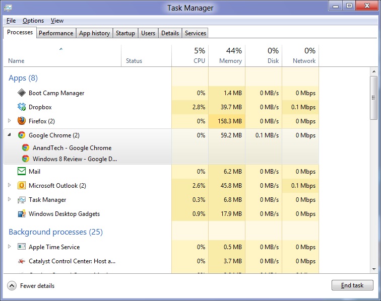
Open up the Task Manager and click “More Details” and the first thing you’ll see is the Processes tab, which gives you a clean list of all Metro and desktop apps running on your system and the resources they’re using—the new Task Manager tracks CPU, RAM, disk, and network bandwidth usage. You can see both absolute values (Firefox is using 164.7 MB of RAM) or in percentages (Firefox is using 8.9% of your RAM), and you can spot resource hogs at a glance—as you can see in the screenshot above, the colors in the Task Manager vary based on how much of a given resource a process is consuming. Apps, background processes, and Windows/system processes are each displayed under their own subheadings.
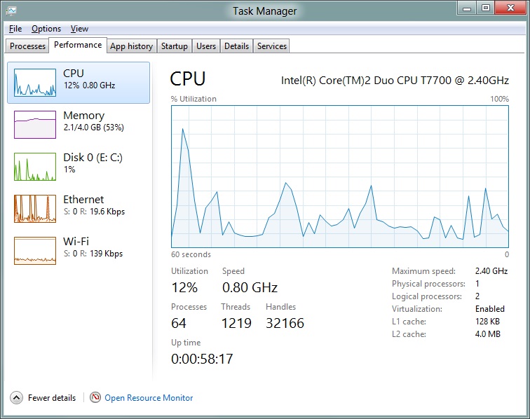
The Performance tab now tracks CPU, RAM, disk, and network usage, and it tracks each network interface separately for your convenience. The CPU graph can be configured to show activity on all cores combined or separately. You can view both graphs and hard numbers for each resource, and you can also see different information about your computer’s hardware—the current clock speed of your CPU, the number of RAM slots you have and how many are occupied, your current IPv4 and IPv6 addresses, and more. The Resource Monitor is still available if you need a more advanced view, but this tab alone drastically increases the Task Manager’s usefulness.
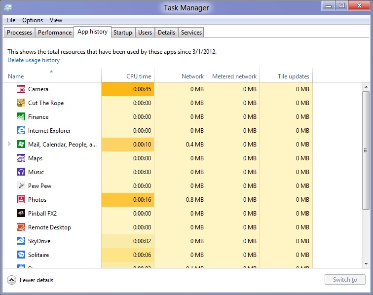
Next up, the App History tab shows statistics for resource usage over time. It’s mostly geared toward network usage, breaking out stats for how much data an app has used on both metered and non-metered networks, as well as how much bandwidth has been spent on keeping Metro live tiles up to date. It also gives you statistics for CPU time. App usage history can be deleted at any time if you’d like a fresh start.
The other tabs are pretty self-explanatory, so we’ll go through them quickly: the Startup tab shows a list of programs that launch when your computer starts. This functionality used to be handled by a combination of the “Startup” folder in the Start menu and a tab in the MSConfig.exe utility (which still exists, but is no longer used to control startup items). The Users tab shows resource usage broken out by logged-in users, much like in the old Task Manager, and will also allow administrators to disconnect users. The Details tab gives a complete unadorned list of all processes and their resource usage, while the Services tab shows all services on your computer whether they’re running or not—you can start, stop, or restart services from this tab, but you’ll have to go into the Services utility for more options.


286 Comments
View All Comments
skanskan - Wednesday, March 14, 2012 - link
The task manager should also include a GPU resource monitor.It's been a long time since GPUs were introduced and we still need third party tools.
Oravendi - Wednesday, March 14, 2012 - link
Linux has allowed for different GUI managers for a long time. Why would Microsoft not offer Metro as a desktop option? Metro is probably better for tablets and cell phones, however if Microsoft were to produce software with the ability to turn Metro off then Metro might have slow or no adoption. Microsoft sees the money. It doesn't want the problems of software like Linux. Answer, force us to Metro and claim the old windows users don't want to change.Origin32 - Wednesday, March 14, 2012 - link
The problem I have with Metro is not that it's different.It's that its different while not adding anything for me as a desktop user. Yes, I'm sure this new interface is much easier to navigate on a tablet, but with M/K I have to click more rather than less to open the more advanced menus, I have to use two user interfaces simultaneously and I have to start to unlearn 10 years of keyboard shortcuts, options locations and all the kinds of things you do automatically in win7. Using Windows 8 will be a whole lot of effort for me, and Microsoft isn't really giving me anything in return for that effort. If they'd added something actually useful like support for multiple user logons on a SAMBA share in one session, a sandbox mode to try out new programs in or really any functionality at all, then I'd have to live with Metro.
Now all I get is a new GUI I sure didn't ask for.
jabber - Wednesday, March 14, 2012 - link
This is it for me too. I just don't get what it is they are trying to sell me here with regards to Metro.I don't get it MS, Sorry.
I've always upgraded my Windows versions due to improvements in performance, load times, functionality with new hardware and tech standards. Sure there are always a few UI changes but nothing that needs 5 minutes to get used to and on the whole they have been positive.
But with Metro there just isn't enough in the deal to make me want to bother using it.
I can get by fine without it. It isn't essential for those of us using desktops/laptops.
perpetualdark - Thursday, March 15, 2012 - link
Quite simply, the home market and the professional market are no longer driven off of each other, and need to diverge. In the past, the professional market drove the PC industry, and the OS was a reflection of that.Home use has grown to be a viable entity on it's own however, and the proof of that is Apple's success in the PC market. People at home want a computer that is media based, and focused around entertainment. Movies, Music, Social Media, and Home Integration are the keys there. They want their media, and they want it everywhere (at the computer, the tv, the laptop, the phone, in bed, in the bathroom, and in the kitchen). They want to be connected to their social media all the time, and have everything integrated into that.
Businesses don't need any of it, and it is all counterproductive to business. If anything, they want everything listed above to be GONE from the picture. Remove the games, the media, and the social aspects. Sharing needs to be tightly controlled, and the "cloud" is a fancy way of saying "security risk". Your boss doesn't want you listening to music, sharing it with others, or getting on facebook or skype to socialize, he wants you productive. Secure sharing of files, remote application use, tying together the office and the mobile workspace, communicating within the company and with the customers, and productive applications. It requires a COMPLETELY different interface because it has a completely different workflow.
Windows 8 is, on the surface anyway, a HOME version of the software. It is MS's attempt to slow Apple down on the home front. But aside from desktop publishing and education, Apple is not even in the business place, and although I couldn't give you numbers, I am willing to bet that the business market is still at least half of the revenues that MS sees in a year.
One more note: Look at Office. Millions of people knew all the ins and outs of Excel and Word, and then MS goes and changes the interface 100%. With NO way of going back. I resisted until recently, and after almost a year on office 2010, I hate it to this day. The ribbons suck, I can never find the things I am looking for, and they don't even have a basic paste function, they made it more complicated. Yeah, I can ctrl-v, but sometimes I want to right click and paste, not right click and hunt for the paste icon I am looking for. I hate icons. I want words. I speak english. If I want to paste special and choose to paste values, I want to right click, paste special, values, ok. I don't want right click and look for the icon that represents pasting values. I am literate, give me words, not icons that represent words. It is a disaster, and as a result, most companies still have Windows XP and Office 2003 installed. If it werent for so many viruses and malware targeting the weak security of XP, I would still have all my machines running on XP. I still run programs like Live Messenger in Vista mode so the icon goes in the tray and not on the bar. I don't understand why MS wants me to change so bad.. I don't want to change, I am more efficient the way I use it, so bugger off and leave me alone! I want my "up directory" button back, and I want the window button in excel back, so when I have 250 spreadsheets open (or even 2), I can switch without having to go to the right hand monitor and click on the excel icon and choose the window from there.. I just want to do it in excel. Come on, quit changing stuff just for the sake of changing..
shin0bi272 - Friday, March 16, 2012 - link
no... just no. Stop talking about stuff you know very little about. It just makes you look bad.Valahano - Friday, March 16, 2012 - link
Care to elaborate?slickr - Thursday, March 15, 2012 - link
Good job Andrew. After years of reading this website you with this obvious piece of propaganda have forced me from this moment on to stop visiting this website.This shameless advertising for this Microsoft crap of a operating system that they call windows 8 is sickening. How much did they pay you?
You people make me sick, at least be honest about it and write that you have been paid to write about their product in a positive way, I guarantee you people won't be too judgmental and will accept the fact that this website with its obvious bias for some time now has been loosing all its visitors and is forced to write propaganda articles for money!
Shinya - Thursday, March 15, 2012 - link
So basically because he likes something that you don't (even though he heavily criticized it) your limited brain capacity calculated that he was paid?Please stick with apple products iTard. Your lord n savior is waiting over at engadget.
shin0bi272 - Friday, March 16, 2012 - link
actually no hes right... if you look at what MS did with win8 its designed for tablets and they are violently forcing pc users to adapt the same gui that will be basically worthless to us and what does the author of this article say?"Yes, Metro is very different from what came before, and yes, Metro was clearly designed with touch in mind, but once you learn its tricks (and especially once you’ve got the new keyboard shortcuts dedicated to memory) it acquits itself as a flexible and powerful user interface."
Sucking up much?