Motorola Xoom Review: The First Honeycomb Tablet Arrives
by Anand Lal Shimpi on February 23, 2011 11:57 PM ESTThe Android Tablet Keyboard
In our iPad review I complained that Apple purposefully turned down the autocorrect aggressiveness, which resulted in a more frustrating typing experience than on the iPhone. Google clearly struggled with the same decision, but left the option up to the end user to configure. There’s a new option in the input device settings to set how aggressive you want the autocorrect to be:
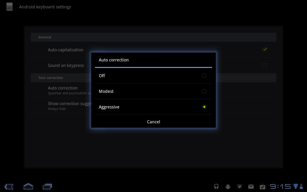
The main difference between moderate and aggressive seems to boil down to spatial recognition for typing errors. On Android and iOS the keyboard looks at the length of the word you’re typing, letters involved as well as the location of the letters selected when comparing to the built in dictionary. In my experience, Android tends to look more at word length and letters involved than it does the physical location of the keys you’re pressing. I’m not actually sure how much Android does the latter, but iOS seems to rely on it pretty heavily. Setting Honeycomb’s autocorrect to aggressive makes the Android keyboard behave a lot more like the iOS keyboard in this regard.
The main issue with aggressive autocorrect is when you’re intentionally typing a word that’s not in the dictionary. Aggressive autocorrect will typically correct it while moderate autocorrect won’t. I’ll give you an ironic example: the name Xoom.
With autocorrect set to moderate, Honeycomb will let you type Xoom without complaining. Set to aggressive, Honeycomb will look at the location of the letter X on the keyboard, realize it is close to the letter Z and assume you meant to type Zoom.
At the same time, where aggressive autocorrect comes in handy is when you actually make a spelling mistake due to a misplaced tap. Take the word "pool". If you accidentally type "pook", moderate autocorrect won’t do anything to the word. It’ll realize it’s not in the dictionary but it is not a blatantly misspelled version of another word. Aggressive autocorrect will realize that the letter k is next to the letter l on the keyboard, assume you meant “pool” and make the substitution.
Google also lets you disable autocorrect entirely but I’m not personally a fan. I’m torn as to what method I prefer on a tablet. Both can be frustrating at times but for different reasons. I feel like aggressive autocorrect is the best option if you have a mature dictionary to check against. By mature I don’t mean that it contains words of mature content, but rather it knows all of the words that you type frequently.
By default, Honeycomb takes a simplistic approach to autocorrection: the suggested words bar is hidden. Unfortunately this means there’s no quick and easy way to manually add words to the dictionary. Thankfully Google lets you show the suggestion bar all the time if you’d like, or only when in portrait mode if that tickles your fancy. Based on what I’ve seen I’d recommend using aggressive auto correct once you’ve added a significant number of words to the dictionary.
The virtual keyboard itself is pretty nice. Key spacing is good both in portrait and landscape modes and the learning curve isn’t too steep. It’s still faster (and less painful) to type on a physical keyboard, but for banging out short messages, emails and URLs - the virtual keyboard works.
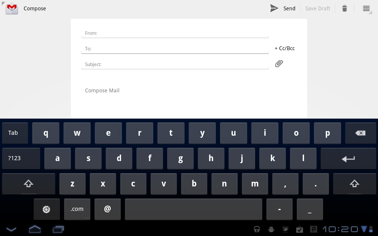
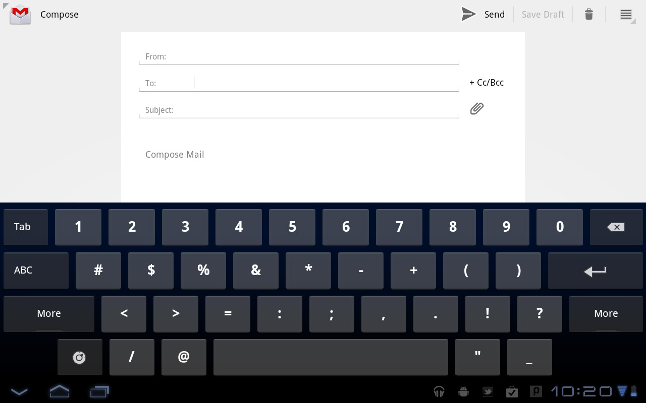
My only real complaint about the virtual keyboard is the location of punctuation keys. Google gives you access to commonly used punctuation (comma, question mark, exclamation point) without switching keyboard modes, but the position of the punctuation keys takes some getting used to - they don’t cleanly map to where you’d find them on a normal QWERTY keyboard. I feel like for first time users Apple got the layout a little better, but the point is moot - as long as you don’t go back and forth between an iPad and a Xoom you’ll get used to it.


112 Comments
View All Comments
softdrinkviking - Thursday, February 24, 2011 - link
anand writes... "I suspect the ideal tablet UI is probably not too far off what modern desktop OSes have become. While a smartphone’s UI must be dramatically different due to the lack of screen real estate, a tablet UI just needs to be more efficient than its desktop counterpart - not necessarily very different."this is an interesting thought, and I am wondering if you are considering the, potentially, drastically different usage models that tablets need to be built for.
not only will people be using these things on the run, but the ways I see people using them now are really different from desktops.
tablets really lend themselves to task integration, where you have a specific reason to use it over and over.
for example, I have seen the subway/train information officers using them here in Japan to give people directions, and I see store clerks using them to implement inventory management software.
that kind of usage demands quick access to a limited number of functions and a low level of file maintenance.
If anything, I would have guessed it the other-way around, where tablets will need to be closer to a smartphone OS, but adjusted for the larger screen real estate.
mlambert890 - Thursday, February 24, 2011 - link
100% spot on. This is where the enthusiast niche that follows forums, and the reviewers and bloggers that server them, can't seem to "get it"For tech geeks, a slightly tweaked desktop metaphor is what they want from a tablet (for the ones that even want one at all). For the vast majority of the target audience, this absolutely misses the mark which is why iOS on iPad, despite all of the nerd rage towards it, has done so well.
I'm as geek as geek gets with 20+ years in this industry, but these days as an old guy, I am also a mobile professional. On the road, which is all the time, for work, i need exactly what you describe. Quick, efficient, task focused access.
I'm not geeking out at a Starbucks or doing proofs of concept (WoW on emu on Android on Xoom!!!) for YouTube. I'm doing email, note taking, Webex and reading/presenting on the go.
If google inches towards a tweaked desktop UX paradigm they will be making the same mistake MSFT did (and continues to) with their tablet efforts.
The hardcore tech crowd might be happy, but they are a micro percentage of this market.
bplewis24 - Thursday, February 24, 2011 - link
Did you miss the part of the review where Honeycomb was better in all of those areas? Or did you just focus on a quote taken out of context which compares this OS to a desktop OS?Never mind, I already know the answer.
Brandon
ccrobopid - Thursday, February 24, 2011 - link
I was waiting for your review of the Xoom. Goog job on your part, but I must say I'm a little disappointed with the hardware. On a tablet the screen quality sure is one of the most important elements, and at this price point I don't think I'll buy it. I also don't get the 16:10 aspect. Widescreen had sense in BIG screens because we have more degrees of vision sidewards, but at this screen size I prefer a 4:3 format because I feel it's more useful for web browsing, reading and apps in general.ccrobopid - Thursday, February 24, 2011 - link
Complementing my post, if it wasn't for the too boxed experience, I still feel like iPad is the device to have. Let's see if iPad2 launches and throws away some of that "boxeness" :Dmacs - Thursday, February 24, 2011 - link
Honeycomb needs:- an update to solve the youth problems
- great screen (at least as good as iPad)
- 16gb and wifi only for 499$
Apple needs:
- to catch up Honeycomb on software side (multitasking,browser,... I don't think that an iPad 2 still running iOS 4.x would be enough...)
- faster SoC (A5 dual core)
- Facetime Camera
- Video Out
Shadowmaster625 - Thursday, February 24, 2011 - link
I have a great idea. Let's all go spend $800 (+ $50 in tax) to have a tablet that crashes constantly and cant be viewed outside. Crackhead.Mr Alpha - Thursday, February 24, 2011 - link
I would really like to see minimum brightness numbers. The ability to turn the back-light way down is important in order to avoid a headache when reading something in a low light situation. The iPad for example has a too high minimum brightness.josephandrews222 - Thursday, February 24, 2011 - link
...you wrote this:"Things like this combined with the instability I mentioned earlier makes me feel like Honeycomb was a bit rushed, perhaps to hit the streets before one other major tablet announcement coming this year?"
...you referring to the iPad2 or HP's 'Pad'?
I really enjoyed this review. A lot. Thanks.
Jinded - Thursday, February 24, 2011 - link
On the Multitasking page, you mention the following about widgets:"In Gingerbread and prior version of Android, widgets were fairly constrained and two dimensional. You could display information within the widget but there was no depth and no concept of scrolling."
I don't think this is quite true, as several launchers (like LauncherPro) support vertically scrolling widgets. I myself use Agenda Widget as a scrollable 1x4 calendar widget. The Samsung TouchWiz interface (and I'm sure others as well) also comes with several widgets set up rolodex-style, displaying maybe the last 10 or so notifications/pictures/events that can be scrolled using up/down buttons. Not quite the same thing as a scrollable widget, but I think it counts as having depth.