The Windows Phone 7 Review
by Anand Lal Shimpi & Brian Klug on October 20, 2010 7:00 PM EST- Posted in
- Smartphones
- Windows Phone 7
- Microsoft
- Mobile
Themes
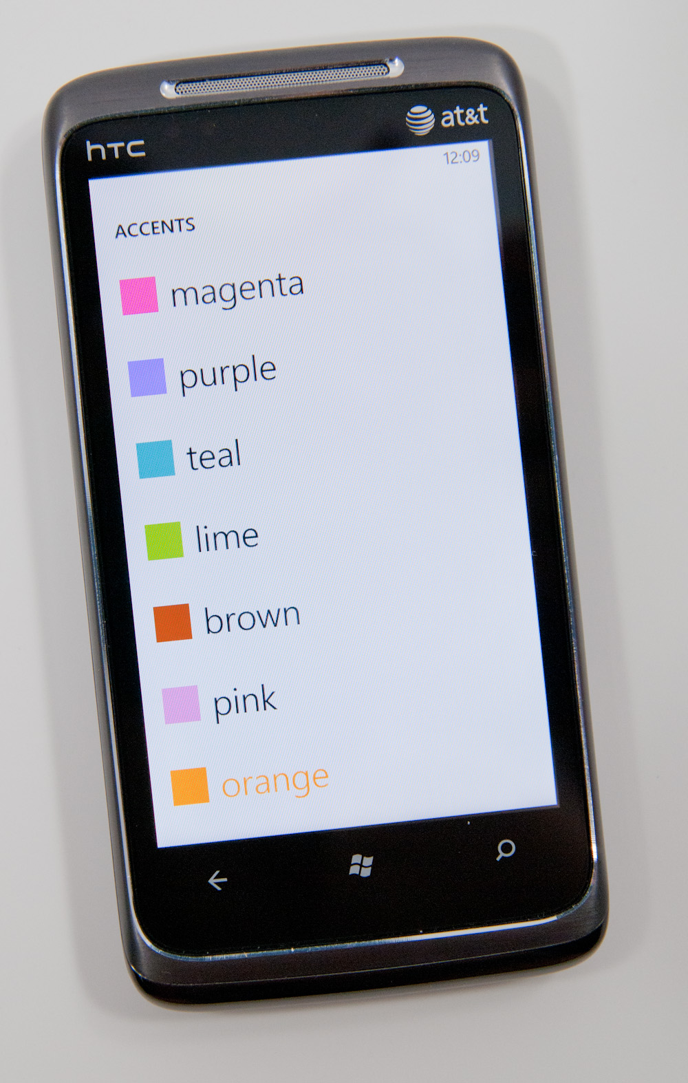
Despite Microsoft’s strict UI policies within Windows Phone, you can tweak two parameters to customize your phone: the background color and the theme color. You can choose white or black for the background color, although I’d recommend against white if you have an AMOLED or Super AMOLED phone as it can significantly reduce battery life.
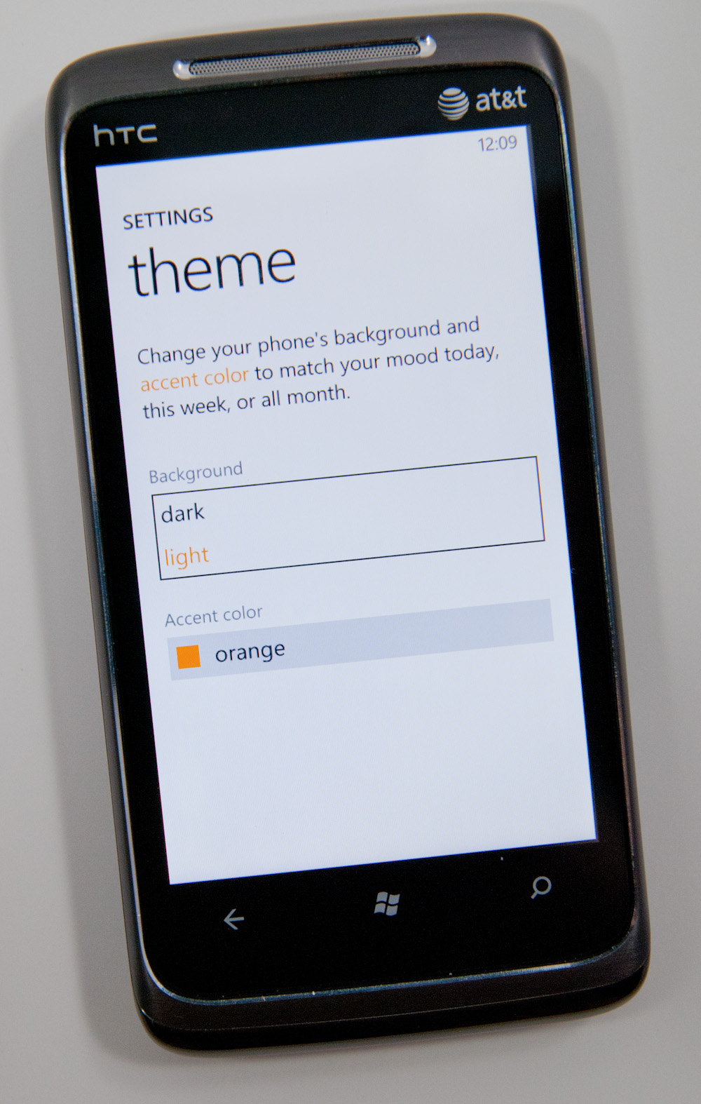
The theme color controls things like the color of your tiles, color of links and even the color of progress bars in IE. The color options are all either bold or vibrant or a little of both, and they dramatically change the look of the device.
I’d say Microsoft got the personalization down just right. You can change the photos on your lock screen but everywhere else the background is either black, white or a picture automatically selected based on the content you’re viewing.


The theme colors are consistent once applied and refreshing to switch between. It’s like getting a case for the inside of your phone.
The UI customizations preserve a standard experience across all Windows Phone devices. Microsoft definitely learned from Windows Mobile.


125 Comments
View All Comments
Crono - Thursday, October 21, 2010 - link
A lot may not have been taken from the Kin One and Kin Two, but the square, multi page Start is the same concept that was implemented in the Kin phones.Looking forward to moving from my Kin One to the Surround. Microsoft is offering 3 months free Zune Pass for those who sign up to be notified about preorders.
heelo - Thursday, October 21, 2010 - link
You might be the only owner of a Surround.That thing has a "value proposition" that I'm really struggling to relate to.
peter7921 - Thursday, October 21, 2010 - link
I have to give recognition to Anandtech for another great review. I have been looking for a detailed review on WP7 and you guys delivered. Not only is it extremely informative but it's also very well written. I read through it all, not once feeling bored or skipping ahead.These types of articles are the reason Anandtech is my first source for all things tech!
Keep up the great work guys!
Confusador - Thursday, October 21, 2010 - link
OK, wow. I mean, even by Anandtech's unusually high standards that was intense. Just one thing I'm not clear on, though... am I reading this correctly?"WP7 calls presents its browser user agent as “Mozilla/4.0 ...""
If that's correct we've come a long way from the days I had to have Firefox masquerade as IE to be effective.
Guspaz - Thursday, October 21, 2010 - link
IE has *always* done this, including on the desktop. IE6 reports as as Mozilla/4.0 too. IE2 also did it (a different version of Mozilla, though). A quick search didn't turn up IE1 user agent strings, but I assume it also did.Spivonious - Thursday, October 21, 2010 - link
Remember back when IE was introduced, Netscape was king. Netscape is based on Mozilla. That's the only reason it's in there - so pages made for Netscape would load correctly in IE.arturnowp - Thursday, October 21, 2010 - link
IT seems strange that WP7 cannot pass test, has very slow JavaScript engine but still pages are fluid and displayed porperly. Maybe Microsoft renders pages remotely and serves them to the phne?UCLAPat - Thursday, October 21, 2010 - link
Wow! After reading this review, it makes all the other reviews look like previews. Definitely going to be considering WP7 when it's time to upgrade my phone. Still have time to burn on my current 2 year contract. By the time it's up, LTE should be up and running and Verizon will probably have a WP7 device for us to consider as well.Apps will come. But they're not a huge part of my life anyway. I want a rock-solid core experience for a phone. A smartphone has to nail the basic experiences first (calls, messaging, calendar, etc). I never liked the main screen completely filled with app icons. That reminded me too much of my old desktop computer before I cleaned up the desktop.
Belard - Thursday, October 21, 2010 - link
But very detailed... tells us pretty much everything anyone can ask.Thanks...
While I'm not exactly PRO-MS... its good to see good design.
I still like Google's a bit more and its shortcoming are easy to spot. Hopefully Android 3.0 will improve on its weaknesses.
The icon / naming is well thought out and is used by others... including Apple, but not on a phone.
silverblue - Thursday, October 21, 2010 - link
"...displays up to 8 tiles of people you’ve either recently communicated with or whose profiles you’ve viewed/stalked."LOL.