The Windows Phone 7 Review
by Anand Lal Shimpi & Brian Klug on October 20, 2010 7:00 PM EST- Posted in
- Smartphones
- Windows Phone 7
- Microsoft
- Mobile
Facebook Integration
Windows Phone does the best job of Facebook integration I’ve seen of any smartphone platform.
Palm’s webOS was the first to seamlessly integrate Facebook into a modern day smartphone. Supply it with your Facebook credentials and you saw the entirety of your oversized friends list appear in your phone contacts. Email addresses, IM accounts, phone numbers and more were all automatically populated in your address book. If any of your Facebook friends changed their information, the information updated on its own on your phone. It was the wave of the future.
Spiritually, Microsoft picks up where Palm left off. You can do the same sort of blanket integration that you could with the Pre. Supply your Facebook login information and Microsoft syncs all of your contacts through the cloud. Unlike webOS however, Microsoft gives you an option to not sync all of your Facebook friends. You can choose to only sync those Facebook contacts who are already in your address book (from Google, Hotmail, Exchange or Yahoo).
Microsoft integrates Facebook in more places than just your address book however. Meet the People Hub.
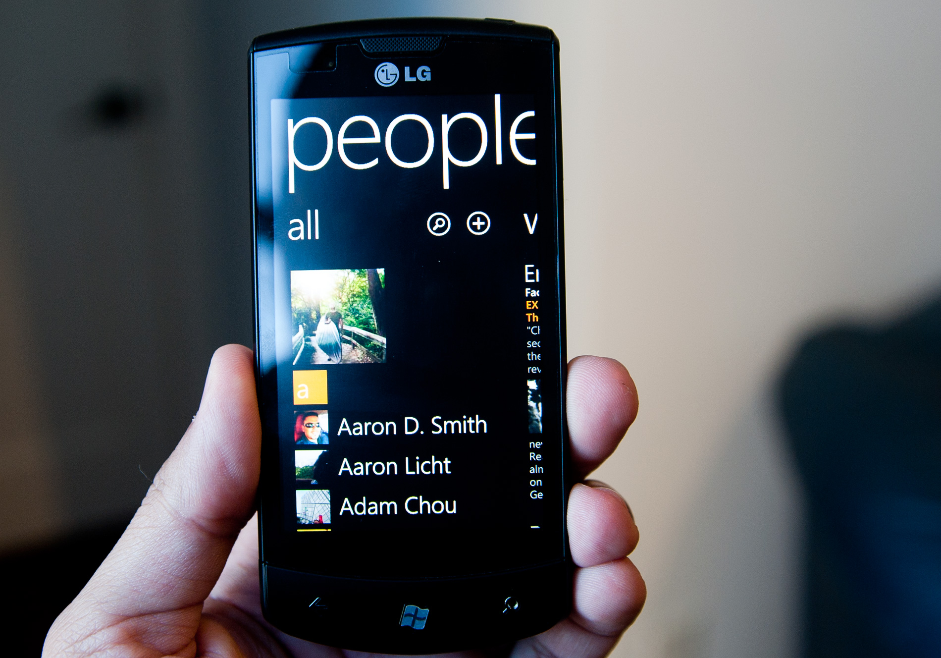
People Hub
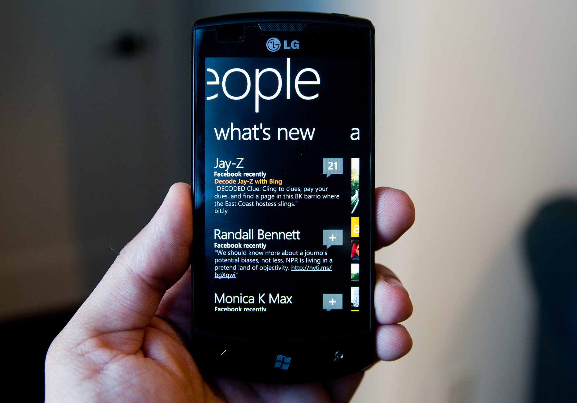
For all intents and purposes the People hub is the Facebook app for Windows Phone 7. If you’ve supplied your Facebook login, the default “what’s new” tab will serve as your news feed. It’s not the reduced load Top News feed you get from Facebook, but literally the most recent news from all of your Facebook friends and pages. You get 25 posts by default (non customizable) and there’s a get older posts button at the bottom of the page if you want to see more.
It’s not a total Facebook app replacement as you don’t get non-content updates. Items like who your friends have added to their friends list are absent from the feed. There is also no integration of friend request management. The Facebook integration is mostly for passive consumption with a couple of exceptions. You can view and add comments to posts as well as like posts, however you can’t see who has liked a post (just the number of likes for any given post).
Tapping on anyones name in the what’s new feed brings you to their contact page. You can view their “what’s new” feed and comment on their posts. You can also view their profile which will pull in data from both Facebook and your contacts (e.g. through Google or Live). Microsoft clearly (and cleanly) indicates what sources it is using to pull the profile information from under the contact’s name.
If you really like talking to/keeping tabs on/being creepy to a person, you can pin their profile to your Start screen for easy access.
From the profile tab you can write on their Facebook wall, send an email, make a phone call, send them a text message or even bring up their address on Bing maps.
All of these functions are super fast and seamlessly integrated into the experience. Quickly writing on someone’s wall without having to fire up a separate Facebook app couldn’t be faster. There’s literally a Write on wall screen that quickly appears when you select the option to. Sending an email or text message from the profile screen is a bit slower since you’re technically switching to another app, but it’s near instantaneous.
Here’s where the functionality of the back button really one-ups iOS multitasking. Let’s say I’m viewing a friend’s profile and I want to get directions to his house. I can click on his address on the profile page which will immediately fire up the Maps app. I can use Maps to quickly see where he lives (or eventually get directions) but now when I want to go back to his profile to send him a text message, there’s no double tapping or app selection - I just hit the back button and I’m back at his profile. Had I tried to get directions while at the Maps screen I would’ve tapped the back button twice (once to get out of directions and into the normal map and once again to go back to the profile) but it’s still a snappier process than manually switching between apps in iOS. The advantage is really limited to these types of scenarios however.
There’s still the need for a standalone Facebook app for more of the FB-specific features (gift giving, messaging, apps, chat, etc...), but the People hub gives you access to the most commonly used tasks. Update: A standalone Facebook app is now available for WP7.
While you can exclude Facebook friends who aren’t already in your address book from appearing in your address book, doing so will not keep those friends from appearing in your what’s new feed. The good news is that the what’s new feed will respect your Facebook news feed options. If you’ve removed someone’s updates from appearing in your Facebook news feed, their updates won’t appear in the what’s new tab on Windows Phone 7.
Today Facebook is front and center with Windows Phone, but it would be just as easy for Microsoft to extend the interface to support other social networks or status aggregators. Twitter obviously comes to mind and while Microsoft isn’t officially announcing anything yet, that’s clearly a target that we can expect to see pulled in at some point.
Aside from the news feed, there are two more tabs to the People hub: recent and all. The recent tab is actually a two-page tab that displays up to 8 tiles of people you’ve either recently communicated with or whose profiles you’ve viewed/stalked. The tiles are animated so you’ll see them alternate between a photo, photo + name, or just name.
This tab is effectively your favorites as there is no such functionality in the Phone app. You don’t get one touch dialing or emailing unfortunately, you’ll need one tap to select the contact and one more to choose your communication method.
The all tab is exactly what it sounds like - a list of all of your contacts. The topmost contact? A big link to your own profile of course, which you can use to provide status updates on your Facebook wall.
The search button will let you search through the all people tab. Results are narrowed down/highlighted as you type.
Tapping on any of the highlighted headers brings you to this screen, which you can use to jump to any other header in the list. I feel like the Android/iOS scrolling widget makes more sense but the Microsoft approach does work.
Facebook Photo Integration
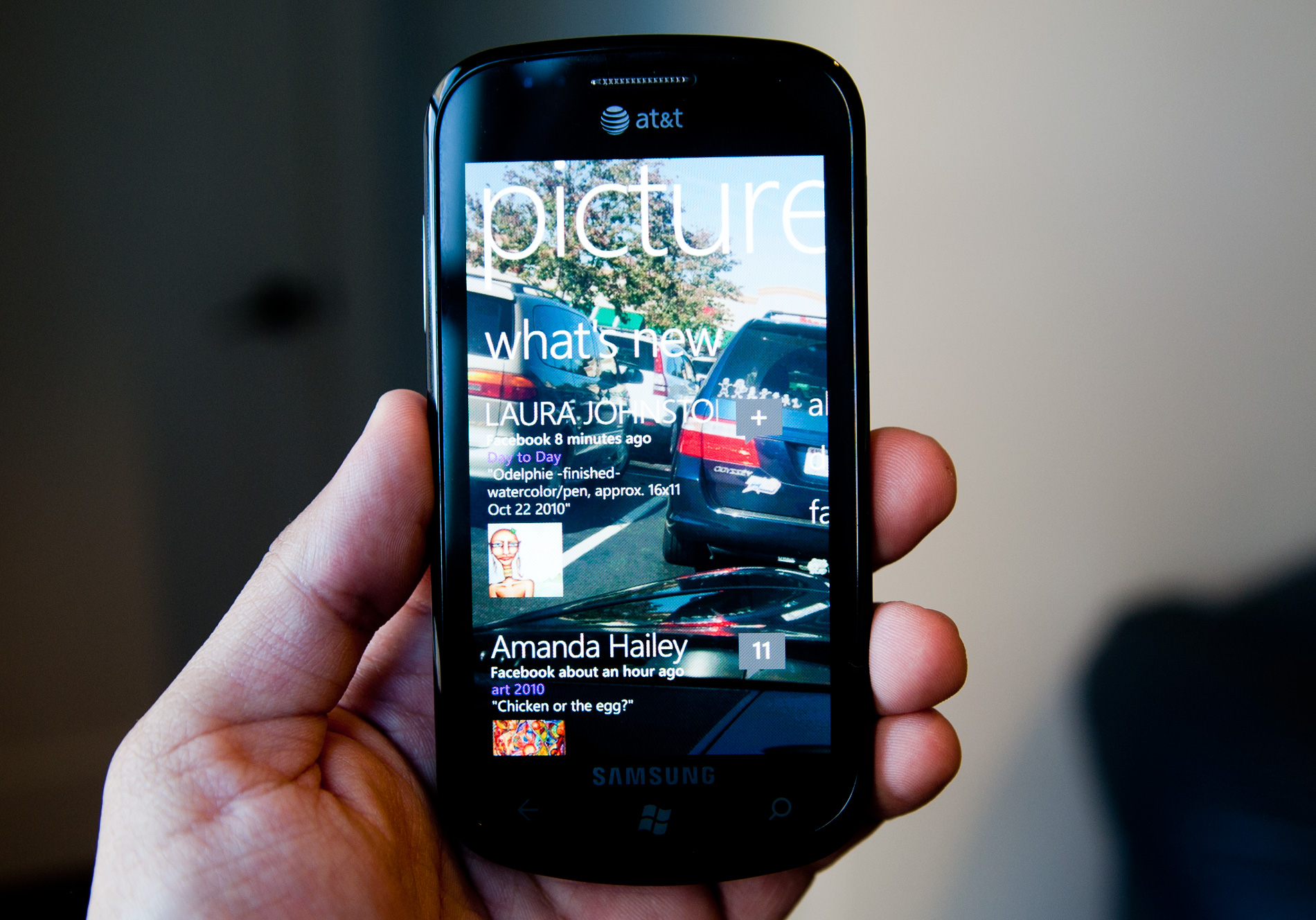
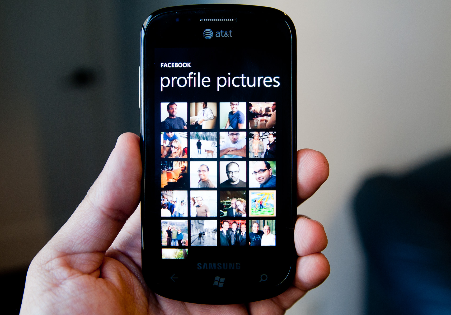
What I was more impressed by was the Facebook integration in the Pictures hub. Your profile pictures and mobile uploads are both listed as albums when looking through all of your photos by date. Browsing photos you’ve synced, photos you’ve stored in the cloud and photos you’ve uploaded to Facebook is not only possible, but done sensibly. On top of all of that, there’s also a what’s new tab in the Pictures hub that just gives you a feed of all of the photos your Facebook friends have posted recently. It’s a great way to photo stalk if that’s what you ultimately end up doing on Facebook anyway.
While Palm used Facebook as a way to integrate contacts, other companies have since tried to pull status updates and photos from the service to populate your phone. Microsoft now joins the list of those who have tried, and while the integration isn’t perfect, it’s quite possibly the best attempt yet.


125 Comments
View All Comments
bplewis24 - Thursday, October 21, 2010 - link
You call it smooth running and functional, which is fine. That doesn't dissuade me and the OP from feeling it is ugly and off-putting. You even say it doesn't have to be cluttered eye candy, but the review claims it is the most beautiful UI he has ever seen. The thing is big blue blocks. It is exactly what he explained on the first page that Windows typically does with any refresh of their OS: "make it bigger and bluer."It is definitely ugly, but if you only care about how functional and fast it is, then you will love it. I admit that I can't stand iOS cluttered eye-candy style either, so I'm with you on that. Give me functional, customizable and sleek and I'm in heaven. Glad somebody already figured out how to do that.
Brandon
geniekid - Thursday, October 21, 2010 - link
In my opinion, it's quite good looking and better than the default home screen on my HTC Incredible.Like you said, it's all a matter of taste. I will put myself out there and say the guy who thinks the "6 year old crackberry looked better" probably has poor taste.
Smilin - Monday, October 25, 2010 - link
It is the most beautiful UI I've seen. Mind you I've SEEN it. Have you? Screenshots don't do it justice. You have to see it moving and the text shifting in parallax. It's eerily 3D.iPhone and Android are beautiful too....if you're a Windows 3.1 progman.exe fan.
gstrickler - Friday, October 22, 2010 - link
It may be simple and functional, but that doesn't mean it has to be boring and ugly. I'm a huge proponent of simple and functional, but that screen looks like something out of the late 80's or early 90's. The tiles have too little to differentiate them from each other. A little use of color and better contrast would make it a lot clearer and faster to identify the icons, and it would look better.Note to MS, hire a usability consultant and put some of your graphic designers to work (I know you have graphic designers). It shouldn't look like just like Windows 7, but it definitely shouldn't look like it comes from Windows 2.0
inighthawki - Thursday, October 21, 2010 - link
That "ugly" home/start screen interface is one of the main reasons I'm interested in WP7. The other smartphone interfaces I've seen from others like iOS and Android are nothing more than glorified and eye-candy enhanced versions of every other phone out there IMO. And as someone who owns a Zune HD which has a very similar interface, I can tell you that it works really well, and is very nice.bplewis24 - Thursday, October 21, 2010 - link
There is no eye candy in Android. It's basically a blank slate desktop background. And obviously it's no surprise that a Zune HD user would prefer the Windows Phone 7 UI. It's also not a surprise you use subjective and vague justifications for your preference :)inighthawki - Friday, October 22, 2010 - link
I don't see why I have to justify a subjective decision. The bottom line is "I like it" and my entire point was that just because the OP thinks it's the ugliest home screen they've ever seen, there are people like myself that not only like it, but actually dislike the style they do. I am not trying to force my opinion on anyone.Smilin - Monday, October 25, 2010 - link
I agree with you FWIW.cknobman - Thursday, October 21, 2010 - link
I agree 100%Gigantic big colored tiles? Seriously?
What a waste of space and an overly boring-bland appearance!!!
Guspaz - Thursday, October 21, 2010 - link
I agree, the WP7 UI looks horrendous to me. Giant space-wasting bland UI components.My biggest concern is how HUGE the tiles are. Anand complained about iOS/Android cluttering screens with app icons, but it seems to me like WP7 will be incredibly worse.
Reducing the number of tiles on the screen so that you can only view 6 full tiles at a time, as WP7 has done (the bottom two tiles appear cut off in pictures) is a huge limitation. The iPhone displays 20 icons.
If I've got 50 apps, and I'm not using folders, an iPhone will give you three screens to scroll through. Android, I assume is similar. Windows phone 7 seems to require something like 8... And the lack of some sort of folder or grouping support is only going to make this worse.
My prediction is that, if WP7 takes off and starts getting a decent number of apps, they're going to have to rethink the home UI or it'll be unusable.