The Windows Phone 7 Review
by Anand Lal Shimpi & Brian Klug on October 20, 2010 7:00 PM EST- Posted in
- Smartphones
- Windows Phone 7
- Microsoft
- Mobile
Xbox Live
The hub that probably saves the most space in the UI is the Xbox Live/Games hub. All of your games go here regardless of whether they are Xbox Live titles or regular Windows Phone games.
There are two categories of games on Windows Phone 7: Xbox Live titles and standard games. The latter are similar to games developed for iOS or Android, anyone can develop for them you just need to spring for the $99 account to get them published. These games can be developed in either Silverlight or using the XNA framework and can leverage the GPU.
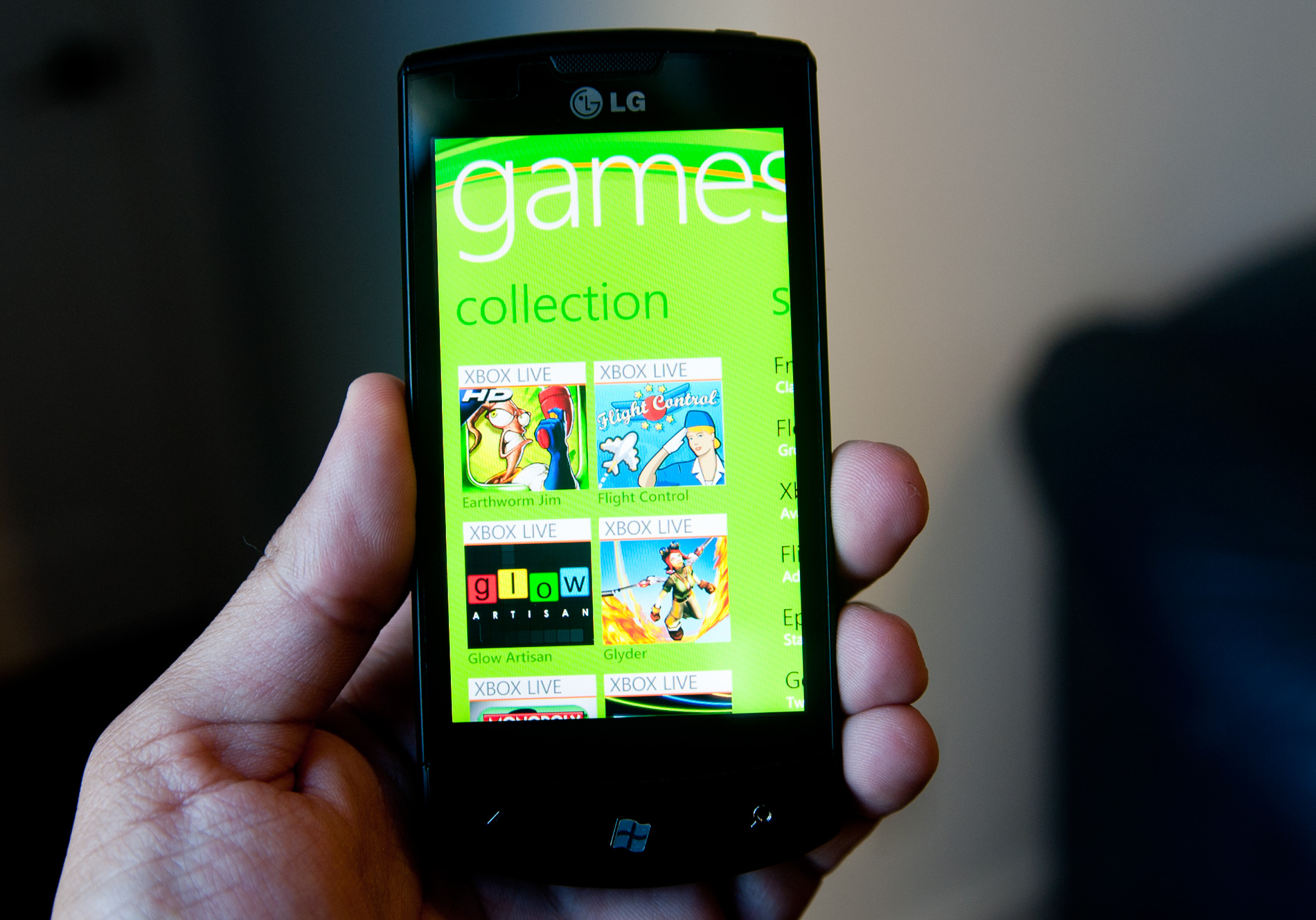
Xbox Live titles are supposed to be more polished and come with a stricter set of requirements. All XBL titles must support a try before you buy demo mode (it’s optional for regular games), they all support achievements and they can support turn based multiplayer (real time is out of the cards for now, we need better mobile bandwidth for that).
The regular games on Windows Phone aren’t all that impressive, they’re not terrible either. But we’re missing titles like Angry Birds (heh) and Plants vs. Zombies. I suspect over time we’ll see these in the marketplace, the phones just need to start shipping first.
With the original Xbox Microsoft had Halo, and what it’s desperately missing from Windows Phone 7 is a Halo equivalent. Not necessarily a first person shooter, but a game that’s so enjoyable that it alone is justification to buy into the platform.
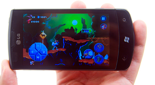
The Xbox Live titles aren’t half bad, but so far they aren’t an order of magnitude better than what you get on an iPhone. They are pricey too. The titles range from $0.99 all the way up to $6.99, and in the long run I expect these prices to follow an upward trend. Games will get deeper, art/development budgets go up and the end user will foot a higher bill. I think the ultimate goal for smartphone gaming is for it to replace handhelds like the PSP or Nintendo DS. I would expect AAA smartphone game prices to be in the same range as games for those devices eventually. Without the need for the traditional publishing model the final price may be a bit lower, but that remains to be seen. It may take a few years but that’s where things are headed.
If your Live id is tied to your Xbox Live Gamertag then you’ll immediately get your avatar and gamer score imported into the Xbox Live hub. Any gamer score accrued in playing on your phone gets added to your total.
![]()
Through the free Xbox Live Extras app you can edit your avatar as well as interact with your XBL friends. This app is one of the slowest on the phone however, switching between tabs is choppy and it’s the only app that seems to consistently have problems.
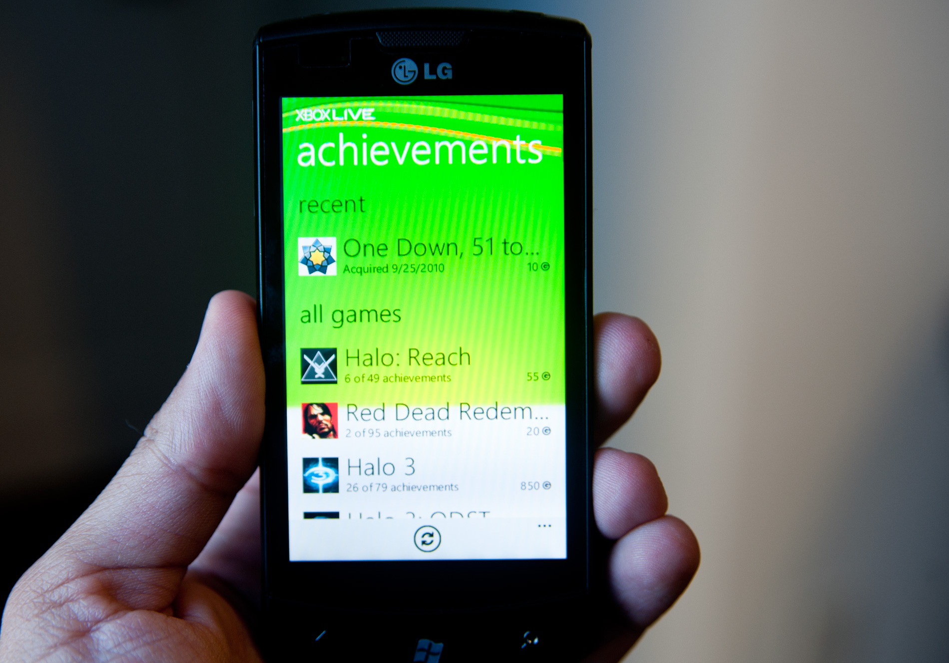
Within the extras app you can view all of your achievements (both in XBL phone games and in 360 titles). You can also view your XBL friends list to see who’s online and even send them messages.
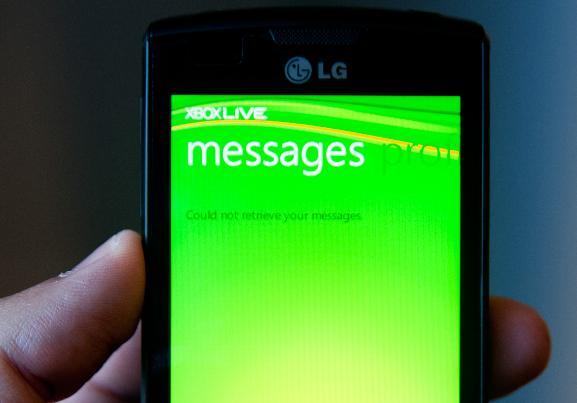
I see the messaging/friends list management as the killer feature for WP7’s Xbox Live integration. Typing messages via an Xbox 360 controller is a pain and the chatpad accessory is a silly thing to buy when you’ve got a fully functional smartphone. If you do a lot of communicating on Xbox Live, Windows Phone 7 has the potential to make things easier. The main problem is the performance of the Extras app, it’s just unacceptable. It’s laggy and crashes a lot - perhaps a rushed attempt to meet the European launch tomorrow, but it needs to be fixed asap.
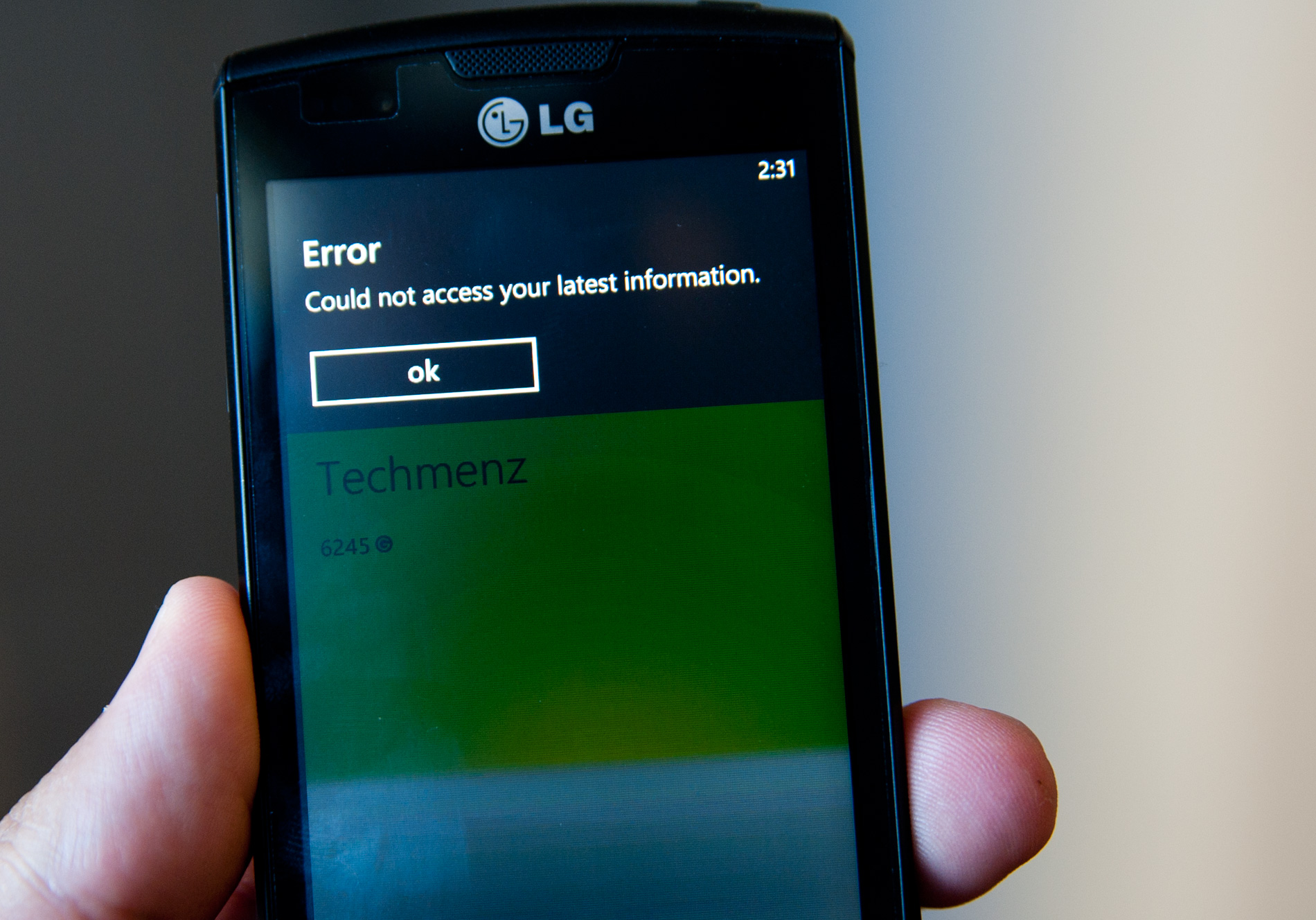
The XBL Extras app is currently in a state of disarray


125 Comments
View All Comments
bplewis24 - Thursday, October 21, 2010 - link
You call it smooth running and functional, which is fine. That doesn't dissuade me and the OP from feeling it is ugly and off-putting. You even say it doesn't have to be cluttered eye candy, but the review claims it is the most beautiful UI he has ever seen. The thing is big blue blocks. It is exactly what he explained on the first page that Windows typically does with any refresh of their OS: "make it bigger and bluer."It is definitely ugly, but if you only care about how functional and fast it is, then you will love it. I admit that I can't stand iOS cluttered eye-candy style either, so I'm with you on that. Give me functional, customizable and sleek and I'm in heaven. Glad somebody already figured out how to do that.
Brandon
geniekid - Thursday, October 21, 2010 - link
In my opinion, it's quite good looking and better than the default home screen on my HTC Incredible.Like you said, it's all a matter of taste. I will put myself out there and say the guy who thinks the "6 year old crackberry looked better" probably has poor taste.
Smilin - Monday, October 25, 2010 - link
It is the most beautiful UI I've seen. Mind you I've SEEN it. Have you? Screenshots don't do it justice. You have to see it moving and the text shifting in parallax. It's eerily 3D.iPhone and Android are beautiful too....if you're a Windows 3.1 progman.exe fan.
gstrickler - Friday, October 22, 2010 - link
It may be simple and functional, but that doesn't mean it has to be boring and ugly. I'm a huge proponent of simple and functional, but that screen looks like something out of the late 80's or early 90's. The tiles have too little to differentiate them from each other. A little use of color and better contrast would make it a lot clearer and faster to identify the icons, and it would look better.Note to MS, hire a usability consultant and put some of your graphic designers to work (I know you have graphic designers). It shouldn't look like just like Windows 7, but it definitely shouldn't look like it comes from Windows 2.0
inighthawki - Thursday, October 21, 2010 - link
That "ugly" home/start screen interface is one of the main reasons I'm interested in WP7. The other smartphone interfaces I've seen from others like iOS and Android are nothing more than glorified and eye-candy enhanced versions of every other phone out there IMO. And as someone who owns a Zune HD which has a very similar interface, I can tell you that it works really well, and is very nice.bplewis24 - Thursday, October 21, 2010 - link
There is no eye candy in Android. It's basically a blank slate desktop background. And obviously it's no surprise that a Zune HD user would prefer the Windows Phone 7 UI. It's also not a surprise you use subjective and vague justifications for your preference :)inighthawki - Friday, October 22, 2010 - link
I don't see why I have to justify a subjective decision. The bottom line is "I like it" and my entire point was that just because the OP thinks it's the ugliest home screen they've ever seen, there are people like myself that not only like it, but actually dislike the style they do. I am not trying to force my opinion on anyone.Smilin - Monday, October 25, 2010 - link
I agree with you FWIW.cknobman - Thursday, October 21, 2010 - link
I agree 100%Gigantic big colored tiles? Seriously?
What a waste of space and an overly boring-bland appearance!!!
Guspaz - Thursday, October 21, 2010 - link
I agree, the WP7 UI looks horrendous to me. Giant space-wasting bland UI components.My biggest concern is how HUGE the tiles are. Anand complained about iOS/Android cluttering screens with app icons, but it seems to me like WP7 will be incredibly worse.
Reducing the number of tiles on the screen so that you can only view 6 full tiles at a time, as WP7 has done (the bottom two tiles appear cut off in pictures) is a huge limitation. The iPhone displays 20 icons.
If I've got 50 apps, and I'm not using folders, an iPhone will give you three screens to scroll through. Android, I assume is similar. Windows phone 7 seems to require something like 8... And the lack of some sort of folder or grouping support is only going to make this worse.
My prediction is that, if WP7 takes off and starts getting a decent number of apps, they're going to have to rethink the home UI or it'll be unusable.