The Windows Phone 7 Review
by Anand Lal Shimpi & Brian Klug on October 20, 2010 7:00 PM EST- Posted in
- Smartphones
- Windows Phone 7
- Microsoft
- Mobile
Messaging
It’s easy to forget sometimes that first and foremost smartphones must perform the duties of an ordinary cell phone. That includes support SMS, MMS, and voice calls.
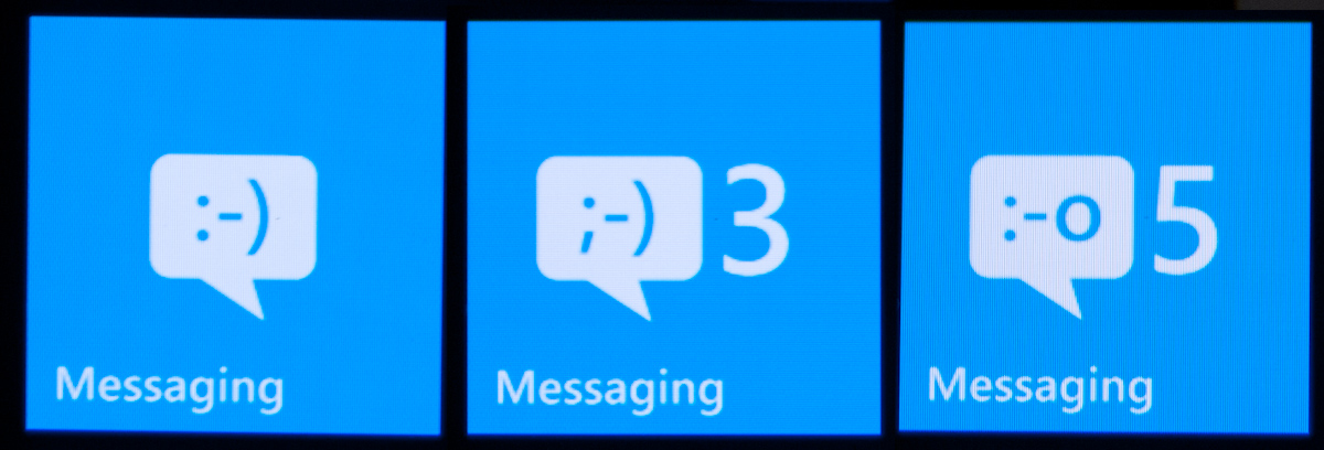
WP7’s messaging application is threaded and minimalist. On the outside, the tile shows the number of unread messages, and an emoticon that changes from a :-) to ;-) to :-o as your unread messages pile up. It’s a subtle change but funny nonetheless.
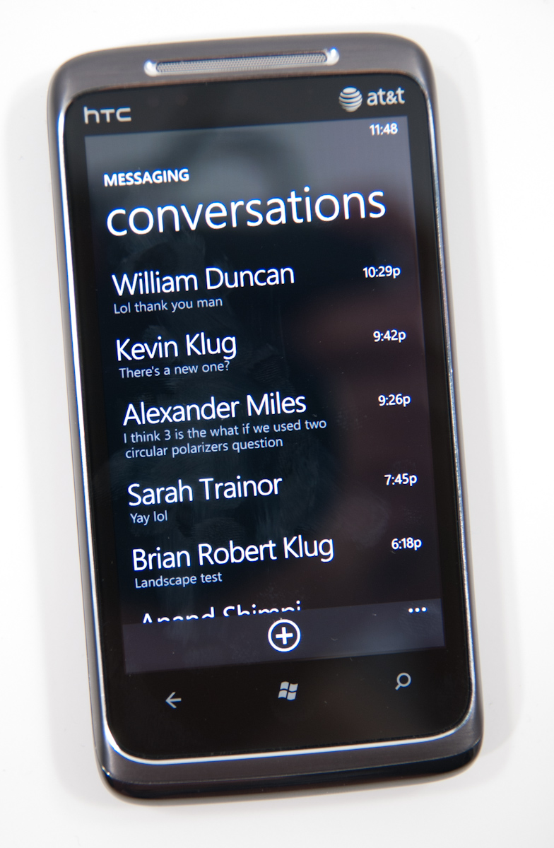
Fire up the application, and you’ll get an overview of all the conversations you’ve got going on. This is pretty standard, and it’s all Metro themed. Threads with new messages will appear in the accent color (blue by default). Long press on a conversation to delete the whole thread. Pretty standard.
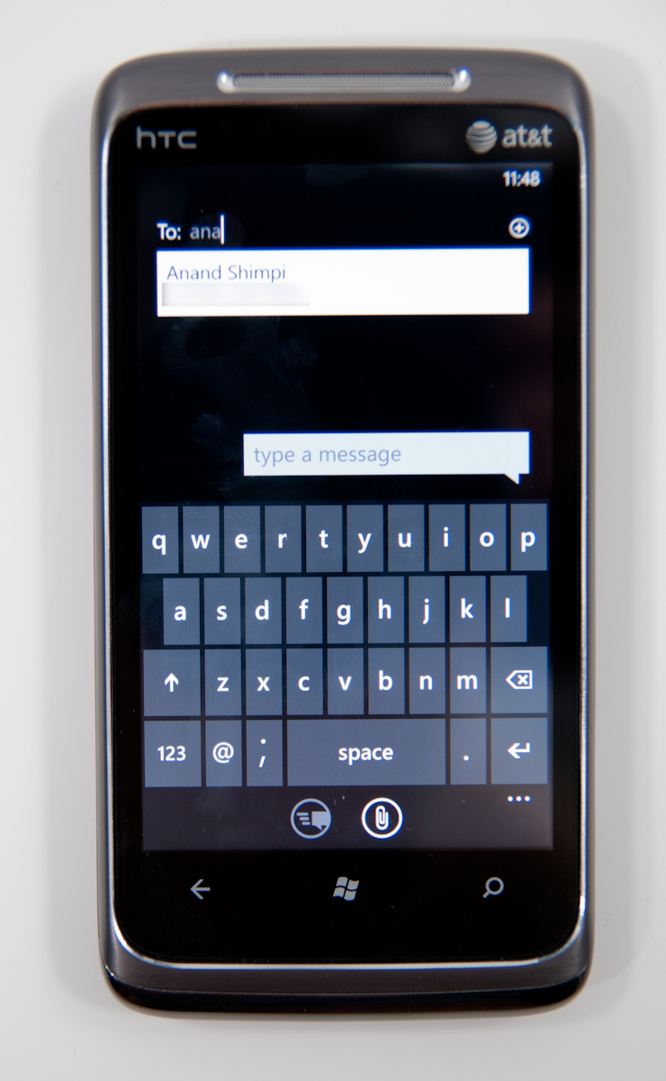
Tap the plus symbol to compose a new message, and you’ll get the compose screen. There’s multiple recipient support, and you can start typing a name and find a contact just like every other platform. There’s initially no character count, but as you pass about 140 characters, the character count appears and starts counting. As you pass 160, the interface will also tell you how many messages your SMS will be split into. It’s a nice touch that WP7 keeps this information out of the way until it comes time to need it - the result is a very clean and simple UI.
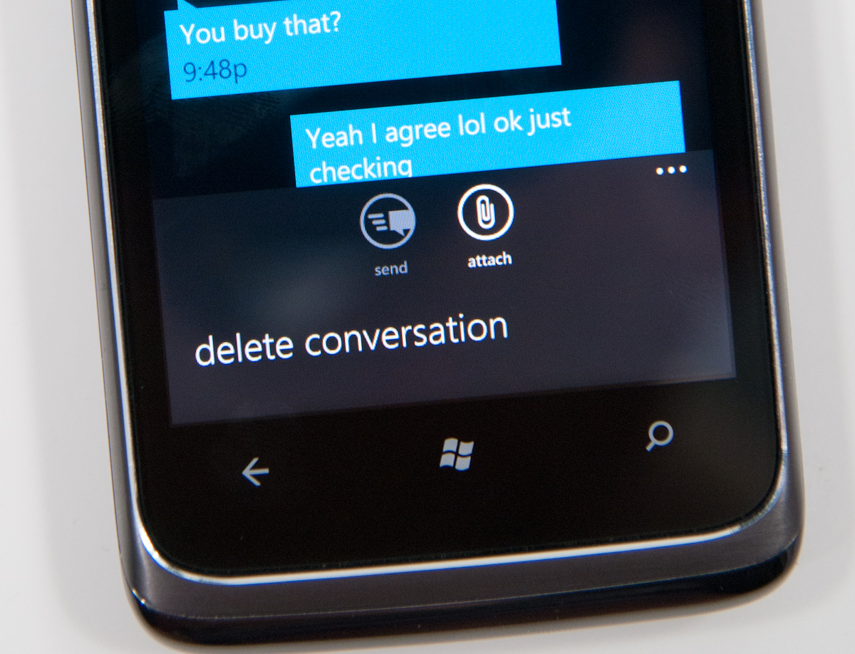
The conversation view itself is honestly quite beautiful, as are the transitions in and out of it. Just like other platforms, your messages are on the right, theirs on the left. Each message is timestamped and you can long press individual messages to delete or forward them. Forward almost mitigates lack of copy and paste, but not quite. From what I’ve seen so far, the conversation thread contains all of the messages you’ve exchanged in the dialog - I’m not sure if there’s some eventual overflow. If there is, I have yet to hit it.
Buttons at the bottom are send and attach photos (more on this in a second), and expanding the menu options lets you delete the conversation from inside it as well. There’s landscape support as well, but if you have the keyboard up, you can only effectively see two lines of a text message.
MMSes with photos thankfully show up with a thumbnail preview. Receive an MMS with more than one photo, and you’ll get a link to expand the whole thing and show everything inside. Unfortunately, videos get no such preview, just a file name and a film icon.
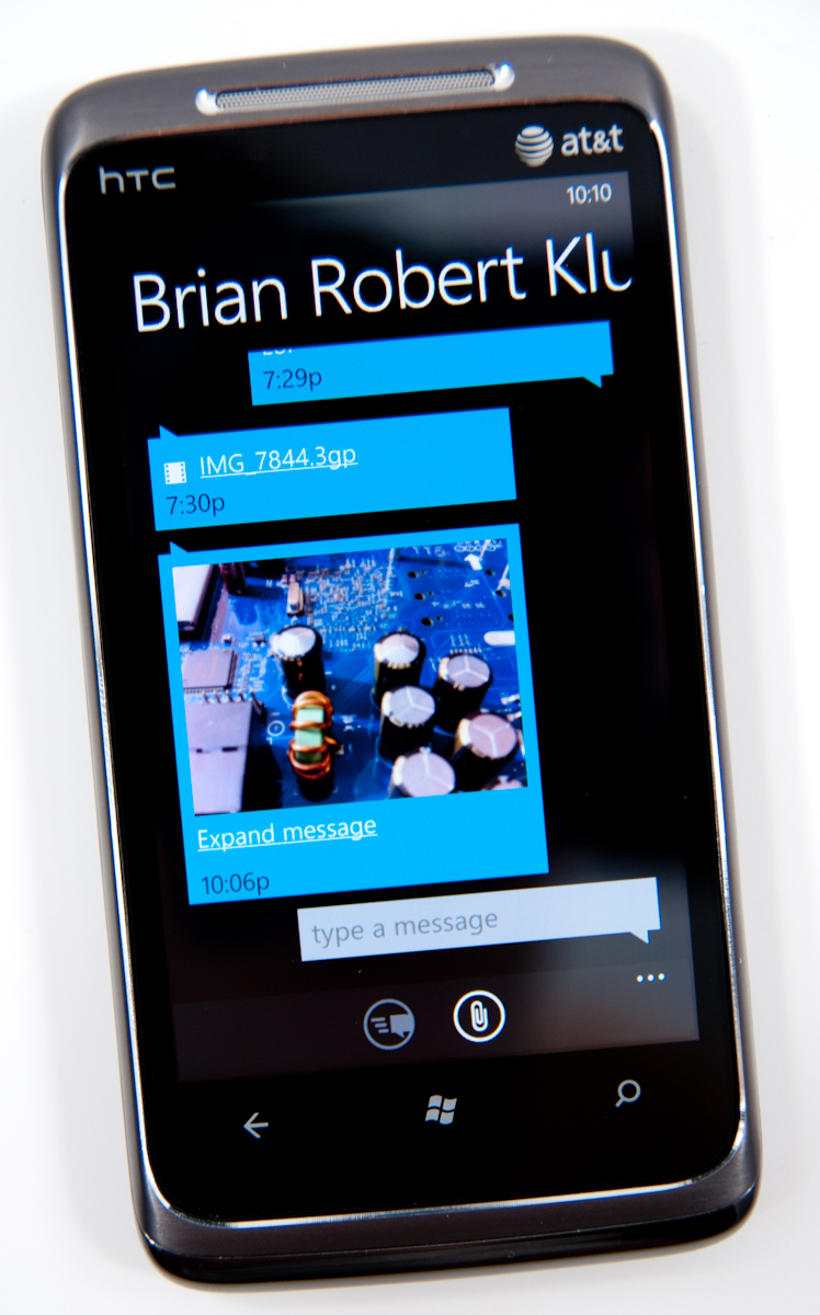
While WP7 supports receiving photos and videos over MMS, it only appears to support sending photos. Support for sending videos captured on the device is strangely absent. I tried recording videos in every resolution allowed and sending them, none of which would appear for attachment from the messaging application. WP7 lacking support for sending videos is a rather strange (and glaring) hole, one I hope will get filled quickly.
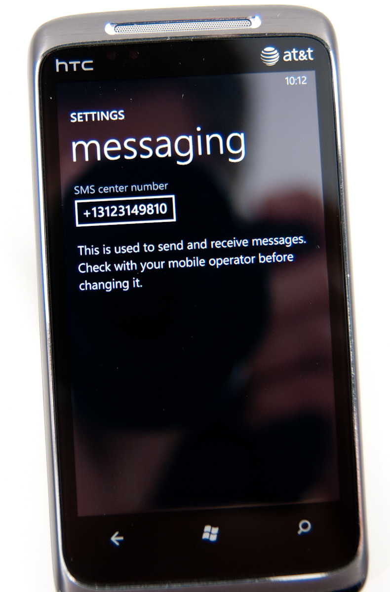
Back on the conversations page, tapping settings brings you to the messaging settings options page, which is pretty sparse. On the HTC Surround and Samsung Focus, there’s an option to change the SMSC number, which is a rather curious thing to expose at all - in general this shouldn’t be changed unless messaging isn’t working.
I’ve expressed my frustration with Android’s sometimes extraordinarily sluggish SMS database and messaging application in the past, which slows down after a few days of heavy texting. It’s something I’ve heard other users complain about, so I know I’m not alone, and even changing clients doesn’t help since they end up using the same SMS subsystem. Let’s not forget, however, that Windows Mobile was at times even more sluggish - I remember routinely out typing the compose field and experiencing dramatic lag on an HTC Touch Pro, Mogul, and even Apache.
For a lot of users, having SMS stay snappy and responsive is very important. Even more important is being able to get in and get out of the messaging application quickly so you can get back to what you were doing before. Thankfully, WP7’s messaging subsystem seems to be quite snappy. Thus far, I haven’t experienced any slowdowns of any kind like I’m used to seeing on other platforms despite regular use. Honestly, having messaging stay snappy is so important of a thing to test that I now routinely throw hundreds of SMSes at devices from different phones to see how they stand up.
I fired a little under 200 SMSes at the HTC Surround in the span of just a few minutes and didn’t experience any dramatic slowdown. There’s a tiny bit of chop scrolling through the list the first time, but subsequent viewing is completely smooth. I did this again later and tried to place a call while SMSes were coming in and managed to crash the phone subsystem so that subsequent incoming and outgoing calls were silence, but a reboot fixed it, and I've seen that on numerous other smartphones.
One of the things WP7 executes extremely well are message notifications. If you’re not in the conversation thread when a message comes in, a notification strip pops up with the number or name of the sender, and a small preview of the message. Tap on that, and you’re brought into the conversation where you can read and reply to it. What’s nice is that you can tap back after and get back to what was going on.
One of the most useful workflows for the back button is when you’re browsing a webpage, and an SMS comes in:
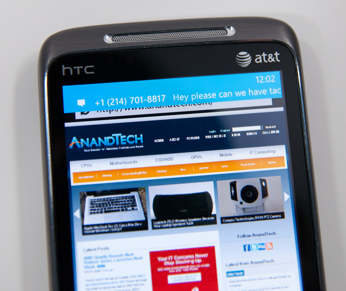
You can tap the notification, jump into the messaging application, reply, then hit back and pop right back out into the browser.
The combination of a smooth interface and an excellent virtual keyboard make messaging on WP7 a very fast experience.
No AIM Application
One thing Palm did very well was use its messaging app for virtually all communication outside of email. SMSs, IMs and Gtalk all took place over the same messaging app and the conversations were stored by contact, not by service.
This is one area where everyone else has fallen short, Microsoft included. Windows Phone 7 ships with no native support for AIM or any other messaging services, including Live Messenger.


125 Comments
View All Comments
Kentcomp - Friday, October 22, 2010 - link
I really appreciate you guys so thoroughly reviewing WP7. Your review was like reading a really well illustrated, yet candid owner's manual. Thank you!PS I find the home screen to be kind of boring too but I'll choose functionality over style 99% of the time. After all, the homescreen is just there to get you to where you really want to be.
Riccardo - Friday, October 22, 2010 - link
That's a remarkably in-depth review. Thanks guys!rye222 - Friday, October 22, 2010 - link
amazingly thorough article. i've been eagerly awaiting these phones ever since i bought the Zune HD and thought, "if MS made this into a phone, they would own". thanks Anand, great job as usual on your articles!lewchenko74 - Friday, October 22, 2010 - link
The interface is too minimalistic. Hate the massive two color icons. Just looks ugly.. and really not that functional if you have a lot of these 'icons' to wade through.Then there are the limitations that mean it isnt quite as feature rich as an iphone or Android in certain areas.
There is absolutely nothing compelling to sway me to this phone (at all).
Anyone with an app library (android or iOS) is hardly gonna part with their spent money on a new device and lose that investment... plus it barely has an app library yet.
I wish MS well as competition is important... but it really doesnt give an iOS / Android owner anything new, plus if I was buying fresh... I think that the iOS / Android phones and app-sphere etc are just more compelling.
Nice thorough review though.... just read a little too enthusiastically MS focussed at times, but a good read.
hakime - Friday, October 22, 2010 - link
"The UI is a thing of beauty. Microsoft got the style, customization and performance one hundred percent right on this thing. It makes iOS feel old and utilitarian. It’s funny to think that Microsoft was the one to out-simplify Apple in the UI department."This sentence summarize by itself how not objective and professional this review is. I mean no one on Earth being a little bit rational can think that this Metro interface is beautiful let alone functional or easy to use. I mean how a hell can a text based interface with half displayed text all around and ugly flat colors on top of black background can be called beautiful? This interface just lacks taste, it is different yes, but it is bad, it lacks interaction. You are so Microsft driven that you come to think that a different interface is necessarily easy to use and functional. Nothing is right here, the theme, the colors are ugly with little sense for giving some wish for the user to use the phone, there are too many steps needed to go to what the user wants to do, the tiles are a mess as they can be anything and hubs are an obscure UI concept that serve little interest. You want to browse through your apps, you are presented with only a list view and good luck with that. The calendar and SMS apps are a horrible vision for the users, they are just ugly. The email app looks like it was design by a bunch of students in GUI design with no clue on how to present the information to users. And everything else is just a mess in itself hidden behind a ton of useless animations.
In contrary, iOS just looks easy to use, clean, beautiful. You have your phone and that's it, not extra useless UI concepts and distractions. They are nice for a demo, but for daily usage, they rapidly get useless.
Then you continue with the Zune pass, noting that it is better than iTunes, but in what regard? You are strange enough to like the Zune pass, that does not make it better than the iTunes model. Again non objective argument.
Best integration of Facebook in WP7? Is it a big deal or even a nice feature? The question is if it is really a good thing. Why should I have all my contact and photos all mixed up in an almost uncontrollable mess? Someone objective would surely recognize that such exaggerated integration of Facebook just makes little sense. A well designed app is more than enough to access the Facebook content without having to have all the time friends and non-friends popping up with messages and photos. Distractive and useless like the UI of WP7.
And what about not being more reserved with the major shortcomings of WP7. How many times we have been told about the lack of multitasking in iOS? And now an os comes to a market where all the other mobiles os have multitasking and this is not called a deal breaker! It is a deal breaker, not having multitasking on WP7 is just inexcusable from Microsoft.
Same thing with copy and paste, in 2010 an smart phone should have an efficient copy and past implemented, and WP7 not having it is a total shame. Sure, most implementation out there sucks, and only the iOS has a real efficient and easy to use implementation, but that does not forgive Microsoft for that.
What about also the significant lack of unified mail box in the email app, the lack of robust security features, the lack of tethering, the clumsy Exchange support, the pour performing third party apps, the lack of universal search, the excessive $14.99 for zune pass, the inexcusable lack for support of HTML5 which is even more unacceptable as the os does not support flash either, no YouTube app, weird interface concept when you need to long press to reach some options and in-app menus, etc...
The list is long, WP7 is surely full of animations but it is little functional. And the authors fail to give an objective review of this system which is new but far behind the competition. Having a different UI style does not make this os more functional or even attractive. It just sacrifices too much on real usability for bringing useless UI concepts. The authors wishing so much that their lovely Microsoft brings something to save itself from the mobile market that they have forgotten what objectivity means.
dustcrusher - Friday, October 22, 2010 - link
It's a review. Reviews are inherently subjective. The only parts that aren't are the benchmarks, and even those are arguably not 100% objective. I think at points they were gushing over what worked well but there were other points where they did bring up some valid objections, even if they tinted them a little with rose-colored glasses.Thanks to this review, I learned enough to realize I'm probably better off going to an Android phone when I am able (disclosure: I'm on WinMo 6 right now). Android simply fits my wants and needs better. I don't see WP7 taking giant chunks of market share from Apple or Android, but I think it will do better than WinMo did.
Microsoft is trying to do something different; seems like they are trying to make a smartphone that is as easy to use as a featurephone. It's risky but it could pay off big time. If their sole intention was to cram all of Android and iOS's features into their new OS, it'd be closer to WinMo 6.6 w/HTC's UI shell on top.
A couple of reviewers decided they like the way WP7 does some things. You are clearly happy with your iPhone, so why are you letting it bother you so much? Do you really want to come off as a trollish fanboy?
cjl - Friday, October 22, 2010 - link
Have you read any of Anand's Iphone reviews? If anything, Anand is biased towards the iphone at the expense of pretty much anything else, so the fact that this review is so positive speaks volumes about the phone.Also, to everyone complaining about the interface, you should really try using a Zune HD sometime. It's amazing how natural the interface is.
headrush69 - Sunday, October 24, 2010 - link
There is a big difference between saying an interface is natural to use over saying it is a thing of beauty.Frankly many of the screen shots make elements of the interface look very basic, dated and rushed.
Example: plain square flat buttons on call screen, on/off toggles in setting screen.
Of course these things are pretty trivial to improve and I'm sure they will, but statements like this in the article
"The UI is a thing of beauty. Microsoft got the style, customization and performance one hundred percent right on this thing. It makes iOS feel old and utilitarian."
I just can't agree with and believe exactly the opposite.
Smilin - Monday, October 25, 2010 - link
Have YOU seen the UI? Not screenshot of it. Have you seen it? Used it?Your opinion is worthless.
Smilin - Monday, October 25, 2010 - link
smells like hater in here.Sorry man but this is the most comprehensive and *objective* review I've seen yet. Most of the things you're griping about are IN the article. Did you read it?