The Windows Phone 7 Review
by Anand Lal Shimpi & Brian Klug on October 20, 2010 7:00 PM EST- Posted in
- Smartphones
- Windows Phone 7
- Microsoft
- Mobile
Bing Search and Maps
Bing is tightly integrated into WP7. One needs to look no further than the inclusion of a dedicated (mandatory) button for search just to tell how serious Microsoft is about pushing Bing into the mobile search space with WP7.
I talked earlier about how entering a string into the URL bar in Internet Explorer takes you out of the browser, into search, and then back depending on whether you choose a web result or not. In almost every context (save the marketplace, here search searches the market), pressing the physical search button launches this unified search application.
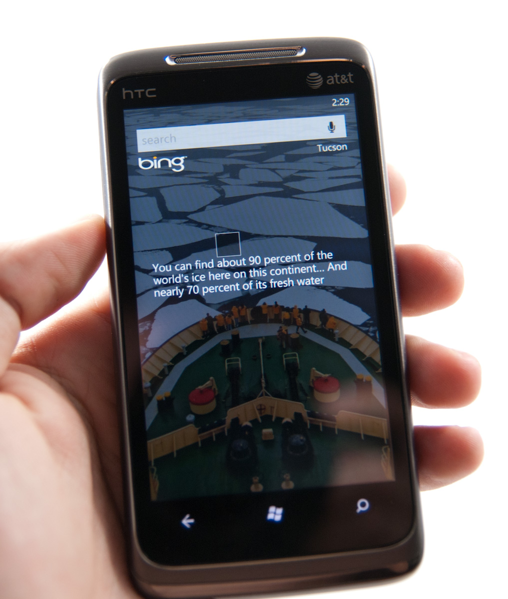
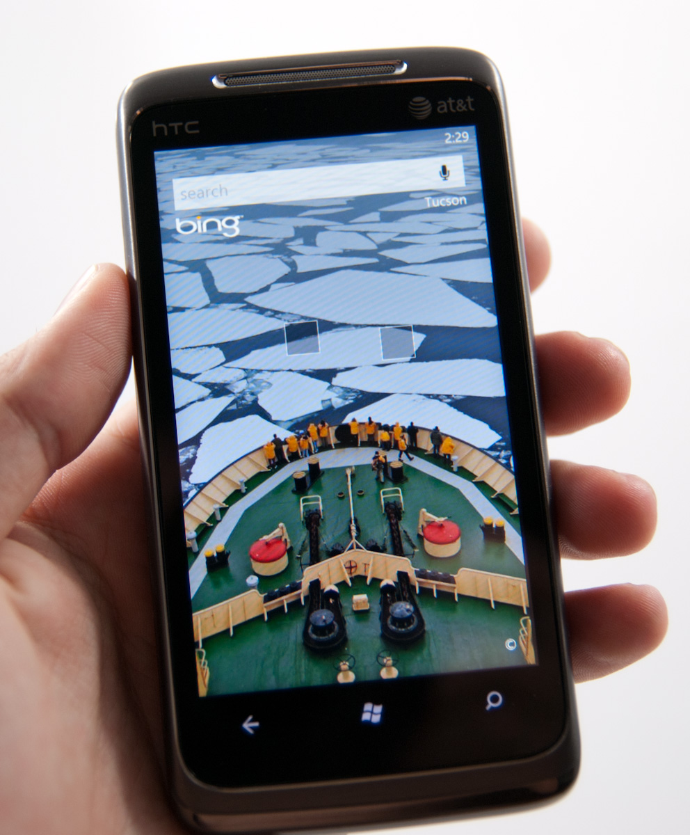
Bing search and maps honestly hasn’t changed much since I saw it at MIX10, and it really didn’t need to as far as basic maps and search go. Hit the button, and you get a Bing homepage like screen with the daily wallpaper and factoid boxes.
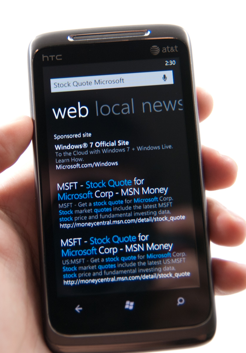
Search terms still pop up differing levels of semantic data - type a company and “stock quote,” and it’ll probably bring that down. Type “pizza in” and a city name, and you’ll get location results. It’s nice to see some intelligence here with searching. You can pivot between web, local, and news. Hit a link on web, and you wind up in the browser. Hit one in local, and you’ll probably wind up in maps. Whether or not you like Bing, the execution here is pretty above average.
What’s lacking is the ability to search local stores like the SMS library or email accounts. It’s sort of ambiguous anymore on every platform what search really does. WebOS has type anywhere, iOS has a mobile spotlight type approach, and Android does a pretty good job searching everything tied to your google account and web.
For whatever reason, WP7 only seems to want to search web facing content most of the time. Hop into messaging, hit search, and you get taken to Bing. Hop into mail, search, and you’ll search email you’ve downloaded - not what’s up on your exchange or IMAP server. Hop into people, hit search, and you’ll search your contacts, but can also search your exchange contacts. The result is that finding stuff is relegated to specific areas rather than one unified place. Whether or not this is right is more of a philosophical argument, it just happens to work that way here.

Another huge omission is the ability to search for things like shipper tracking numbers or unit conversions in Bing. The Bing website allows you to type in a FedEx tracking number or a unit conversion (e.g. 40 pounds in kg), but the search app on Windows Phone won’t give you those results. Given the data already exists on Microsoft’s end, it’s something I’d expect to see down the road.
Microsoft does still have to worry about the bottom line and thus you’ll sometimes see a sponsored search result (similar to what you’d get on a web browser) above your actual results. Microsoft says that the sponsored results will always be limited to one at most.
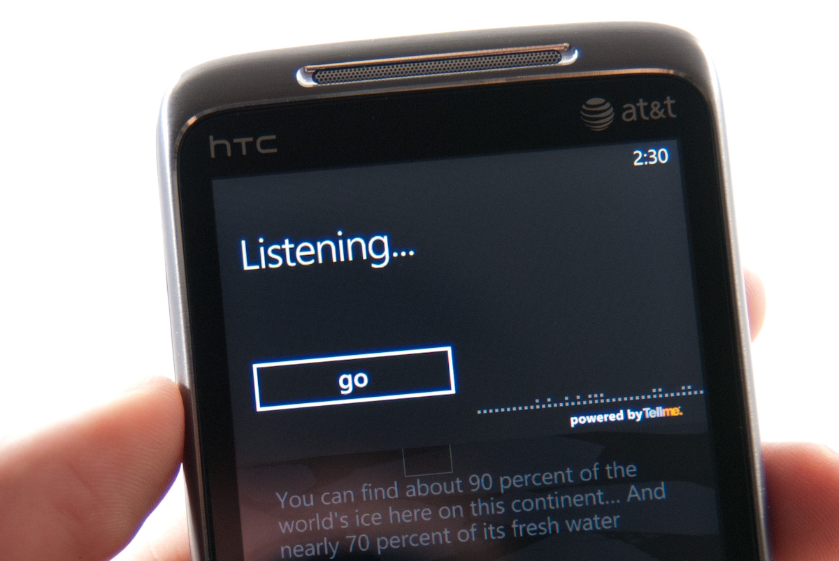
There’s also voice search support from within Bing and the entire platform. You can tap the microphone icon in Bing, or hold down the Windows button for a few seconds anywhere from WP7. It truthfully works very well for calling contacts, searching simple things, but sadly can’t nail down ‘Anandtech.com’ - that results in ‘Manhunt Xbox Com.’
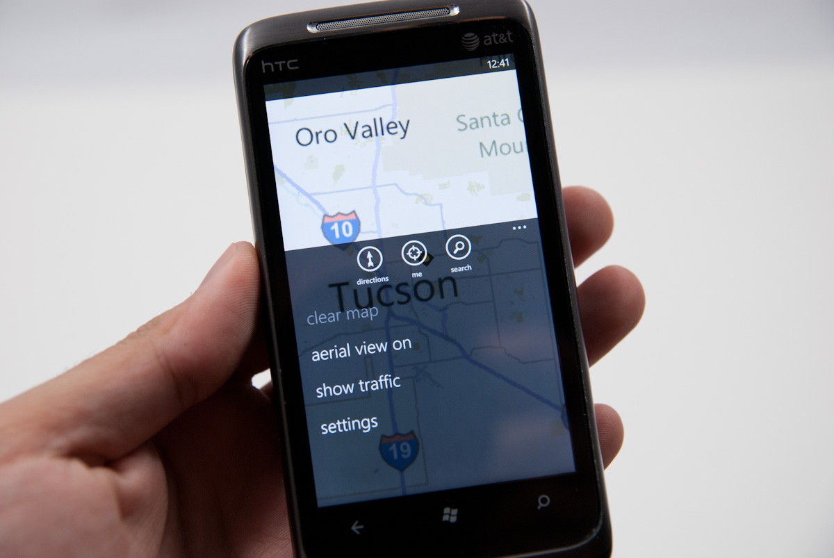
Finally there’s Bing maps. I had a bad experience with Bing maps on Android. It felt slow and clunky, and initially lacked multitouch support entirely. Thankfully Bing maps on WP7 and home turf is completely diffrerent. It’s fluid, packs multitouch support, and loads quickly.
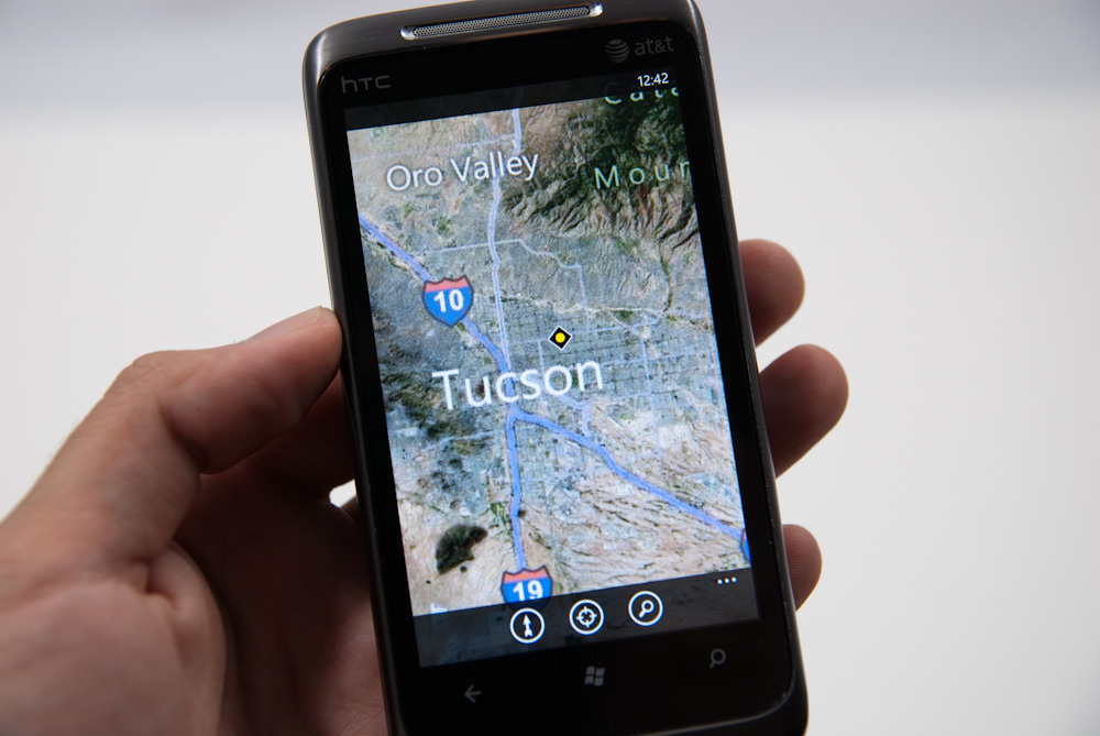
I think WP7 takes a strong nod from iOS here, going the minimalist route with basic directions, locate me, and search support. Expand the options menu, and you can toggle aerial views and traffic, or clear everything from settings.
Directions works well and is a bit unique. There’s support for walking and driving navigation directions, sadly no public transport. There’s a top window that shows the map as you progress and scroll through the directions in the list box below. Finally at the destination you get Bing’s street view perspective of the destination.
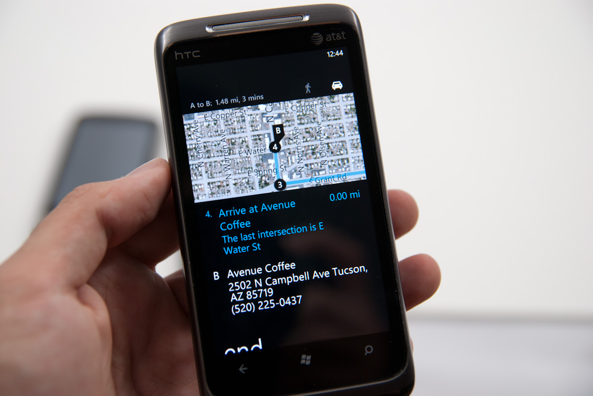
Searching from Bing maps for a location does what you’d expect - flags drop down onto the map. Tapping on these brings up details such as phone, website, and hours if Bing has them. Reviews and nearby and related listings also populate the adjacent pivots.
This is as opportune a time as any to note that the location services on WP7 have continually brought down very speedy location fixes. It’s fast and definitely leverages a location services database like Skyhook or respective databases Apple and Google use. I’m not entirely certain what WP7 is using, or whether Microsoft is rolling its own, but so far I’ve yet to be not be located just as well as I otherwise would be on Android or iOS even inside buildings with no possible way of getting GPS.


125 Comments
View All Comments
Kentcomp - Friday, October 22, 2010 - link
I really appreciate you guys so thoroughly reviewing WP7. Your review was like reading a really well illustrated, yet candid owner's manual. Thank you!PS I find the home screen to be kind of boring too but I'll choose functionality over style 99% of the time. After all, the homescreen is just there to get you to where you really want to be.
Riccardo - Friday, October 22, 2010 - link
That's a remarkably in-depth review. Thanks guys!rye222 - Friday, October 22, 2010 - link
amazingly thorough article. i've been eagerly awaiting these phones ever since i bought the Zune HD and thought, "if MS made this into a phone, they would own". thanks Anand, great job as usual on your articles!lewchenko74 - Friday, October 22, 2010 - link
The interface is too minimalistic. Hate the massive two color icons. Just looks ugly.. and really not that functional if you have a lot of these 'icons' to wade through.Then there are the limitations that mean it isnt quite as feature rich as an iphone or Android in certain areas.
There is absolutely nothing compelling to sway me to this phone (at all).
Anyone with an app library (android or iOS) is hardly gonna part with their spent money on a new device and lose that investment... plus it barely has an app library yet.
I wish MS well as competition is important... but it really doesnt give an iOS / Android owner anything new, plus if I was buying fresh... I think that the iOS / Android phones and app-sphere etc are just more compelling.
Nice thorough review though.... just read a little too enthusiastically MS focussed at times, but a good read.
hakime - Friday, October 22, 2010 - link
"The UI is a thing of beauty. Microsoft got the style, customization and performance one hundred percent right on this thing. It makes iOS feel old and utilitarian. It’s funny to think that Microsoft was the one to out-simplify Apple in the UI department."This sentence summarize by itself how not objective and professional this review is. I mean no one on Earth being a little bit rational can think that this Metro interface is beautiful let alone functional or easy to use. I mean how a hell can a text based interface with half displayed text all around and ugly flat colors on top of black background can be called beautiful? This interface just lacks taste, it is different yes, but it is bad, it lacks interaction. You are so Microsft driven that you come to think that a different interface is necessarily easy to use and functional. Nothing is right here, the theme, the colors are ugly with little sense for giving some wish for the user to use the phone, there are too many steps needed to go to what the user wants to do, the tiles are a mess as they can be anything and hubs are an obscure UI concept that serve little interest. You want to browse through your apps, you are presented with only a list view and good luck with that. The calendar and SMS apps are a horrible vision for the users, they are just ugly. The email app looks like it was design by a bunch of students in GUI design with no clue on how to present the information to users. And everything else is just a mess in itself hidden behind a ton of useless animations.
In contrary, iOS just looks easy to use, clean, beautiful. You have your phone and that's it, not extra useless UI concepts and distractions. They are nice for a demo, but for daily usage, they rapidly get useless.
Then you continue with the Zune pass, noting that it is better than iTunes, but in what regard? You are strange enough to like the Zune pass, that does not make it better than the iTunes model. Again non objective argument.
Best integration of Facebook in WP7? Is it a big deal or even a nice feature? The question is if it is really a good thing. Why should I have all my contact and photos all mixed up in an almost uncontrollable mess? Someone objective would surely recognize that such exaggerated integration of Facebook just makes little sense. A well designed app is more than enough to access the Facebook content without having to have all the time friends and non-friends popping up with messages and photos. Distractive and useless like the UI of WP7.
And what about not being more reserved with the major shortcomings of WP7. How many times we have been told about the lack of multitasking in iOS? And now an os comes to a market where all the other mobiles os have multitasking and this is not called a deal breaker! It is a deal breaker, not having multitasking on WP7 is just inexcusable from Microsoft.
Same thing with copy and paste, in 2010 an smart phone should have an efficient copy and past implemented, and WP7 not having it is a total shame. Sure, most implementation out there sucks, and only the iOS has a real efficient and easy to use implementation, but that does not forgive Microsoft for that.
What about also the significant lack of unified mail box in the email app, the lack of robust security features, the lack of tethering, the clumsy Exchange support, the pour performing third party apps, the lack of universal search, the excessive $14.99 for zune pass, the inexcusable lack for support of HTML5 which is even more unacceptable as the os does not support flash either, no YouTube app, weird interface concept when you need to long press to reach some options and in-app menus, etc...
The list is long, WP7 is surely full of animations but it is little functional. And the authors fail to give an objective review of this system which is new but far behind the competition. Having a different UI style does not make this os more functional or even attractive. It just sacrifices too much on real usability for bringing useless UI concepts. The authors wishing so much that their lovely Microsoft brings something to save itself from the mobile market that they have forgotten what objectivity means.
dustcrusher - Friday, October 22, 2010 - link
It's a review. Reviews are inherently subjective. The only parts that aren't are the benchmarks, and even those are arguably not 100% objective. I think at points they were gushing over what worked well but there were other points where they did bring up some valid objections, even if they tinted them a little with rose-colored glasses.Thanks to this review, I learned enough to realize I'm probably better off going to an Android phone when I am able (disclosure: I'm on WinMo 6 right now). Android simply fits my wants and needs better. I don't see WP7 taking giant chunks of market share from Apple or Android, but I think it will do better than WinMo did.
Microsoft is trying to do something different; seems like they are trying to make a smartphone that is as easy to use as a featurephone. It's risky but it could pay off big time. If their sole intention was to cram all of Android and iOS's features into their new OS, it'd be closer to WinMo 6.6 w/HTC's UI shell on top.
A couple of reviewers decided they like the way WP7 does some things. You are clearly happy with your iPhone, so why are you letting it bother you so much? Do you really want to come off as a trollish fanboy?
cjl - Friday, October 22, 2010 - link
Have you read any of Anand's Iphone reviews? If anything, Anand is biased towards the iphone at the expense of pretty much anything else, so the fact that this review is so positive speaks volumes about the phone.Also, to everyone complaining about the interface, you should really try using a Zune HD sometime. It's amazing how natural the interface is.
headrush69 - Sunday, October 24, 2010 - link
There is a big difference between saying an interface is natural to use over saying it is a thing of beauty.Frankly many of the screen shots make elements of the interface look very basic, dated and rushed.
Example: plain square flat buttons on call screen, on/off toggles in setting screen.
Of course these things are pretty trivial to improve and I'm sure they will, but statements like this in the article
"The UI is a thing of beauty. Microsoft got the style, customization and performance one hundred percent right on this thing. It makes iOS feel old and utilitarian."
I just can't agree with and believe exactly the opposite.
Smilin - Monday, October 25, 2010 - link
Have YOU seen the UI? Not screenshot of it. Have you seen it? Used it?Your opinion is worthless.
Smilin - Monday, October 25, 2010 - link
smells like hater in here.Sorry man but this is the most comprehensive and *objective* review I've seen yet. Most of the things you're griping about are IN the article. Did you read it?