The Windows Phone 7 Review
by Anand Lal Shimpi & Brian Klug on October 20, 2010 7:00 PM EST- Posted in
- Smartphones
- Windows Phone 7
- Microsoft
- Mobile
Putting the Phone in Windows
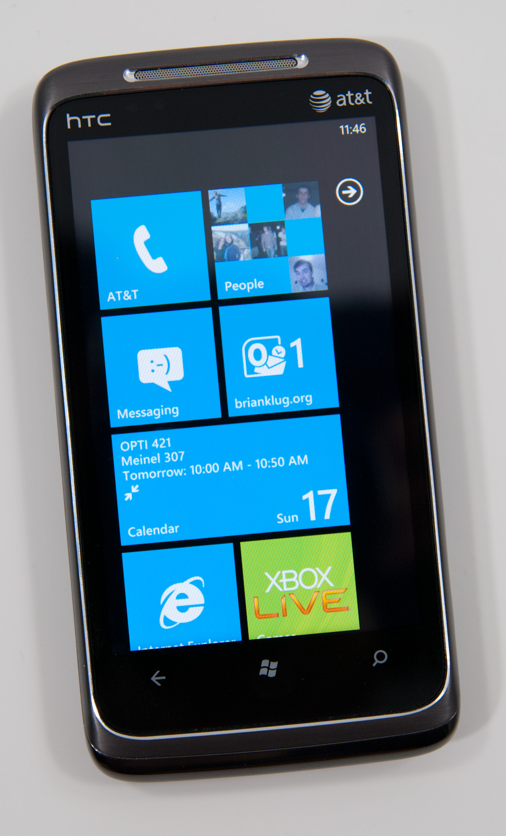
Though Windows Phone 7 doesn’t have a dedicated phone button, there is emphasis placed on calling as evidenced by the Phone tile being top left on the start screen. The tile - like others - displays a number corresponding to the number of missed calls or voicemails. The carrier string is relegated to the bottom left of the tile - the same size and style as other text.
Phone’s tile does change as you miss calls and get voicemails:

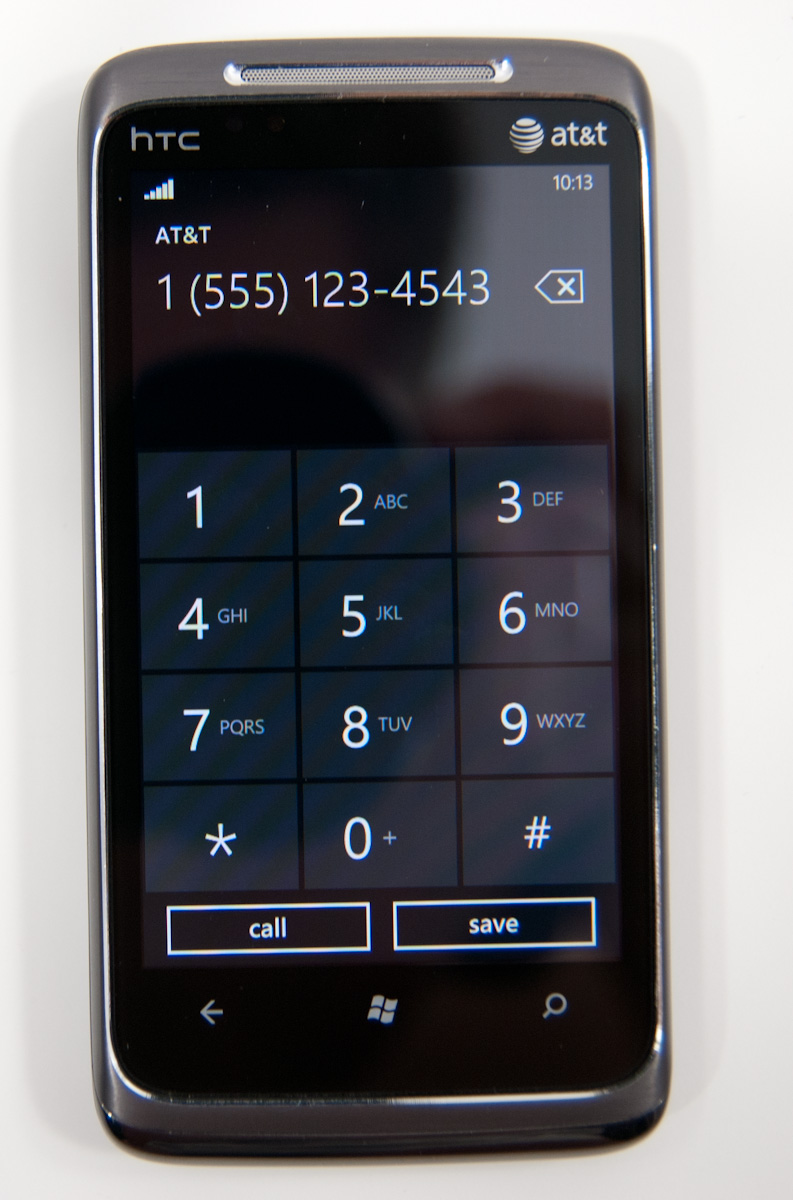
The dialer itself is very spartan. The application opens up to the call history pane by default. Opening the dialer pad requires tapping on the keypad icon at the bottom. To the left and right are links to voicemail (there’s no visual voicemail support, this just dials your voicemail number), and people tile respectively. Expanding the option pane brings you into phone settings or lets you delete all the call history.
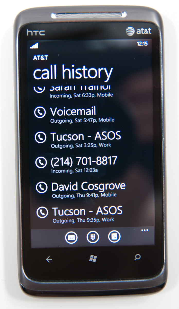
The call history list itself is again very basic. Tapping on the phone symbol to the left of entries immediately dials the last called number, and tapping on the item itself just brings up the contact entry in the people tile. What’s missing here is the ability to see individual call duration, or break down your contact history with a specific number. The only information you get is when the call started, whether it was incoming or outgoing, and whether the number was associated with work, home, e.t.c.
The keypad interface itself is probably one of the most simple I’ve seen before - dialing a number doesn’t get you smart dialing abilities or contact lookup. You’re just entering numbers. It’s clear (rightfully so) that Microsoft expects most calls to happen from contact entries or the call history. You can also pin contacts to the start screen.
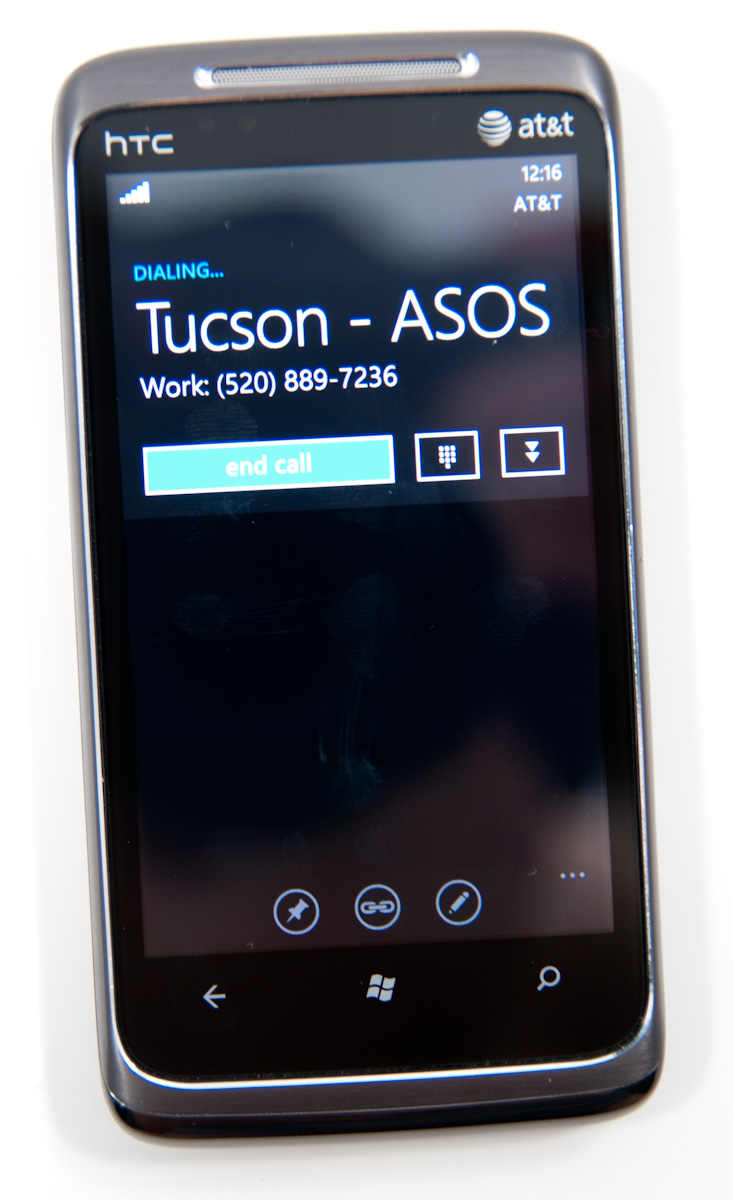
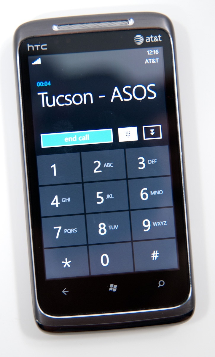
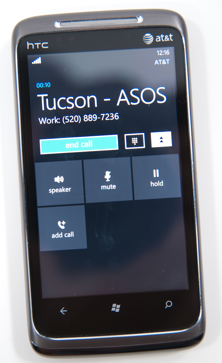
Where WP7’s core phone functionality differs from others is how it transports the dialer UI basically anywhere. Fire up a call, and you’ll get an overlay with the call duration, name, and number. At right are buttons to bring out the keypad, and expand a shade with options for call management.
Hit the windows button, however, and everything rolls up into an accented notification strip just like we see for incoming messages. The text alternates between tap to expand, and the current contact’s name and call duration. What’s even more interesting is the way the notifications bar shows you the signal bars when you’ve got a call in progress - most of the time everything is hidden unless you tap on the top of the screen, then status indicators elegantly drop down.
Tapping on this brings down the dialer overlay again - the best part is that the window underneath goes transparent. It’s slick in practice and nicely animated with Metro 3D transitions.
What’s nice is that again the dialer UI is basically transported anywhere on the phone - it isn’t just relegated to a standalone application but instead is inherently a part of the phone from any perspective.
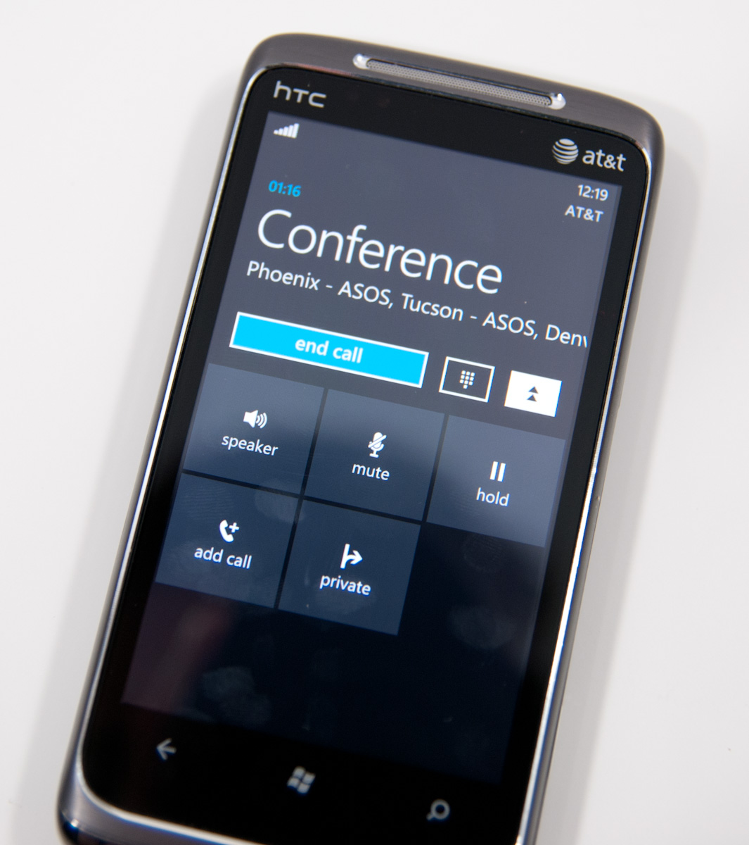
There’s conference support as well if your carrier and plan support it. I tossed a ton of ASOS numbers into a conference. Tapping on the conference title brings up a new window with a more readable itemized list of each line that’s going. If you’re just juggling many calls without doing a conference, the status notification at top changes to “tap to swap.” It’s obvious that someone really thought about getting this right.
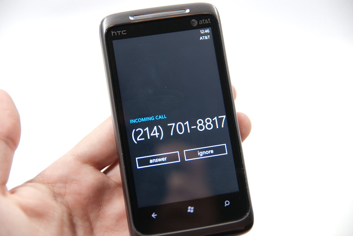
Finally, incoming calls are handled with a full screen overlay with answer and ignore buttons. If the incoming caller has a contact photo, the entire background is that photo.
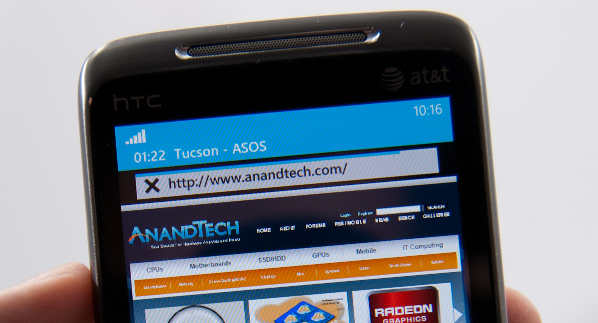
While WP7 has done a good job making the notifications bar blend in and rotate appropriately in landscape, I did catch one edge case that seems strange. In the browser, I pointed out that you can get messaging notifications in landscape, dive in, reply, and emerge back where you were with the back button. Look where that notification comes up:
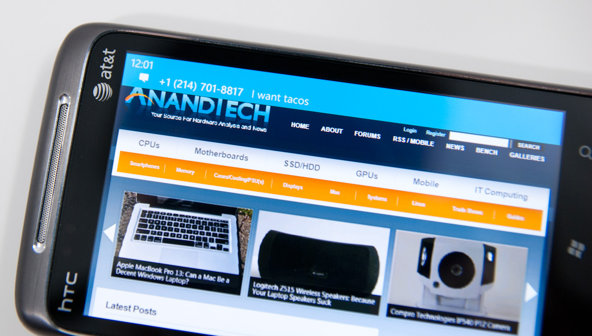
Now look at where the call in progress strip is in the browser when in landscape:

I think this is just a minor inconsistency that was overlooked, otherwise I’ve only found two more occurrence of WP7 mixing landscape view with portrait elements. More on those two in a second.


125 Comments
View All Comments
Shadowmaster625 - Friday, October 22, 2010 - link
It cant play avi files? What do you call a $500 device that cant play avi files? FAIL.beefnot - Friday, October 22, 2010 - link
I'm so sick of seeing "fail" in user comments. 99% of the time, it follows a point or points being made that wouldn't have swayed them to deem it worthy anyway. YAWN.mutatio - Friday, October 22, 2010 - link
I'm glad you guys found it to be as smooth and useful as you did. Based on what you described and the corresponding pictures, however, I'm having a hard time understanding something "just works" when the UI looks like a crap sandwich and almost makes my eyes bleed. "No, we don't use those oh-so-80's icons that graphically represent what the App does. We're much too posh for that, minimalist traffic signs for everything! Brilliant!" Maybe it'll be different with hands on, but it looks like MS went out of their way to try and make this thing look clever and almost abstract. Think myspace made into a smartphone, and if you're like me and think that myspace pages more often look like pop culture chewed up, swallowed, and thrown up onto a web page, then you get where I'm coming from. If that is the case when I get my hands on one of these, I can't see how MS can get any significant traction in the smartphone market. They might get some young emo hipsters who dig the abstract layout, but the appeal thus far of iOS and Android is the overall ease of use. My impression from your review, despite your reassurances, is that MS has again made a product much more complicated than it needs to be. I hope for MS' sake that is not the case when actually using the phone.MacGyver85 - Saturday, October 23, 2010 - link
You'll just have to try it to appreciate it I guess.I can understand people when they say the interface looks bland or overly simplistic based on "screenshots" of the UI. But when you see it in person it's so much better. Really.
Likewise with how you navigate around it. It's just so intuitive you don't for a second have to think how to do something. Every time someone asks me if what it's like I always respond that they'll have to use it themselves. And everyone that does loves it. Seriously :)
Dare I use it but what the hell: it just works!
DJJoeJoe - Saturday, October 23, 2010 - link
I don't think any OS at this point can grab a drastic number of market share like we see in the phone space obviously, or even the slightly slower moving browser space. Modern Operating Systems are so mature at this point that there is really little you can do, both Win7 and Snow Leopard were just small refinements to their previous versions.I think it's doubtful that even something as force-ably drastic as Chrome OS will do anything to the landscape either, even if Google bucketed down and really nailed it. Sadly the market share is ruled by the people going to costco and grabbing up a pre made pc, or large corps running xp, and I can't see something drastic being sold to either groups in the next handful of years.
tis all in the phones these days, and I wish I had a time machine so I could get the second wave of hopefully nicer wp7 handsets and maybe a good update to the os itself. Don't got the money to spend on a 'amazing start'.
Sabresiberian - Monday, October 25, 2010 - link
Looks to me like Vista's bad press helped Apple reach 9% market share, but that's as far as they've moved up. Win 7 is sweet and everyone knows it so Apple is no longer making headway.I don't want Microsoft execs to think that way though - like was written in the article, I think Microsoft performs better as an underdog, and if they think more in terms of being threatened by Apple or someone else then perhaps they'll be more inclined to put a shining example of what they can do out on the market.
Glad to see Microsoft did produce a product with some shine.
;)
dotroy - Thursday, October 28, 2010 - link
Windows 7 phone is good ...umm ..some things not as good ..but win7 phone is good, there are somethings done better by others OS but win 7 phone is good. I never felt like this before. This is a paid advertising. Anand is making good money.pete2s - Thursday, October 28, 2010 - link
Will Windows 7 Phone store apps on the ROM partition? If so, this severely limits the number and size of apps as well as their quality.Although Android is evolving past this limitation, Android, Blackberry and Palm phones store the OS and all apps on an encrypted partition referred to in the specs as the ROM. Usually, this ROM is 512MB. After the OS is installed, the phone has less than 300MB for apps.
Initially, I thought Windows 7 Phone would not store apps on the ROM because of its unified storage system that creates a single volume. If this were the case, however, there'd be no point in having a larger ROM because the ROM would only be holding the OS + the 60MB limit of pre-installed software. Some phones, like the Samsung Focus, do have larger ROMs though (1GB compared to 512MB). The only point of having a larger ROM would be to store more apps because apps are installed to the ROM.
If the above is true, Windows 7 Phone will be severely limited in app size and thus development.
drwho9437 - Monday, November 1, 2010 - link
"It’s almost as if Microsoft is taking Apple’s approach and simply letting everyone build iPhones."Exactly and it is genius, it means the cost margin will vanish and the experience will still be as the software people want, people won't think poorly of these phones just because of a few badly designed devices they used. Let's hope it works out.
owbert - Monday, November 1, 2010 - link
best review of win7 phone amongst others. great work!