The Windows Phone 7 Review
by Anand Lal Shimpi & Brian Klug on October 20, 2010 7:00 PM EST- Posted in
- Smartphones
- Windows Phone 7
- Microsoft
- Mobile
Camera
One of the chief ways for device manufacturers to differentiate handsets from one another is camera performance. Though Microsoft has set hardware requirements that each WP7 device have at least a 5 MP camera with flash, as we’ve shown consistently in our camera bench shots, smartphone pure pixel count isn’t everything. Optical system design and detector sensitivity play a hugely important role
Though OEMs write drivers and can include extras in the camera settings menus, the top level of the camera experience is the same across every WP7 device. By default, the camera tile isn’t on the start screen, rather hidden away in the applications list. At first, I was very puzzled by this decision - getting to the camera fast is important, so much so that I almost always put it right on the first home screen on iOS and Android alike. How Microsoft wants you to get to the camera is through the dedicated camera button, which is a hardware requirement.
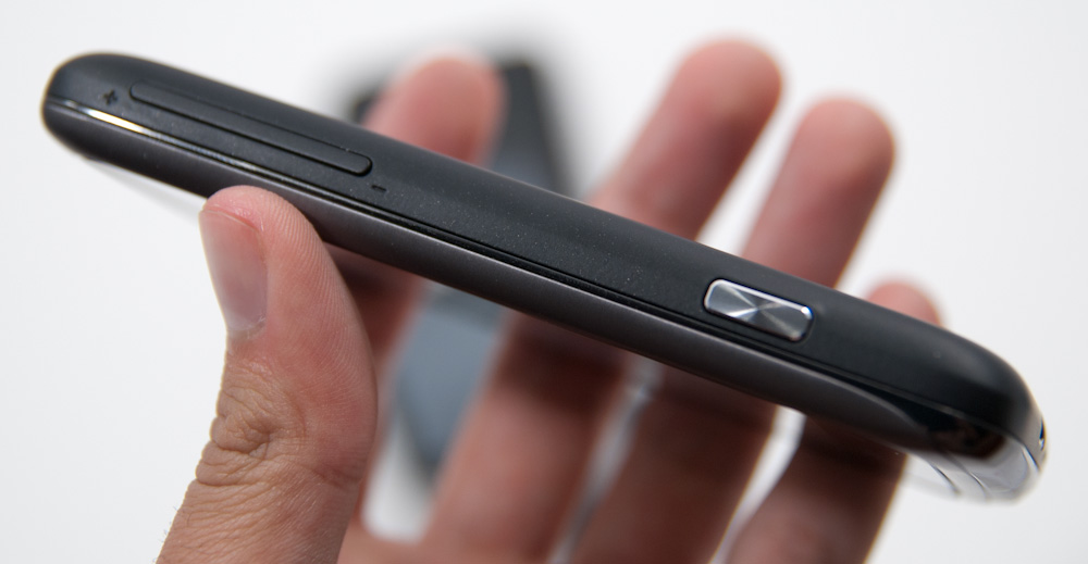
Hold down the camera button when the device is on - or for five seconds when the device is off - and you’ll instantly fire up the camera application. Camera launch is relatively speedy on the HTC Surround at 2.2 seconds. If you have a screen lock set, this trick still works, but you’re stuck in a walled garden in the camera application and can’t view other photos or get to the home screen. There’s a tiny lock in the bottom left. Even if you get messages or calls in this view, you can’t tap on them and get around the screen lock. I tested a variety of things I thought would get me cleverly out of the walled garden - none of them worked.
The camera UI largely follows the Metro UI style guidelines, but feels a bit different. There's a dedicated settings button, still and video switch, and digital zoom controls. Tapping digital zoom in and out steps you through seven discrete zoom levels - there's no overlay about how far you're zooming though.
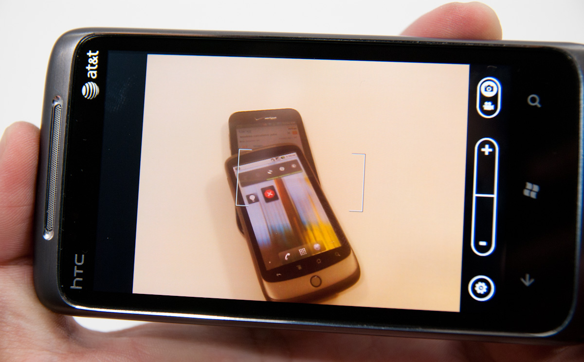
The preview itself doesn’t have tap to focus or expose support. Instead, autofocus and exposure runs when the shutter button is pressed to the first detent. A focus bracket pops up letting you know the routine is done as shown above. That’s a bit lacking, but not experience-killing. Thankfully, you can mash the button down before autofocus runs and immediately capture a shot. Capture on the HTC Surround is very quick, and subsequent captures remain steadily fast. I shot just under 80 photos in quick succession without any pause or slowdown at all - very impressive.
Landscape is the preferred orientation here for photo capture, however only one orientation of landscape. There’s also portrait image capture support, but it’s curiously counter-intuitive. Microsoft made a huge deal at MIX10 about how all of the icons rotate appropriately when transitioning from portrait to landscape, and for the most part that’s a well-enforced part of the WP7 UI.
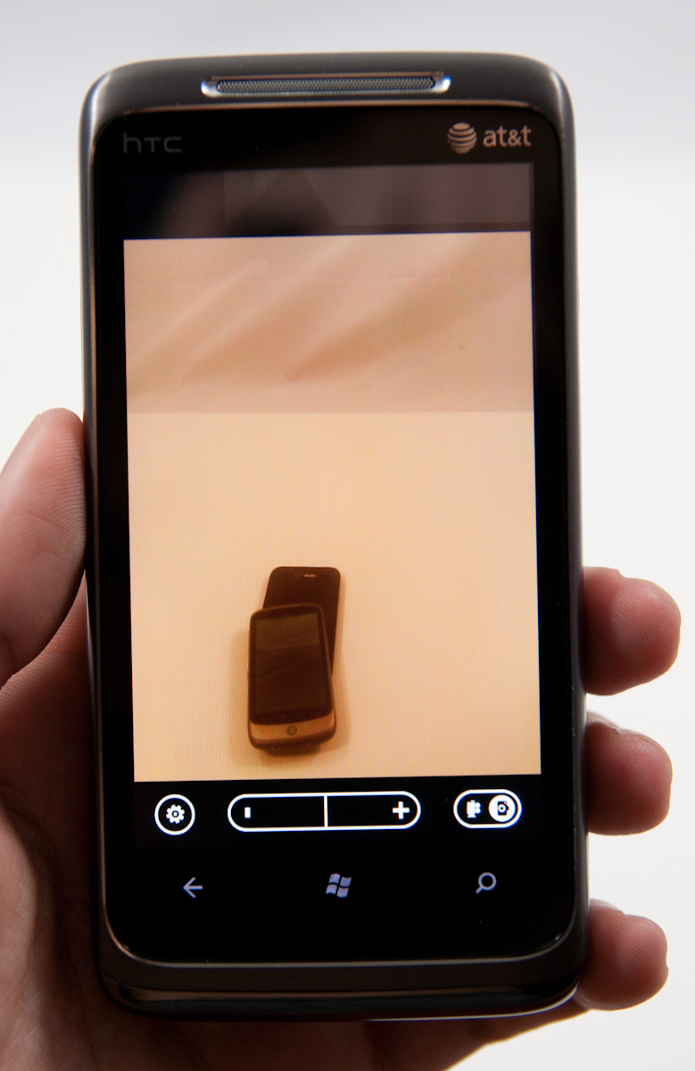
However, the icons in the camera application are static - they don’t rotate when you rotate 90 degrees from landscape to portait, so it’s not immediately obvious that you’ll get the right EXIF orientation data embedded in the JPEG header. Look at the photo above. It took some experimentation for me to figure out that yes - indeed every rotation is possible and encodes properly (upside down included), but without iconographic feedback, it’s confusing. I digress.
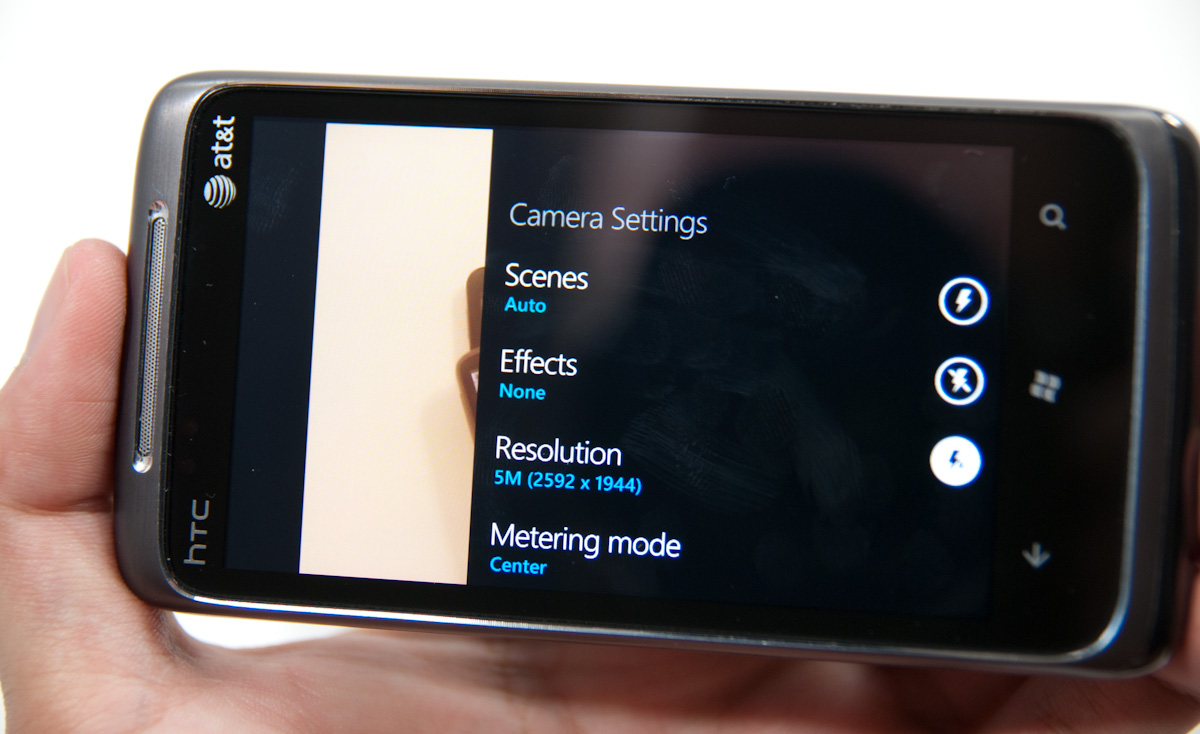
Tapping the settings gear on the preview brings up the camera settings. While Anand played with the Samsung Cetus, er... Fetus, I mean Focus, I used the HTC Surround. This is one area where there’s some differentiation between devices, which I’ll expand on in a second.
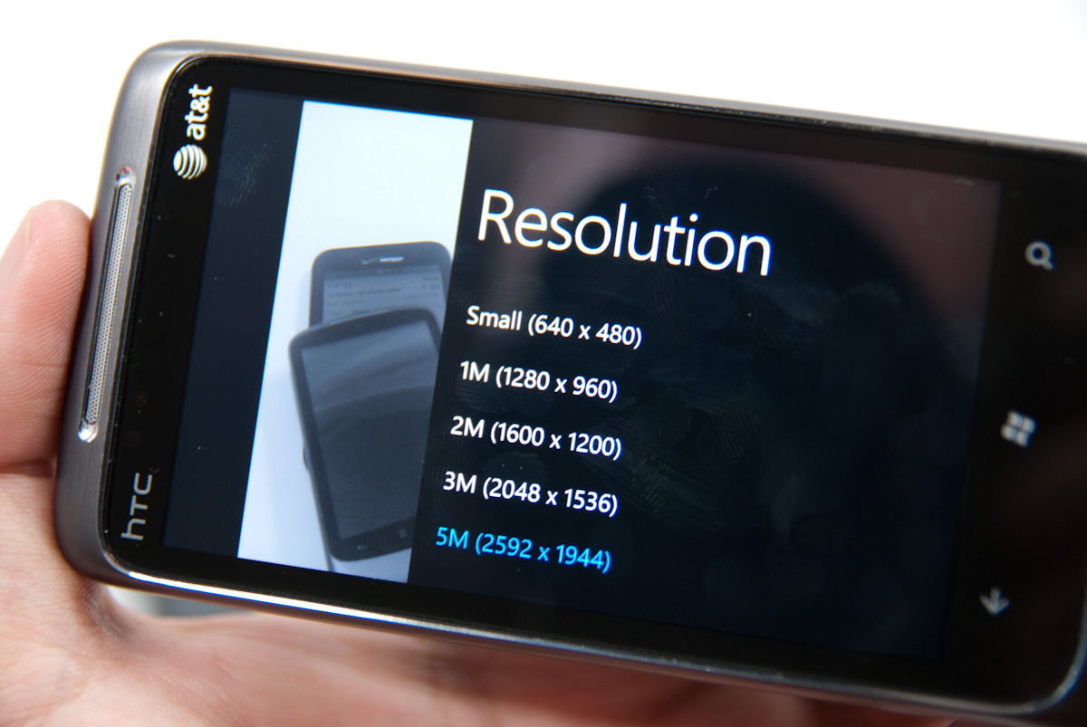
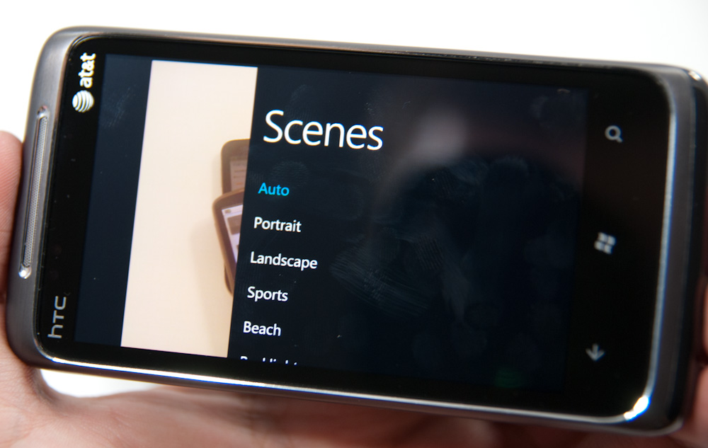
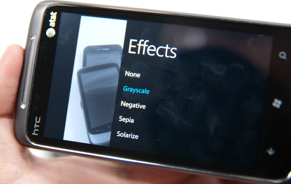
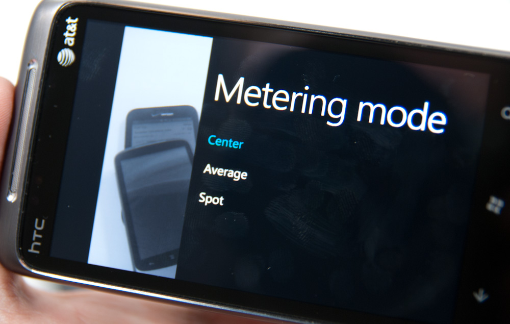
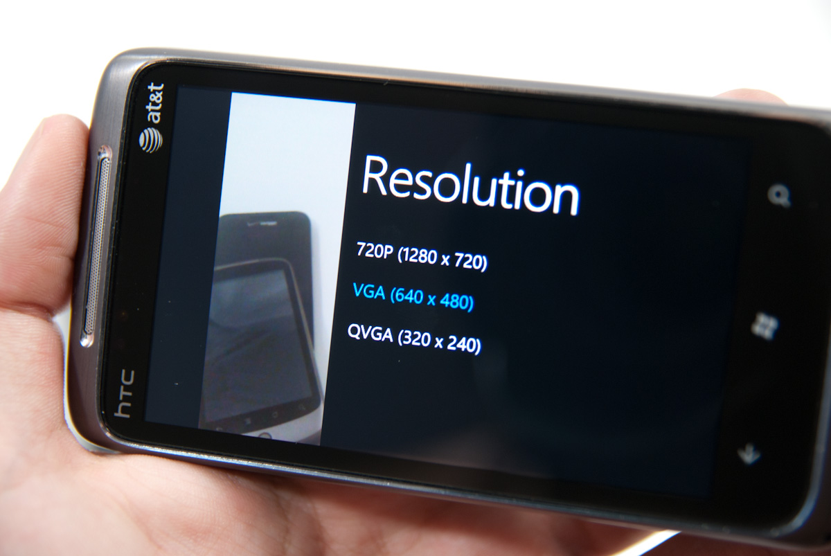
Inside settings, you get a nice overlay (with the live preview still underneath) with 8 scene settings (auto, portrait, landscape, sports, beach, backlight, candlelight, and macro), 5 effects (greyscale, negative, sepia, and solarize), 5 different resolutions (VGA, 1M, 2M, 3M, and 5M 2592x1944), 3 metering modes (center, average, and spot), and the usual flicker adjustment (auto, 50 Hz, 60 Hz).
At the right on that pane are flash settings for auto, on, and off. Navigating through these settings panes makes heavy use of the back button. There’s also a reset to defaults button at the bottom.
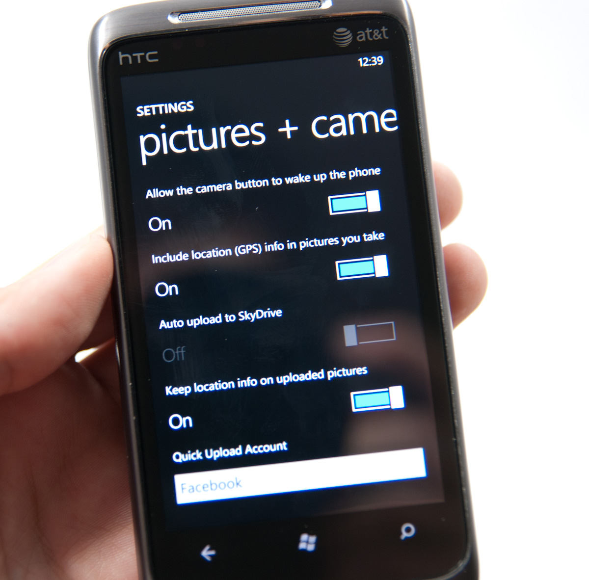
Interestingly enough, there are more settings that are photo and camera capture specific, but to get to them you’ll have to go into settings from the tile, scrub to applications, and find pictures + camera. It’s here that you can configure automatic geotagging which is on by default, uploading to SkyDrive if you have Live (more on that later), and whether to keep location data embedded in photos you upload from the device. It’s a bit odd to find these settings outside of the application itself, when most of the other settings menus can be accessed from respective apps in addition to from this applications settings list.
Auto SkyDrive image uploading is rather intriguing. If you have already have a Live account signed in on the device, the first time you fire up the camera application and try to look at an image preview, you’ll be prompted whether you want to auto upload photos to the cloud. You can share those with friends, everyone, or keep them to yourself. I opted to just keep my photos to myself for starters. If you turn this on, photos you capture on the device will immediately start getting dumped into a folder called “SkyDrive camera roll” on your Live account that the device creates with the appropriate permissions.
The images themselves upload regardless of whether the current connection is WiFi or 3G. It happens nearly instantaneously. The photos are relatively small, at just 717 x 538 and compressed to around 100 KB, but they’re decent web quality images fit for destinations like Facebook. It’d be great to have some control and optionally upload higher resolution images, but no doubt you’d run out of SkyDrive space quickly. It’s nice to see some of the KIN-like cloud components come to play with WP7, but the nice thing about KIN was that full resolution images rather than much smaller images were backed up to the cloud.
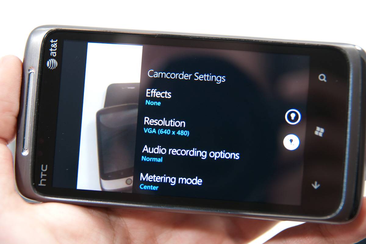
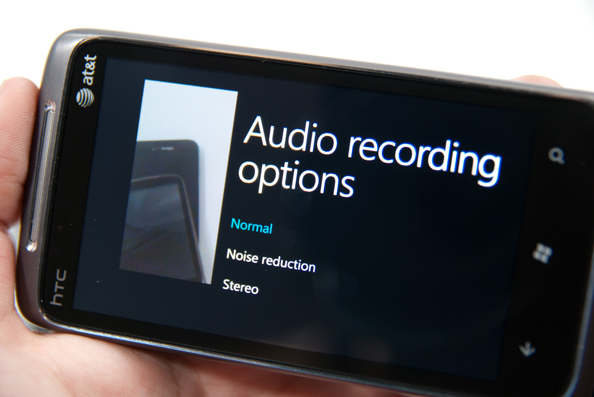
Toggling video capture mode from the live preview screen happens just by tapping the switcher. Nothing visibly changes, but video capture is ready. If you fire up settings, there’s a lot of familiar territory, but the options now are effects, resolution, metering mode, and flicker adjustment. At the far right is an option to use the LED as an illuminator as well. On the HTC Surround, there’s another option - audio recording options, which inside reveals options for Normal, Noise reduction, and Stereo audio recording. What puzzles me is that the default video recording resolution is VGA - getting 720P requires going into settings and selecting it. The catch is that every single time you want to record HD video you have to change to 720P manually in settings. That gets tiresome really fast.
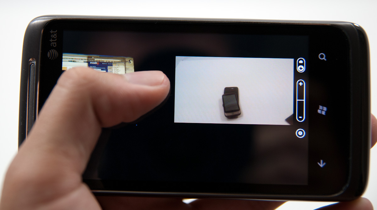
Swipe left from the capture screen and you’ll get to a horizontal preview strip of photos and videos captured on the device. What’s impressive here is that as you swipe to the side, the capture preview remains live and surprisingly high framerate. Pinch to zoom out, and the preview, complete with UI, gets small. It’s a silly thing to be amused with, but it’s really telling of just how GPU accelerated the entire UI on WP7 is that this is feasible, much less completely fluid.
As usual, there’s an ellipsis you can tap to bring up more options. For videos, the only current option is deletion. As it stands right now, you can’t share or disseminate videos taken on the device unless you sync with a desktop. For photos, however, you get a host of options including sharing via MMS, email, facebook, and SkyDrive. Unfortunately, photos uploaded to SkyDrive here are the same resolution as they are if they’re uploaded automatically.
HD 720P videos recorded on the HTC Surround (and I’m assuming the same applies to the other WP7 devices) are shot in 24 FPS MPEG-4 video with AAC audio. I recorded 34 seconds of 720P video 34.8 MB in size, for an average bitrate of around 8 megabits/s. Video quality is decent, but what I noticed across two HTC Surrounds was that the camera runs the autofocus routine very frequently during the video, resulting in a pretty apparent zoom in, zoom out effect. If you’ve used an autofocus smartphone camera, you know exactly what I’m talking about.
I found very little difference between how audio sounded recorded with each of the three audio recording settings. In fact, I found audio recording performance to be a bit poor and distorted regardless of what setting I chose. Audio is encoded at 48 kbps and always 2 channel, with or without stereo selected explicitly under settings.
I took the HTC around to our usual bench locations and snapped photos, and in addition took controlled photos in the lightbox. One of the interesting things I noted is that WP7 sadly doesn’t turn on the LED when running the autofocus routine in the dark. The result is that sometimes you’ll get sharp images, sometimes completely blurry images. I shot through 8 or so before settling on the reasonably focused photo in the gallery with lights off. It’d be nice to see WP7 update and fire up the flash while the focus routine is going.


Performance on the HTC Surround honestly isn’t impressive. To be totally honest, it reminds me of the Nexus One all around. Both have plastic layers from the case between the top of the optical system and the phone exterior, where it’s easy to leave fingerprints and add to glare dramatically. Even the design and package of the camera assembly looks the same underneath. I wouldn’t be surprised if they’re very similar.
Image quality isn’t really stellar - the Surround takes decent photos when well lit, but has HTC’s trademark oversharpening. It’s clear that HTC is also being pretty liberal with its noise reduction algorithm, as we lose nearly all the spatial detail in the focusing ring on the Exakta camera. Compare and contrast that to the other 5 MP cameras in there, even from the Torch. It’ll be interesting to see how the other WP7 devices fare in our box and tests.
The LED flash on the Surround isn’t bad, I’d say it has more even illumination than the Nexus One, Torch, and Pre Plus. There’s a definite blue tint to the photo however. I’m particularly interested in trying out the HTC HD7’s xeon flash down the road.


125 Comments
View All Comments
Kentcomp - Friday, October 22, 2010 - link
I really appreciate you guys so thoroughly reviewing WP7. Your review was like reading a really well illustrated, yet candid owner's manual. Thank you!PS I find the home screen to be kind of boring too but I'll choose functionality over style 99% of the time. After all, the homescreen is just there to get you to where you really want to be.
Riccardo - Friday, October 22, 2010 - link
That's a remarkably in-depth review. Thanks guys!rye222 - Friday, October 22, 2010 - link
amazingly thorough article. i've been eagerly awaiting these phones ever since i bought the Zune HD and thought, "if MS made this into a phone, they would own". thanks Anand, great job as usual on your articles!lewchenko74 - Friday, October 22, 2010 - link
The interface is too minimalistic. Hate the massive two color icons. Just looks ugly.. and really not that functional if you have a lot of these 'icons' to wade through.Then there are the limitations that mean it isnt quite as feature rich as an iphone or Android in certain areas.
There is absolutely nothing compelling to sway me to this phone (at all).
Anyone with an app library (android or iOS) is hardly gonna part with their spent money on a new device and lose that investment... plus it barely has an app library yet.
I wish MS well as competition is important... but it really doesnt give an iOS / Android owner anything new, plus if I was buying fresh... I think that the iOS / Android phones and app-sphere etc are just more compelling.
Nice thorough review though.... just read a little too enthusiastically MS focussed at times, but a good read.
hakime - Friday, October 22, 2010 - link
"The UI is a thing of beauty. Microsoft got the style, customization and performance one hundred percent right on this thing. It makes iOS feel old and utilitarian. It’s funny to think that Microsoft was the one to out-simplify Apple in the UI department."This sentence summarize by itself how not objective and professional this review is. I mean no one on Earth being a little bit rational can think that this Metro interface is beautiful let alone functional or easy to use. I mean how a hell can a text based interface with half displayed text all around and ugly flat colors on top of black background can be called beautiful? This interface just lacks taste, it is different yes, but it is bad, it lacks interaction. You are so Microsft driven that you come to think that a different interface is necessarily easy to use and functional. Nothing is right here, the theme, the colors are ugly with little sense for giving some wish for the user to use the phone, there are too many steps needed to go to what the user wants to do, the tiles are a mess as they can be anything and hubs are an obscure UI concept that serve little interest. You want to browse through your apps, you are presented with only a list view and good luck with that. The calendar and SMS apps are a horrible vision for the users, they are just ugly. The email app looks like it was design by a bunch of students in GUI design with no clue on how to present the information to users. And everything else is just a mess in itself hidden behind a ton of useless animations.
In contrary, iOS just looks easy to use, clean, beautiful. You have your phone and that's it, not extra useless UI concepts and distractions. They are nice for a demo, but for daily usage, they rapidly get useless.
Then you continue with the Zune pass, noting that it is better than iTunes, but in what regard? You are strange enough to like the Zune pass, that does not make it better than the iTunes model. Again non objective argument.
Best integration of Facebook in WP7? Is it a big deal or even a nice feature? The question is if it is really a good thing. Why should I have all my contact and photos all mixed up in an almost uncontrollable mess? Someone objective would surely recognize that such exaggerated integration of Facebook just makes little sense. A well designed app is more than enough to access the Facebook content without having to have all the time friends and non-friends popping up with messages and photos. Distractive and useless like the UI of WP7.
And what about not being more reserved with the major shortcomings of WP7. How many times we have been told about the lack of multitasking in iOS? And now an os comes to a market where all the other mobiles os have multitasking and this is not called a deal breaker! It is a deal breaker, not having multitasking on WP7 is just inexcusable from Microsoft.
Same thing with copy and paste, in 2010 an smart phone should have an efficient copy and past implemented, and WP7 not having it is a total shame. Sure, most implementation out there sucks, and only the iOS has a real efficient and easy to use implementation, but that does not forgive Microsoft for that.
What about also the significant lack of unified mail box in the email app, the lack of robust security features, the lack of tethering, the clumsy Exchange support, the pour performing third party apps, the lack of universal search, the excessive $14.99 for zune pass, the inexcusable lack for support of HTML5 which is even more unacceptable as the os does not support flash either, no YouTube app, weird interface concept when you need to long press to reach some options and in-app menus, etc...
The list is long, WP7 is surely full of animations but it is little functional. And the authors fail to give an objective review of this system which is new but far behind the competition. Having a different UI style does not make this os more functional or even attractive. It just sacrifices too much on real usability for bringing useless UI concepts. The authors wishing so much that their lovely Microsoft brings something to save itself from the mobile market that they have forgotten what objectivity means.
dustcrusher - Friday, October 22, 2010 - link
It's a review. Reviews are inherently subjective. The only parts that aren't are the benchmarks, and even those are arguably not 100% objective. I think at points they were gushing over what worked well but there were other points where they did bring up some valid objections, even if they tinted them a little with rose-colored glasses.Thanks to this review, I learned enough to realize I'm probably better off going to an Android phone when I am able (disclosure: I'm on WinMo 6 right now). Android simply fits my wants and needs better. I don't see WP7 taking giant chunks of market share from Apple or Android, but I think it will do better than WinMo did.
Microsoft is trying to do something different; seems like they are trying to make a smartphone that is as easy to use as a featurephone. It's risky but it could pay off big time. If their sole intention was to cram all of Android and iOS's features into their new OS, it'd be closer to WinMo 6.6 w/HTC's UI shell on top.
A couple of reviewers decided they like the way WP7 does some things. You are clearly happy with your iPhone, so why are you letting it bother you so much? Do you really want to come off as a trollish fanboy?
cjl - Friday, October 22, 2010 - link
Have you read any of Anand's Iphone reviews? If anything, Anand is biased towards the iphone at the expense of pretty much anything else, so the fact that this review is so positive speaks volumes about the phone.Also, to everyone complaining about the interface, you should really try using a Zune HD sometime. It's amazing how natural the interface is.
headrush69 - Sunday, October 24, 2010 - link
There is a big difference between saying an interface is natural to use over saying it is a thing of beauty.Frankly many of the screen shots make elements of the interface look very basic, dated and rushed.
Example: plain square flat buttons on call screen, on/off toggles in setting screen.
Of course these things are pretty trivial to improve and I'm sure they will, but statements like this in the article
"The UI is a thing of beauty. Microsoft got the style, customization and performance one hundred percent right on this thing. It makes iOS feel old and utilitarian."
I just can't agree with and believe exactly the opposite.
Smilin - Monday, October 25, 2010 - link
Have YOU seen the UI? Not screenshot of it. Have you seen it? Used it?Your opinion is worthless.
Smilin - Monday, October 25, 2010 - link
smells like hater in here.Sorry man but this is the most comprehensive and *objective* review I've seen yet. Most of the things you're griping about are IN the article. Did you read it?