Motorola Droid X: Thoroughly Reviewed
by Brian Klug on July 20, 2010 4:27 PM EST- Posted in
- Smartphones
- Motorola Droid X
- OMAP
- Mobile
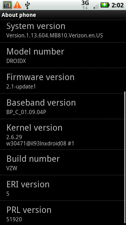
Software - Android 2.1
I want some froyo already.
The X launched with Android 2.1, although Motorola emphatically promises that they will update the X to 2.2 “late summer.” That update will bring all the Froyo goodness I’ve been enjoying on my Nexus One since the update, including flash, tweaks to the UI, much improved responsiveness, and “update all” in the market among a host of others.
Droid X Software - after OTA Update
To be honest, using 2.1 on the X makes it just feel old after using my Nexus One with 2.2 solidly for a few weeks. I can understand Motorola wanting to launch the X as soon as possible, but launching mid summer and promising a platform-changing and relatively major update by late summer is a bit puzzling.
Motorola Droid reviews written running 2.0 at launch read totally different than reviews from the device running 2.1. So too will the X will be changed from 2.1 to 2.2. Hopefully we’ll still have our X when the update hits, because 2.2 honestly makes 2.1 feel old in so many ways. I’ve been spoiled running my Nexus One with froyo more than I thought possible. That’s not to say that 2.1 isn’t totally manageable and workable, it’s just that for a phone launching right now, the update can’t come soon enough.
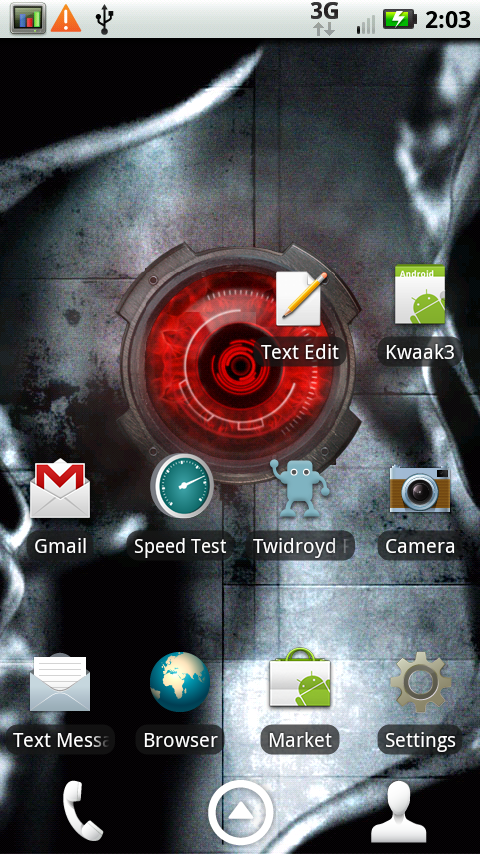
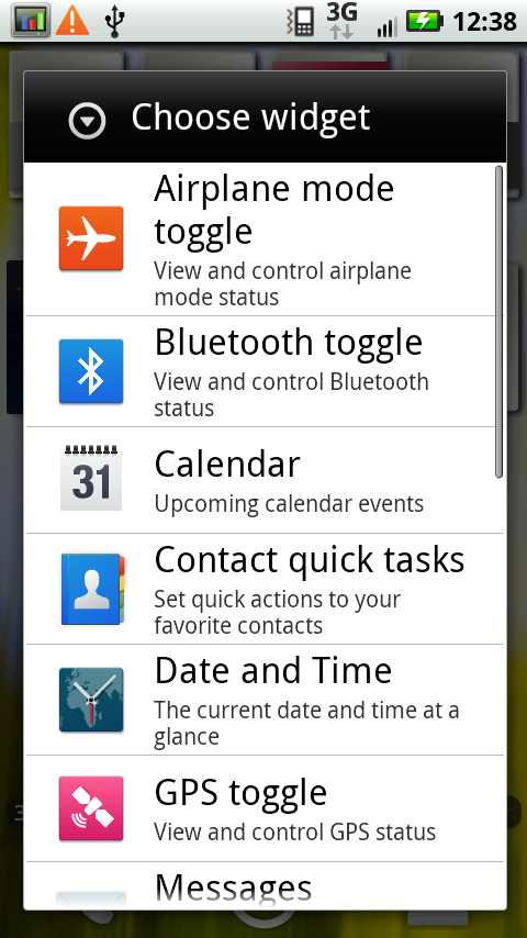
MOTOBLUR lite edition
Motorola has rolled a lite version of their BLUR interface and skin into the X. It isn’t the full on intrusive BLUR that the CLIQ or Devour featured. It’s not as much of a reskinning as HTC’s sense, but still does change the UI.
|
MOTOBLUR lite - it's honestly minimalist
|
|
 |
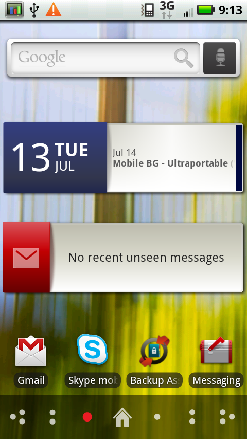 |
The phone comes out of box with Blur widgets all over the home screens. Literally every single one has Motorola widgets and shortcuts, a number of which I immediately dragged to the trash.
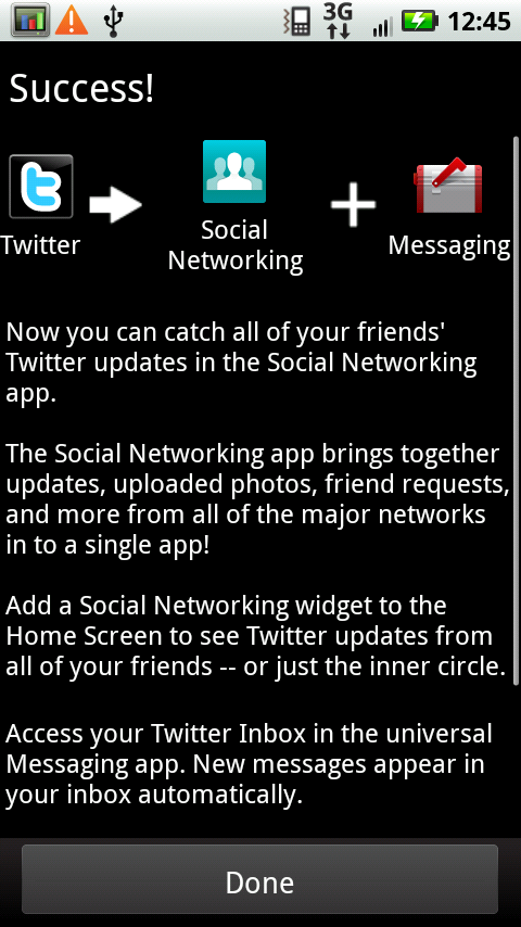
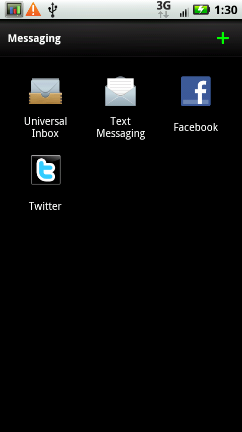
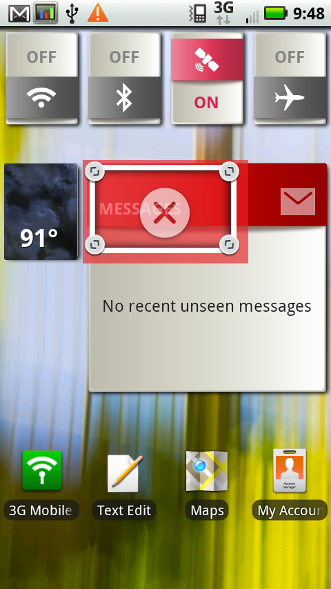
Motorola tries to roll all of your social network messaging into a unified messaging application (whose icon consistently confuses me with Gmail’s shorcut icon). It’s a good idea that ended up pushing me over the Twitter API call limit a bunch of times on other devices, but does pull down Facebook messages and others effectively.
|
Social Networking Unified Inbox - Great in theory, not perfect in practice
|
||
 |
 |
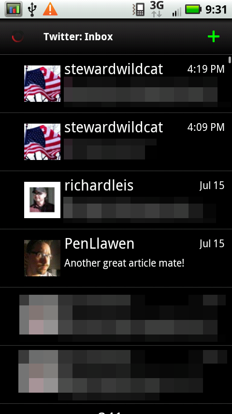 |
I’m just left wondering what use having this done is when Facebook and Twitter offer their own applications and integration - you can inadvertently wind up with two duplicate Facebook icons and inboxes in the messaging app.
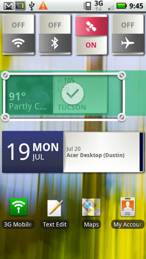
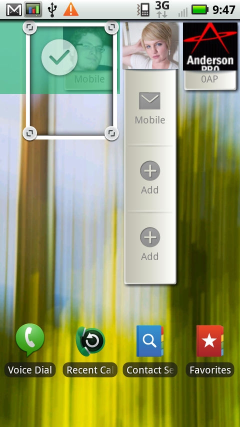
But a lot of it I think is quite tasteful. The clock, calendar, and weather widgets are well done, arguably a bit better than Android’s default. The contacts shortcuts are also not bad. They still aren’t as nice as some of HTC Sense’s, but not nearly as bad as I expected them to be. Motorola keeps its widgets in a different tab when you long press on the home screen, so they’re not mixed into your main widgets library. If you don’t like ‘em, they’re segmented away in a separate menu entirely.
|
Blur Widgets - Not bad
|
||
 |
 |
 |
The other interesting thing is the way most of the BLUR widgets are resizable. Long press on the widget, and up pop some resize handles at the corners. They’re a tiny hard to get the hang of at first, but you can then drag and resize the widget entirely. I think that’s kind of cool - for example, you can resize the date/calendar widget and see a ton of events instead of just one. Pull down the contacts widget, and you get more shortcuts. Make the weather widget longer, and you get more detail.
|
Blur widgets can be resized dynamically
|
||
 |
 |
 |
The rest of the sense tweaks seem to make the interface actually less busy than stock Android. The signal icons are simple, the shade has no texture when you pull it out, and the applications launcher is just a bunch of application tiles. There’s no 3D cube effect like the Nexus One (which still feels laggy to me), nor a pop up shade like the old Droid, or a button and tray like Sense.
I feel like most of the Blur additions are pretty minimalist, thankfully.
The only major annoyance is what happens to the three icons at the bottom when you change screens left or right. Normally, you see three icons - phone, the applications launcher, and contacts. If you drag back and forth to change which home screen you’re on, however, this changes to a home logo and dots corresponding to the 7 home screens.
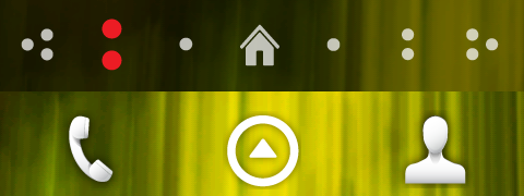
It changes from the bottom to the top when you're touching the screen.
The problem is that this visualization to let you know what screen you’re on (which itself seems a bit extraneous unless you’re spatially challenged) gets in the way of tapping on the applications launcher - it will replace the 3 icons for a full 3 seconds. I inevitably end up sliding to a different home screen, wanting to launch the app launcher, and tapping on home. It’s frustrating. I guess the icons are useful if you want to tap on a specific page, but seriously, it gets in the way.


89 Comments
View All Comments
Jonathan Dum - Tuesday, July 20, 2010 - link
Thanks for the comprehensive and all around excellent review, but I have one caveat.As far as Android phones go, their multitouch screen controllers have tended to be sub par (try any multitouch on a nexus one, for example). I would like to know if there's any noticeable difference between these newest phones and older Android phones with capacitive screens.
As always, keep rocking these reviews, Anand. ;)
Frangible - Tuesday, July 20, 2010 - link
I've not used another Android device, but it's hypersensitive compared to my iPad/iPod Touch. Portrait keyboard mode drives me nuts. If the touchscreen were alive, I'd say it would have a degenerarive demyelinating disease. Unfortunately putting prednsone tablets on my Droid X does nothing.It's so twitchy I can blow away the Blur, Swype, and even a modded HTC keyboard with Graffiti (free from Android Market btw). And that's Graffiti with my *thumb*, in portrait or landscape. If I started using my Pogo stylus... oh, it would be*on*.
Clearly, others don't share my opinion, but the touchscreen on the Droid X is incredibly fruuuuustrating at times.
Frangible - Tuesday, July 20, 2010 - link
As a new Droid X owner, let me first say thanks for another great in-depth review, especially regarding the screeen details-- I just have to know these things, dammit.Anyway, just wanted to make two screen-related comments:
1. The outdoor screen comparison pics don't show any obvious transreflective displays. This either means none of them were, or they weren't angled in a way where a transreflective display would be obviously better.
FWIW, my iPod Touch Gen 1 has a TRD, and even my iPad's display is somewhat TRD (though with poorer contrast than the iPod or even a Tungsten TX in direct sunlight; a consequence of a lesser area of reflectivity, or the IPS display?) I don't know which of the iPhones have TRDs, but it would seem likely the iPhone 4G would be on par with the iPad.
Anyway, a TRD adds a LOT to outdoor viewing if you angle it correctly. You can even turn down, or off, the backlight.
The Droid X is certainly not TR, and was worse than my much dimmer Moto Q9C outdoors (due to the touch layer). And yeah sadly, the Tungsten Tx on min bright was better. So that's why I bring this up-- TRDs are the daywalkers of the LCD underworld, so imo this should be accounted for in outdoor comparisons.
2. I looked at the pixel structures of a variety of displays under a 100x light microscope. The Droid X's sub-pixels are divided into two sections, each with a black "hole". It looked quite similar to the PSP Go's subpixels, though with a standard RGB pattern and lack of the chevron textures on the PSP Go's. I assume this is some TN variant? Does anyone which kind?
The iPad's subpixels were divided into to halves of a series of stacked chevron color bars. Only the green subpixel had the "hole" (transistor?) which looked an awful lot like a mandlebrot fractal to me. FWIW.
ImSpartacus - Tuesday, July 20, 2010 - link
I always love reading ATech's reviews, but this one was especially wonderful.I laughed out loud at the following sentence:
"Everything about the X seems like it can be followed up with a 'that’s what she said.'"
Simply hilarious.
The0ne - Wednesday, July 21, 2010 - link
Yes, I especially love some of the very technical tests as well. For example...1. I let my wife use it for a day and she likes it...
2. I work in milliseconds so having a webpage load 1s makes any other phone besides iphone a no go
3. I have no fcking clue about real multi-tasking, although I know it's been around for decades, but I'll just demand for it and do a bat-shit review of it.
4. My wife and kids love it so it's an editor's choice! Go buy it.
5. It only has a few thousand apps, not the millions and millions of apps like iphone so it's crap, regardless if many of those millions of shtty apps and dictated.
Obviously, I'm exaggerating the comments to the extreme but the basis is there. While at it the review might as well include the orgasmic scene from the movie "When Harry met Sally."
honkj - Tuesday, August 17, 2010 - link
for anyone wondering why that survey showed iPhone owners get more sex...this "theone" guy pretty much shows how clueless and geeky and "lady" hating, some Android fanboys come off to the opposite sex.....
actually they just come off as hating anything that moves.
jasperjones - Tuesday, July 20, 2010 - link
a dozen comments already that point out the high quality of the review. it's getting boring. anyway, +1, excellent review. i've made critical comments on your smartphone reviews earlier this year. but the last couple of reviews were just awesome, and my confidence in AT is fully restored :)Hazdaz - Tuesday, July 20, 2010 - link
It is so nice to read a review that is more than just a corporate press release. Actually taking the time to really review a device and give us honest and very thorough information is what I love about this site.I just ordered my X and won't get it for a few days, but I tested all the usual suspects and felt that it was the right phone for me... assuming I can get used to the size.
I know there are a few people that mentioned the GalaxyS family of phones and I have to say that I really wanted to get one... they are slightly smaller in size than the X, but because of their curved shape, they felt even smaller - while still offering a 4" screen. And about that screen, well it did look great, but from all the hype, I was really expecting for it to be even better. Anyways, I really wanted to like the phone - and I was ready to settle on it actually, until I tested the call quality. HUGE let down there... I could barely hear the person on the other end of the phone call, and the speakerphone volume was terrible. Tried this test on more than one version of the GalaxyS and was quite let down.
The Incredible actually had the best sounding speakerphone that I have heard, it was quite loud - but alas I was looking for something a little bigger in size. The X had good volume - much louder than the GalaxyS - so that's the one I picked.
ImmortalZ - Wednesday, July 21, 2010 - link
The gold contacts on the battery door are a staple of Motorola designs since a long time. My old E6 and it's cousin the Z6 both have gold contacts to the battery doors. So does the RAZR line. In fact, I'll go as far as to say that nearly every one of their phones with a metal battery door has multiple contacts from the door to the phone.MacTheSpoon - Wednesday, July 21, 2010 - link
The review was spectacular in many ways, but I couldn't find anything about call quality. Does this thing actually perform well as a phone? Did people you talk to think you sounded good, and did they sound loud and clear to you as well? How did it compare to other phones?Was this info in there somewhere, and I just missed it?