Gateway AMD and Intel Laptops, a Platform Analysis
by Jarred Walton on August 12, 2009 2:00 AM EST- Posted in
- Laptops
PCMark Performance - AMD vs. Intel
Futuremark's method of determining composite scores in PCMark (and 3DMark) can be something of a mystery. Rather than taking the results at face value, we felt it would be more beneficial to show the individual scores for the various tests. We'll start with PCMark05, which is somewhat outdated relative to current software but also provides a more realistic look at how many people continue to use their computers (i.e. most people continue to use single-threaded applications more than multi-threaded applications).
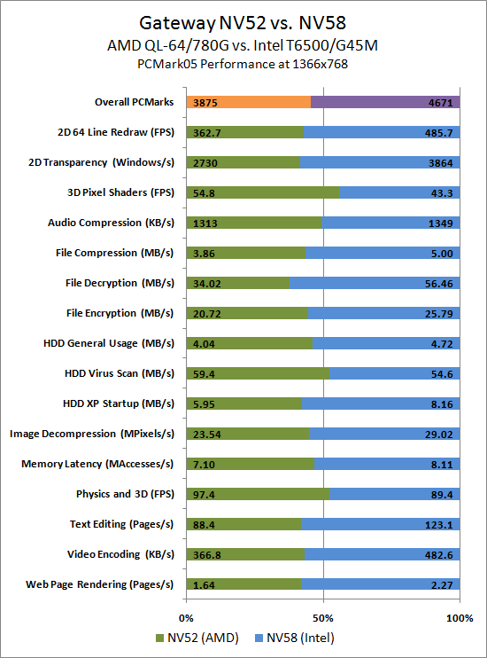
In PCMark05, the Intel system ends up 20.5% faster in the overall metric, but individual scores range from Intel leading by 66% (File Encryption) to AMD leading by 26% (3D Pixel Shaders). A couple other important metrics are Web Page Rendering, HDD XP Startup, and HDD General Usage. These are all common situations that you encounter any time you use a computer, and Intel leads by 38%, 37%, and 17% in these tests, respectively. During testing, it was obvious that the Intel system was substantially faster in general use. Booting both systems, it would always finish loading Windows noticeably faster, and when we ran a disk defragment on both systems after installing all of the test software the AMD system took hours longer to finish.
It should be clear why the AMD system wins in the Physics and 3D (9%) and 3D Pixel Shaders (26%) tests. What's not so clear is why AMD would win in the HDD Virus Scan (8%) result, and the likely culprit is the Seagate hard drive is faster than the Hitachi HDD in the NV58 in this specific test. It's also important to remember that individual scores can fluctuate quite a bit between runs on PCMark05 - up to 12% between the various runs we conducted on these two laptops. The overall scores on the other hand remain relatively consistent. Let's move on to PCMark Vantage and see if the picture changes at all.
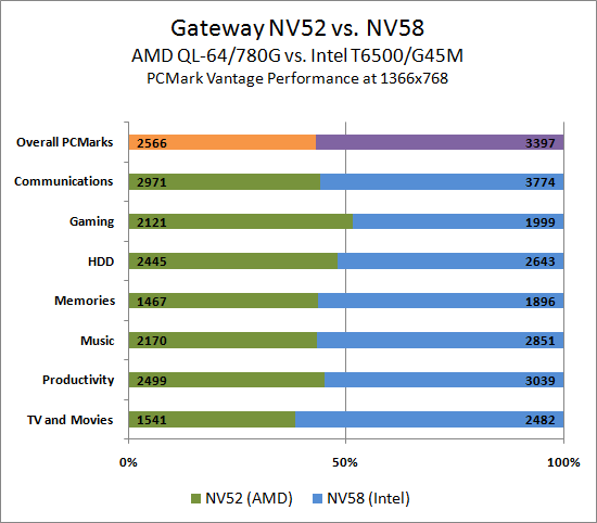
This time the Intel system is 32% faster in the composite score, with individual scores ranging from 6% in AMD's favor to 61% in Intel's favor. Again, AMD takes the Gaming crown, although as we shall see shortly the 6% margin of victory is highly suspect when we get to actual games. Outside of the HDD test - a test that logically focuses more on the hard drive than the rest of the system - Intel maintains a comfortable lead of 20% or more.
The short story to this point is that not only does the Intel system provide substantially better battery life, it also provides a much snappier user experience. If all you're looking for is a typical office computer, the extra $80 you spend for the NV58 is definitely a worthwhile investment compared to the NV52. There is still the question of graphics, of course, so let's look at the last area and consider how much gaming performance matters in your laptop purchasing decision.
Update
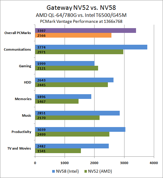
Here's an alternate chart for PCMark Vantage showing relative performance. Given the disparity in scores for PCMark05, we didn't bother creating this style of chart.


67 Comments
View All Comments
samspqr - Wednesday, August 12, 2009 - link
(I mean the one on page 5)JarredWalton - Wednesday, August 12, 2009 - link
As mentioned in the text, the graphs on pages 5 though 8 use a different format. I chose the format because I feel it provides a quick way of looking at relative performance. The percent labels aren't particularly meaningful, since the bars are not in actual percentages (though the bar sizes are).Spacecomber - Wednesday, August 12, 2009 - link
Although I found the article interesting, comparing the advantages of intel based laptops to amd based laptops, I have to agree that the choice of how to represent the data in the charts doesn't really work for me. I understand what the notion was, representing the data as a kind of tug of war between the two platforms, but the utility used to create these charts didn't provide the means to make this clear. I'm a strong believer that charts should be intuitively obvious and that you should be able to interpret them without looking at anything other than what is contained in the chart.These charts have an additional problem when it comes to the representation of the gaming data (or any data where the same measurement unit is being used). You can no longer easily compare performance for the same platform across different games (or whatever the instances being measure are). For example, it is not easy to see in these graphs that some games don't have playable framerates, regardless of the platform.
Anyway, while I'm sympathetic with the effort to try something different, I didn't find that it helped me to comprehend the data any better, and it seemed to be more of a hinderance, instead.
JarredWalton - Wednesday, August 12, 2009 - link
The problem is two-fold: I had a bunch of data to represent, and I didn't want a ton of small charts. I debated just putting in a table, but that seemed a poor way of doing things - especially since I can show the number labels and you get the chart plus table effect. The issue is compounded by units that are not easy to chart with each other - i.e. PCMark05 has some scores in single digits, some in the tens, and some in the hundreds. Do I break PCMark05 scores into 16 different charts, or does the "100% Stacked Bar" chart option provide all the necessary detail?I'm inclined to go with the latter as a reasonable compromise between the various options, and let people spend a few more minutes looking at the data to draw conclusions. It's great when a chart can be "intuitively obvious", but there are times when complex data requires a more complex chart. The net result is that I had a choice between more aesthetically pleasing pages and a single summary chart, or I could make dozens of smaller charts and get a cluttered page.
I understand some people won't like the representation, but I've been playing with the data for the past hour and there's really no option that's as succinct. Some graphs (gaming) lend themselves to other options, but the PCMark05 chart and Application Performance charts have to be split up, put in a table, or something else.
FWIW, I'll post alternative charts in a bit for those that really hate the current charts. However, I'm still a firm believer in requiring people to READ the text. I get the impression that many of the comments have only looked at a small portion of the text and are making a lot of assumptions - assumption which are, not surprisingly, incorrect.
Wellsoul2 - Wednesday, August 12, 2009 - link
The Chart is still backwards compared to the first article onbattery life. Idle is 111 minutes and DVD 242 minutes.
It's reversed from last article.
JarredWalton - Wednesday, August 12, 2009 - link
Sorry... not sure how that happened, other than sorting charts in Excel. For some reason, the top spreadsheet cell showed up on the bottom of the chart, and so I resorted. Apparently I missed the numbers at some point. I'll correct the chart shortly....mczak - Wednesday, August 12, 2009 - link
Hmm, what about the raw numbers which should show minutes runtime? Idle has lowest runtime, DVD playback largest. That definitely looks wrong...Wellsoul2 - Wednesday, August 12, 2009 - link
Yes...looks like you reversed the numbers.whatthehey - Wednesday, August 12, 2009 - link
Reading comprehension is a great thing!"We are using a different format for the graphing than we used previously.... For this chart, equal performance is denoted by the 50% mark in the middle of the chart. A larger bar means better performance, and the numerical results (in minutes) are available for those that prefer raw numbers."
Ah, yes, the percentage marks are entirely misleading! Shame on you AnandTech for making people read! (FWIW, I had no issues reading and interpreting the graphs, but then I'm a computer programmer.)
Ben90 - Wednesday, August 12, 2009 - link
" quit looking ahead and pay attention to this paragraph! " You should have added that to the page before, my screen was already down in the chart when i read this :)