Brightness and Contrast Ratio
For the brightness (luminance), contrast, and color accuracy tests, we depend on a hardware colorimeter and software to help calibrate the displays. We use a Monaco Optix XR (DTP-94) colorimeter and Monaco Optix XR Pro software, and we also test with ColorEyes Display Pro. Results in nearly every case have been better with Monaco Optix XR Pro, so we only report the ColorEyes Display Pro results on the monitor evaluation pages. We'll start with a look at the range of brightness and contrast at the default LCD settings while changing just the brightness level. (In some cases, it will be necessary to reduce the color levels if you want to achieve a more reasonable brightness setting of 100 or 120 nits.)
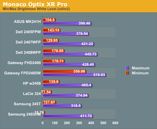
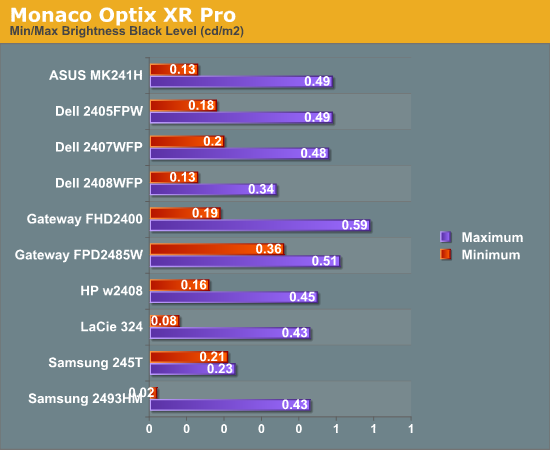
Nearly all of the LCDs have a maximum brightness level of around 400 nits, which is more than sufficient and is actually brighter than what most users prefer to use in an office environment. Minimum brightness without adjusting other settings is often above 100 nits, so it will be necessary to go in and adjust color levels as mentioned already. The Gateway FPD2485W is the prime example of this, where the default settings have a minimum brightness of 356 nits. Black levels are also reasonably consistent among the LCDs, with maximum and minimum black levels corresponding to the maximum and minimum white levels.
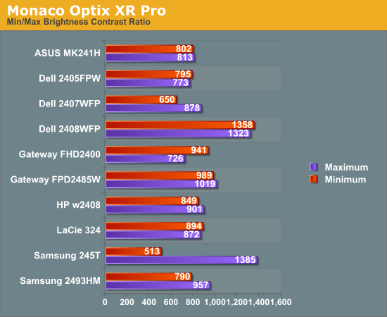
More important than the luminosity is the contrast ratio that is achievable at the various brightness settings. Here we begin to see some differences, with many of the LCDs following in the 800:1 ~ 900:1 range. The Dell 2408WFP and Samsung 245T stand out as having some of the highest contrast ratios, with the Dell taking the lead as it maintains the high contrast ratio even at low brightness settings. However, we should also mention that in practice the difference between 500:1 and 750:1 really isn't very significant for most users. It's only when you fall below 500:1 that colors really start to look washed out.
Color Gamut
We've already discussed color gamut of individual LCD evaluations, but it's a new addition to our LCD testing. This is something we wanted to add previously, but we lacked a good utility for generating the appropriate charts and data. We recently found out about Gamutvision, a utility developed by Imatest LLC. They were kind enough to provide us with a copy of their software, and it does exactly what we need. We compared the color profiles of all previously tested LCDs to the Adobe RGB 1998 color profile. Graphs of the individual gamut volumes are available on the evaluation pages. Below is a chart showing the percentage of the Adobe RGB 1998 gamut from the various displays.
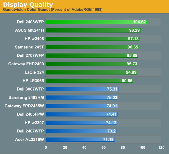
We basically end up with two tiers of quality in terms of color gamut. Filling the bottom tier are mostly older displays that have 82% NTSC color gamut backlighting. These may seem drastically inferior to the newer LCDs, but keep in mind that if you are just using the standard sRGB profile these LCDs look fine. It's only when you work in applications like Adobe Photoshop with its improved color space that you begin to notice a difference between the displays. Most of the newer displays now have ~95% Adobe RGB color gamuts, and the Dell 2408WFP actually surpasses the Adobe RGB 1998 color space. The only display in this round up that doesn't make it into the upper tier is the Samsung 2493HM.
Power Requirements
Another new test we decided to add with this roundup is a quick look at power requirements. Like the above tests, power requirements are checked at default LCD settings while varying the brightness setting. Also note that minimum power requirements are going to depend largely on how dim the backlight is at the minimum setting, so looking at the above charts it shouldn't be difficult to figure out that the Samsung 2493HM will require less power than the others when it's only putting out 16 lumens.
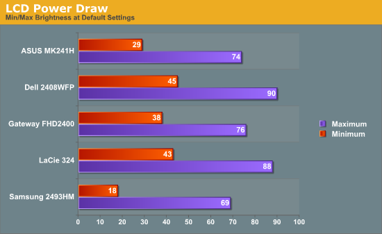
We've only begun collecting this data with this batch of LCDs, so we don't have any clear patterns established yet. However, it's interesting to note that the two S-PVA panels to seem to draw slightly more power than the three TN panels. At equivalent brightness settings, the differences in power draw are very small.


89 Comments
View All Comments
Basilisk - Friday, May 2, 2008 - link
Ditto. But I expect Hanns is too low-priced to send a review sample. [Sigh.]JarredWalton - Friday, May 2, 2008 - link
A request email has been sent to Hanns.G; whether they'll respond is anyone's guess. :-)benno - Thursday, May 1, 2008 - link
I've got nothing better to do so I thought I'd point out there are two errors on the first page of this article. You Americans are as bad as us Aussies when it comes to butchering the English language :)benno - Thursday, May 1, 2008 - link
HA! One of them just got fixed...JarredWalton - Thursday, May 1, 2008 - link
Sorry - speech recognition misses some stuff like "to" vs. "two" vs. "too". Since I'm also the copy editor and have been trying to finish up this article for the past two weeks, I admit to being a bit lazy about doing final proofing. Whine in the comments and I'll be sure to correct the errors. Figured most people would be more interested in getting the article than in getting 100% correct English. :Dwordsworm - Sunday, May 4, 2008 - link
Why don't you guys and daily tech split on a proof reader? Surely a proofreader would be able to catch all the errors without much problem.benno - Thursday, May 1, 2008 - link
No worries. I didn't really care I just had nothing better to do. Maybe I should start a hobby...GaryJohnson - Friday, May 2, 2008 - link
There's always kangaroo tipping.niva - Monday, May 5, 2008 - link
No, you don't tip those things, they'd f u up if you try.