The Samsung Galaxy S10+ Snapdragon & Exynos Review: Almost Perfect, Yet So Flawed
by Andrei Frumusanu on March 29, 2019 9:00 AM ESTDisplay Measurement
On the new Galaxy S10, the display is the centre-piece of the phone. Samsung in particular has proclaimed some big new improvements in terms of brightness and display quality, advertising the HDR10+ capabilities of the screen.
One thing that Samsung didn’t mention is that this is the first Galaxy device shipping with Android’s new colour management support out of the box. What this means is that we have support for both standard gamut as well as wide-gamut content without switching between display modes in the settings. This latter menu has been redesigned in the Galaxy S10: gone are the familiar display modes such as Cinema, AMOLED Cinema or AMOLED Photo. The new S10 instead simply ships with a mere two modes: “Natural” and “Vivid”.
The natural mode is the default that the devices comes in, and is also the accurate CMS profile of the phone. This also means that Samsung now finally ships an accurate targeting display mode out of the box, targeting both sRGB and Display P3 gamuts (I didn’t test wider gamuts!).
The Vivid mode is a super-wide gamut near the native capability of the panel, the colours here don’t adhere to any specific display standard and are just meant for punchier colours which some users enjoy.
We move on to the display calibration and fundamental display measurements of the S10 screen. As always, we thank X-Rite and SpecraCal, as our measurements are performed with an X-Rite i1Pro 2 spectrophotometer, with the exception of black levels which are measured with an i1Display Pro colorimeter. Data is collected and examined using SpectraCal's CalMAN software.
The Galaxy S10’s brightness was something that was much touted during the launch of the phone. Here Samsung had advertised “peak brightness of up to 1200 nits”. This figure was sourced by DisplayMate’s testing, however it’s a pretty misleading number as the phone only achieves this at minimal APL, which is nearly impossible to achieve in real life usage.
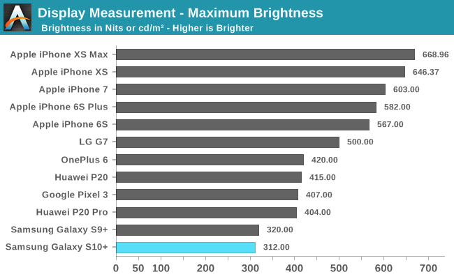
In regular scenarios, the Galaxy S10’s maximum brightness is similar to that we’re used to from past Samsung phones, reaching a maximum of 310-320nits.
To achieve brightness higher than this, the phone needs to be in adaptive brightness mode and in high ambient light. Here the Galaxy S10+ reaches up to around 700nits. I’ve tested this on both my units and got matching maximum brightness figures.
SpectraCal CalMAN
Exynos Natural
Exynos Vivid
Snapdragon Natural Snapdragon Vivid
Greyscale accuracy measurements on the Galaxy S10+ ended up being quite a headache because the Exynos and Snapdragon units behaved very differently. The issue at hand wasn’t any manufacturing divergence on the part of the panel, but rather an issue of diverging software calibrations between the different models and display modes. To make things even more annoying, the Galaxy S10 is also Samsung’s first smartphone with very aggressive CABC (Content adaptive brightness control) which cannot be turned off, with brightness scaling very differently based on APL.
At 200 cd/m² on both Exynos and Snapdragon units in Natural mode we see too warm white colour balance, with especially dominating reds, resulting in colour temperatures of 6327K and 6250K for each respective unit. In Vivid mode, oddly enough the Snapdragon was warmer at 6945K while the Exynos had a more blue 7697K CCT. It’s to be noted that in Vivid mode Samsung allows users to adjust the colour temperature, whilst this isn't possible in Natural mode.
What is inherently broken on both phones in different modes are the gamma curves. On the Exynos unit the natural mode has a far too low gamma at low levels and too high on high levels. In Vivid mode this low gamma on the low-end is reversed, with some additional black clipping now due to too high gamma, with again too high gamma at the high levels.
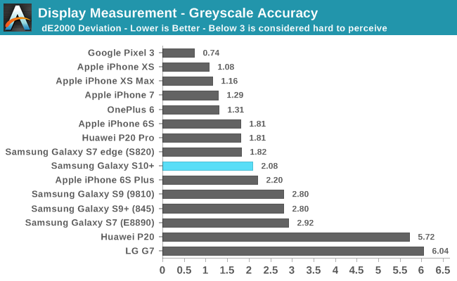
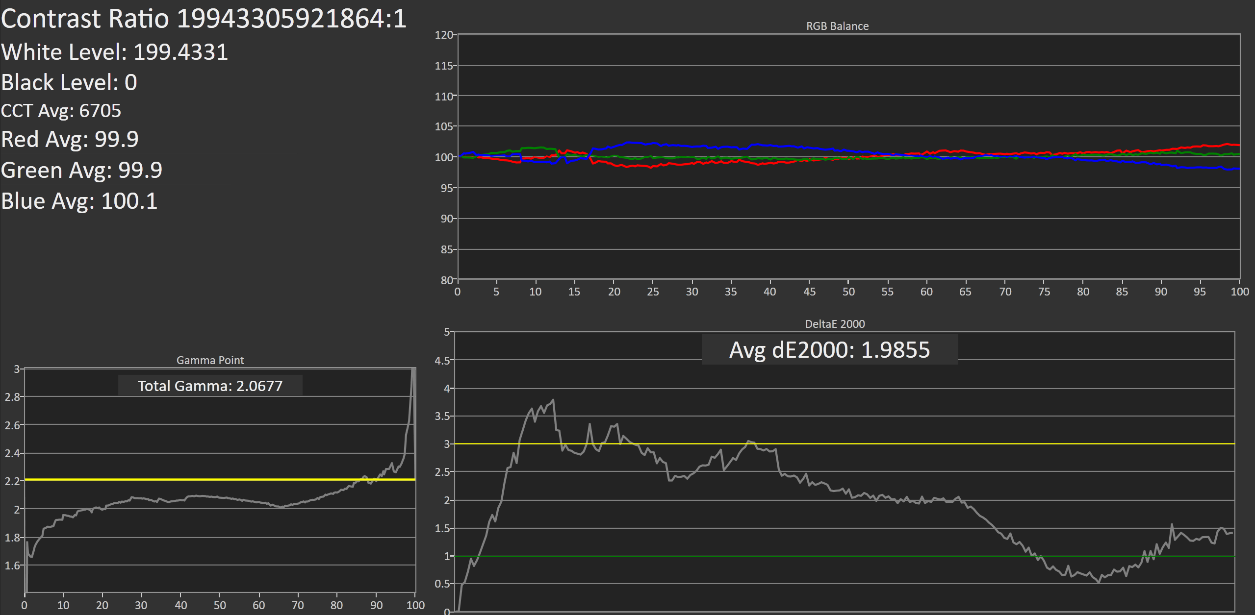
On the Snapdragon unit, the natural mode is the only display mode out of all combinations that actually manages to have a correct gamma near 2.2, with the only issue being a slight amount of black clipping at the lower levels. This is the mode and device with the best greyscale dE2000 of 1.79 – only thwarted from getting a better score due to the overly red colour temperature.

Exynos Gamma Problem
The gamma issues on the Exynos variant in natural mode are especially apparent in the most ironic place: Samsung’s own display mode settings screen. When enabling Night Mode in OneUI and using the dark interface, the background isn’t actually black but of a very low level grey. It’s exactly at these levels where the gamma differences between the Natural and Vivid display become obviously apparent. The above GIF shows how the broken low gamma in natural mode makes the UI exceedingly brighter. On the Snapdragon unit of the Galaxy S10, and for that matter the S9 and Note9 as well, we don’t encounter this change in gamma when switching between display modes and the Night Mode UI remains of an extremely dark grey nearing true black.
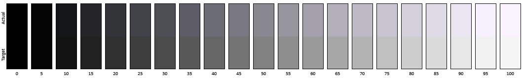
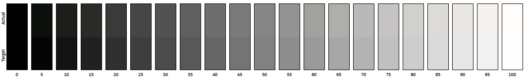
We end up with four different greyscale comparison patterns:
SpectraCal CalMAN - Exynos Vivid
The Exynos in Vivid mode is too blue with too dark mid to high level tones.
SpectraCal CalMAN - Exynos Natural
The Exynos in natural mode is unperceivably red, however we can clearly see too bright tones above what they normally should be.

SpectraCal CalMAN - Snapdragon Vivid
The Snapdragon in Vivid mode is ever so slightly too blue, but the gamma is off and again too dark.
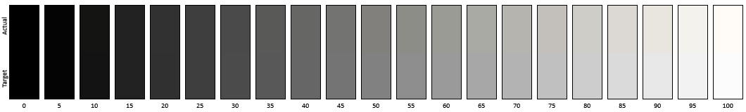
SpectraCal CalMAN - Snapdragon Natural
Finally, the Snapdragon in Natural mode is the only mode that is near perfect, with correct gamma and a hard to perceive slight shift towards red.

SpectraCal CalMAN
Exynos - Snapdragon
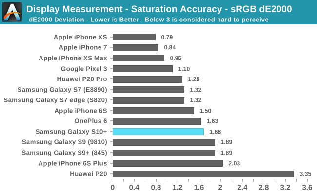
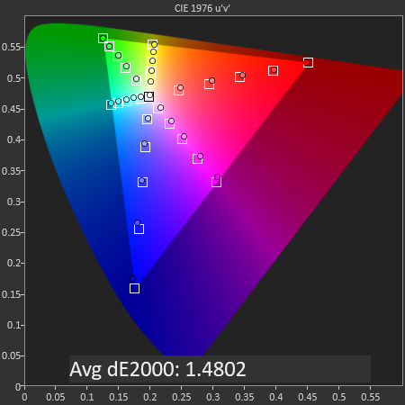
Continuing with saturation accuracy measurements, we see that in that in Natural mode on both phones we’re getting similar results with dE2000 deviations of 1.68 for the Exynos and 1.48 for the Snapdragon. Both phones share the same issue of having offset red mid-level saturations.

SpectraCal CalMAN
Exynos - Samsung S-Browser
Testing the Display P3 patterns in Natural mode is a bit of a headache. Samsung introduced colour management with the Galaxy S10, however there’s one gigantic caveat: The OS can’t display content of different gamuts alongside each other. For example, viewing P3 pictures in Samsung’s default S-Browser results in incorrectly clipped saturations, and in effect the browser is still limited to sRGB content.
Out of all applications I’ve tested on the Galaxy S10, Samsung’s only app that supports wide gamut content is the Gallery app, but again with a big caveat. It only switches over to wide gamut when opening up a picture, and when in thumbnail mode the content is still limited to sRGB. Apple’s iPhone Photos app doesn’t have this issue and is able to display P3 thumbnails alongside sRGB thumbnails.

SpectraCal CalMAN
Exynos - Samsung Gallery vs Chrome P3 Forced
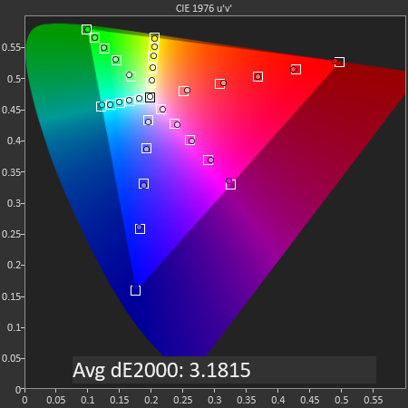
To make matters worse, the actual rendering of P3 content though the OS is actually incorrect. Displaying P3 patterns in the Gallery app results in a dE of 3.18, which at the limit of what should be acceptable. However if we completely bypass Android’s internal CMS transform and instead of rely on an external app, we can achieve some great results. In this case we rely on Chrome and tell it to force itself to D65 P3 display mode, and through this we’re measuring the Galaxy S10’s panel with a fantastic dE2000 of 1.03, as good as Apple’s best performance in the iPhone XS.
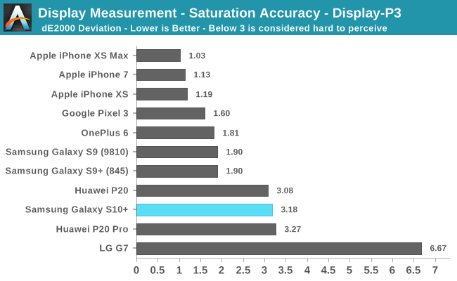
In the end, because most users will be using P3 content through the default CMS, the Galaxy S10+ ends up with a disappointing dE of 3.18.
SpectraCal CalMAN
SpectraCal CalMAN
Exynos
SpectraCal CalMAN
SpectraCal CalMAN
Snapdragon
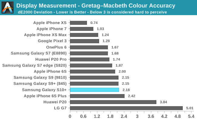
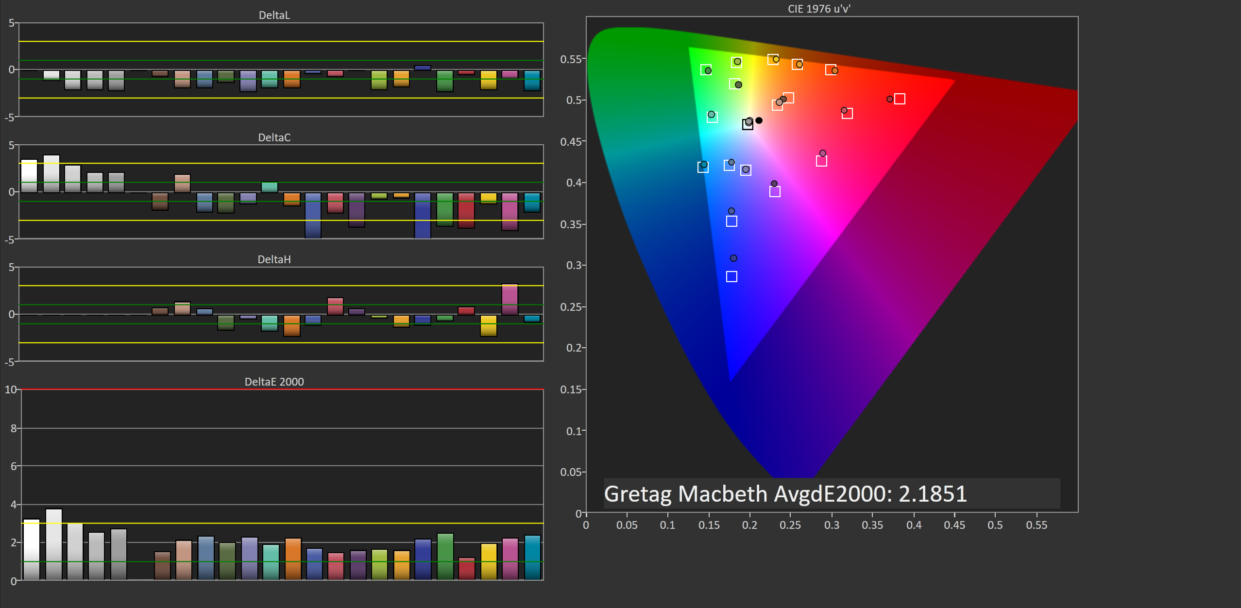
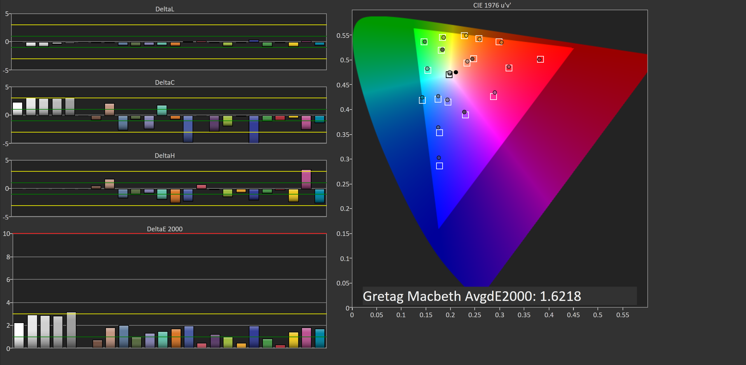
Finally, in the Gretag-Macbeth test of common found tones we see a case of the Exynos S10 scoring worse with a dE of 2.18 versus the Snapdragon’s figure of 1.62. In terms of hue, both display panels exhibit extremely similar characteristics in the test tones, but it’s again the flawed gamma on the Exynos unit which really offsets things and shows too bright results, compared to the Snapdragon’s near perfect gamma.
Display Conclusions
Overall, the Galaxy S10+’s display is a typical Galaxy S display. Samsung over the last 3 iterations has continued to have issues with their gamma, often times patching the most obvious issues a few months after release. While differences between the Exynos and Snapdragon calibrations have always been there, we’ve never had such a jarring issue as on the Exynos’ Natural mode. The other display modes including on the Snapdragon also continue to have black clipping at the first few greyscale levels. To be honest, this is getting a bit tiring and frankly I’m losing hope in Samsung to ever getting this right at release, it’s obvious that the quality control in their calibration department just isn’t there and after so many years of the same issues the company obviously doesn’t care to improve things.
Samsung adopting Android’s CMS in the Galaxy S10 also is of mixed feelings. Actually the S10 shipped with the traditional various mDNIe scenarios we’re used to from Samsung, but they’re just unavailable from the settings UI. Thus I think the decision to have the phone released with the CMS must have been a last minute choice. The biggest caveat here is the fact that Android cannot display different gamuts alongside each other, and fundamentally this is an issue of Android, Google and maybe even the SoC vendors. For now, Apple is 4 years ahead of everybody else and there’s yet to be an Android phone matching the iPhone’s colour management capabilities.
Having said all of the negative things, the Galaxy S10 with all its issues still probably remains among the best displays available. It’s a step down from the S9 and Note9 in terms of calibration, but all other aspects such as display sharpness, viewing angles, brightness and naturally contrast are just top-notch for the new Galaxy S10.


229 Comments
View All Comments
GekkePrutser - Saturday, March 30, 2019 - link
The orientation of the selfie camera in this case significantly reduces the experience and overall screen space from what would be possible. And smartphones are all about the screen. Making a big hole in it is really annoying.I'd personally find it a lot less flawed if it just left the selfie camera out altogether as I'd gladly do without it, or just kept the bezels.
Tropicocity - Sunday, March 31, 2019 - link
So your solution to what is actually the smallest and least-intrusive version of a 'total full screen display' (screen to body ratio is the highest ever pretty much, save for a few gimmicky ideas) is to remove it entirely?Linus seems to be in love with the front-and-back display idea, where there's a whole extra screen on the rear so you turn the phone around completely to take a selfie. Personally, I think the cutout is way better compared with the 'notch' on other phones. Sure, the s10+ having a double one isn't as nice as the singular one on the regular S10, but you get better depth-sensing and better selfies out of it.
Zoolook - Saturday, March 30, 2019 - link
Isn't that a bit like tying one arm to your back for a while because it's so good when you release it?drajitshnew - Friday, March 29, 2019 - link
Thank you ANDREI. This is really nice, comprehensive, review with very useful conclusions. I really liked it.apexjr - Friday, March 29, 2019 - link
Andrei Frumusanu,You nailed this display part! I actually returned my first S10 yesterday because the calibration wasn't great. I saw way too much greens while looking at a grey display. Nothing I could do fixed it.
On my next S10 the calibration was better. I selected Vivid, max'd out Cool, reduced green by 2 notches. That seemed to get the white closer to white, even though there is still a bit too much red/yellow mixed in. It is acceptable now though.
Would you possibly try adjusting it within the vivid sections to maybe get a better color accuracy?
I don't know what is going on with this display. I bought a S9 for my daughter at the same time and the colors are much better/accurate. The contrast is a bit too punchy though, as dark scenes are rendered too dark. This is what you are talking about and continues to be in the S10 (but to a lesser degree in my two phones).
Thanks!
nicolaim - Friday, March 29, 2019 - link
Typo on the last page: "the SoC represents be"nicolaim - Friday, March 29, 2019 - link
And another: "comfing"Andrei Frumusanu - Friday, March 29, 2019 - link
Thank you.SwordOS - Friday, March 29, 2019 - link
also s10s don't have iris scanner..danwells - Friday, March 29, 2019 - link
There's only one problem with any ultra-high-end Android phone... Apple!If you're going to pay for a phone that's in the Apple price range, the average person would be MUCH better off with an iPhone - you can avoid Android's security problems, ads and tracking entirely. Every performance test posted that included modern iPhones also showed the iPhones are faster and more power efficient.
Yes, there's a small fraction of the market (and a larger fraction of AnandTech's readership) that prefers the greater customizability of Android, and that's fine as long as they're aware of the security risks and don't mind the ads and tracking. 9 out of 10 people who are in the segment of the market that contains the modern iPhone ($750+) are better off with an iPhone, and the other 1/10 know why they don't want one.