The Microsoft Surface Studio Review
by Brett Howse on January 20, 2017 8:00 AM EST- Posted in
- Desktop
- Microsoft
- Surface
- Surface Studio
Microsoft has only been in the PC system game for a few years now, but over the last couple of years they have made a lot of progress rather quickly. These days they have a solid foundation of products available, with the Surface Pro 4 being one of the best convertible tablets, the Surface Book being a very solid convertible laptop, and also the more specialized products like the Hololens, and Surface Hub. Going into their October 2016 event, the one missing piece of their PC product lineup was a desktop computer, but with the announcement and release of the Surface Studio, that particular gap has now been filled.
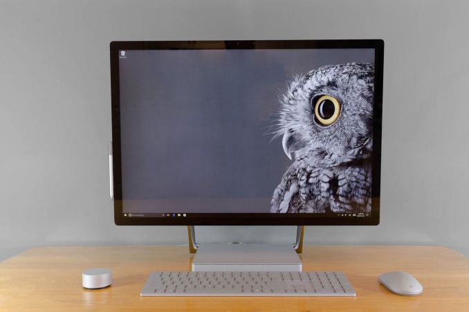
But the Surface Studio is not your typical desktop PC. Even at first glance, the sleek, beautiful lines are readily apparent, and once powered on, it is rare for anyone to first glimpse the 28.125-inch 4500x3000 display and not say “wow”. It’s not only the very high resolution, but also the 3:2 aspect ratio that is unheard of in this segment, that makes the display stand out as something unique.
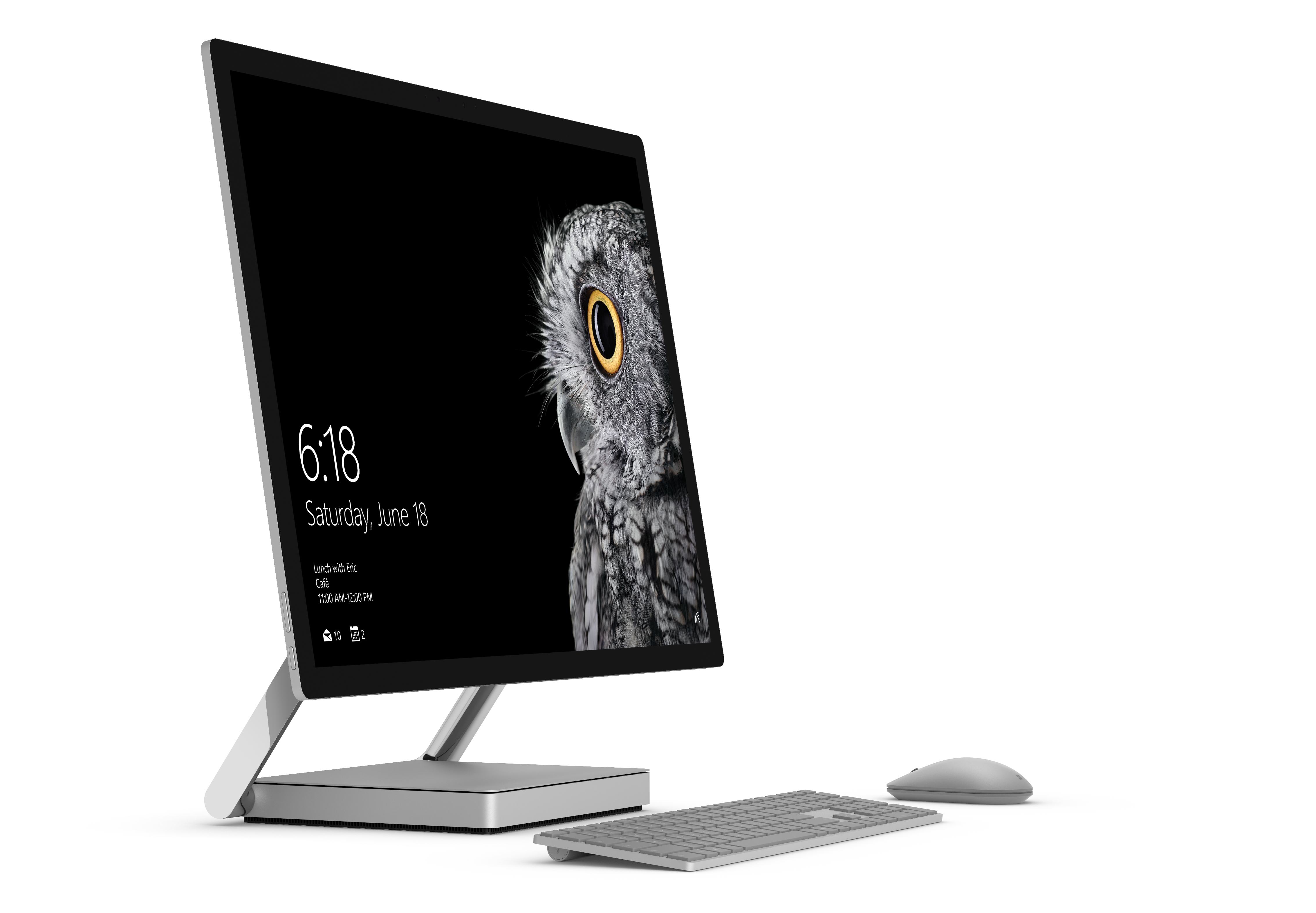
Microsoft has become one of the superlative hardware manufacturers in only the short span of four years or so, and the Surface Studio is one of their finest designs yet. However, from the very first Surface RT, Microsoft always tries to add something different, but more importantly interesting, to their designs, and in the case of the Surface Studio, it is the zero-gravity hinge, which allows the all-in-one to be quickly and easily tilted back to a 20° angle, letting it be used as a huge, digital drafting table. Microsoft announced the Surface Studio at their October Windows event, where they also announced the next Windows 10 Update, called the Creator’s Update, and it is wonderful to see them building hardware to truly bring out the exclusive features of their software.
Packed into the base of the Surface Studio is a laptop-class computer, with three different models available now. The base model, coming in at $2999, features an Intel Core i5-6440HQ processor, 8 GB of memory, a 1 TB hybrid drive with a 64 GB SSD cache, and a NVIDIA GeForce GTX 965M GPU. The mid-level model, which costs $3499, bumps the CPU up to an Intel Core i7-6820HQ, doubles the RAM to 16 GB, and doubles the SSD cache to a PCIe 128 GB model, with the same 1 TB HDD and GTX 965M. The highest priced model, at $4199, is an Intel Core i7-6820HQ, 32 GB of RAM, a 2 TB hybrid drive with a 128 GB PCIe cache, and a NVIDIA GTX 980M GPU with 4 GB of memory.
| Microsoft Surface Studio | ||||||
| Base | Middle | Top (As Tested) | ||||
| CPU | Intel Core i5-6440HQ Quad-Core, 2.6-3.5 GHz 6 MB Cache, 45W TDP, No Hyperthreading |
Intel Core i7-6820HQ Quad-Core, 2.7-3.6 GHz 8 MB Cache, 45W TDP, Hyperthreading |
||||
| GPU | NVIDIA GTX 965M 1024 CUDA Cores 944 Mhz + Boost 2 GB GDDR5 128-bit memory |
NVIDIA GTX 980M 1536 CUDA Cores 1038 Mhz + Boost 4 GB GDDR5 256-bit memory |
||||
| RAM | 8 GB DDR4 | 16 GB DDR4 | 32 GB DDR4 | |||
| Storage | 1 TB Hybrid Drive 64 GB SATA SSD Cache / 1 TB SATA HDD |
1 TB Hybrid Drive 128 GB PCIe SSD Cache / 1 TB SATA HDD |
2 TB Hybrid Drive 128 GB PCIe SSD Cache / 2 TB SATA HDD |
|||
| IO | 4 USB 3.0 ports - one high power port Full size SD Card Slot Headset Jack Xbox Wireless Connectivity DisplayPort |
|||||
| Display | 28.125-inch PixelSense Display 4500 x 3000 resolution 192 DPI sRGB, DCI-P3, P3 D65 color modes |
|||||
| Webcam | 5 MP Webcam Windows Hello Facial Recognition |
|||||
| Networking | Marvel AVASTAR 802.11ac Intel I219-LM Gigabit Ethernet |
|||||
| Price | $2,999 | $3,499 | $4,199 | |||
There was quite a bit of discussion at the time of the Surface Studio launch over the fact that it was equipped with older technology. Intel’s Kaby Lake quad-core parts just launched at CES this year, so Skylake quad-core CPUs were the latest generation available at launch. The Maxwell based graphics options chosen were not the latest generation mobile graphics from NVIDIA, with the GTX 965M and GTX 980M available in the Studio. The Pascal based GTX 1060 and GTX 1070 would have been much more powerful substitutes, but they are not pin-compatible drop-in components with the Maxwell GPUs in the Surface Studio, meaning a new board design and thermal considerations would have been necessary late in the design phase, and Microsoft appears to have been conservative here to avoid missing their launch window.
Microsoft has also been very conservative with their I/O choices, with four USB 3.0 Type-A ports on the back of the Studio, along with a SD card slot, and mini DisplayPort. As with the Surface Pro 4 and Surface Book, Microsoft has continued to provide only the older USB-A ports, and not even offer a single USB-C port, let alone with Thunderbolt. Anyone purchasing a Studio will likely be using it for several years, and the lack of USB-C is going to be an issue in the future, if not already today. The Surface team really needs to reconsider this as it is already a detriment to not include any.
There also must be some questions raised about the use of a hybrid drive in a PC of this price. We’ll dig in to the experience later, but Microsoft could and should offer a larger SSD as the boot disk, complimented by a HDD as a secondary disk, at least on the highest end model. A 512 GB NVMe SSD as the boot drive would appease much of the criticism. The computer does cost over $4000 after all, and while much of the cost of the device is in the display, SSDs have been the biggest improvement in user experience on the PC in a long time.


197 Comments
View All Comments
warrenk81 - Friday, January 20, 2017 - link
what does this sentence mean? "It would be great to see backlighting as well, but that is also not missing."Does it have lights or not?
Ryan Smith - Friday, January 20, 2017 - link
One too many negations, it seems. Let's try this: "It would be great to see backlighting on this keyboard as well, but that is also absent"melgross - Friday, January 20, 2017 - link
About the review. There are a number of errors in areas in which the reviewer doesn't seem to understand,D65 is NOT daylight, the concept of what daylight is is very complex. For many decades, daylight has been standardized as 5.6K, not 6.5K. The reason why D65 was invented wasn't to simulate daylight, but because of practical graphics standards reasoning.
D5 has been the graphics standard going back a very long time. Every light box used for color was D5. So were print view boxes and such. The problem was that in the beginning days of computers entering the graphics space, a problem came up.
While my Barco monitors, in my place, that cost $16,000, could reach D5 calibration, no other could. The problem was that the monitors couldn't be made to display enough brightness. As a result, calibrating to D5 left us with a fairly dim, and very yellow screen. Since the red and green couldn't be brought up enough, the blue needed to be turned down, leaving that horrible screen. The barco was the only monitor that had enough brightness.
So there was much discussion, and as a result, D65 was decided upon as a compromise. It could easily be calibrated to using most high quality graphics monitors, and so that became the standard.
Now, we thing of D65 as daylight, but it isn't. Daylight varies from about D22 to about D20.0 in other words, about 2.2K to about 20K. Where you are in the world, at any given time of the day, or year, will determine what that point is, and it doesn't average D65.
It's why when a photo is taken with sunlight and open shade, the sun portion is very yellow, and the shade is mostly cyan.
This may seem to be a little point to make, but I see people misunderstanding this so often, it's frustrating. I ran a large commercial photo lab in NYC for many years, and we were one of the first to begin to go digital in 1988.
By the way, Windows has never had effective color management. Individual developers such as Adobe have had to write their own management software, which isn't usable systemwide. That means that if you have anything other than an image that is using the sRGB gamut, it won't be correct except when running in a color managed app.
Windows 10 is the first Windows OS to have a working color management system built-in, but it comes turned off, because turning it on at this late stage screws up everything else in Windows, and it's very buggy. Maybe someday, that will change. But for now, you can't view two images with differing gamuts side by side in Windows. Only one will ever show correctly.
This is one reason doing commercial color work on this will be a major headache.
Brandon Chester - Friday, January 20, 2017 - link
All CIE standard illuminants from series D are designed to simulate daylight. I believe by D5 you mean D50, which has a lower CCT than D65. The review is not incorrect in describing D65 as representing daylight. In fact, the actual spec states that D65 should be used for all colorimetric calculations requiring a value to represent daylight. I encourage you to read ISO 11664-2.You are correct on companies having to roll their own color management. However, Windows 10 still uses WCS, it is just as unusable as before, and neither Win32 nor UWP integrate it at all, so there is not some working CMM that is just turned off. This is why brand new UWP apps like Photos and Microsoft Edge still aren't color managed, which would be implicit in a system where the underlying graphics framework is color managed and thus any component that uses it for drawing is color managed.
melgross - Friday, January 20, 2017 - link
Yes, D50, but, hese color spaces do not actually represent daylight. They represent a convenient compromise that allows equipment to be made and maintained, while giving some "sort" of recognizable color while point.This is why the concept of daylight has varied so much over time. I know ISO 11664-2, because I was one of those who was consulted on this standard way back then. As I say, all of these various standards are mechanical approximations of something natural.
So, for example, what is a proper white point? Well, we really don't know. Should it be represented by something that supposedly looks something like "natural" light, whatever that is? Should it be represented by our own eye/brain combination which is most sensitive to yellow/green?
So when you look at the sky, it's about 20K. But that's not what's always reflected off an object, which could be closer to 3K, which is what we're looking at, and what our brain recognizes as "correct", with its ability to adjust its perception to various light sources.
I've undergone many permutations of these questions over the decades. And it will change again.
I did say that WCS is so buggy that it's still turned off. But that's not the only reason. Microsoft's customers don't care about color management in a large enough percentage for Microsoft to really care. They only added this, years ago, to satisfy those screaming for it, but without bothering to really work on it. Enough said, they think, that it's there.
You basically said what I did, it with more explanation. Yeah, it's always been a mess, and it's not likely to be fixed anytime soon. Android, by the way, has no color management whatsoever, and isn't likely to get any, which is why wide band screens on Android products are almost useless.
id4andrei - Friday, January 20, 2017 - link
I'm curious, in the case of something like a Samsung Galaxy phone, when you select the supposedly exceptionally accurate "basic" profile is that not akin to switching colorspaces on the Studio? I mean Samsung does not use pure Android which as you said is completely inept at color management, but a modified and skinned Android that might have some rudimentary color management. Is it not?Brett Howse - Friday, January 20, 2017 - link
How do I put this. If there was color management, it wouldn't matter what gamut the display was able to use, since the colors would be transformed to fit that color space, assuming the display color space covers both. So, as an example, if you were viewing a sRGB photo on a P3 D65 display, the colors would be correct because there is color management, and it knows the photo is sRGB, and it knows the display is P3 D65, so it can use some math to put the sRGB photo into the correct P3 D65 space.If you don't have color management, and something is 85% red in sRGB, but your display is P3 D65, it will appear as 85% of the larger space, and would be oversaturated.
We should really have Brandon write up a piece on this outside of the few times he's addressed it.
Some Windows apps do have color management, and some respect the color management in Windows, but most do not. For instance the old Photo Viewer does work, but the new UWP Photos app has no color management. Apps like Adobe Photoshop have written their own color management, so they generally work well.
id4andrei - Saturday, January 21, 2017 - link
Aha so viewing a random sRGB picture on your presumably AdobeRGB Android smartphone would look waaaay off. While an AdobeRGB picture would look right.Brett Howse - Saturday, January 21, 2017 - link
Exactly, and that's the case on Android. iOS has color management, so the P3 D65 displays they've started using don't suffer from this issue.Icehawk - Sunday, January 22, 2017 - link
I bet this is why colors were off viewing a file in the new Photo app (like way off) but using the old Photo Viewer it looked right.