The Microsoft Surface Studio Review
by Brett Howse on January 20, 2017 8:00 AM EST- Posted in
- Desktop
- Microsoft
- Surface
- Surface Studio
System Performance
As is typical with an all-in-one PC, the Surface Studio uses mobile parts to ensure things don’t get too toasty. The base model ships with a Core i5-6440HQ, which is a quad-core processor running at 2.6-3.5 GHz. There is 6 MB of cache and no hyperthreading, and it has a 45-Watt TDP. The CPU is likely fine for most tasks, but the base Surface Studio comes with just 8 GB of DDR4 memory, which would hardly be called adequate for an almost $3000 computer. Graphics to run the 13.5 million pixel display come courtesy of the NVIDIA GeForce GTX 965M, launched at CES in 2015.
The jump up to the mid-level model offers a lot more computer, but comes at a cost of an additional $500. The CPU is upgraded to the Core i7-6820HQ, which is a quad-core with hyperthreading, and a 2.7-3.6 GHz frequency, along with 8 MB of cache. The big upgrade is the RAM, which doubles to a more respectable 16 GB, and while the GPU is the same, and the hard drive capacity is the same, the mid-level model doubles the SSD cache from a 64 GB SATA SSD to a 128 GB PCIe SSD. While the CPU is going to offer more performance, especially in heavily-threaded workloads, the increased RAM and SSD cache are likely to do more for the overall performance than anything, and the mid-level is really where the Surface Studio should have started.
Our review unit is the top level model, with the same Core i7-6820HQ CPU as the mid-level model, but with double the RAM again, which means 32 GB of DDR4. The hybrid hard drive capacity is also doubled, to 2 TB, with the same 128 GB of PCIe SSD cache. The biggest upgrade on the top model is the graphics, which jumps from the GeForce GTX 965M all the way to the GeForce GTX 980M. This was the top mobile graphics card available until earlier this year when the GeForce GTX 10 series launched, and it offers quite a bit more performance. The GTX 965M was a solid performer for low-end gaming, but the GTX 980M offers more of everything, with double the video memory to 4 GB, more memory bandwidth, more CUDA cores, and far more performance.
Much has been made of the fact that the Surface Studio shipped with “old technology” in a Skylake CPU, when Kaby Lake CPUs were available, and especially the Maxwell based graphics, when Pascal was launched. The CPU argument was never true though, with quad-core Kaby Lake only available since the beginning of 2017, and Kaby Lake offers no IPC increases over Skylake, although they can run at a higher frequency for the same power consumption. The GPU argument is sound though, and the Pascal based GPUs would offer greater performance for less power consumption, and therefore less heat generated. The new GPUs are not pin-compatible though, meaning Microsoft would have had to redesign the board completely, as well as possibly addressed the different TDPs of the mobile chips, but this would have been engineering time well spent.
| NVIDIA Mobile Maxwell GPUs | |||||
| GeForce GTX 965M | GeForce GTX 980M | ||||
| CUDA Cores | 1024 | 1536 | |||
| Core Clock | 944 + Boost | 1038 + Boost | |||
| Memory | 2 GB GDDR5 128-bit | 4 GB GDDR5 256-bit | |||
| Memory Clock | 2500 MHz | 2500 MHz | |||
| Memory Bandwidth | 80 GB/s | 160 GB/s | |||
Ultimately, it would have been nice to see a GTX 1070 and GTX 1060 options, or even a GTX 1050 to replace the GTX 965M, although that GPU just launched for laptops at CES 2017. The performance increases alone would be significant, but there are also advantages such as full hardware decode for HEVC on the Pascal chips which would have been a nice feature. Clearly the timing did not work out, and Microsoft said they had to choose the components a year before launch. They likely didn’t want to risk choosing Pascal and then having supply issues, but at the end of the day they made a conservative decision.
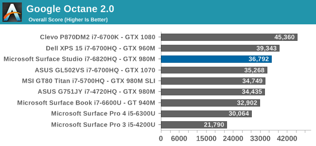
So let’s see how the Surface Studio does perform, with the Skylake and Maxwell combination that is available. The Surface Studio was run through our standard suite of tests, and for comparisons it is put up against some of the more recent laptops we’ve tested.
PCMark
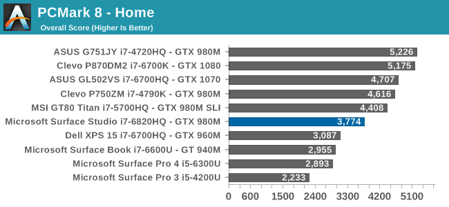
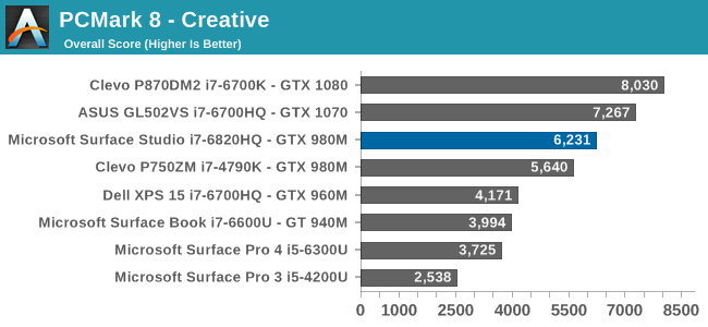
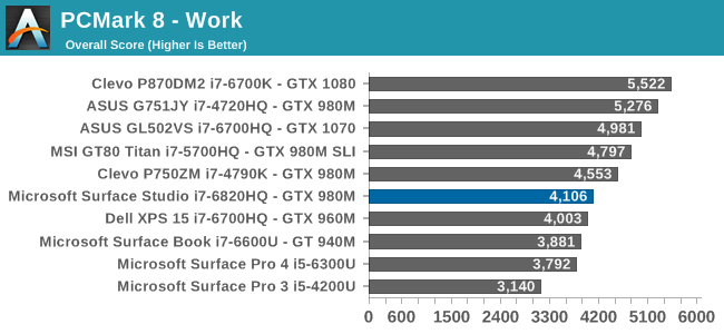
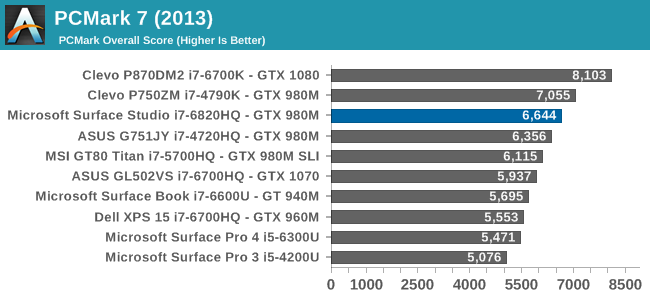
PCMark is a comprehensive set of tests, which uses real-world applications to test system responsiveness and performance. All aspects of the system are tested, including the storage, and even display resolution can have an affect. Here the Surface Studio is decidedly average, with decent scores in some tests, but less than amazing results in others. The hybrid storage and high display resolution likely didn’t help out the Surface Studio here.
Cinebench
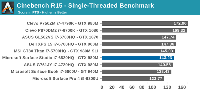

Cinebench is a purely CPU test, and despite the Surface Studio having a Core i7-6820HQ when most quad-core laptops are the i7-6700HQ, it still fell slightly below them on this test.
X264
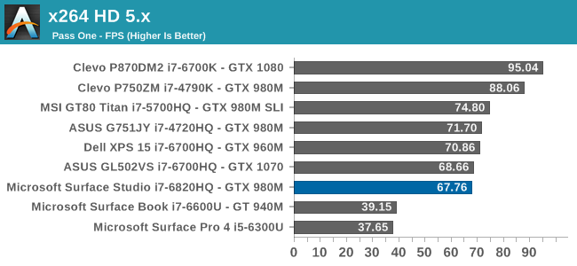
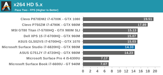
Much like Cinebench, this is a pure CPU test, but unlike Cinebench which renders an image, x264 encodes a video file. As with Cinebench, the Surface Studio falls a bit under the performance of the i7-6700HQ found in most notebooks.
Web Tests
Browsing the web is likely what most computers do, most of the time, but unlike the previous tests, web tests are always evolving over time as the underlying browsers are updated. For our tests, we use the latest version of Microsoft Edge.
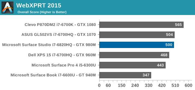
As with the other tests, the Surface Studio falls just a hair under the performance of typical quad-core laptops. With a sample size of one, it’s difficult to point the finger at why this is – is it cooling or is it something else – but I would have expected it to be just slightly ahead of the i7-6700HQ machines.


197 Comments
View All Comments
warrenk81 - Friday, January 20, 2017 - link
what does this sentence mean? "It would be great to see backlighting as well, but that is also not missing."Does it have lights or not?
Ryan Smith - Friday, January 20, 2017 - link
One too many negations, it seems. Let's try this: "It would be great to see backlighting on this keyboard as well, but that is also absent"melgross - Friday, January 20, 2017 - link
About the review. There are a number of errors in areas in which the reviewer doesn't seem to understand,D65 is NOT daylight, the concept of what daylight is is very complex. For many decades, daylight has been standardized as 5.6K, not 6.5K. The reason why D65 was invented wasn't to simulate daylight, but because of practical graphics standards reasoning.
D5 has been the graphics standard going back a very long time. Every light box used for color was D5. So were print view boxes and such. The problem was that in the beginning days of computers entering the graphics space, a problem came up.
While my Barco monitors, in my place, that cost $16,000, could reach D5 calibration, no other could. The problem was that the monitors couldn't be made to display enough brightness. As a result, calibrating to D5 left us with a fairly dim, and very yellow screen. Since the red and green couldn't be brought up enough, the blue needed to be turned down, leaving that horrible screen. The barco was the only monitor that had enough brightness.
So there was much discussion, and as a result, D65 was decided upon as a compromise. It could easily be calibrated to using most high quality graphics monitors, and so that became the standard.
Now, we thing of D65 as daylight, but it isn't. Daylight varies from about D22 to about D20.0 in other words, about 2.2K to about 20K. Where you are in the world, at any given time of the day, or year, will determine what that point is, and it doesn't average D65.
It's why when a photo is taken with sunlight and open shade, the sun portion is very yellow, and the shade is mostly cyan.
This may seem to be a little point to make, but I see people misunderstanding this so often, it's frustrating. I ran a large commercial photo lab in NYC for many years, and we were one of the first to begin to go digital in 1988.
By the way, Windows has never had effective color management. Individual developers such as Adobe have had to write their own management software, which isn't usable systemwide. That means that if you have anything other than an image that is using the sRGB gamut, it won't be correct except when running in a color managed app.
Windows 10 is the first Windows OS to have a working color management system built-in, but it comes turned off, because turning it on at this late stage screws up everything else in Windows, and it's very buggy. Maybe someday, that will change. But for now, you can't view two images with differing gamuts side by side in Windows. Only one will ever show correctly.
This is one reason doing commercial color work on this will be a major headache.
Brandon Chester - Friday, January 20, 2017 - link
All CIE standard illuminants from series D are designed to simulate daylight. I believe by D5 you mean D50, which has a lower CCT than D65. The review is not incorrect in describing D65 as representing daylight. In fact, the actual spec states that D65 should be used for all colorimetric calculations requiring a value to represent daylight. I encourage you to read ISO 11664-2.You are correct on companies having to roll their own color management. However, Windows 10 still uses WCS, it is just as unusable as before, and neither Win32 nor UWP integrate it at all, so there is not some working CMM that is just turned off. This is why brand new UWP apps like Photos and Microsoft Edge still aren't color managed, which would be implicit in a system where the underlying graphics framework is color managed and thus any component that uses it for drawing is color managed.
melgross - Friday, January 20, 2017 - link
Yes, D50, but, hese color spaces do not actually represent daylight. They represent a convenient compromise that allows equipment to be made and maintained, while giving some "sort" of recognizable color while point.This is why the concept of daylight has varied so much over time. I know ISO 11664-2, because I was one of those who was consulted on this standard way back then. As I say, all of these various standards are mechanical approximations of something natural.
So, for example, what is a proper white point? Well, we really don't know. Should it be represented by something that supposedly looks something like "natural" light, whatever that is? Should it be represented by our own eye/brain combination which is most sensitive to yellow/green?
So when you look at the sky, it's about 20K. But that's not what's always reflected off an object, which could be closer to 3K, which is what we're looking at, and what our brain recognizes as "correct", with its ability to adjust its perception to various light sources.
I've undergone many permutations of these questions over the decades. And it will change again.
I did say that WCS is so buggy that it's still turned off. But that's not the only reason. Microsoft's customers don't care about color management in a large enough percentage for Microsoft to really care. They only added this, years ago, to satisfy those screaming for it, but without bothering to really work on it. Enough said, they think, that it's there.
You basically said what I did, it with more explanation. Yeah, it's always been a mess, and it's not likely to be fixed anytime soon. Android, by the way, has no color management whatsoever, and isn't likely to get any, which is why wide band screens on Android products are almost useless.
id4andrei - Friday, January 20, 2017 - link
I'm curious, in the case of something like a Samsung Galaxy phone, when you select the supposedly exceptionally accurate "basic" profile is that not akin to switching colorspaces on the Studio? I mean Samsung does not use pure Android which as you said is completely inept at color management, but a modified and skinned Android that might have some rudimentary color management. Is it not?Brett Howse - Friday, January 20, 2017 - link
How do I put this. If there was color management, it wouldn't matter what gamut the display was able to use, since the colors would be transformed to fit that color space, assuming the display color space covers both. So, as an example, if you were viewing a sRGB photo on a P3 D65 display, the colors would be correct because there is color management, and it knows the photo is sRGB, and it knows the display is P3 D65, so it can use some math to put the sRGB photo into the correct P3 D65 space.If you don't have color management, and something is 85% red in sRGB, but your display is P3 D65, it will appear as 85% of the larger space, and would be oversaturated.
We should really have Brandon write up a piece on this outside of the few times he's addressed it.
Some Windows apps do have color management, and some respect the color management in Windows, but most do not. For instance the old Photo Viewer does work, but the new UWP Photos app has no color management. Apps like Adobe Photoshop have written their own color management, so they generally work well.
id4andrei - Saturday, January 21, 2017 - link
Aha so viewing a random sRGB picture on your presumably AdobeRGB Android smartphone would look waaaay off. While an AdobeRGB picture would look right.Brett Howse - Saturday, January 21, 2017 - link
Exactly, and that's the case on Android. iOS has color management, so the P3 D65 displays they've started using don't suffer from this issue.Icehawk - Sunday, January 22, 2017 - link
I bet this is why colors were off viewing a file in the new Photo app (like way off) but using the old Photo Viewer it looked right.