The Samsung Galaxy Note7 (S820) Review
by Joshua Ho on August 16, 2016 9:00 AM ESTDisplay
Moving past the design the next point of interest is going to be the display which is one of the major elements of any smartphone, and pretty much the first thing you’re going to notice when you power on the phone. It’s easy to look at a display and provide some fluff about how the colors pop and how the high contrast leads to dark, inky blacks, but to rely solely on subjective observation really fails to capture the full extent of what a display is really like. If you put two displays side by side, you can tell that one is more visible outdoors, but there’s no way of distinguishing whether this is the case because of differences in display reflectance or display luminance. Other factors like gamut and gamma can also affect perceived visibility which is the basis for technologies like Apical’s Assertive Display system.
In order to try and separate out these various effects and reduce the need for relative testing we can use testing equipment that allows for absolute values which allow us to draw various conclusions about the ability of a display to perform to a certain specification. While in some cases more is generally speaking better, there are some cases where this isn’t necessarily true. An example of this is gamut and gamma. Although from an engineering perspective the ability to display extremely wide color gamuts is a good thing, we’re faced with the issue of standards compliance. For the most part we aren’t creating content that is solely for our own consumption, so a display needs to accurately reproduce content as the content creator intended. On the content creation side, it’s hard to know how to edit a photo to be shared if you don’t know how it will actually look on other people’s hardware. This can lead to monetary costs as well if you print photos from your phone that look nothing like the on-device preview.
To test all relevant aspects of a mobile display, our current workflow uses X-Rite’s i1Display Pro for cases where contrast and luminance accuracy is important, and the i1Pro2 spectrophotometer for cases where color accuracy is the main metric of interest. In order to put this hardware to use we use SpectraCal/Portrait Display’s CalMAN 5 Ultimate for its highly customizable UI and powerful workflow.

Before we get into the results though I want to discuss a few choice aspects of the Galaxy Note7’s display. At a high level this is a 5.7 inch 1440p Super AMOLED display that is made by Samsung with a PenTile subpixel matrix that uses two subpixels per logical pixel in a diamond arrangement. The display driver supports panel self-refresh as a MIPI DSI command panel rather than a video panel. In the Snapdragon 820 variant of this device it looks like there isn’t a dynamic FPS system and a two lane system is used so the display is rendered in halves. The panel identifies itself as S6E3HA5_AMB567MK01 which I’ve never actually seen anywhere else, but if we take the leap of guessing that the first half is the DDIC this uses a slightly newer revision of DDIC than the S6E3HA3 used in the Galaxy S7. I’m guessing this allows for the HDR mode that Samsung is advertising, but the panel is likely to be fairly comparable to the Galaxy Note5 given that the Galaxy S7 panel is fairly comparable to what we saw in the Galaxy S6.
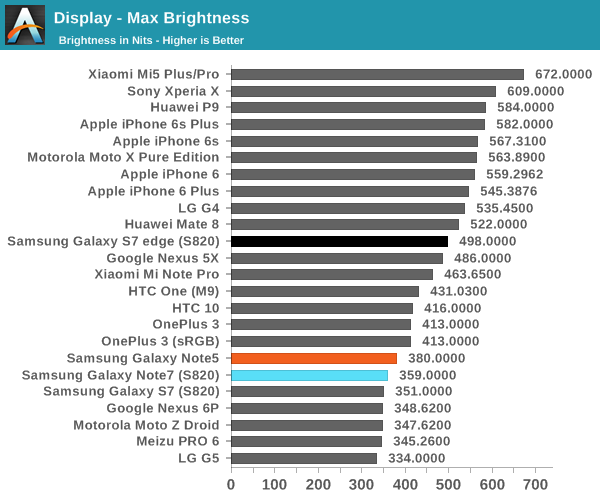
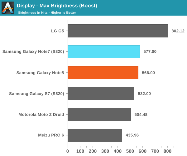
Looking at the brightness of the display, it’s pretty evident that the Galaxy Note7 is a bright panel, especially when compared to things like the HTC 10 and LG G5. The G5 does reach “800 nits” with its auto brightness boost, but the true steady state is nowhere near that point while the Galaxy Note7’s display can actually stay at its boost brightness for a reasonable amount of time and I’ve never really noticed a case where the boost brightness couldn’t be sustained if the environment dictated it.
Before we get into the calibration of the display it’s probably also worth discussing the viewing angles. As you might have guessed, the nature of PenTile and AMOLED have noticeable effects on viewing angles, but in different ways. As AMOLED places light emitters closer to the surface of the glass and doesn’t have a liquid crystal array to affect light emission, contrast and luminance are maintained significantly better than a traditional LCD. However, due to the use of PenTile it is still very obvious that there is a lot of color shifting as viewing angles vary. There are still some interference effects when you vary viewing angles as well. In this regard, LCDs seen in phones like the iPhone 6s are still better here. You could argue that one is more important than the other so I’d call this a wash, but AMOLED could stand to improve here.

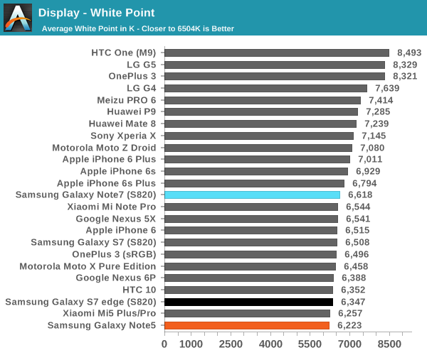
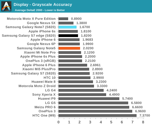
Moving on to grayscale and other parts of the display calibration testing it’s worth mentioning that all of these tests are done in Basic mode which is something I would suggest using in these AMOLED devices in order to improve both calibration accuracy and battery life as brightness is generally controlled by PWM while hue is controlled by voltage, so constraining the gamut actually reduces power draw of the display. Putting this comment aside, the grayscale calibration is really absurdly good here. Samsung could afford to slightly increase the target gamma from 2.1 to 2.2 but the difference is basically indistinguishable even if you had a perfectly calibrated monitor to compare to the Note7 we were sampled. Color temperature here is also neutral with none of the green push that often plagues Samsung AMOLEDs. There’s basically no room to discuss for improvement here because the calibration is going to be almost impossible to distinguish from perfect.
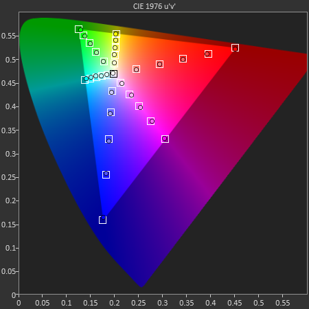
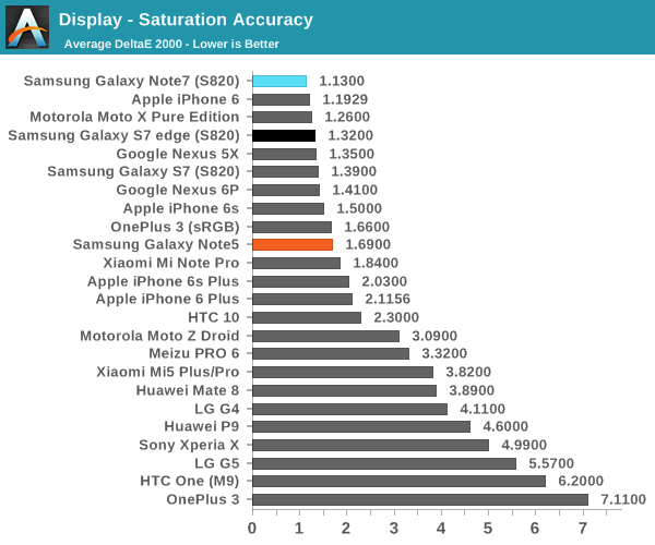
In the saturations test again Samsung has basically nailed the sRGB gamut here to the extent that it’s going to be basically impossible to distinguish it from a reference monitor. I really have nothing else to say here because Samsung has no room to improve here. Of course, saturation sweeps are just one part of the whole story, so we can look at the GMB ColorChecker to see how well the Note7’s display can reproduce common hues.
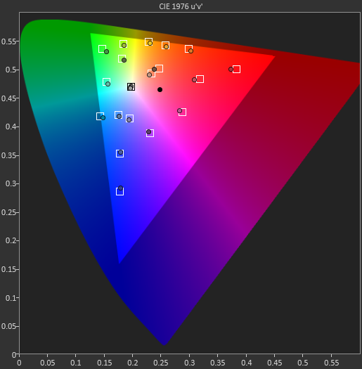
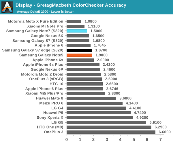
In the Gretag MacBeth ColorChecker test a number of common tones including skin, sky, and foliage are represented as well as other common colors. Again, Samsung is basically perfect here. They might need to push up the saturation of reds slightly higher but it’s basically impossible to tell this apart from a reference monitor. If you want to use your phone for photo editing, online shopping, watching videos, sharing photos, or pretty much anything where images are reproduced on more than one device, the Galaxy Note7 is going to be a great display. It may not be much of a step up from the Galaxy Note5, but at this point the only avenues that Samsung really needs to improve on is the maximum brightness at realistic APLs above 50% and power efficiency. It would also be good to see wider color gamuts in general, but I suspect the value of such things is going to continue to be limited until Google and Microsoft actually make a serious effort at building color management into the OS. It might also make sense to try and improve color stability with changes in viewing angle, but I suspect that AMOLED faces greater constraints here relative to LCD due to the need to improve the aging characteristics of the display. Regardless, it’s truly amazing just how well Samsung can execute when they make something a priority.


202 Comments
View All Comments
theduckofdeath - Tuesday, August 16, 2016 - link
The typical half glass full, negative approach when reviewing Samsung devices at Anandtech... I guess more of you guys wants a job at Apple like the one Anand managed to get?theduckofdeath - Tuesday, August 16, 2016 - link
Half glass empty, that is...See, I'm simply not capable of being as negative as an Anandtech writer. :)
jiffylube1024 - Tuesday, August 16, 2016 - link
I hate to hear the "Anandtech is posting biased reviews" argument because they do such a good job of being in-depth, and I appreciate their reviews tremendously. However, I agree that there is a bias in the wording, intentional or not, against Samsung's recent Galaxy phones, which have been spectacular options in the Galaxy S6/S7 era, even in spite of Touchwiz's shittiness.Is Samsung's aluminum and glass industrial design and unique bezel-free design really so bad? Anandtech thinks it's tired and needs a refresh. In The Verge's review, they come up with a completely different conclusion - they say the Note 7 the best big phone ever, and praise how Samsung has out-designed the competition. Such a huge discrepancy down to essentially a matter of taste. Can we not reach a middle ground - every review of a Galaxy review on AT needs to mention how they need to spice up the "rectangle with rounded corners". It's fine for what it is!
----
To take just one example to hone my point, The iPhone 6S's camera in the AT review was rightly praised for its improved video - 4K recording and 1080p 120 fps. However very little was made of how it was essentially the same damn sensor as the last gen with shrunken pixels giving it a nominal bump from 8MP to 12MP, with basically zero quality difference in stills.
In the Samsung Galaxy S7 review, the super fast laser Autofocus was mentioned, but the overall image quality was described thusly "However, with that said the output of the Galaxy S7 and S7 edge’s camera is not that impressive. I would argue that while it’s not worse than the iPhone 6s Plus, it is basically comparable."
It's not that impressive, yet equal to the iPhone 6S Plus. There was nothing in the iPhone 6S review or conclusion that described its camera as mediocre, yet that's how it comes off in the S7 review - Samsung has to be better, or it's unimpressive.
lilmoe - Tuesday, August 16, 2016 - link
Samsung has to be a lot, LOT, better, or it's unimpressive. FTFY.It's a mentality that really kills me.
theduckofdeath - Wednesday, August 17, 2016 - link
Exactly.Just because a person writes a ten page biased review it really doesn't make it less biased. This place just can't learn from old mistakes. Anandtech used to be a place you could go to to read reliable in-depth reviews about technology and gadgets. I don't know exactly when that changed, but I guess it was a long time ago when Anand had received enough gifts and perks from Apple to sway the whole writing culture on Anandtech.
thunderwave_2 - Thursday, August 18, 2016 - link
Here in the UK, though, they're charging £700 for it. You could buy two OnePlus 3's (£329 each) and still have change. Don't get me wrong, this is surely the better phone. But is it really worth twice the price?lilmoe - Saturday, August 20, 2016 - link
Then why isn't the same being said about every other expensive phone???Meteor2 - Saturday, August 20, 2016 - link
It is.theduckofdeath - Saturday, August 20, 2016 - link
Read the first page of the iPhone 5 SE review and you'll get some perspective. An over-priced cynical release that Apple released thinking consumers were all stupid. Not a single complaint about Apple reusing the exact same hardware of a phone they had released several years earlier, and still asking for a stupid high price.This Galaxy Note 7 is still using a really unique design language that no other brand has managed to copy. Read the first page of this review again.
This site has gone down the drain as an Apple marketing portal. Which I guess is why the comment sections are really starting to die. Because you know, people are not as stupid as Apple and Anand and his minions seem to think.
Bluetooth - Tuesday, August 16, 2016 - link
How can you say that when they do absolutely the best reviews, which are based on actual and realistic measurements. If you prefer superfluous reviews go to The Verge.