The Meizu M3 Note vs. Xiaomi Redmi Note 3 Review: Comparing Notes
by Matt Humrick on July 12, 2016 8:00 AM EST- Posted in
- Smartphones
- Mobile
- Xiaomi
- Meizu
- Redmi
Software
To help differentiate their products, most OEMs put their own stamp on Android that adheres to their aesthetics and adds, modifies, or even removes features found in AOSP. Meizu and Xiaomi are no exception; the M3 note and Redmi Note 3 are running Flyme OS 5.1 and MIUI 7.3, respectively, with Android 5.1 underneath. While both Meizu and Xiaomi provide regular updates to their OS skins and apps on a regular basis, Android updates are rare to nonexistent. Lack of timely updates is an issue for the Android ecosystem as a whole, but it’s especially prevalent among Chinese OEMs and for the less expensive phones where profit margins are thin. Whether or not either phone will ever see an update to Android Marshmallow is still uncertain; however, the fact that both are still running Lollipop speaks volumes.
User Interface Design: Meizu M3 note (left) vs. Xiaomi Redmi Note 3 (right)
Both Meizu’s Flyme and Xiaomi’s MIUI stray pretty far from Google's Material Design language. While it’s still possible to recognize some stock Android design elements in Flyme, like the action overflow button in the top-right corner of apps and standard floating menus with drop shadows, MIUI eradicates all visual similarity to Google’s Android. Instead of floating menus that pop over the app, MIUI’s menus slide in from the top or bottom of the screen and use a semi-transparent background rather than drop shadows to indicate depth. MIUI also restyles all of the menus and buttons, opting for smaller controls and text with less color. Navigation also works a bit differently: Whereas Flyme pretty consistently places a back link in the action bar at the top of the screen, MIUI sometimes uses back links or cancel buttons in the action bar, but relies more heavily on using the hardware back button instead.
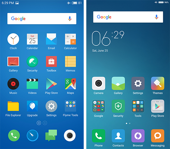
Home Screen: Meizu M3 note (left) vs. Xiaomi Redmi Note 3 (right)
Both Flyme and MIUI do not include an app drawer, opting for a more iOS-like system for managing apps that spreads them across multiple home screens. The app icons can at least be readily rearranged and placed anywhere on the screen. They can also be grouped into folders that expand into a full-screen view when opened on both phones.
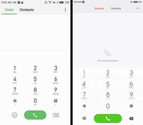
We’ve already seen how Meizu and Xiaomi approach user interface design differently, so it’s not surprising to see them use different philosophies for navigation too. Xiaomi’s Redmi Note 3 uses traditional recents, home, and back hardware buttons (from left to right), but unlike phones that use software buttons, or even OnePlus’ hardware buttons, that allow the buttons to be rearranged or even new ones to be added, the Redmi Note 3’s button order is fixed. The only available options are for assigning different tasks when long-pressing the buttons and for controlling the buttons’ backlight.
Meizu’s M3 note, like the PRO 5 we recently reviewed, foregoes Android’s traditional navigation buttons. The recent apps menu is opened simply by swiping up from the bottom bezel, which I find to be a very intuitive gesture that’s easier to do one-handed than tapping a small button. Its lone hardware button plays a dual role: In addition to acting as a home button when pressed, it can also perform one of several different actions when tapped, although using it as a back button makes the most sense.
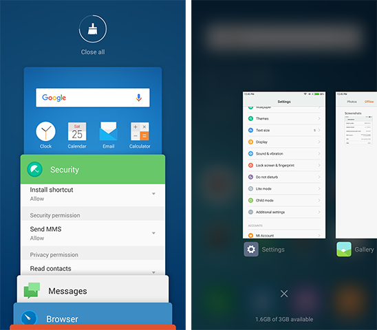
Recent Apps Menu: Meizu M3 note (left) vs. Xiaomi Redmi Note 3 (right)
Looking through recent apps in Flyme is similar to stock Android, with a vertically scrolling array of app preview cards that can be dismissed by swiping to the side. Conversely, Xiaomi’s MIUI uses a side-scrolling array of cards over a semi-transparent background. Both interfaces offer a convenient button to close all open apps.
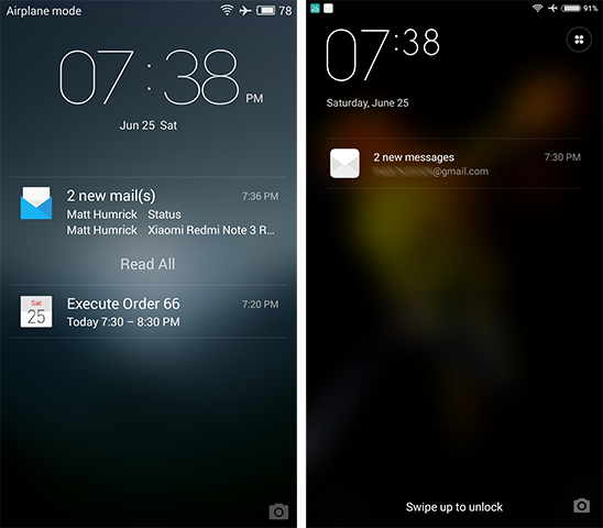
Lock Screen: Meizu M3 note (left) vs. Xiaomi Redmi Note 3 (right)
The lock screen’s appearance and functionality is similar for both phones. By default they prominently show the wallpaper with the time and date displayed at the top. There’s also a camera shortcut in the bottom-right corner, and while the Redmi Note 3’s MIUI does not allow any additional shortcuts on the lock screen, the M3 note’s Flyme supports lock screen gestures, which we’ll discuss more below. If notifications are set to appear on the lock screen, they appear above the wallpaper with a frosted overlay like in the images above. Access to the notification shade and not waking the phone when receiving notifications are options for both lock screens.
The M3 note’s lock screen does have the more elegant solution for controlling music, with larger, easier to use controls and a more attractive appearance that adjusts the background color to match the album art. When a music app is open but not currently playing music, its player widget shows up at the top of the notification list on the lock screen for easy access (while this works for some third-party players, it oddly does not work with Flyme’s default music app). On the Redmi Note 3, you have to pull the notification shade down first to access the player controls. If music is already playing, both lock screens default to showing the album art and music controls.
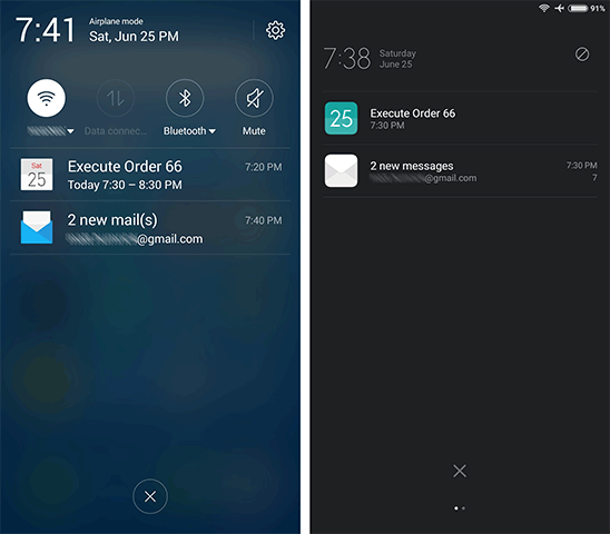
Notification Shade: Meizu M3 note (left) vs. Xiaomi Redmi Note 3 (right)
Pulling down the notification shade reveals similar functionality across both phones that’s presented in a way consistent with Meizu’s and Xiaomi’s design principles. The M3 note’s Flyme OS shows quick setting toggles at the top with notifications listed below. Swiping down or up expands or collapses the quick settings panel, which is consistent with the vertical swiping used in the recent apps menu. You can set which toggles appear in the menu and even rearrange them, but the number of toggles shown is fixed.
MIUI on the Redmi Note 3 takes a different approach, dividing notifications and quick settings into separate screens that you switch between with a horizontal swipe—the same gesture used in the recent apps menu. Similar to Flyme OS, MIUI allows you to rearrange the quick setting toggles, but it does not limit the number shown in the notification shade, allowing you to reach additional toggles by scrolling through them vertically.
Personally, I find the larger fonts and toggles used by Meizu’s Flyme easier to see and use (font size is adjustable in MIUI but not the size of buttons or toggles). I also like having access to everything on a single screen; however, if you tend to get a lot of notifications, MIUI’s roomier notification screen may be an advantage.
Additional Features: Meizu M3 note (left) vs. Xiaomi Redmi Note 3 (right)
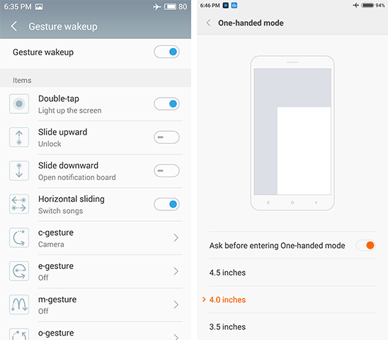
Both phones offer some special features. The Meizu M3 note includes “Gesture wakeup,” a collection of optional gestures for use on the lock screen. The most useful one for me is the ability to double tap the screen to wake the phone. Swiping left or right with the screen off to switch music tracks is also convenient. You can also wake up the phone and launch apps by drawing letters on the screen.
The M3 note’s “SmartTouch” feature is a little, semi-transparent, repositionable joystick/button that’s always visible on the screen (there’s a quick settings toggle to show/hide it). Moving or tapping the button performs various actions such as pulling down the notification shade when pulled down, switching between open apps by pushing it to the side, working as a back button when tapped, or locking the screen when double tapped. By placing the button within easy reach, it serves as a useful feature for one-handed use.
The Redmi Note 3 addresses the reachability issue differently with a special one-handed mode. Sliding a finger across the capacitive buttons shrinks the screen into a smaller window anchored to either the left- or right-bottom corner, depending on the direction of the finger swipe. Tapping the blank area outside of the window restores the screen to its full size.
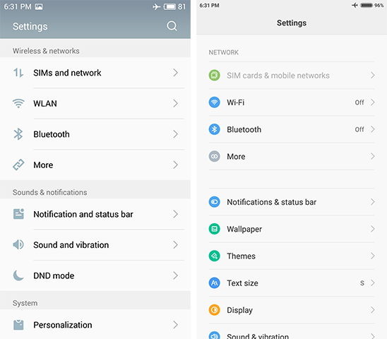
Settings Menu: Meizu M3 note (left) vs. Xiaomi Redmi Note 3 (right)
Both Flyme and MIUI come with the usual collection of apps—email, messaging, calendar, gallery, file explorer, and the like—in addition to the standard collection of Google apps (for the international versions). These apps are pretty standard fare, although the Redmi Note 3’s calendar app definitely stands above the M3 note’s simple offering, and the number of included apps is not excessive. Both phones come with security apps that purport to do a number of things, including virus scanning, blocking messages and phone numbers, and cleaning up old files. The apps also provide control over individual app permissions, which is a valuable feature that’s not provided natively in Android Lollipop.
Despite each phone having the word “note” in its name, neither the M3 note nor the Redmi Note 3 offer any unique note-taking features beyond a standard note-taking app, unlike Samsung's Galaxy Note series that comes with a stylus and an array of software features that make it easier to jot down information. The “note” moniker is really just a marketing term for these phones rather than a declaration of capability, because their note-taking ability is no different from any other smartphone.
The M3 note’s Flyme OS and the Redmi Note 3’s MIUI use different approaches to user interface design and navigation. While both deviate from stock Android, MIUI strays much further than Flyme. I find Flyme’s interface to be more consistent in appearance and easier to navigate, but each have their merits.


79 Comments
View All Comments
realbabilu - Friday, July 15, 2016 - link
G4 I meanbennyg - Monday, July 18, 2016 - link
As a 2 month user of a Redmi Note 3 Pro I'm never sorry to see some justification to my buyer biased opinion of its awesomeness. As someone who's been fine with one or two year old flagships for nearly a decade this was a nice surprise to be buying something new that raised the bar still without breaching the self imposed budget. I was reticent to buy the MTK version when it first came out, the Pro (Snap) however is well well worth it and will go down as one of the gems of its generation for good reasonBadCommand - Tuesday, July 19, 2016 - link
Other than the (hopefully) properly vetted Huawei Nexus 6p- I can't fathom why anyone would want/trust a Chinese branded phone.mfmx - Sunday, July 31, 2016 - link
The "full netcom" Redmi Note 3 does support some American bands:WCDMA bands B1/B2/B4/B5/B8
FDD-LTE bands B1/B3/B4/B5/B7/B8
So it supports AWS bands for 3G/4G on T-mobile in the US.
Also there is a 2GB/16GB "international" version now with English packaging and European charger sold on aliexpress that supports
FDD LTE bands B1/2/3/4/5/7/8/20/28
So that's band 20 for Europe, 28 for Asia Pacific and 2 and 4 for the US. No WCDMA band 4 though.
serendip - Wednesday, August 3, 2016 - link
I just picked up the Note 3, thanks to AT's great review, and I think it's a great phone. Shame about the locked bootloader and Xiaomi's ridiculous unlocking procedure that fails most of the time.Anyway, there are 3 versions of the Redmi Note 3: MTK X10 (production code Hennessy), Snapdragon 650 Netcom (Kenzo) and Snapdragon 650 Taiwan (Kate). The Kate model has support for more LTE bands at the expense of some WCDMA and CDMA bands. I've heard of people flashing Kate radio firmware on Kenzo that enables European LTE bands but reception is supposed to be flaky. Maybe there's different radio hardware that enables those extra bands.
milli - Wednesday, August 17, 2016 - link
What type of glass do these phones use?Didn't see that mentioned in the review.
Shashankpal - Tuesday, August 23, 2016 - link
It's xiaomi's own glass but is equivalent to gorilla glass 4Alex Frank - Friday, October 7, 2016 - link
Thanks for your comparison ,This is what i wanna find ,btw ,will you make a comparison meizu m3 with Vkworld T1 ? the Vkworld T1 seems have higher cost effectiveCGO89 - Thursday, February 2, 2017 - link
If somebody is interested, I found Meizu M3 Note at a promotional price: http://www.gearbest.com/cell-phones/pp_484410.html...