Hands-On With the Android N Developer Beta: Multi-Window & More
by Brandon Chester on March 10, 2016 8:00 AM EST- Posted in
- Smartphones
- Android
- Mobile
- Tablets
Initial Impressions
Though I suspect it's not a popular opinion, I have long felt that the software design ecosystem for Android tablets has been stuck in a rut since the early days, and as a result users have struggled to find good, modern applications that really excel at the tablet experience. Android N can't magically bring proper tablet interfaces to all Android apps, but the Multi-Window support is a big help in improving the situation. With split windows in use, on a standard tablet you're really dealing with a screen segmented into two areas, and this is where a phone layout works pretty well. With that in mind, it does help to address the problems that Android tablets currently face, but I do hope that developers will continue to maintain existing tablet UIs, and that new developers will take the time to create ones. I don't know if Google's internal app development groups are prepared for this, but I have faith in the larger Android's developer community.
It's worth noting that the Multi-Window mode technically also works on phones. That said, unless you have a 6.8" phone (which is practically a tablet), I don't think the feature is very useful, but it's there. Even on the Nexus 6 there's just not enough screen space, and I would never use it myself. That said, while I was initially ttempted to recommend that Google just remove the feature on phones, on reflection it doesn't really hurt anyone to have it there for users that want it. On top of that, leaving it to tablets alone may cause some developers to just not support the feature entirely.
Google also has an advantage with Android apps already being designed to support many resolutions and aspect ratios. Several apps that I tried already worked with the split screen mode, and developers aren't going to have to rebuild their UIs like they did when Apple introduced split screen multitasking on iOS. In fact, it's most certainly the case that there are more apps that work with Android N's multitasking than there are that work with multitasking on the iPad, and considering that the feature just launched today in a beta OS I'd say that's a big win for Google and for Android.
If I were to make any recommendations for Google, it would be to make it a bit more obvious to the user that you can hold down the multitasking button inside an app to instantly get into split view mode. I happened to come across it because I figured that Google would have implemented some sort of quick access method, but it's not obvious enough for your average user. In addition, I think the current method of simply filling the view with the background color as you adjust the ratio between apps is not very aesthetically pleasing. These apps still aren't really designed to adjust their UI in real time, and although it's somewhat lame to just blur it out like Apple does on iOS, it looks better than watching the UI frantically try to fill the space.
Quick toggles are easier to access in Android N
As for Google's other changes, I think they're in line with what we've come to expect. After Lollipop, Google was able to step back and focus on the lower level problems with their platform, particularly regarding efficiency. The improvements to Doze will certainly have an impact on energy usage, and blocking apps from waking up in large numbers whenever the phone goes on or off of WiFi is a smart move. I expect that we'll see continued improvement of this sort in future Android releases, as problems with energy management are potentially the biggest problem plaguing the platform right now, with performance and usability having been mostly sorted out. These releases also provide a way for Google to make small improvements to areas like notifications and their built in applications to make the user experience a lot better through many little changes.
On that note, I'm sure many of our more technical readers are interested in being part of the beta. I'm very happy that Google has taken the necessary steps to make the process of enrolling in the program much easier for developers and users. Right now the supported devices include the Pixel C, Nexus 9, Nexus 5X, Nexus 6, Nexus 6P, and Nexus Player. To enroll your device in the beta you can visit this link and your device will quickly notify you that an update is available. It does need to be reiterated that this is a developer beta and a true beta at that - it's not a large-stage end-user beta - but I would encourage enthusiasts who do enroll to consider sending some feedback to Google about what they like and what could be improved, as that's ultimately what these beta programs are all about.
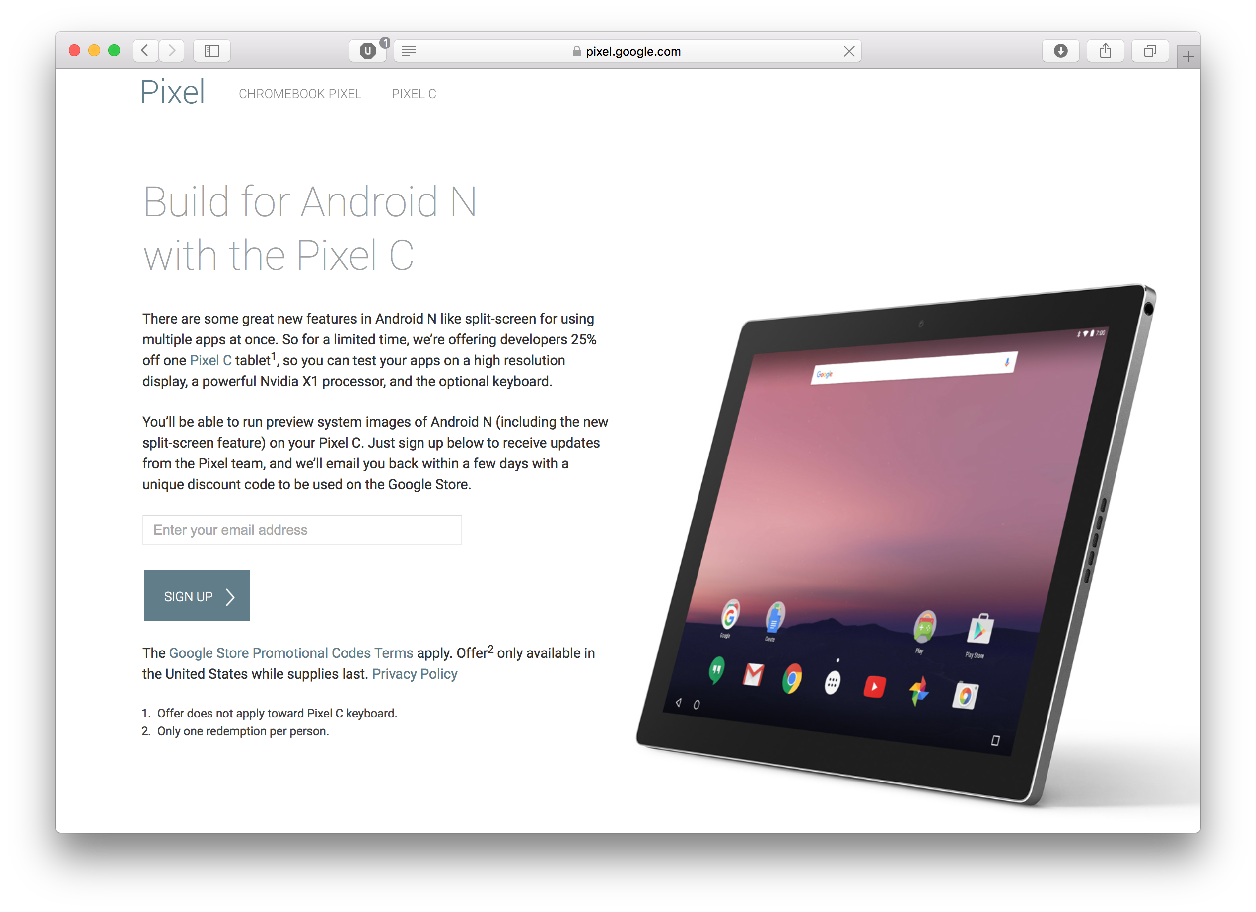
One last thing to note is Google's incentive for developers to test their apps on tablets so they can ensure proper Multi-Window support. For a limited time developers can sign up here to get a promo code which will knock 25% off the cost of the Google Pixel C. With Google recently having patched the most serious bugs on the Pixel C, for $375 it's a pretty good tablet and a very good device for doing application testing considering the fact that the Android N beta only works on two tablets. Interested developers can sign up here, and Google is seemingly taking people on faith that they really do intend to use the unit for development as it only involves entering your email address.
With Android N being in its early stages, I must say that I'm impressed with the stability and usability of the features that Google has added. With Google IO on the horizon we'll certainly be hearing more about what's coming in Android N, and I'm very excited about the direction Google is headed in.


124 Comments
View All Comments
raptormissle - Thursday, March 10, 2016 - link
The Samsung hack/implementation only worked with a relatively small number of apps - the majority being the ones you never used like Samsung apps.Brandon Chester - Thursday, March 10, 2016 - link
All that is is a link that takes you to the app to reply. This is an in line reply field.Le Geek - Thursday, March 10, 2016 - link
No, I was also talking about an in line field. In fact the reply field on my phone looks quite similar (if not exactly the same) to the screenshot posted in the article. Again, I am not sure whether this feature existed on stock android. But it sure is present on Zen Ui in lollipop.Brandon Chester - Thursday, March 10, 2016 - link
It didn't exist in that form in Google's Android. Hangouts is one exception where it opened that kind of ugly looking overlay for a moment, but apps like Skype just took you to the app where they now allow you to just type your response right in the notification itself.Le Geek - Thursday, March 10, 2016 - link
Okay, I get your point. Thanks.Le Geek - Thursday, March 10, 2016 - link
Here is a screenshot to back my claims.http://i737.photobucket.com/albums/xx20/ayushde9/M...
Brandon Chester - Thursday, March 10, 2016 - link
Is that Hangouts? I only ask because Hangouts actually has had that for a while in general, but it's not in line because it closes the notification drawer and opens an overlay. I actually have a similar screenshot on page three.Le Geek - Thursday, March 10, 2016 - link
Yes, that is hangouts. I actually saw that screenshot on the 3rd page and mistook it for the "new" in line reply feature being talked about in the article. I guess that's what happens when you try to go through an article in a hurry. My apologies.Drumsticks - Thursday, March 10, 2016 - link
I like what they've done with Android N. The notification shade replies are pretty useful, having an API that will let a developer make easy replies instead of having each individual app have their own is a good idea and should help spur its adoption. I'm looking forward to the beta being good enough to run daily!BenSkywalker - Thursday, March 10, 2016 - link
Outside of some developer flags and the new power saving elements, everything "new" you brought up has been in Android for years. Multi window baked into the base OS is nice, but that option has been around for a long time. Working with apps directly from the notification window- again- been around for years now. Battery icon not displaying a percentage- change it- I have an Android 1.5 device kicking around here that has numerical representation.I think AT should really just decide if they want to cover only iOS devices all the time, or if they actually want to continue with their Android articles. People seem to think your iOS coverage is great, your Android coverage is abhorrent to be as kind as possible.
You come across like much a Windows user who does every single task in Windows, and then tries to provide useful information on a new build of Linux.
"If I were to make any recommendations for Google, it would be to make it a bit more obvious to the user that you can hold down the multitasking button inside an app to instantly get into split view mode."
That's how we've been accessing all levels of Android multi tasking for more then half a decade now, but Google should change that.....? I could nit pick this article to death, you don't like Android, that's fine. You should find someone who does to handle these types of articles.