Apple's iPhone: The Future is Here
by Anand Lal Shimpi on July 2, 2007 6:13 PM EST- Posted in
- Smartphones
- Mobile
As predictable as what happened next may be, its truth is undeniable: I actually got better with the iPhone's keyboard. I wasn't as fast as I was on my Blackberry or even the Blackjack, but I was getting there and typing on the phone no longer made me want to kill myself with a SIM card.
There are really two tricks to getting reasonably fast with the keyboard, and Apple is very forthcoming with both:
1) Start with your index finger alone (give your thumbs the week off), and
2) Trust the auto correction
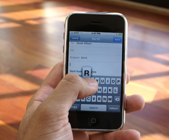
Using the index finger is important for one main reason: it's smaller than your thumb. Just as the cramped keyboard is an issue on the Blackjack and Curve, it's an issue on the iPhone. Since there are no distinct divisions between keys, it's very easy to cross boundaries and select a letter you didn't intend to. Whenever you tap a key, the key itself will get bigger to show you what you've just selected, hopefully exposing itself from beneath your finger. If you happen to select the wrong key, your initial instinct will be to delete and try again but that's not necessarily the best reaction with the iPhone as you'll soon see.

The iPhone will make you feel like you've got the fattest thumbs ever
With my index finger, I'm accurate and fast in typing on the iPhone. On my best days you'd swear a room full of monkeys were churning out a copy of Macbeth, that being said, I'm in desperate need of mastering two thumbed typing. Not only does typing long emails with a single index finger grow tiring, two thumbs are necessary to even remain competitive with typing speeds on regular qwerty keyboard devices.
I'm guessing the trick to mastering thumb typing is deliberate placement of your thumbs over the keys you wish to strike. Although your thumb is bigger than your index finger, the part of your thumb that actually triggers the keystroke isn't that much larger. The main issues seem to be that the thumb's contact patch is located in a different area, and the thumb covers up more of the keyboard, making it more difficult to 1) orient and 2) trust yourself, when typing. As you can probably guess, I'm still struggling with thumbs, but it looks like there's still room to grow in typing efficiency on the iPhone.
The iPhone does its best to replace tactile feedback with aural response; you get a rewarding typewriter keystroke sound every time you hit a key on the keyboard (you can disable this if you hate it). The sound is rewarding in the sense that once you actually get fast at typing, it sounds like your pounding out your fifth novel on your iPhone, and if you thrive on feelings of accomplishment like yours truly, it'll help you get better. It's like a personal trainer cheering you on as you work out, the sounds keep coming as long as you keep hitting keys, they don't care if you hit the wrong ones or not, and that's where the second trick comes in.
The early previews and reviews of the iPhone praised its autocorrecting capabilities, which I truly didn't understand because predictive text input has been around for ages. From a distance, that's all the iPhone appeared to have, a slightly cleaner interface to T9. On the second day of using the iPhone, I finally understood what all the fuss was about.

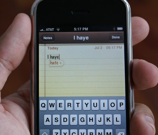
When you're entering text, the iPhone compares what you're typing to its built in dictionary and suggest words that it thinks you are trying to type. For example, if you are typing the word incredible the iPhone will figure it out once you've typed incredibl and suggest the full word. Hitting space at this point will accept the dictionary's suggestion, saving you a keystroke.

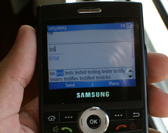
T9 in action
The first difference between the iPhone and some T9 based systems (e.g. the Blackjack) is that the iPhone provides a single suggestion while you're typing. If you enable T9 on the Blackjack, you lose some of your screen to a two-line suggestion of possible words you could be trying to type, which changes dynamically as you type away. The end result is a distracting element on the screen that adds marginal functionality on a device with a full qwerty keyboard vs. the iPhone method that remains nonintrusive.

If you don't like the iPhone's suggestion, simply tap the suggested word and it'll disappear. Note that just like T9 based systems, the iPhone's dictionary will grow based on your typing habits; proper nouns and other words will eventually start appearing as suggestions as you type them more frequently.
Both the T9 and iPhone approaches take some getting used to if you are a qwerty Blackberry user who isn't used to such aids, but the iPhone system has a gentler learning curve thanks to its simplicity.
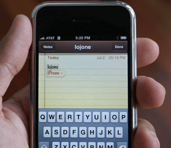
In addition to looking at the word you're typing, iPhone also looks at the keys you're hitting and the proximity of those keys to other keys that you may have actually wanted to hit instead. For example, the word iPhone comes preloaded into the dictionary, the device doesn't have to learn it. But if, while typing furiously with your index finger, you lose your bearings and type iogonr instead (the o key is right next to the p key, the g key is right next to h, and and r is right next to e), the iPhone will mathematically determine that although iogonr could be a word, it's also possible that you just fouled up your finger placement and meant to type iPhone. The software will suggest iPhone as a correction and all you have to do is hit space to accept it.
When Apple recommends that you trust the intelligence of the device, it's this analysis of finger placement that you need to trust. When typing, you know what keys you meant to hit, Apple's iPhone tries its best to figure that out as well (it doesn't like to be yelled at, so it tries really hard).


85 Comments
View All Comments
jay401 - Tuesday, July 3, 2007 - link
Now that's practically an unpardonable sin, given that it's such a basic request and something absent from most phones because most providers think people are dumb enough to pay money to download a ringtone (like hell would I ever do that nonsense).
So why not just let people use their mp3s? I already do that on my cellphone but since I can't do it directly I do it in a round-about way by sending myself the mp3 clips as attachments to messages sent to my phone, which I can then download and assign as a ringtone.
Why not just make it straightforward and easy? You'd think this is one thing Apple could do right. :(
jay401 - Tuesday, July 3, 2007 - link
from page 11:If I could read any of the incredibly tiny text in that picture, maybe I would be able to. ;P
Anand Lal Shimpi - Tuesday, July 3, 2007 - link
Seriously, the PDF looked shockingly good. Once you stretch to zoom in so you can actually read the slides, it's amazing. Yes, I realized being excited about how good a PDF looks on a phone is silly, but I figure after waiting in line for five hours for said phone, I've got nothing more to lose :)Take care,
Anand
Griswold - Tuesday, July 3, 2007 - link
You can't make videos on the phone, you can't copy/paste, there's no IM client, you can't replace the battery on your own, you can't add applications to it, there's no Flash/Java support, it's heavy and the list goes on. But here's the catch: there isn't a phone out today (smart or not) that doesn't have at least as long of a list of issues.But for a price tag like this, I expect a shorter list. And unfortunately, many of the things on this list are important to me.
Still, after being so skeptic about the iphone, I'd still like to have one (yea, it does have this star trek datapad feeling!!) but due to the flaws and shortcomings, i'll just wait for the next incarnation that will most likely hit the street within a year.
I dont believe in early adopting gear from a company with zero experience on this particular field, and while apple did most of their homework, my motto (rightfully) stands.
The next iphone will most likely be much better suited for me.
mongo lloyd - Tuesday, July 3, 2007 - link
Comic Sans? Really?plinden - Tuesday, July 3, 2007 - link
No - http://www.searchfreefonts.com/fonts/m9.htm">Marker Felt Thinmongo lloyd - Wednesday, July 4, 2007 - link
Oh ok. Equally terrible font, I'd say. Is that a standard-use font for Apple? Yikes to that.Sunrise089 - Tuesday, July 3, 2007 - link
Lots of personality, info that wasn't just a run down of specs, and best of all telepathy.I was actually thinking while I read this "I wonder if I'd be able to watch TopGear clips on this, since often they get pulled from Youtube. I scroll down the page, and see Clarkson staring back at me. Amazing.
One more thing, about the homeless guy's choice between the Enzo and the Veyron - between ugly and boring, I don't know which I'd pick either. After all these years, McLaren F1 FTW!
Yongsta - Tuesday, July 3, 2007 - link
Nice Review, the iphone sounds great but $600 is out of my budget. Hopefully Apple in the future releases new types of iphone's at affordable prices. Maybe Samsung/Nokia/Motorola will try to make a copycat phone but they probably cant match Apple's UI.Locutus465 - Tuesday, July 3, 2007 - link
I do love the looks of the iPhone... However if everything I hear about it is true then it would not interest me. Complete lack of 3rd party software support? If this is true then yikes! I've got my Windows Mobile phone running with quite a bit of 3rd party software and for me that's a huge must... Like my Trillian like all in one chat client, Pocket Putty, CISCO VPN client and of course, pocket mahjoong (spelling?).Also, I've heard for a closed system they missed the boat on what would be some truely killer features (which could be solved via allowing 3rd party software). For instance it has (google?) maps, yet from what I hear no GPS integration? Why not? At least in windows mobile you have options (though yes, it's not built into that platform either).
It would however, be nice to see more cell companies consentrate on end user experience... It's appriciated that is for sure.