The iPhone SE Review
by Brandon Chester on May 16, 2016 8:00 AM EST- Posted in
- Smartphones
- Apple
- Mobile
- iPhone
- iPhone SE

With the launch of the iPhone 6, Apple had finally tapped into the latent demand for bigger iPhones, and as a result we saw some record-setting quarters from Apple. However, at the same time by moving to a larger display size there was a fairly sizeable audience that was being left behind. While a 4.7" phone is generally a one-handed device for most, there's definitely a sizeable portion of iPhone users that bought the iPhone 5s because the 4-inch size was the largest they could go without facing problems with one-handed usability.
The other challenge that Apple faced was their need to be more competitive at the mid-range. For a lot of people, 300-400 USD is pretty much the most that they can afford to pay for a smartphone, and as a result the value proposition for an iPhone flagship that was two generations behind the latest was increasingly weak in markets like India and China, especially when Xiaomi and Huawei were often shipping the latest and greatest hardware for similar prices. While margin might not be as high in this segment of the market, the volume here can definitely compensate.
With these two issues in mind, this brings us to Apple's newest iPhone, the iPhone SE. As Apple's smaller iPhone, the iPhone SE has two functions. It provides a viable option for users who want a smaller iPhone, and it allows Apple to sell at price points that they can't reach with their larger and more expensive iPhones. This is especially key with Apple's push to increase sales in emerging markets like China and India, as for many people the price of the iPhone 6s and 6s Plus makes them inaccessible. As you'll see, the iPhone SE brings the price of a new iPhone lower than it has ever been before.
It's probably no surprise at this point, but the iPhone SE is going to be a familiar phone. With essentially the same chassis as the iPhone 5s, the iPhone SE marks the first time that Apple has used the same design in three generations of an iPhone. While the iPhone SE is the same as the iPhone 5s on the outside, Apple has made some serious improvements to what's on the inside. Below you can see how Apple's new 4-inch smartphone compares to its predecessor, and to Apple's flagship iPhone, the iPhone 6s.
| Apple iPhone Line | |||
| Apple iPhone 5s | Apple iPhone SE | Apple iPhone 6s | |
| SoC | Apple A7 2 x 1.3GHz Apple Cyclone |
Apple A9 2 x 1.85GHz Apple Twister |
|
| GPU | PowerVR GX6450 | PowerVR GT7600 | |
| RAM | 1GB LPDDR3 | 2GB LPDDR4 | |
| Display | 4.0-inch 1136 x 640 IPS LCD |
4.7-inch 1334 x 750 IPS LCD |
|
| Size / Mass | 123.8 x 58.6 x 7.6 mm 112 grams |
123.8 x 58.6 x 7.6 mm 113 grams |
138.3 x 67.1 x 7.1 mm 143 grams |
| Camera | Rear Facing 8MP iSight with 1.5µm pixels + True Tone Flash |
Rear Facing 12MP iSight with 1.22µm pixels + True Tone Flash |
|
| Front Facing 1.2MP f/2.4 |
Front Facing 5MP f/2.2 + Retina Flash | ||
| Storage | 16GB 32GB 64GB |
16GB 64GB |
16GB 64GB 128GB |
| I/O | Apple Lightning connector, 3.5mm headset | ||
| WiFi | 2.4/5GHz Dual Band 1x1 802.11n BT 4.2 |
2.4/5GHz Dual Band 1x1 802.11ac BT 4.2, NFC |
2.4/5GHz Dual Band 2x2 802.11ac BT 4.2, NFC |
| Price | 16GB: $449 | 16GB: $399 64GB: $499 |
16GB: $649 64GB: $749 128GB: $849 |
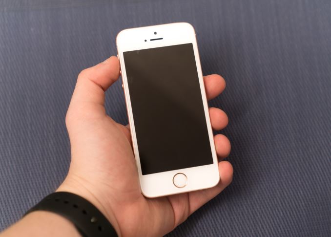
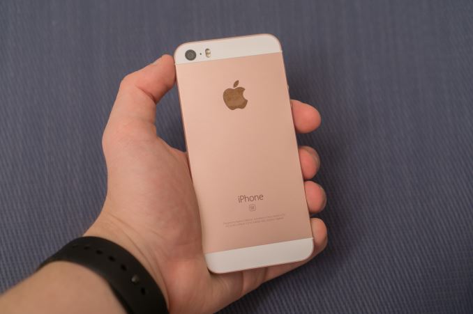
Even if I hadn’t put any images on this page, it’s likely that you’d be able to visualize the design of the iPhone SE. At its core it’s a design that has been around since 2012, with a few tweaks having been made along the way. Despite that, it’s a design that still holds up, and I think the HTC One M7 is the only other device from that time that you can really say that about today.
From an aesthetic point of view, the chassis style of the iPhone 5, 5s, and SE is still one of my favorite smartphone designs. The flat sides, chamfered edges, circular volume buttons, and antenna inserts all make for an elegant look, and in my opinion it’s actually a more visually appealing design than that of the iPhone 6/6s which uses injected plastic antenna lines, chiclet buttons, and a camera hump. On the flip side, the iPhone 6 definitely comes ahead as far as ergonomics are concerned. The flat sides and chamfered edges of the SE make for an elegant design, but when you make a phone with flat edges on all sides you inevitably end up with a somewhat brick-like device that doesn’t conform well to the human hand. The fact that the iPhones with this design have all had displays of 3.5” or 4” lets them get away with this due to their smaller profile, but there’s no denying that the curved iPhone 6 design has a better in-hand feel.
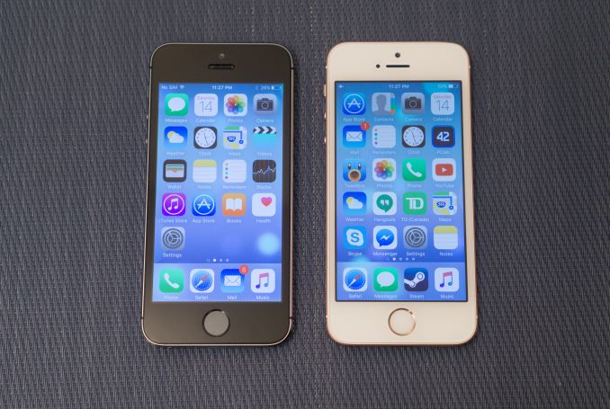
Almost nothing has changed externally going from the iPhone 5s to the SE. The dimensions are unchanged, and the mass has only gone up by a single gram. I've only noticed two changes. The first is the elimination of the regulatory logos from the rear of the chassis, and the second is a change from a shiny chamfered edge to one with a matte finish that matches the rest of the chassis. Beyond that, and the inclusion of the new rose gold color, the design is unchanged from the iPhone 5s.
Going with an older design has some advantages and drawbacks, and some of these end up being the same aspect viewed from two different perspectives. For example, with the SE being a less expensive iPhone in an older design, Apple isn’t pushed to make it the thinnest possible device. While this is arguably a bad thing by Apple’s own standards, it does mean that there’s more space for the battery than if Apple were to slim down the device, and you don’t get a camera hump. The older design does come with a fairly large bezel on the left and right sides of the screen relative to the size of the display itself, and the black space between the white face plate and the actual screen is significantly thicker than on newer iPhones which does make the design look a bit dated.
The iPhone SE may be part of a larger general trend where smartphone designs don’t change as significantly from generation to generation now that the market is maturing. In many ways, having to change your design every year is actually not a good thing, as it implies that your past design had significant flaws that necessitated a brand new one. Samsung’s Galaxy S7 is a good example of this, with the design changes being minimal but noticeable refinements on the existing Galaxy S6 which had a much better design than its predecessors. Good design is long-lasting, and much like how the truly good laptops on the market can keep the same design for many years, smartphones will likely begin to do so as well, with smaller refinements to accommodate new features, and in Apple’s case, a continued reduction in device thickness.
Ultimately, the design of the iPhone 5 and 5s still works, and there aren’t any significant flaws with it that would necessitate a change in design. With it being a well-known and, as Apple puts it, beloved design, it’s not surprising to see it return for a third time in the iPhone SE. While there are some small tweaks like changing the chamfered edge from a reflective to a matte finish, the core design is the same one that Apple’s existing owners of 4” iPhones know and love.


138 Comments
View All Comments
michael2k - Tuesday, May 17, 2016 - link
What exactly did you want to see? S7 is slightly slower than the iPhone SE in CPU, slower NAND, slightly faster in GPU offscreen, slightly slower in GPU onscreen (due to larger and higher resolution screen), several hundred dollars more, and about the same battery life.http://www.anandtech.com/show/10120/the-samsung-ga...
Che - Wednesday, May 18, 2016 - link
I want to read reviews for the various android phones released this year. I am not in the market for an iPhone, personal preference.I think you missed my point.
michael2k - Friday, May 20, 2016 - link
I did, sorry. When you said 'lack of review of Galaxy S7' I had misinterpreted your comment as a complaint that they didn't compare the SE to the S7.jav_eee - Tuesday, May 17, 2016 - link
The only part I disagree with is where you mention that the 6 feels better in the hand. I don't think it does. It is much too slippery. The 5 was perfect.Silvio6 - Tuesday, May 17, 2016 - link
This looks like the benchmarks were extracted from a tool, and not realy real-life tests. For example, i was told the fingerprint sensor was slower than the one from the 6 and 6s. How much slower ? The one in the 6 is acceptable, but i wish there was the one in the 6s. There is no mention of it in the tests, and this is something anyone would be confronted to multiple times a day.bodonnell - Wednesday, May 18, 2016 - link
It is slower than the 6s, but at worst it should perform similar to Touch ID in the 6 as both use the 1st gen sensor. In practice it may be slightly faster than the 6 as the A9 chip processes the unlock faster than the A8 in the 6.heartinpiece - Tuesday, May 17, 2016 - link
For the NAND tests are the read/writes to NAND encrypted?I'm guessing some of the other compared devices are not encrypted... Could you elaborate, or distinguish the encrypted from unencrypted devices?
Brandon Chester - Tuesday, May 17, 2016 - link
In mobile if a device is encrypted then you're usually stuck with that, so I don't see any point in differentiating. In the end we're still comparing devices as they work within the limitations of their hardware and software, not the hardware components individually.gochichi - Wednesday, May 18, 2016 - link
I'm really happy with the Nexus 5X, including the great price, camera, 32GB option, etc. I'm a happy camper.Nick Arthur - Wednesday, May 18, 2016 - link
It seems a transitional version between 5 and 6 but combines some advantages of the two version together. The price is much cheaper, exactly.