Microsoft BUILD: Windows 8, A Pre-Beta Preview
by Brian Klug & Ryan Smith on September 13, 2011 12:05 PM EST- Posted in
- BUILD
- Windows
- Microsoft
- Windows 8
- Trade Shows
The Technical Side Of Windows 8: Cont
Moving up the chain, Microsoft has added a number of base class drivers for hardware in Windows 8. This includes not only USB 3, but also class drivers for mobile broadband radios, sensors, and even printers. For printers this means Windows 8 can print to roughly 70% of all Windows 7 certified printers without an additional driver, which is nearly a necessity for Windows 8 as an ARM tablet OS, as drivers may not be available and tracking down a driver flies in the face of the modern pre-configured OS model for tablets.
For mobile broadband things are a bit more interesting. With this addition mobile broadband is being promoted to a first class connectivity option, right up there with Wi-Fi and Ethernet. Mobile broadband hardware can then be integrated into a laptop or a tablet or added via a dongle without requiring a driver or a complex dialer/manager application. Managers will still exist in a lesser form as a Metro application; Microsoft included one such example with the tablet we tested, which had a working AT&T 3G modem and its associated management application.
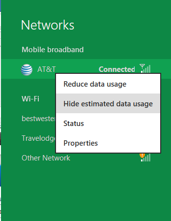
Windows 8 will also be aware of the limitations of mobile broadband connections, with an emphasis in usage caps. Given appropriate information by the ISP Windows 8 knows to halt background download processes (e.g. Windows Update, weather updates, RSS) to keep them from consuming valuable bits, and to notify the user if the device is approaching the cap and would be subject to overages. Along these lines Windows 8 also knows to switch to another source (i.e. Wi-Fi) when it’s available to avoid using up those metered bits.
We’ve mentioned permissions before when talking about the Windows Store, but it seems prudent to mention it again. For Metro applications Windows 8 will have a more fine grained permissions model than existing low/user/admin level privileges, by implementing Android style permissions. Metro applications will only be able to access the resources and data they were approved for, reducing the ability for a compromised application to be used as a launch pad for further attacks.
Our next stop on our look at the technical details for Windows 8 is the boot process. Microsoft put up an interesting blog last week discussing Windows 8’s new boot process, which was reiterated here – Windows 8 boots up much faster than Windows 7 thanks to the fact that only user processes are shut down, meanwhile the kernel is hibernated rather than shut down, shaving off a lot of time that would be needed to reload the kernel from a fresh boot. Realistically you need a motherboard with a very fast POSTing sequence, which means this is best paired with UEFI-based OEM boards. Certainly self-built systems will improve too, but we would not expect by as much.
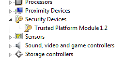
The other new fact discussed about the Windows 8 boot process was that Microsoft is making another push to secure it through chain of trust hardware (presumably a TPM module), this time under the name Secure Boot. Utilizing the chain when available, if Windows 8 detects that a boot component has been modified it will fail the boot and kick over to the Windows Recovery Environment to restore the OS to a fixed state. With ARM devices (and even most PC tablets) the use of this feature will be a given, but obviously TPM hardware is much rarer on laptops and desktops.
Windows’ anti-malware features will also be making an appearance in the boot process. Windows Defender (which now includes Microsoft Security Essentials) now loads immediately after the critical boot components are loaded, allowing Defender to check everything that wasn’t protected by the Secure Boot process above.
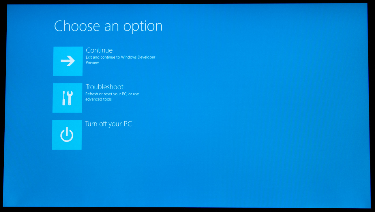
Finally when it comes to booting, the last bastion of the CLI in the Windows boot process is gone. The F8 menu has been replaced with a GUI based Windows Recovery Environment. The WRE goes hand in hand with two other recovery features: Refresh and Reset.
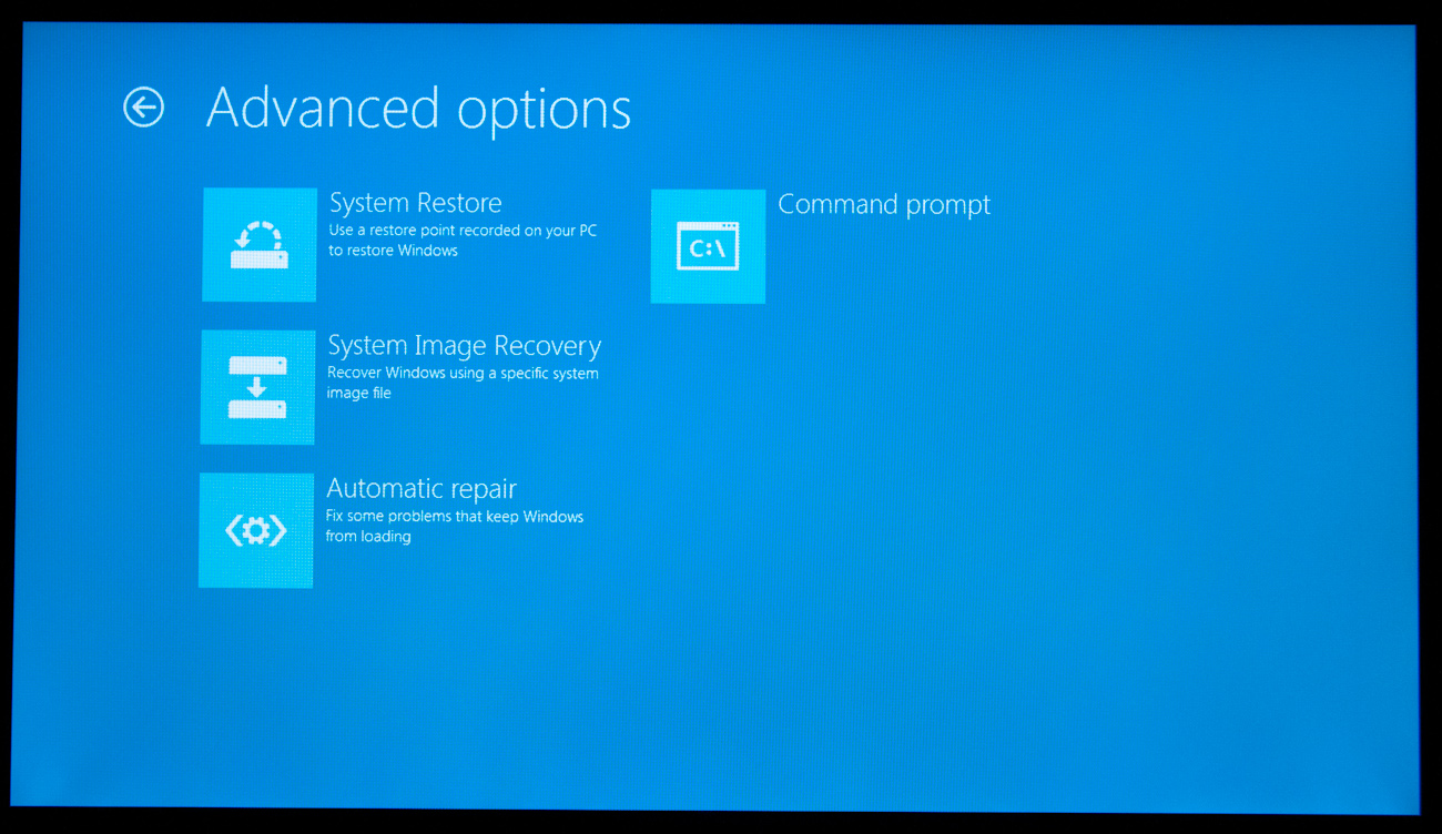
Reset is a Windows-based implementation of OEM OS recovery partitions: when Reset is triggered, the entire system is overwritten by the restoration copy. As for Refresh it’s a bit more nebulous; it’s apparently a new implementation of Windows’ existing Last Known Good Configuration, allowing users to revert anything crapware may have done. But we don’t have the full details on its underpinnings at this time.
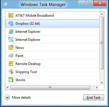
Last, but certainly not least we have the Task Manager. Other than a couple of minor changes with Windows Vista the Task Manager has remained nearly unchanged for years, so of course Microsoft has gone ahead and overhauled it. By default the new Task Manager is extremely simplified and only lists running user applications, thereby ensuring users only close applications and not background processes and such by mistake.
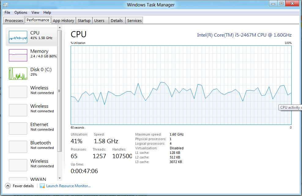
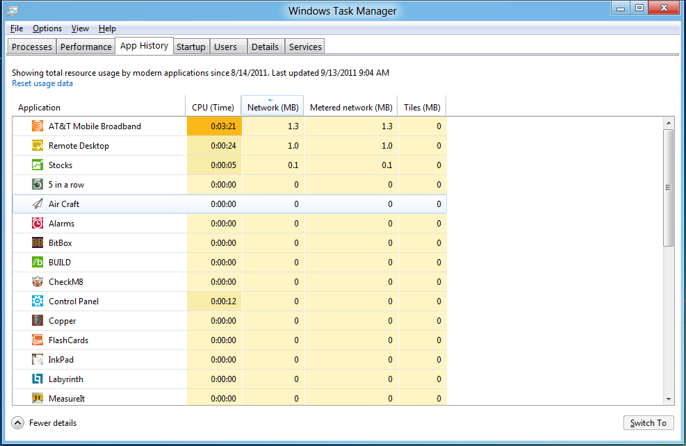
In detailed most the Task Manager takes on a more traditional appearance, giving you greater details about all of the running processes (including breaking them down by application or background process), but also a number of new performance metrics (largely taken from Windows 7’s performance monitor), and even an over-time breakdown of the resource usage of all of the system’s installed Metro applications. Interestingly the Task Manager itself is not strictly Metro, but rather a desktop application that doesn’t require the desktop environment to be loaded.


235 Comments
View All Comments
Booster - Tuesday, September 13, 2011 - link
Exaclty. MS needs to get rid of Julie Larson-Green, the infamous inventor of the wretched ribbon and I suspect this abomination.BioTurboNick - Tuesday, September 13, 2011 - link
The ribbon is great. I'm sorry that you love trudging through menus to find the things you want.frozentundra123456 - Tuesday, September 13, 2011 - link
I agree with Booster. I absolutely hate the ribbon in Microsoft Office. It may add a lot of things that menus didnt have, but most of them are worthless. It requires considerably more steps to do simple tasks.The ribbon may be OK for someone who uses Office all day, every day, for business tasks. But I use it in a scientific setting, and just want to use the basic commands as quickly and easily as possible. For this kind of use, I really, really hate the ribbon.
ph0tek - Wednesday, September 14, 2011 - link
How did you manage to post that on DOS?Anyway... I bet the vast majority of people making the kind of comments as yourself are pretty old. Either that or just stupid. The Ribbon is better. Not debatable. New users of Office all agree it's better and do far better using it, thats a fact.
On Win 8 you can even customise the ribbon, or make a quick access bar with your own most used ribbon buttons. Instant access. You can get more quicker or efficient than that.
cjs150 - Wednesday, September 14, 2011 - link
No the ribbon is not better. I am a power user of word, our documents often run to 100 pages, with tables of contents, multiple level headings and paragraphs, track changes, charts and tables. When we get board we throw in columns as well.Let me take a simple example that happens all the time. Your document has track changes on it but is formatted incorrectly (for example you need to use keep with next). Right clicking the mouse will not bring up paragrpah settings because according to MS the context is tracking changes, so you go up to the ribbon, which is of course stuck in review mode because that was the last time you used it to switch track changes on, now scroll back to the home section of the ribbon, Where are the paragraph settings? - Not obviously there, you have to click on the little arrow in the bottom right of the paragraph tile on the ribbon and finally you have got what you needed.
And they call that an improvement?
The ribbon is fine for people who write a letter once every few days, but a complete waste of effort for business
BioTurboNick - Thursday, September 15, 2011 - link
That sounds like an imperfect implementation, not a problem with the interface style per se.quanta - Tuesday, September 13, 2011 - link
Since the introduction of Windows XP themes, the usable screen spaces have been on the decline.First of all, the default XP themes wasted more spaces by creating bigger margins/paddings between interactive screen elements just to fit pretty effects instead of making more efficient use of the same UI margins found in Classic theme while dressing up the visual.
Then came Windows Vista's Aero, which wastes even more space by switching to Segoe UI, where in its default configuration, has a bigger font sizes than the already inflated XP theme. Worse still, Segoe UI is one of the later ClearType-optimized fonts that looks blurry even after tuning, and ClearType itself isn't even designed for alternate subpixel layouts like non-aperture grille CRTs and Sharp Quattron (ClearType is only defined for 3-subpixel array, not 4-subpixel), making the default Vista UI look even worse on old and new monitors. Shrinking Segoe UI may have saved some screen estate, but the ClearType-tuned fonts are optimized for larger point sizes than the venerable Tahoma or even Microsoft Sans Serif, so it trades one compromise with another. The screen margin wastage is even worse than the XP themes. With all these new-fangled update, one would expect it the Aero UI will be more customizable, but it is not. You may be able to adjust the theme colours of Aero, but if you want to switch the colour of single elements such as (in)active menu bar or title, or switch the Aero font, YOU CAN'T! Well, at least not without hacking the system libraries[1], or going through the pain of editing the features with tools not supplied with the operating system, or use the Windows Classic theme. Windows 7 may have the mean of using the UI to build custom theme[2], but there is still zero method for conserving screen estates using Aero theme unless manually editing .theme files[3].
In this next Windows iteration, the incorporation of ribbon just add more clutter to the desktop. While the ribbon is needed for touchscreen uses, the way it is organized is far from most efficient. Does the ribbon really need text description over a button group for the buttons that already have descriptions on them? Desktop aside, the Metro fails to reuse the ribbon on the desktop UI, which would have provide a more consistent experience when switching between Metro and desktop, and even with the already bloated Windows 7-based UI, the ribbon layout still uses screen space more efficiently than Metro.
[1] http://www.howtogeek.com/howto/windows-vista/how-t...
[2] http://windows.microsoft.com/en-US/windows7/create...
[3] http://msdn.microsoft.com/en-us/library/bb773190%2...
Impulses - Tuesday, September 13, 2011 - link
Anyone else concerned that Win 8's multiple display support will be pretty hobbled? I'm already iffy on the whole Metro style, switching back to Metro to open unpinned apps when working on the traditional desktop seems horribly inefficient... But I don't see how that's gonna scale across multiple displays, I guess ideally you could leave the start panel with it's live tiles on a second screen, but MS has a history of ignoring multiple display users...We still rely on 3rd party tools to extend the taskbar or fine tune wallpapers across three displays... It's a shame too because after multiple cores and SSDs, multiple displays has been the biggest productivity boost I've gained thru hardware in the last 10 years.
BioTurboNick - Tuesday, September 13, 2011 - link
http://www.winsupersite.com/article/windows8/windo...Multiple monitor support is improved. Though this is just the desktop, not Metro.
CSMR - Tuesday, September 13, 2011 - link
That was fast. Thanks for the info Anand!