First Look: Viewsonic G Tablet and Tegra 2 Performance Preview
by Vivek Gowri on December 9, 2010 3:04 AM ESTThe slate computing market is about to explode, with a literal flood of new tablets releasing over the coming months. Many of them will be Android based, running Nvidia’s Tegra 2 SoC. Nvidia made a big deal about Tegra 2 back at CES 2010, but for some reason, it’s taken quite a bit of time for anything running the platform to hit the market. Finally, we have one - the Viewsonic G Tablet.
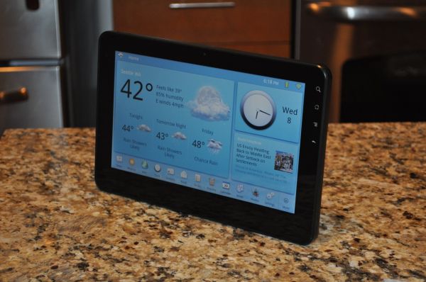
The Tegra 2-based Viewsonic G Tablet showing the Tap UI homescreen
The specs are pretty straightforward; we’ve got a 10” WSVGA display with LED backlighting, Android 2.2 with a specialized UI skin on top, a 16GB microSD card, 2.4GHz 802.11n, Bluetooth 2.1, a 27 Whr lithium ion battery, and the Tegra 2 SoC. The dual-core Cortex A9 is clocked at a nice, round 1 GHz, and there’s 512MB of LPDDR RAM on board. The GPU is Nvidia’s Ultra-Low Power GeForce GPU and there are separate HD video encode and decode blocks also onboard. But the big deal with Tegra 2, as Anand went over in his first look at the SoC, is Cortex A9. The A9 is an out of order architecture with a relatively short pipeline, so it should be significantly faster than the in-order A8 on a per-clock basis.
But before we get to the performance aspect, let’s give the tablet a once over. The Viewsonic is not the most interesting physical specimen, just a screen with a thin bezel around it. From the front, it looks nearly identical to the Galaxy Tab and any number of other tablets on the market. The sides are pretty plain, with volume buttons at the top and a dock connector and mic at the bottom. The left side has a mini USB port, a headphone jack, and a power jack, while there are speakers on either side. The back is filled with logos - Viewsonic, the gTablet logo, the American distributor’s logo, barcode, FCC ID, etc - but otherwise pretty plain. Build quality is actually pretty decent and the tablet has a pretty weighty feel in hand. There’s no flex anywhere, and while the casing doesn’t feel particularly high quality, it’s not low quality by any means. There are some touches in the industrial design that make it seem a bit cheap. The capacitive touch buttons are off-center and easy to press inadvertently, and the physical buttons are placed pretty haphazardly. One thing that really threw me off is the volume rocker, which is switched from the logical layout (volume up is the lower button, volume down is the upper button).
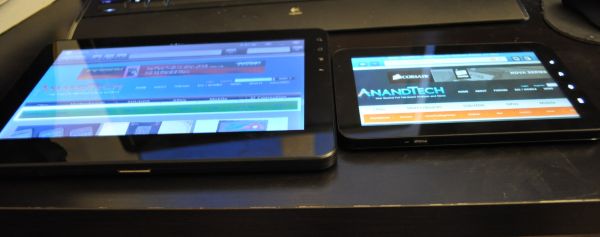
The Viewsonic (left) next to the Samsung Galaxy Tab, both on maximum brightness, to illustrate the viewing angles of both tablets
But for $399 for a Tegra 2 tablet, minor quibbles about build quality and industrial design are about what one should expect. I also expected a not-so-great screen, but not like this. I know that not everyone can splurge like Apple did and go for an IPS screen, but when you look at the TN panels in these and other tablets, it really does make sense. The problem isn’t contrast ratio, the 432:1 figure is actually pretty good for a netbook screen and much better than most small notebooks. It doesn't match the iPad's amazing 934:1 contrast ratio, but still, contrast is not the problem. Unfortunately, the max brightness is not that high at 186nits, which only exacerbates the terrible viewing angles. Something I’ve realized in using tablets - the viewing angles matter a whole lot more than they do in laptops. As is typical with widescreen displays, the horizontal viewing angle is decent, but the vertical viewing angle is pretty bad - anything more than 30 degrees off center and the screen completely washes out. If I try to lay it flat on my desk and use it like my iPad or the Galaxy Tab, it’s basically impossible to see anything on the screen. For a device with a usage model so heavily dependant on good off-center viewing angles, speccing a screen with poor viewing angles was a pretty big oversight.
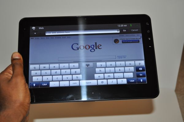
Viewsonic's Tap UI landscape split keyboard in the revised browser interface
Viewsonic loaded their own Tap UI onto the G Tablet. It’s a decent looking UI, but it’s aggravatingly slow and makes most of the navigation through the OS pretty painful. As with most tablets, there’s no Market preinstalled on the G Tablet (Samsung is the exception here, since they have managed to work around the Android Market restrictions). However, the XDA developers forum is your friend - there’s a simple workaround to get Market and other Google applications enabled, and it’s also possible to disable the UI skin. We’ll go over the software package and hacking aspects of the G Tablet in the full review; for now just know that the preloaded UI is pretty terrible, you'll want to disable it as soon as possible.
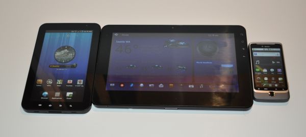
The G Tablet (center) next to the Galaxy Tab (left) and T-Mobile G2 (right)
Our first impressions of the G Tablet, beyond the woeful viewing angles and the unfortunate UI skin, is actually that of a fairly usable budget tablet. The user experience is actually pretty decent once you get out of the main UI and into an app or a browser window, and the split keyboard in landscape mode is much better than expected. The tablet has a nice, weighty feel in hand, but if you're using it in landscape mode, it might feel a little heavy for one-handed operation. The touchscreen is responsive enough, though it doesn't feel quite as sensitive as the Galaxy Tab or the iPad. That could just be because of the overall sluggishness of the UI, but we'll see about that after I load the stock Android UI onto the G Tablet. We'll see, but at first brush it looks like the main problems with the Viewsonic are the screen and the UI. We'll have a full review later on with more complete impressions and battery life numbers, but for now, we'll leave you with a preview of Tegra 2 performance.


78 Comments
View All Comments
dcyli - Thursday, December 9, 2010 - link
Nice, I never thought that the viewing angle would play so much in slates.VivekGowri - Thursday, December 9, 2010 - link
What's up, my friend. But yeah, viewing angle is huge. That shot of the Gal Tab vs Viewsonic is taken from my vantage point on my desk. The Viewsonic is pretty awful as far using away from you goes. If you go more than 15deg off center in either direction, you get shafted and everything washes out.BuddyRich - Thursday, December 9, 2010 - link
This is something Apple doesn't get enough credit for, that being their very nice IPS screen. Hopefully another company implements one in their tablet offering, though most seem to be going with the AMOLED.For the full review I hope you add a few more existing games into the benchmarks to further test the tile-based optimizations vs. Nvidia's architecture and of course doing the browser and usage tests with stock UI vs. Viewsonic's custom one (though I think you mentioned you would be doing just that).
B3an - Thursday, December 9, 2010 - link
They're right in going with AMOLED. It has even better viewing angles than IPS, better contrast, and blacks that are as black as you can possibly get as the pixels are just turned off for black.melgross - Thursday, December 9, 2010 - link
I don't see companies going for AMOLED screens for tablets for some time, because of the price. At least another year. Of course, if you consider something as small as the Streak to be a tablet, then we may see some sooner.But I'm not so impressed with any of the AMOLEDs so far because of their low brightness, and inability to work outdoors on a bright day. My friend's Samsung is tidally washed out no matter how bright he makes the screen. A couple more generations and that may be solved.
therealnickdanger - Thursday, December 9, 2010 - link
You'll never run into a person that intentionally holds his device in direct sunlight. Every human being I have encountered even since the first laptops were built, regardless of screen technology, always seeks refuge from direct sunlight via different angles, shade, indoors, or cupping a hand over the display.I think your expectations are strange. We'll likely never see a display technology that looks the same in broad daylight as it does in a controlled environment. Sure, some displays are brighter than others in daylight, but I have yet to see one that wasn't viewable to the point where usability was threatened. I have both OLED and LCD phones and I've had no issues reading text or viewing pictures in direct sunlight. Sure, I notice a difference between the two, and certainly between indoor and outdoor, but I don't enjoy viewing LCDs in direct sunlight any more than OLEDs.
If they can improve it, great, but hopefully not at the expence of what make OLEDs so attractive in the first place.
kmmatney - Thursday, December 9, 2010 - link
There are times when its hard to avoid the sun - like trying to use your GPS in the car, on a bright day. Here in Denver, we have a lot of bright days, and this is often in important issue.Zan Lynx - Friday, December 10, 2010 - link
Transflective LCD is pretty great in direct sunlight.I still have a Sharp Zaurus that is excellent for reading ebooks outside. I can turn screen brightness to the minimum and read for several hours.
melgross - Saturday, December 11, 2010 - link
Every single human you've met? What about the non humans then? Strange way to put it. I've seen several AMOLED phones, and none of them were worth a damn in the sunlight. Every review of those phones says the same thing. I'm scrptocal when someone says that their's works well enough for that reason.Yes, no one deliberately holds their phone in direct sunlight. But sometimes itmcan't be helped, and cup g your hand over it rarely helps much. But, these are tablets we're talking about. No matter how big your hand is, it won't help on these screens. Even the small 7" tablets are too big for that, and the 10" models are much too big.
I'm certainly not saying that they should be the same in the sunlight as indoors. For you to assume I did is odd.
I do expect that at some point, when efficiency allows much higher brightness levels in AMOLED displays, we will see them working much better outdoors. But now, they are much dimmer than the best LCDs. Again, you can check the reviews and comparison tests. And it's brightness that determines how well a display will work outdoors.
taltamir - Friday, December 10, 2010 - link
in addition to be better contrast, better viewing angles, better blacks etc... it also takes 1/3 the electricity and is a lot lighter and thinner.