The HTC One (M8) Review
by Anand Lal Shimpi & Joshua Ho on March 26, 2014 7:00 PM EST- Posted in
- Smartphones
- HTC
- Mobile
- HTC One
Display
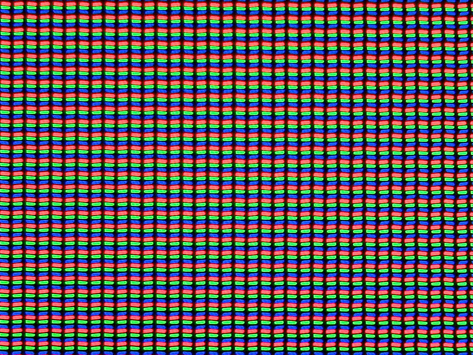
The new One increases its display size from 4.7” to 5.0”. The M8’s IPS Pro panel (read: IPS) still features a 1080p resolution. There are no funny subpixel arrays here, just a standard RGB stripe. HTC isn’t using in-cell touch, although Synaptics supplies the touch controller for the M8. The display is a MIPI command mode type panel (effectively supporting self refreshing of the panel).
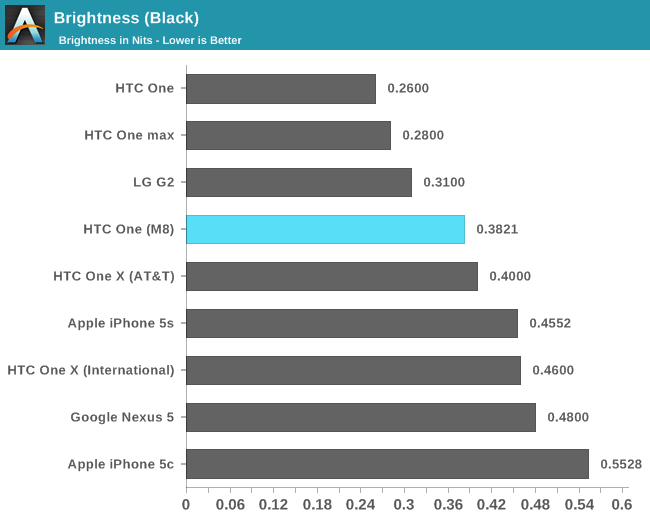
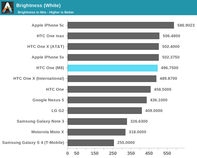
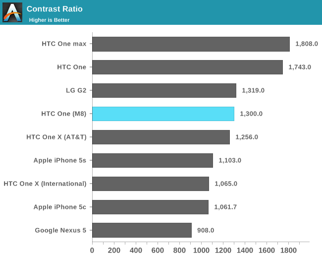
The overall display experience on M8 is near identical to M7 from a color accuracy standpoint. Black levels are higher than our original M7 sample, but max contrast ratio is still a healthy 1300:1.
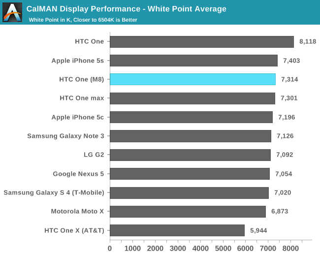
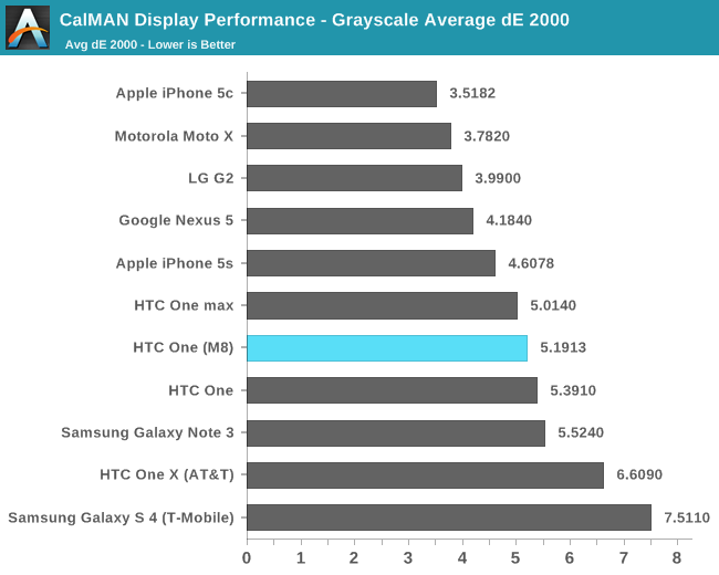
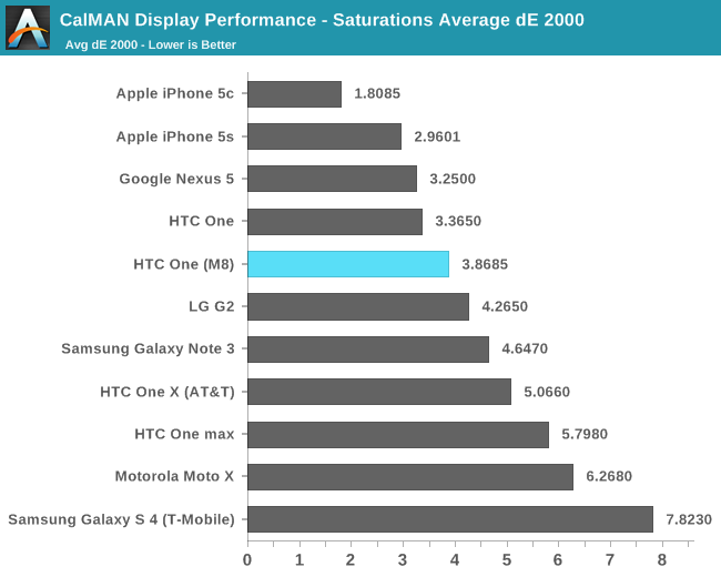
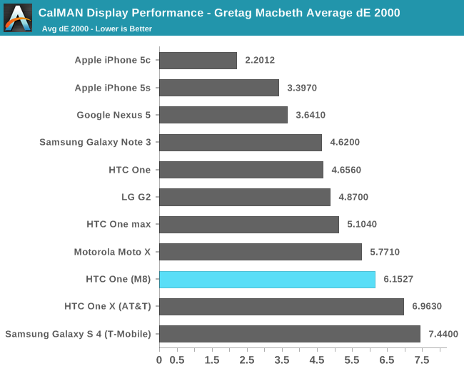
The M8’s display isn’t bad by any means, but I continue to be disappointed in the lack of attention paid to pursuing greater color accuracy among most Android OEMs. The Nexus 5 and 7 are the targets to aim for in that space - I hope we’ll eventually have more than Google pursuing them.


222 Comments
View All Comments
althaz - Wednesday, March 26, 2014 - link
Why are the OLED screens not listed in the brightness for black and contrast tables? Yes, they have zero black levels and infinite contrast, but that's the level LCDs should be aspiring to and it's worth comparing them, IMO.There's a reason most people go for OLED screens (despite almost every reviewer preferring LCDs), they have MUCH better contrast. IMO this is a serious flaw of all LCD phones and should be mentioned. Sure, the tradeoffs may well be worth the relatively poor contrast, but that's something each user has to decide for themselves.
Braumin - Wednesday, March 26, 2014 - link
There's not enough horizontal pixels to graph infinity.evonitzer - Saturday, March 29, 2014 - link
True, but it still seems like there should be some mention of that, or just putting them at the top a bit above the leader. When I was looking at HDTV's some years ago, black levels were of very high priority, hence me getting a plasma. To think we would have perfect blacks on phones and people would shrug just a few short years later ...hangfirew8 - Wednesday, March 26, 2014 - link
Great review, not enough reason to trade-up from my M7, especially given the OIS video difference.I'll repeat my request to review the matching car dock and car mode/launcher with each review. With so many places passing hands-off laws for drivers, this mode is more and more important, and is obviously not given enough attention by either OEM's or reviewers.
Besides car dock mode, I really think a BT test such be conducted against, say, a Pioneer, a Kenwood and some select factory auto receivers. Complaints about niggling sync or lag or other bugs are common, but if no one is reviewing these combinations systematically, the manufacturers of both the phones and the car audio systems are not going to do anything about it.
Think of it this way- many phones spend most of their screen-on operating time docked in a car dock or holder of some kind, and BT synced with the receiver. It is the second most common operating usage after sitting beside us on our desk or armchair.
SorryItsAThrowAway - Wednesday, March 26, 2014 - link
I disagree that Sense UI is the best experience "bar none." If you've only compared it to Samsung or LG - then, sure. That would be an obviously true statement. However other manufacturers have arguably far more usable designs. If we stay with the Western audience as this article so clearly does then the best examples would be Motorola recently and even more especially Sony.Even if these still somehow came up short to Sense (debatable) they are certainly not so far away from the strong wording this review claims.
dylan522p - Wednesday, March 26, 2014 - link
Moto isn't classified as a skin and Sony adds VERY VERY little features and a lot of pointless changes.SorryItsAThrowAway - Wednesday, March 26, 2014 - link
I disagree. If it isn't stock then it's a skin. Moto is very minimal. Sony as well but they also have an entire theme system to change things like the appearance of the on-screen interface buttons. So, Sony can go either way with that in mind (good or bad).rxzlmn - Wednesday, March 26, 2014 - link
That's wrong. Sony keeps the main UI elements all the same, but does add many little helpful things. But they don't change how things behave and look in terms of usability compared to stock (different from HTC, LG or Samsung).CoryWeston101 - Monday, March 31, 2014 - link
No. Sense is the best user experience and best UI. No other Android OEM comes close. Motorola's UI is just stock with some added stuff. And Sony has a good UI but it isn't better than Sense.icwhatudidthere - Wednesday, March 26, 2014 - link
Actually that photo of you in the bar is how normal bokeh would look as well. Everything in your plane should be in focus, in this case, the second sensor is doing its job correctly and rendering a more realistic bokeh instead of a software-only solution.There is one artifact though on the wall paneling close to the table. I guess they're not actually assigning depth values to individual pixels but grids instead for faster processing.