Samsung Galaxy Tab Pro 8.4 and 10.1 Review
by Jarred Walton on March 22, 2014 9:30 PM ESTLCD Testing: A Feast for Your Eyes
Let’s start out the testing by going straight to the biggest draw with the Galaxy Pro tablets: the WQXGA displays. Even without testing, I could see by looking that the colors on the Pro 10.1 looked a bit better/more natural than on the Pro 8.4, but I was curious to see if the colors were truly accurate or merely not as oversaturated. Depending on your display setting, it’s a little of both.
I tested the Pro 10.1 in four modes (“Auto”, Dynamic, Standard, and Movie), and contrary to what I’ve seen reported elsewhere, the Movie mode resulted in the most accurate colors. Most tablets and laptops often use white points that are far too hot (blue), and that applies to the 10.1 on the Dynamic and Standard modes, though Standard is a bit better perhaps; it also applies to the Pro 8.4 display. The Movie mode on the other hand clearly reduces the saturation levels and ends up being very good overall. Here are five sets of galleries showing the testing results for the various display modes on the 10.1 as well as the sole mode on the 8.4.


As for brightness, contrast, and DeltaE results, both models do reasonably well, again with the color accuracy advantage going to the 10.1. Keep in mind that the only other tablets in these charts just happen to be some of the best displays on the market, with the iPad Air being factory calibrated and the Nexus 7 being one of the best non-Apple devices in terms of color accuracy.
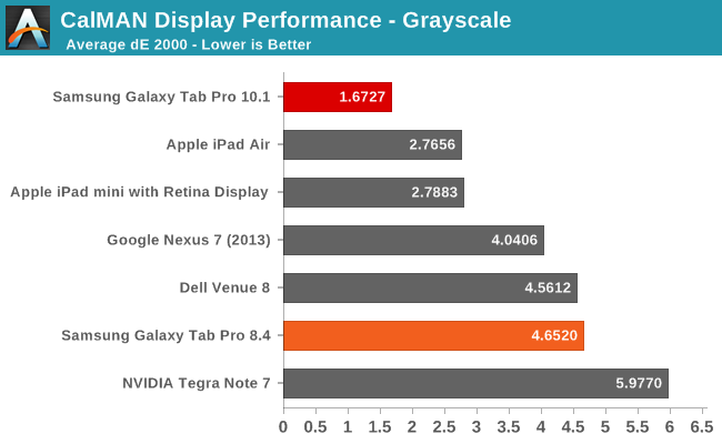
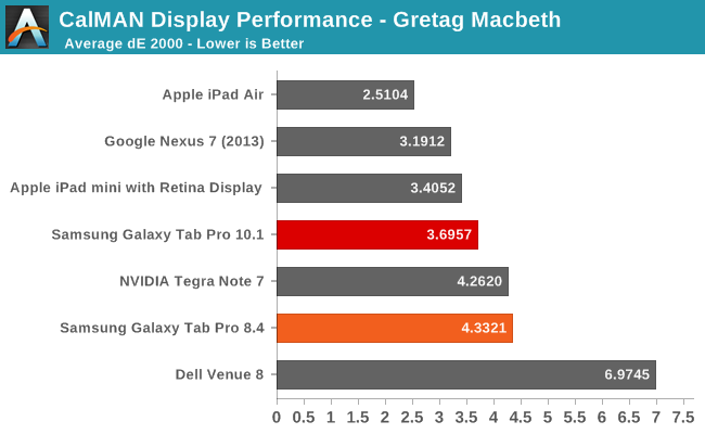
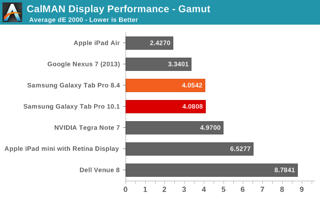
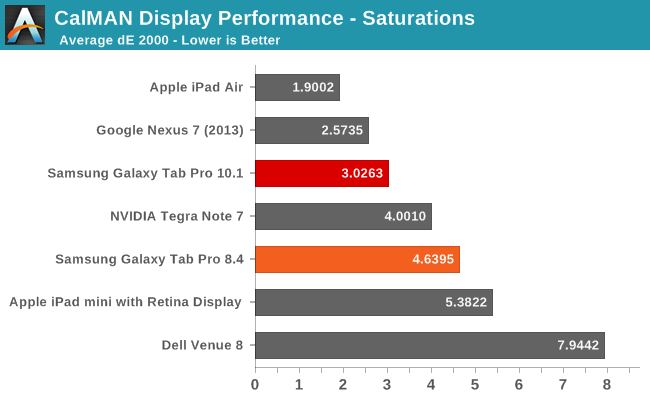
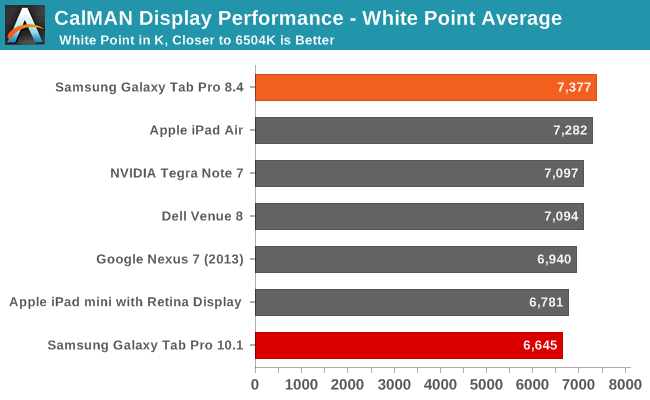
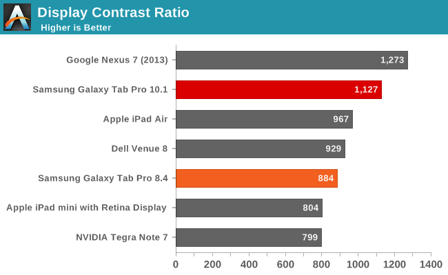

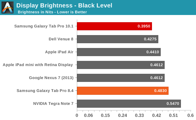
While none of the results are necessarily standouts (other than the grayscale dE 2000 on the Pro 10.1), we again have to keep in mind the fact that these are 2560x1600 panels in 10.1 and 8.4 inch devices. Factory calibration would push them over the top, but even without that they’re going to provide a wow factor to anyone used to lower resolution, lower quality displays.


125 Comments
View All Comments
JarredWalton - Sunday, March 23, 2014 - link
I lack the hardware to properly see whether this is Pentile or not... I hope to have the necessary tools "soon". As I noted, the pixels on these are so small that I'm not sure the arrangement really matters. I can literally press my nose against the tablets and I still couldn't say with certainty whether they're RGB stripe or Pentile. If I need a microscope to say what type of arrangement they use, does it really matter in the real world?themossie - Sunday, March 23, 2014 - link
Jarred,If you need a microscope to tell the difference it doesn't matter in the real world :-) That may not be true for everyone.
My problem with Pentile is that lines looked blurry and caused eyestrain (headaches after a few minutes of use) because vertical/horizontal lines weren't 'straight' without RGB striping. This can be somewhat mitigated by different subpixel arrangements, but doesn't go away entirely. If these are pentile, this would probably be an issue for me at this resolution and screensize.
This problem is somewhat explained in the second paragraph of http://www.anandtech.com/show/7743/the-pixel-densi... -
"For example, human vision systems are able to determine whether two lines are aligned extremely well, with a resolution around two arcseconds. This translates into an effective 1800 PPD. For reference, a 5” display with a 2560x1440 resolution would only have 123 PPD."
themossie - Sunday, March 23, 2014 - link
*If you need a microscope to tell the difference, it doesn't matter for you :-Pakdj - Monday, March 24, 2014 - link
But it does for you? WTF are you doing with your tablet to need a microscope to see the 'pixel arrangement'? Other than 'fatigue'....if that's real or not, up for debate, these HiDPI displays are beyond the point of 'mattering' to anyone other than the most anal of display dorksthemossie - Monday, March 24, 2014 - link
Huh? I don't care about high resolution (or high DPI), I just want RGB stripe so I don't get headaches :-Pdarkich - Tuesday, March 25, 2014 - link
Your argument seems incredibly ridiculous.By your definition we would need like 32K resolutions on a 5" screen for our vision to stop being bothered by pen tile!!
I could bet a house that your headache isn't caused by freaking micro missalingment of lines on a 380ppi screen.
I use my Note 3 for hours at a time and wow, I don't have headaches. It must be a natural phenomenon!
How about you try things like lowering the brightness?? Lol.
Get reasonable, man
StrangerGuy - Tuesday, March 25, 2014 - link
Right, so after gutting 1/3 effective PPI with pentile, how much would these Note Pros left? 9000 or number so high it doesn't matter like the Note 3 ? Nope, a measly 200 for the 10.1 and an absymal 150 for the 12.2. And we thought the first iPhone was bad at 160 by current standards, and now we don't even get AMOLED at all as a tradeoff for pentile?Hey let's just give a free pass Samsung on gutting the most important aspect of mobile device, why the hell not? The Android PPI flip-floppers are funny: "lol Apple still stuck at 300 ppi" but "150 ppi on uber expensive 12.2 Pro? It doesn't matter because I can't see it"
darkich - Tuesday, March 25, 2014 - link
Well sorry but that's crazy.The Note 8.4 has 360ppi and I can assure you the sharpness looks exactly the same as on the LCD with the similar ppi.
End of discussion.
As for the note 12.2..comparing it with the forst iPhone shows no one should take you seriously.
Do you have a laptop, or desktop?
If so, tell me their respective pixel densities
ESC2000 - Friday, March 28, 2014 - link
Yes it matters to the people who use ipads and will never consider buying this tablet who are trying to avoid the cognitive dissonance of having bought an equally or more expensive device with fewer features. And possibly to one guy who gets headaches from penile.davidgoscinny - Sunday, March 23, 2014 - link
I hope they've worked on the Flipboard app team to develop this Magazine UX "hence keeping the Flipboard) otherwise they should've at least changed the name.