In-Depth with the Windows 8 Consumer Preview
by Andrew Cunningham, Ryan Smith, Kristian Vättö & Jarred Walton on March 9, 2012 10:30 AM EST- Posted in
- Microsoft
- Operating Systems
- Windows
- Windows 8
Technically, everything in the Windows 8 Consumer Preview is in a non-final preview, but some things obviously need a bit more work than the others—one of these areas is the core set of Metro apps included with the Consumer Preview, all of which carry a prominent APP PREVIEW label. For this reason, we're just taking a limited look at just a few of Microsoft's core Metro apps for now—we'll do a deeper dive when they're finished, but at least for now it doesn't make a lot of sense to do a head-to-head comparison with their counterparts in iOS and Android. That said, let's continue:
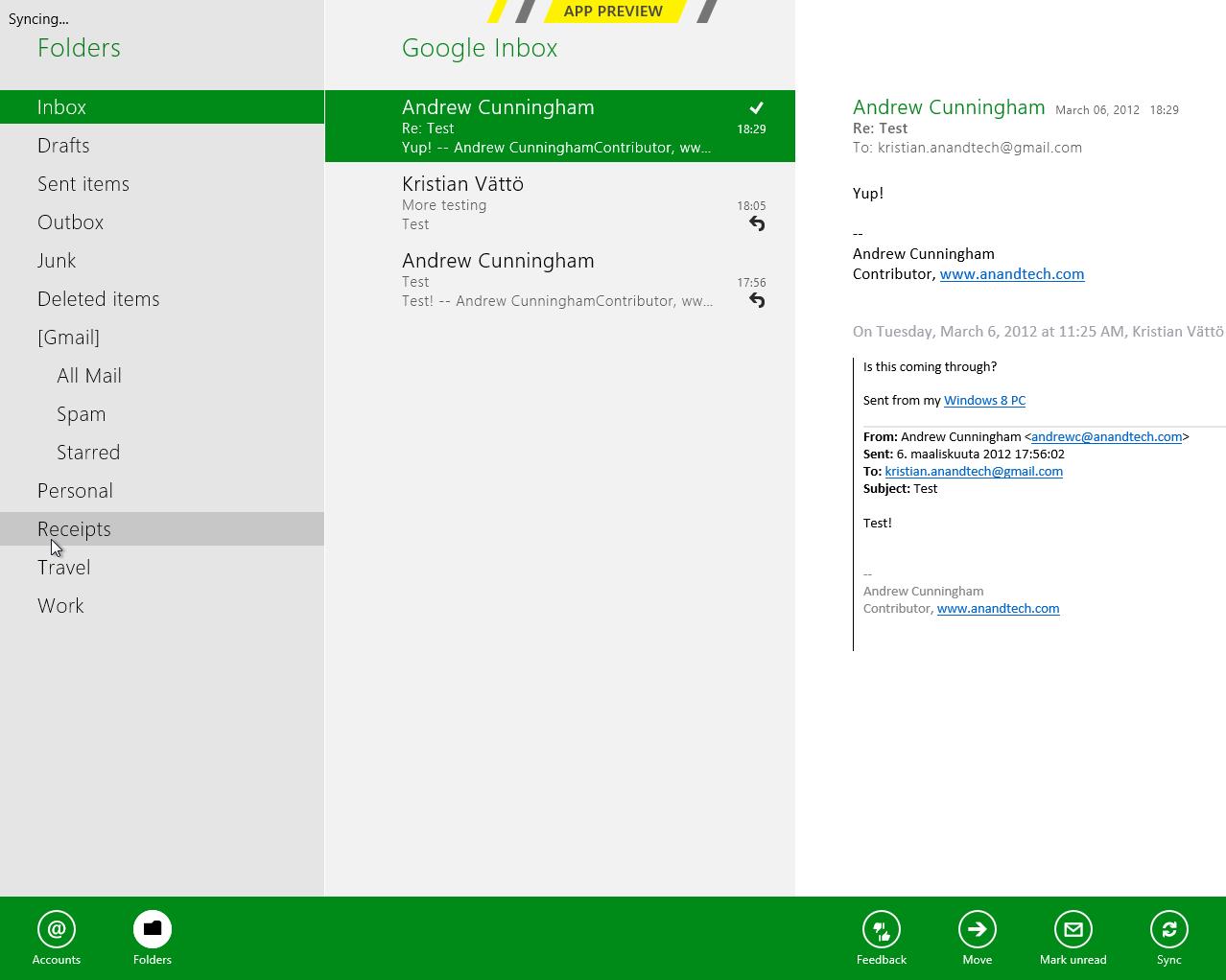
Metro’s Mail uses a design that’s very common in email clients: You have accounts/folders in the left, emails in the middle and the selected email in the right-hand-side. The overall design is extremely bare, something you’re not used to in a desktop email client. There aren’t any visible buttons when in accounts/folders view but when you select a certain account or folder, you get buttons for new email, respond and delete. The respond button holds reply, reply all and forward functions inside it. Right-clicking fires up the so-called menu, which allows switching between accounts and folders view, as well as options to move or mark the email or sync your accounts.
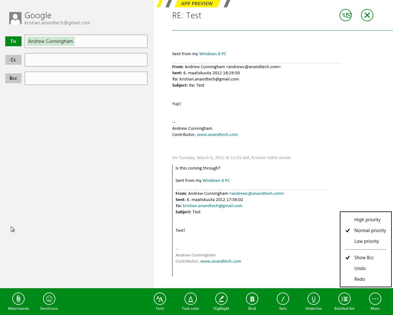
The actual text editor offers a bit more power than the rest of the mail client. Once again, the tools are a right-click away but fortunately, the text editor isn’t as limited as other parts of the app. The basic text editing features are present along with some additional email tools. One should also note that the default signature is “Sent from my Windows 8 PC”, which is more or less a direct copy of Apple’s “Sent from my iPhone/iPad” signatures.
What about supported services and protocols? First and foremost, Metro’s Mail client only supports Hotmail, Gmail and Exchange accounts. Yes, you read it right, there is no support for 3rd party POP or IMAP services as of this writing. This is a huge drawback if you use any other services. For example, our AnandTech mail server is IMAP, which means I can’t use my work email with Metro’s Mail client. Of course, it’s possible to auto-forward emails from other services to Hotmail/Gmail, but that’s not a very convenient solution—hopefully this will change in the final version of the app.
Overall, Metro’s Mail client is fairly awkward for desktop use. It makes sense on a tablet with limited screen estate, but even a free email client like Windows Live Mail is way more powerful and usable in desktop environment. It doesn’t seem logical to be constantly right-clicking in order to access the menu when regular desktop email clients have the menu visible at all times. Even simple commands like reply and syncing are buried under a second click, which is just illogical.
Calendar
Metro’s Calendar is similar to Mail: It’s a very scarce app with not much extra. In Mail, this was a bigger issue but a calendar app doesn’t need to be filled with features to do its job.
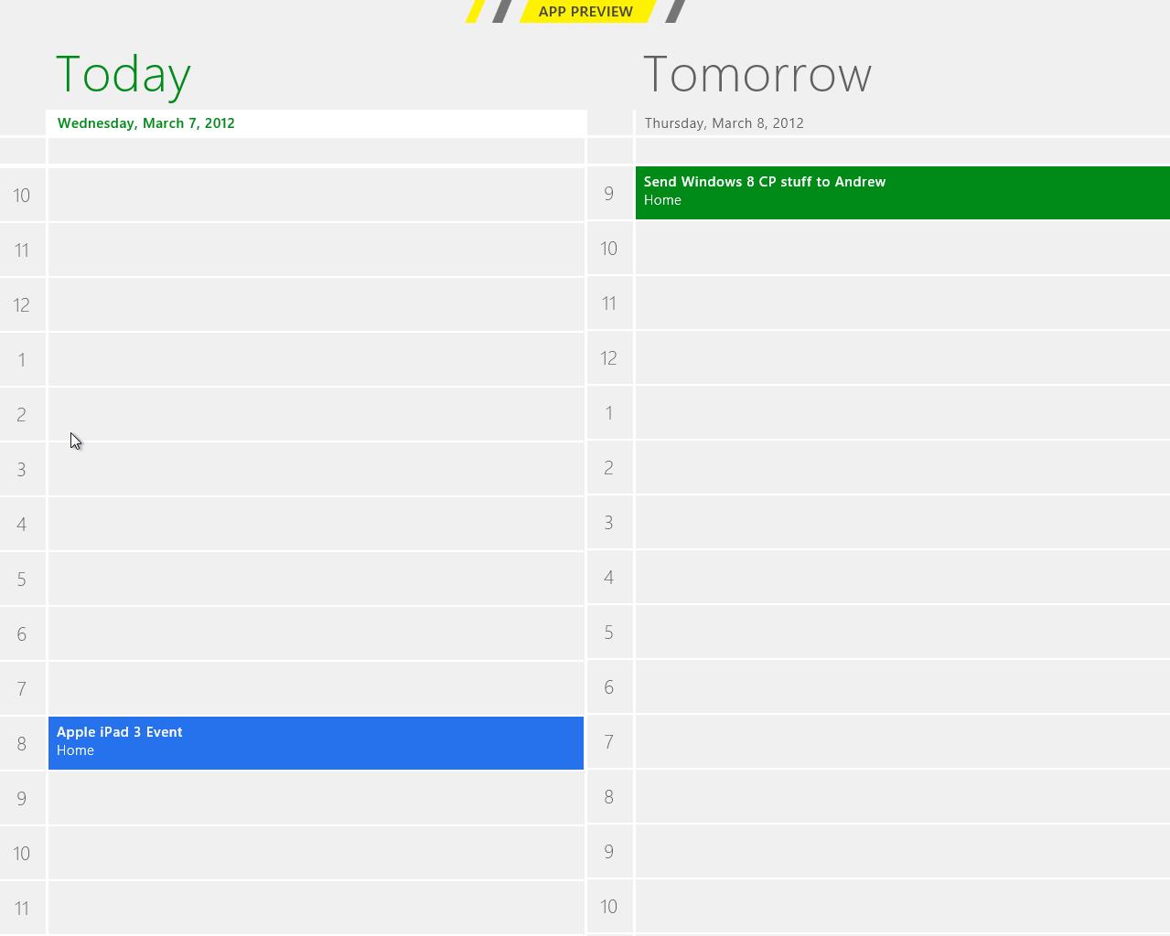
The design is very basic. The background is grey and event tiles are in bright colors. Weekends show up in darker grey in day and week views, distinguishing them from weekdays.
Navigation is once again hidden behind a right-click, which brings up options for alternating between day, week and month views, as well as option to navigate to today or add a new event. Adding an event can also be done by clicking a tile where you want to schedule the event to. Navigating between days/weeks/months is done by bringing your mouse close to the upper corners and clicking an arrow.
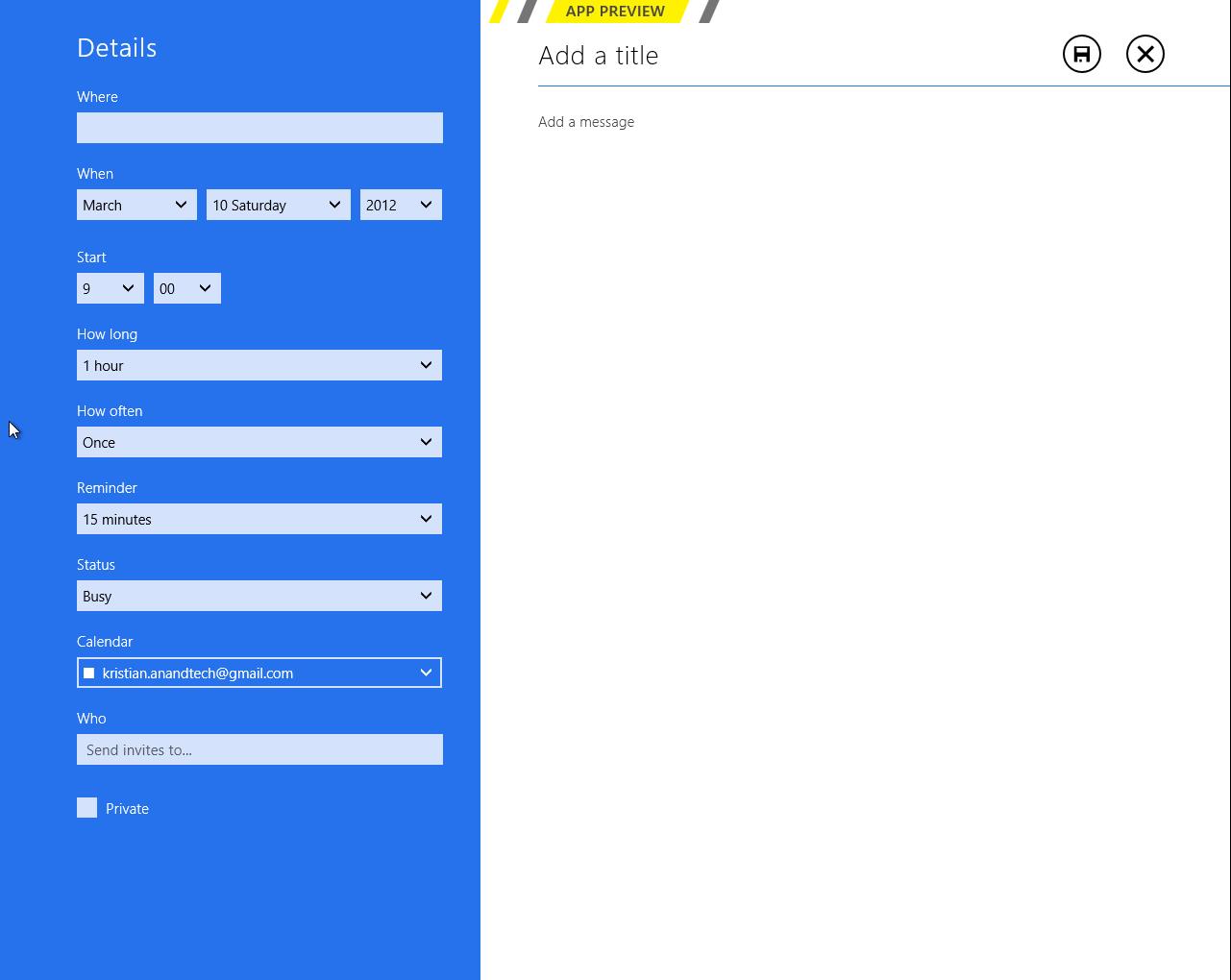
Adding an event has the common tools which are used by many other services. You can add a location, message, reminder and so on. There is an option to select the calendar where you want the event to be added, which is useful if you use different calendars/services for home and work purposes for example.
Service support is the same as Mail’s: Google, Microsoft (via Windows Live), and Exchange. I quickly tried Google and Microsoft and they synced fine. There is a slight delay in Metro’s Calendar so it takes a while before an event shows up. Different colors in the calendar stand for different services – in this case Google is in blue and Microsoft is in green.
Again, it feels odd to be constantly right-clicking in order to navigate in the user interface. There is definitely enough space for day/week/month buttons and personally I would prefer having them visible rather than right-click to access them. Moreover, the lack of list view can be a con if you’re used to using Apple’s calendar applications. Overall the calendar app is alright – there is no yippee effect but it’s mostly functional.
Messaging
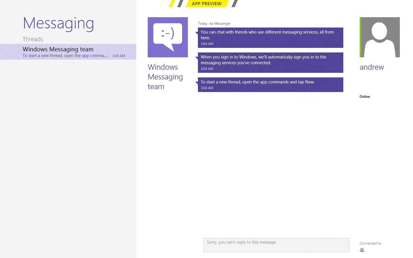
Like the other apps we've looked at, Messaging can only access a couple of services at present—Windows Messenger and Facebook, so again it's really best looked at as a demo or proof-of-concept than as a replacement for whatever your favorite IM program is. Messages between parties are laid out in a standard "speech bubble" format, with different colors and arrows to differentiate the parties who are sending messages.
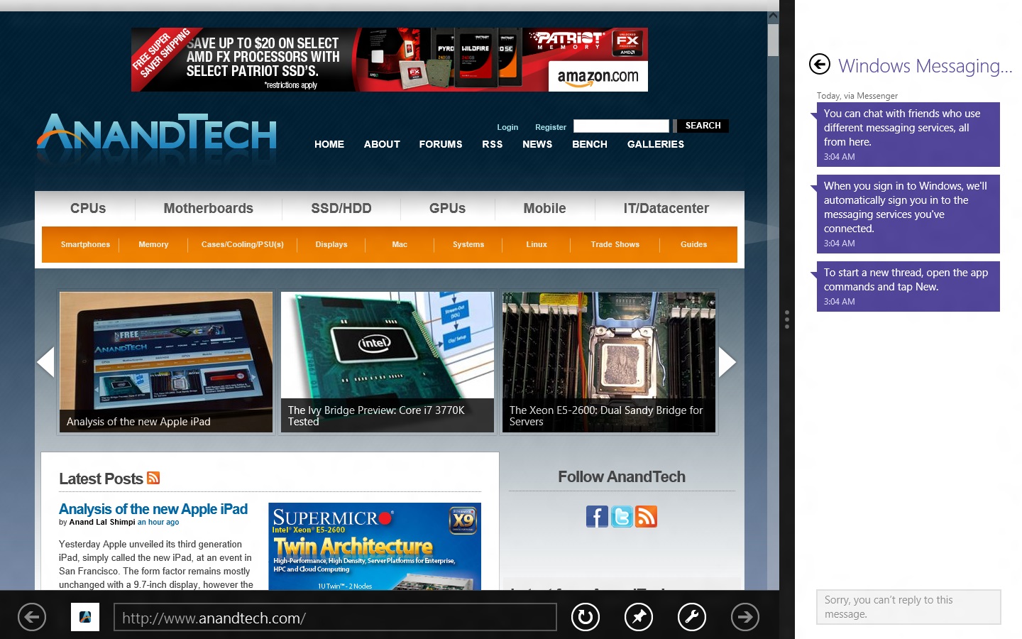
As a side note, Messaging is actually a really good example of the kind of app that works really well with Metro Snap—it takes up just the right amount of space on the side of your screen, and even on a 1366x768 display you still have enough room to use desktop apps comfortably. Someone make a Twitter client that works like this soon, OK?
People

The Metro People app serves more or less as an aggregator for all of your contacts from different services, including Facebook, Hotmail, Twitter, Google, Exchange, and others. You can tie People to these accounts directly from the app, and it will also pull data from accounts you've set up through other apps (like Messaging, Mail, and etc.). It can also aggregate status updates from various social networking services under its "What's new" heading.
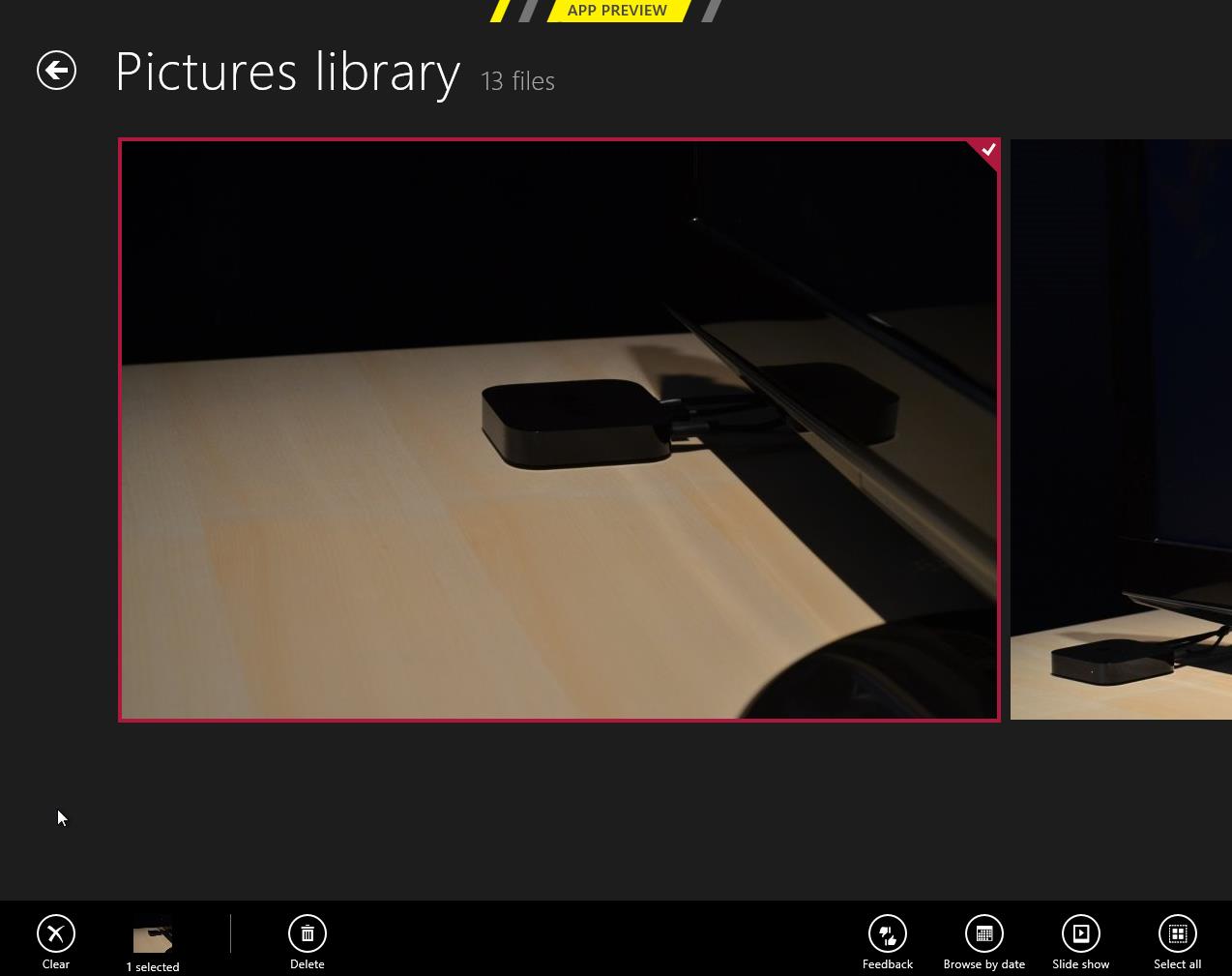
Photos
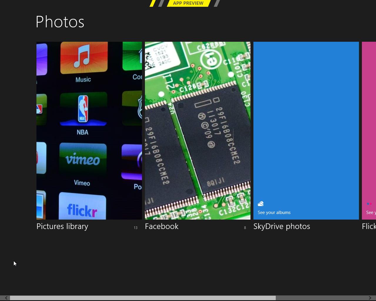
There is a very basic photo viewer included in Metro. Don’t expect anything fancy, all it does is view your photos. Supported services are the local pictures folder (obviously), Facebook, SkyDrive and Flickr. Once you enter your credentials, all of the photos show up in the now-familiar Metro-style grid of tiles [Editor's note: Kristian had problems getting SkyDrive and Flickr working, but this may be due to his geographical location—both services work fine for me here in the US].
The menu has four tiles, one for each service. Click a tile and the selected service opens. Right-clicking doesn’t bring any extra features here in the main menu.
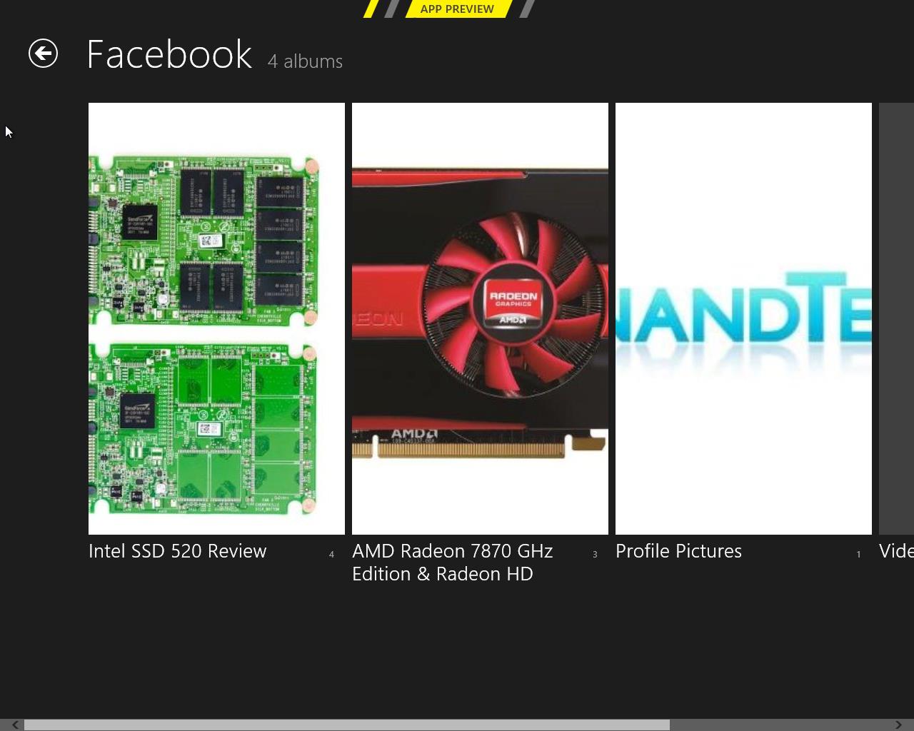
Once you open a service, it shows you the photos and possible folders. I created a test Facebook account and uploaded a few pics from our recent reviews, and they all show up fine. Unfortunately, Photos doesn’t show Facebook photos where you were tagged, so it’s limited to photos uploaded to your account.
Inside an actual photo folder, you can play a regular slide show of the pictures or view them separately. Pictures library allows deletion and browsing by date as well, and Facebook has an option to view the photo in Facebook.
Metro’s Photos is very tablet-like and once again screams for touch input. It’s usable with a mouse but there are better photo viewing applications which are a lot more powerful as well in terms of features (editing, organizing, etc.). This time the service support is at least decent and Photos is indeed more than just a shortcut to your pictures folder.
Camera
Windows 8 includes a basic camera app that can be used to take pictures with your device's built-in camera—snapshots are saved in your Pictures library by default. The app has basic settings for setting camera resolution, controlling brightness, and other settings—it’s not going to turn a crappy webcam into an SLR, but it’s nice to see Windows finally get a functional native camera app.
Conclusions
The finished versions of these apps may be entirely different than the evaluation versions that Microsoft is showing off in the Consumer Preview, but even in their current form they give us an idea of how Windows 8 is going to approach the problem of vendor lock-in.
It seems like all of the major players in the tablet market—Google, Apple, and most recently Amazon—are using their hardware and software to lock the user into their respective ecosystems. Apple's iCloud offers easy setup and syncing for Apple mail, calendar, and other services; Google has built everything from an email service to a social network in an effort to get you to spend all of your time on its pages; and the Kindle Fire is purpose-built to purchase items from Amazon's stores. It can make interoperability difficult, and the longer you live in a given ecosystem, the more painful it can be to jump ship.
This is not to say that Microsoft doesn't offer you the option of lock-in: all settings are synced via your Windows Live ID, which is also needed to download apps, and it can also tie you to Hotmail, SkyDrive, Messenger, and any number of Microsoft-hosted services—they are trying to run a business here. The difference in Windows 8 is that you can also access data on the services that you're already using, and have data from those services treated the same way as data hosted by Microsoft. It's convenient and, most importantly, it presents a consistent user experience no matter where your stuff is coming from.


286 Comments
View All Comments
Andrew.a.cunningham - Friday, March 9, 2012 - link
Totally agree with you about missing unified search, even if we don't quite see eye-to-eye on some of the other Metro stuff.AeroRob - Friday, March 9, 2012 - link
I just don't know what anyone can see good in this for desktop use. Instead of having a nice list of common programs, a unified search/cmd field, and the ability to browse and organize your programs, you're flung into a different UI, which is less versatile and has almost no means of organization. (Other than rearranging tiles. Call me crazy, but I actually like having the ability to group programs in folders according to function, and would rather not be bombarded with *every* executable on my machine at once.)silverblue - Friday, March 9, 2012 - link
A friend at work has been playing about with Win8 and he was wondering about how to shut it down as well; only took a moment to find, and it's something you'd get used to rather quickly (you could always press the power button assuming you've set it up to shut the machine down via the Power Options control panel).I'm liking the Metro interface, but I suppose having a Lumia 800 has prepared me for it.
AeroRob - Friday, March 9, 2012 - link
I found the shutdown button without too much difficulty, but I imagine your average desktop user will have a much harder time. However, the point of that example is not merely that it's more difficult to find, but that you have to go through a number of undocumented steps in order to reach one of the most basic functions of a device, and one that was immensely easy to reach before.It's all a step backwards, at least for anyone not using a tablet.
dagamer34 - Friday, March 9, 2012 - link
How often do you turn off a device instead of putting it to sleep?phoenix_rizzen - Saturday, March 10, 2012 - link
Just about daily. Sleep/hibernate/resume doesn't always work on desktops. Laptops I tend to rarely reboot, though.silverblue - Saturday, March 10, 2012 - link
A simple tile for shutdown/restart/standby/hibernate would appease everybody.Sabresiberian - Saturday, March 10, 2012 - link
I ALWAYS turn my system off, I never put it in any kind of "sleep" or standby mode.Back in the day, your computer would actually run better if you turned it off and let the memory allocations and whatever else that started clogging the works re-set. I don't know f that makes a difference now so much, but it seemed to at one time - that's why I got in a habit of turning off the computer completely.
Really, the best way is to shut your system down and hit the switch on your UPS, so that no power is drawn at all. I mean, if you LIKE paying for a computer (don't forge the monitor) that is still drawing juice when you aren't using it, fine, but I'd rather not, myself. Power them both down - completely. If in doubt, use a Kill A Watt or some similar device to make sure your draw is zero.
;)
p05esto - Friday, March 9, 2012 - link
I agree totally. I've been enabling the classic start menu since Xp and still want it. Win7 actually took a step back by not letting my put folders in the start menu with cascading apps. I've got about 50 apps installed I use often and usually 5-10 open at once. I want quick and fast access to all my apps so when I'm developing I can open and close them fast and often all at once. Hidden menus, search bars and some separate start screen is NOT going to work for me. No way, total deal killer!!!PopinFRESH007 - Sunday, April 15, 2012 - link
I think there are many people of both the techie and non-techie variety that will fall along this same line. The thing Microsoft is betting on is that they are so pervasive that people will just go along with it and deal with the cumbersome annoyances. People like you will likely run out Windows 7 while migrating to your favorite distro of *nix. However I think most average users will find this an even bigger push toward a Mac. There are tons of people out there that use a PC and have iDevices and this is one more reason to finally jump ship.I mentioned in length in a previous post that I'm not 100% opposed to the Metro UI and it could be useful with the Live Tile idea. The problem with Windows 8 is that it's basically 2 separate OS's stitched together like a crazy frankenstein OS with two heads.