In-Depth with the Windows 8 Consumer Preview
by Andrew Cunningham, Ryan Smith, Kristian Vättö & Jarred Walton on March 9, 2012 10:30 AM EST- Posted in
- Microsoft
- Operating Systems
- Windows
- Windows 8
Technically, everything in the Windows 8 Consumer Preview is in a non-final preview, but some things obviously need a bit more work than the others—one of these areas is the core set of Metro apps included with the Consumer Preview, all of which carry a prominent APP PREVIEW label. For this reason, we're just taking a limited look at just a few of Microsoft's core Metro apps for now—we'll do a deeper dive when they're finished, but at least for now it doesn't make a lot of sense to do a head-to-head comparison with their counterparts in iOS and Android. That said, let's continue:
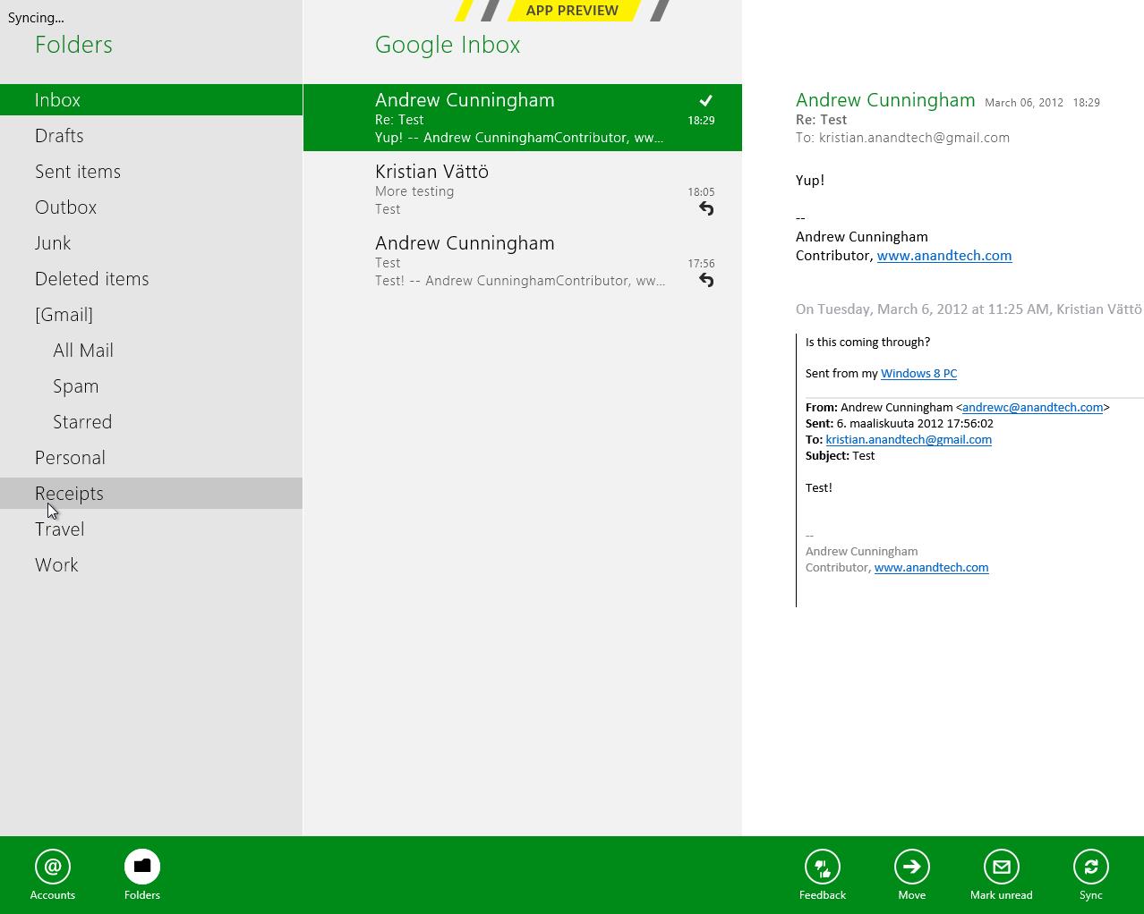
Metro’s Mail uses a design that’s very common in email clients: You have accounts/folders in the left, emails in the middle and the selected email in the right-hand-side. The overall design is extremely bare, something you’re not used to in a desktop email client. There aren’t any visible buttons when in accounts/folders view but when you select a certain account or folder, you get buttons for new email, respond and delete. The respond button holds reply, reply all and forward functions inside it. Right-clicking fires up the so-called menu, which allows switching between accounts and folders view, as well as options to move or mark the email or sync your accounts.
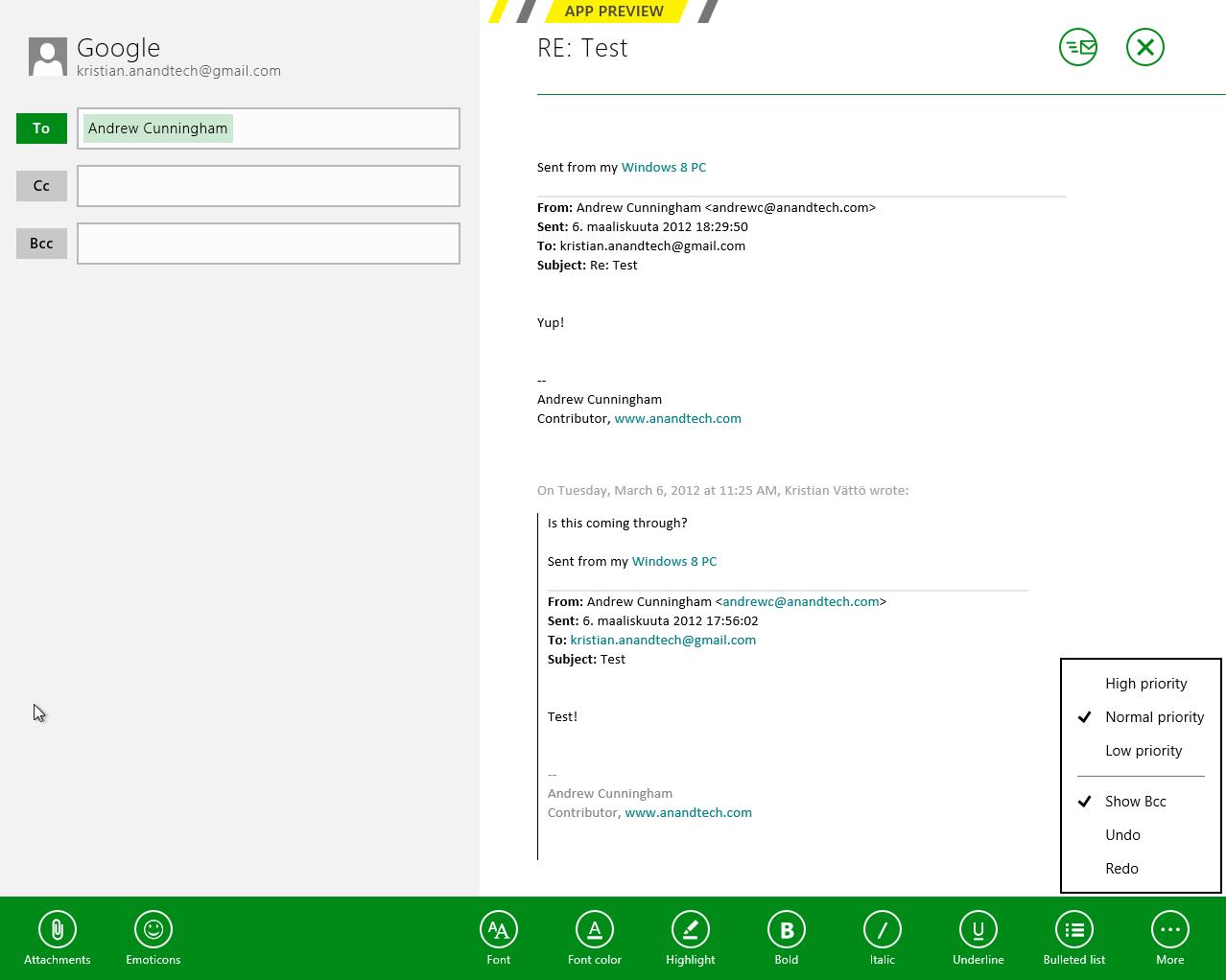
The actual text editor offers a bit more power than the rest of the mail client. Once again, the tools are a right-click away but fortunately, the text editor isn’t as limited as other parts of the app. The basic text editing features are present along with some additional email tools. One should also note that the default signature is “Sent from my Windows 8 PC”, which is more or less a direct copy of Apple’s “Sent from my iPhone/iPad” signatures.
What about supported services and protocols? First and foremost, Metro’s Mail client only supports Hotmail, Gmail and Exchange accounts. Yes, you read it right, there is no support for 3rd party POP or IMAP services as of this writing. This is a huge drawback if you use any other services. For example, our AnandTech mail server is IMAP, which means I can’t use my work email with Metro’s Mail client. Of course, it’s possible to auto-forward emails from other services to Hotmail/Gmail, but that’s not a very convenient solution—hopefully this will change in the final version of the app.
Overall, Metro’s Mail client is fairly awkward for desktop use. It makes sense on a tablet with limited screen estate, but even a free email client like Windows Live Mail is way more powerful and usable in desktop environment. It doesn’t seem logical to be constantly right-clicking in order to access the menu when regular desktop email clients have the menu visible at all times. Even simple commands like reply and syncing are buried under a second click, which is just illogical.
Calendar
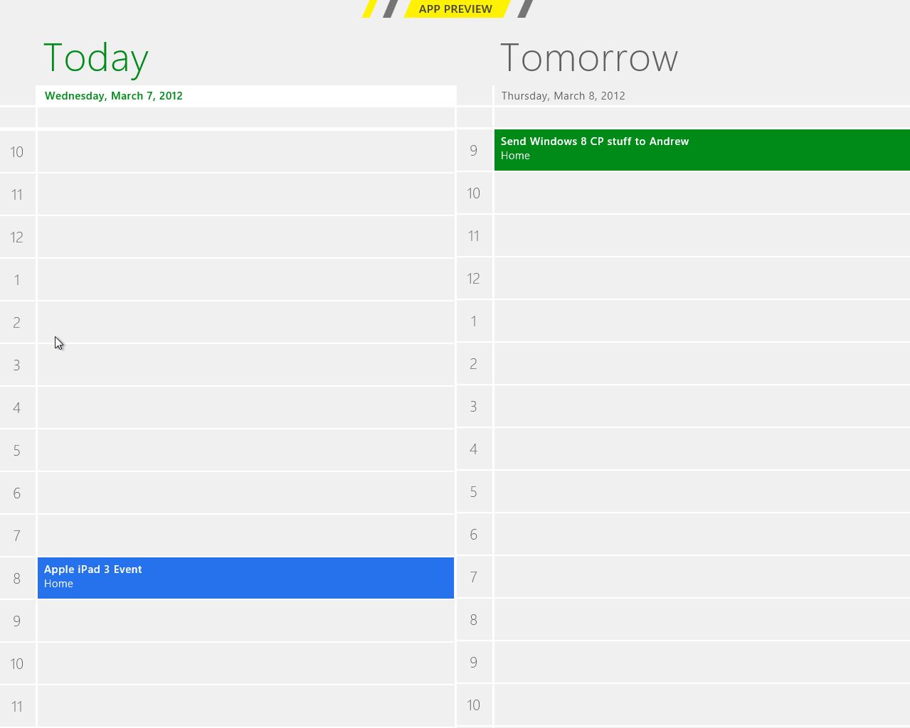
Metro’s Calendar is similar to Mail: It’s a very scarce app with not much extra. In Mail, this was a bigger issue but a calendar app doesn’t need to be filled with features to do its job.
The design is very basic. The background is grey and event tiles are in bright colors. Weekends show up in darker grey in day and week views, distinguishing them from weekdays.
Navigation is once again hidden behind a right-click, which brings up options for alternating between day, week and month views, as well as option to navigate to today or add a new event. Adding an event can also be done by clicking a tile where you want to schedule the event to. Navigating between days/weeks/months is done by bringing your mouse close to the upper corners and clicking an arrow.
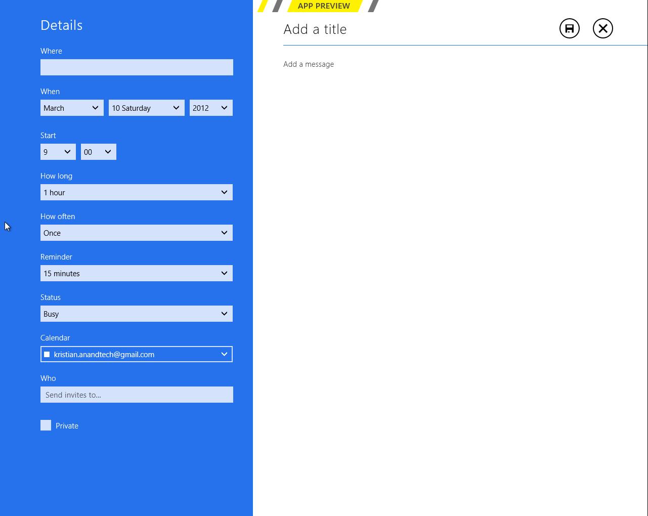
Adding an event has the common tools which are used by many other services. You can add a location, message, reminder and so on. There is an option to select the calendar where you want the event to be added, which is useful if you use different calendars/services for home and work purposes for example.
Service support is the same as Mail’s: Google, Microsoft (via Windows Live), and Exchange. I quickly tried Google and Microsoft and they synced fine. There is a slight delay in Metro’s Calendar so it takes a while before an event shows up. Different colors in the calendar stand for different services – in this case Google is in blue and Microsoft is in green.
Again, it feels odd to be constantly right-clicking in order to navigate in the user interface. There is definitely enough space for day/week/month buttons and personally I would prefer having them visible rather than right-click to access them. Moreover, the lack of list view can be a con if you’re used to using Apple’s calendar applications. Overall the calendar app is alright – there is no yippee effect but it’s mostly functional.
Messaging
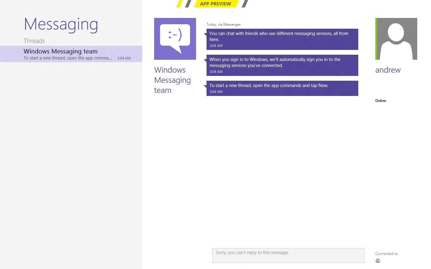
Like the other apps we've looked at, Messaging can only access a couple of services at present—Windows Messenger and Facebook, so again it's really best looked at as a demo or proof-of-concept than as a replacement for whatever your favorite IM program is. Messages between parties are laid out in a standard "speech bubble" format, with different colors and arrows to differentiate the parties who are sending messages.
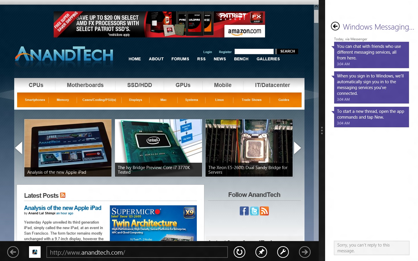
As a side note, Messaging is actually a really good example of the kind of app that works really well with Metro Snap—it takes up just the right amount of space on the side of your screen, and even on a 1366x768 display you still have enough room to use desktop apps comfortably. Someone make a Twitter client that works like this soon, OK?
People

The Metro People app serves more or less as an aggregator for all of your contacts from different services, including Facebook, Hotmail, Twitter, Google, Exchange, and others. You can tie People to these accounts directly from the app, and it will also pull data from accounts you've set up through other apps (like Messaging, Mail, and etc.). It can also aggregate status updates from various social networking services under its "What's new" heading.
Photos
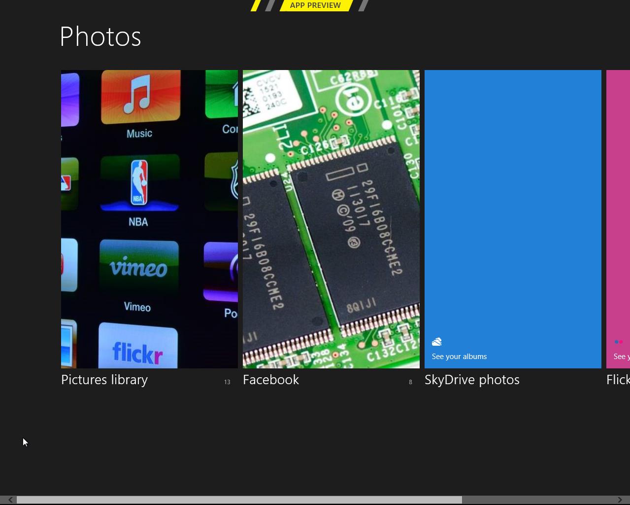
There is a very basic photo viewer included in Metro. Don’t expect anything fancy, all it does is view your photos. Supported services are the local pictures folder (obviously), Facebook, SkyDrive and Flickr. Once you enter your credentials, all of the photos show up in the now-familiar Metro-style grid of tiles [Editor's note: Kristian had problems getting SkyDrive and Flickr working, but this may be due to his geographical location—both services work fine for me here in the US].
The menu has four tiles, one for each service. Click a tile and the selected service opens. Right-clicking doesn’t bring any extra features here in the main menu.
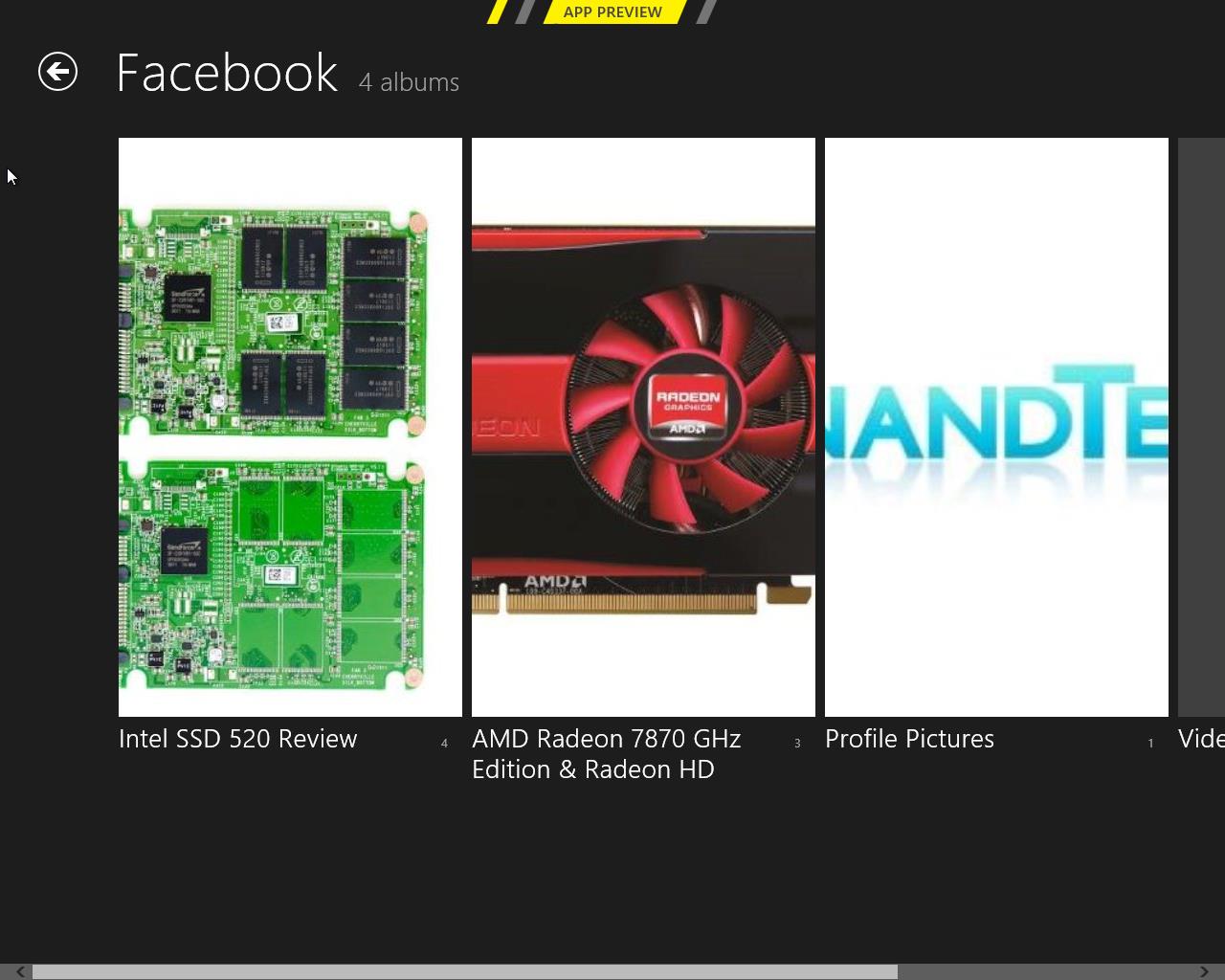
Once you open a service, it shows you the photos and possible folders. I created a test Facebook account and uploaded a few pics from our recent reviews, and they all show up fine. Unfortunately, Photos doesn’t show Facebook photos where you were tagged, so it’s limited to photos uploaded to your account.
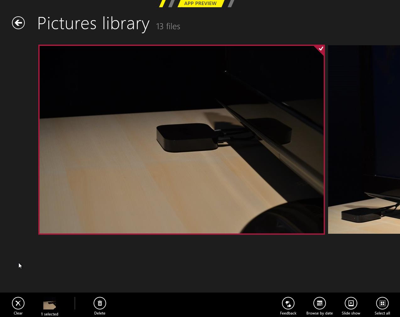
Inside an actual photo folder, you can play a regular slide show of the pictures or view them separately. Pictures library allows deletion and browsing by date as well, and Facebook has an option to view the photo in Facebook.
Metro’s Photos is very tablet-like and once again screams for touch input. It’s usable with a mouse but there are better photo viewing applications which are a lot more powerful as well in terms of features (editing, organizing, etc.). This time the service support is at least decent and Photos is indeed more than just a shortcut to your pictures folder.
Camera
Windows 8 includes a basic camera app that can be used to take pictures with your device's built-in camera—snapshots are saved in your Pictures library by default. The app has basic settings for setting camera resolution, controlling brightness, and other settings—it’s not going to turn a crappy webcam into an SLR, but it’s nice to see Windows finally get a functional native camera app.
Conclusions
The finished versions of these apps may be entirely different than the evaluation versions that Microsoft is showing off in the Consumer Preview, but even in their current form they give us an idea of how Windows 8 is going to approach the problem of vendor lock-in.
It seems like all of the major players in the tablet market—Google, Apple, and most recently Amazon—are using their hardware and software to lock the user into their respective ecosystems. Apple's iCloud offers easy setup and syncing for Apple mail, calendar, and other services; Google has built everything from an email service to a social network in an effort to get you to spend all of your time on its pages; and the Kindle Fire is purpose-built to purchase items from Amazon's stores. It can make interoperability difficult, and the longer you live in a given ecosystem, the more painful it can be to jump ship.
This is not to say that Microsoft doesn't offer you the option of lock-in: all settings are synced via your Windows Live ID, which is also needed to download apps, and it can also tie you to Hotmail, SkyDrive, Messenger, and any number of Microsoft-hosted services—they are trying to run a business here. The difference in Windows 8 is that you can also access data on the services that you're already using, and have data from those services treated the same way as data hosted by Microsoft. It's convenient and, most importantly, it presents a consistent user experience no matter where your stuff is coming from.


286 Comments
View All Comments
skanskan - Wednesday, March 14, 2012 - link
The task manager should also include a GPU resource monitor.It's been a long time since GPUs were introduced and we still need third party tools.
Oravendi - Wednesday, March 14, 2012 - link
Linux has allowed for different GUI managers for a long time. Why would Microsoft not offer Metro as a desktop option? Metro is probably better for tablets and cell phones, however if Microsoft were to produce software with the ability to turn Metro off then Metro might have slow or no adoption. Microsoft sees the money. It doesn't want the problems of software like Linux. Answer, force us to Metro and claim the old windows users don't want to change.Origin32 - Wednesday, March 14, 2012 - link
The problem I have with Metro is not that it's different.It's that its different while not adding anything for me as a desktop user. Yes, I'm sure this new interface is much easier to navigate on a tablet, but with M/K I have to click more rather than less to open the more advanced menus, I have to use two user interfaces simultaneously and I have to start to unlearn 10 years of keyboard shortcuts, options locations and all the kinds of things you do automatically in win7. Using Windows 8 will be a whole lot of effort for me, and Microsoft isn't really giving me anything in return for that effort. If they'd added something actually useful like support for multiple user logons on a SAMBA share in one session, a sandbox mode to try out new programs in or really any functionality at all, then I'd have to live with Metro.
Now all I get is a new GUI I sure didn't ask for.
jabber - Wednesday, March 14, 2012 - link
This is it for me too. I just don't get what it is they are trying to sell me here with regards to Metro.I don't get it MS, Sorry.
I've always upgraded my Windows versions due to improvements in performance, load times, functionality with new hardware and tech standards. Sure there are always a few UI changes but nothing that needs 5 minutes to get used to and on the whole they have been positive.
But with Metro there just isn't enough in the deal to make me want to bother using it.
I can get by fine without it. It isn't essential for those of us using desktops/laptops.
perpetualdark - Thursday, March 15, 2012 - link
Quite simply, the home market and the professional market are no longer driven off of each other, and need to diverge. In the past, the professional market drove the PC industry, and the OS was a reflection of that.Home use has grown to be a viable entity on it's own however, and the proof of that is Apple's success in the PC market. People at home want a computer that is media based, and focused around entertainment. Movies, Music, Social Media, and Home Integration are the keys there. They want their media, and they want it everywhere (at the computer, the tv, the laptop, the phone, in bed, in the bathroom, and in the kitchen). They want to be connected to their social media all the time, and have everything integrated into that.
Businesses don't need any of it, and it is all counterproductive to business. If anything, they want everything listed above to be GONE from the picture. Remove the games, the media, and the social aspects. Sharing needs to be tightly controlled, and the "cloud" is a fancy way of saying "security risk". Your boss doesn't want you listening to music, sharing it with others, or getting on facebook or skype to socialize, he wants you productive. Secure sharing of files, remote application use, tying together the office and the mobile workspace, communicating within the company and with the customers, and productive applications. It requires a COMPLETELY different interface because it has a completely different workflow.
Windows 8 is, on the surface anyway, a HOME version of the software. It is MS's attempt to slow Apple down on the home front. But aside from desktop publishing and education, Apple is not even in the business place, and although I couldn't give you numbers, I am willing to bet that the business market is still at least half of the revenues that MS sees in a year.
One more note: Look at Office. Millions of people knew all the ins and outs of Excel and Word, and then MS goes and changes the interface 100%. With NO way of going back. I resisted until recently, and after almost a year on office 2010, I hate it to this day. The ribbons suck, I can never find the things I am looking for, and they don't even have a basic paste function, they made it more complicated. Yeah, I can ctrl-v, but sometimes I want to right click and paste, not right click and hunt for the paste icon I am looking for. I hate icons. I want words. I speak english. If I want to paste special and choose to paste values, I want to right click, paste special, values, ok. I don't want right click and look for the icon that represents pasting values. I am literate, give me words, not icons that represent words. It is a disaster, and as a result, most companies still have Windows XP and Office 2003 installed. If it werent for so many viruses and malware targeting the weak security of XP, I would still have all my machines running on XP. I still run programs like Live Messenger in Vista mode so the icon goes in the tray and not on the bar. I don't understand why MS wants me to change so bad.. I don't want to change, I am more efficient the way I use it, so bugger off and leave me alone! I want my "up directory" button back, and I want the window button in excel back, so when I have 250 spreadsheets open (or even 2), I can switch without having to go to the right hand monitor and click on the excel icon and choose the window from there.. I just want to do it in excel. Come on, quit changing stuff just for the sake of changing..
shin0bi272 - Friday, March 16, 2012 - link
no... just no. Stop talking about stuff you know very little about. It just makes you look bad.Valahano - Friday, March 16, 2012 - link
Care to elaborate?slickr - Thursday, March 15, 2012 - link
Good job Andrew. After years of reading this website you with this obvious piece of propaganda have forced me from this moment on to stop visiting this website.This shameless advertising for this Microsoft crap of a operating system that they call windows 8 is sickening. How much did they pay you?
You people make me sick, at least be honest about it and write that you have been paid to write about their product in a positive way, I guarantee you people won't be too judgmental and will accept the fact that this website with its obvious bias for some time now has been loosing all its visitors and is forced to write propaganda articles for money!
Shinya - Thursday, March 15, 2012 - link
So basically because he likes something that you don't (even though he heavily criticized it) your limited brain capacity calculated that he was paid?Please stick with apple products iTard. Your lord n savior is waiting over at engadget.
shin0bi272 - Friday, March 16, 2012 - link
actually no hes right... if you look at what MS did with win8 its designed for tablets and they are violently forcing pc users to adapt the same gui that will be basically worthless to us and what does the author of this article say?"Yes, Metro is very different from what came before, and yes, Metro was clearly designed with touch in mind, but once you learn its tricks (and especially once you’ve got the new keyboard shortcuts dedicated to memory) it acquits itself as a flexible and powerful user interface."
Sucking up much?