In-Depth with the Windows 8 Consumer Preview
by Andrew Cunningham, Ryan Smith, Kristian Vättö & Jarred Walton on March 9, 2012 10:30 AM EST- Posted in
- Microsoft
- Operating Systems
- Windows
- Windows 8
Technically, everything in the Windows 8 Consumer Preview is in a non-final preview, but some things obviously need a bit more work than the others—one of these areas is the core set of Metro apps included with the Consumer Preview, all of which carry a prominent APP PREVIEW label. For this reason, we're just taking a limited look at just a few of Microsoft's core Metro apps for now—we'll do a deeper dive when they're finished, but at least for now it doesn't make a lot of sense to do a head-to-head comparison with their counterparts in iOS and Android. That said, let's continue:
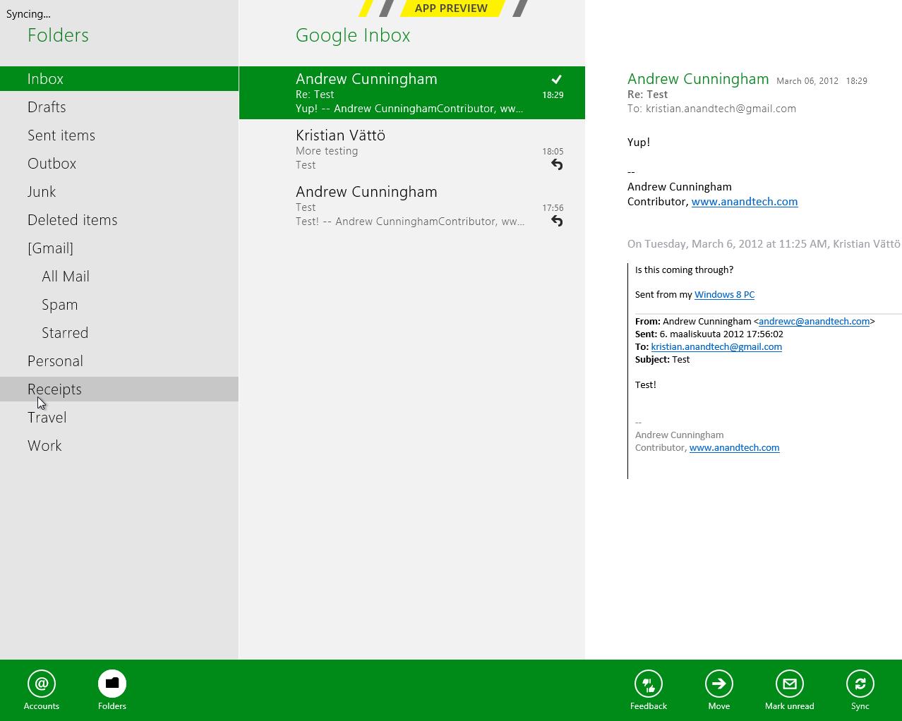
Metro’s Mail uses a design that’s very common in email clients: You have accounts/folders in the left, emails in the middle and the selected email in the right-hand-side. The overall design is extremely bare, something you’re not used to in a desktop email client. There aren’t any visible buttons when in accounts/folders view but when you select a certain account or folder, you get buttons for new email, respond and delete. The respond button holds reply, reply all and forward functions inside it. Right-clicking fires up the so-called menu, which allows switching between accounts and folders view, as well as options to move or mark the email or sync your accounts.
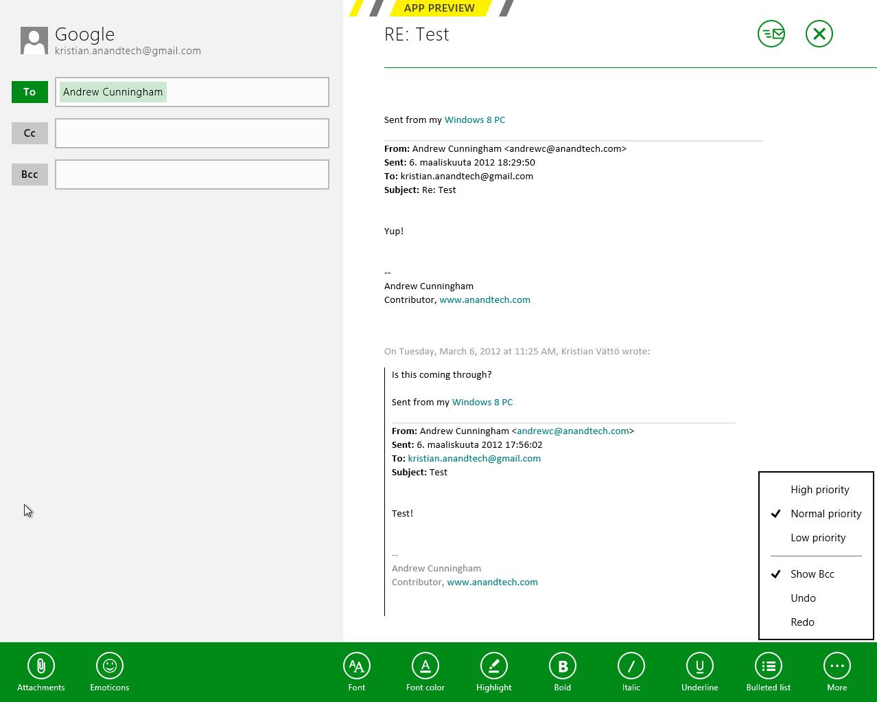
The actual text editor offers a bit more power than the rest of the mail client. Once again, the tools are a right-click away but fortunately, the text editor isn’t as limited as other parts of the app. The basic text editing features are present along with some additional email tools. One should also note that the default signature is “Sent from my Windows 8 PC”, which is more or less a direct copy of Apple’s “Sent from my iPhone/iPad” signatures.
What about supported services and protocols? First and foremost, Metro’s Mail client only supports Hotmail, Gmail and Exchange accounts. Yes, you read it right, there is no support for 3rd party POP or IMAP services as of this writing. This is a huge drawback if you use any other services. For example, our AnandTech mail server is IMAP, which means I can’t use my work email with Metro’s Mail client. Of course, it’s possible to auto-forward emails from other services to Hotmail/Gmail, but that’s not a very convenient solution—hopefully this will change in the final version of the app.
Overall, Metro’s Mail client is fairly awkward for desktop use. It makes sense on a tablet with limited screen estate, but even a free email client like Windows Live Mail is way more powerful and usable in desktop environment. It doesn’t seem logical to be constantly right-clicking in order to access the menu when regular desktop email clients have the menu visible at all times. Even simple commands like reply and syncing are buried under a second click, which is just illogical.
Calendar
Metro’s Calendar is similar to Mail: It’s a very scarce app with not much extra. In Mail, this was a bigger issue but a calendar app doesn’t need to be filled with features to do its job.
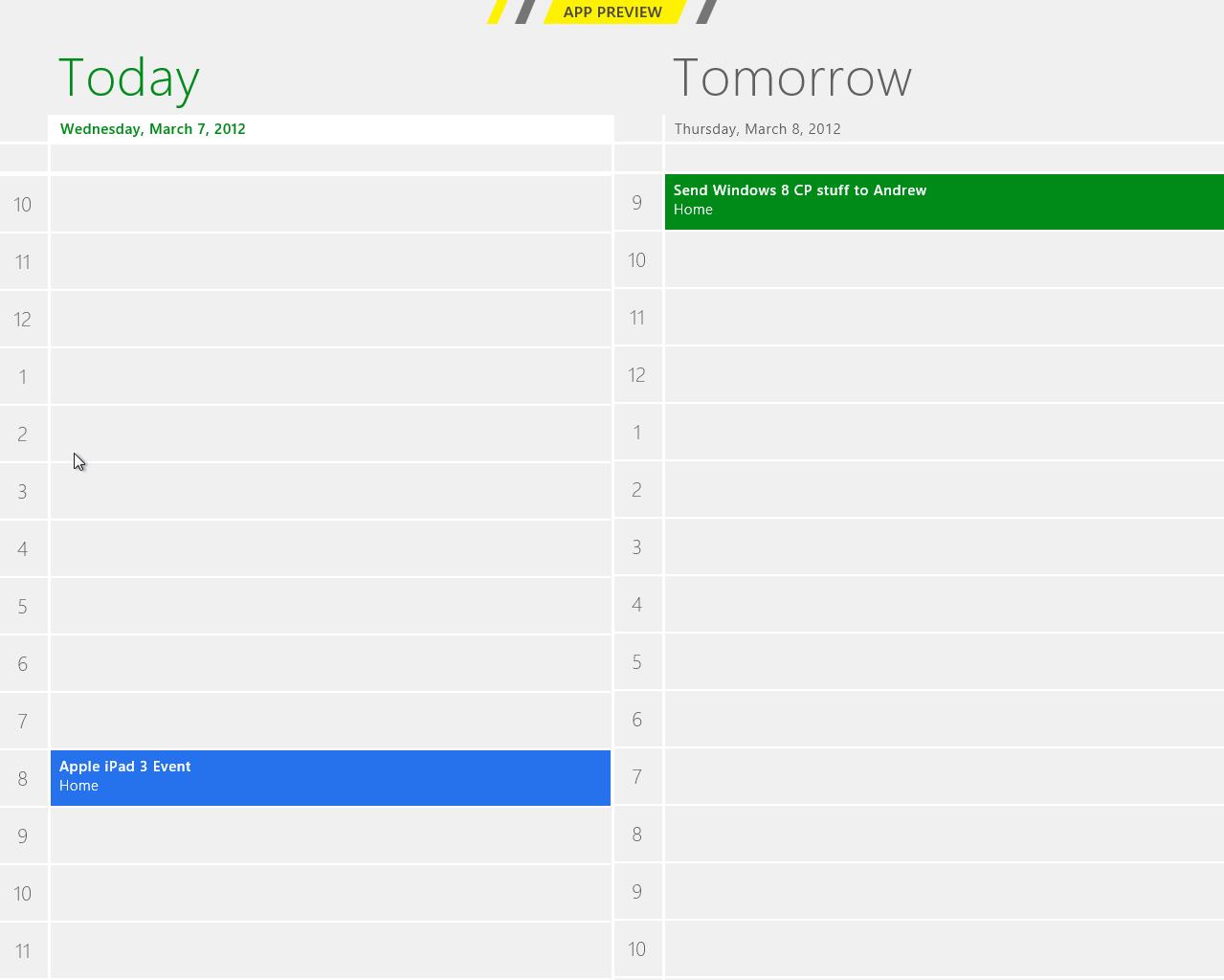
The design is very basic. The background is grey and event tiles are in bright colors. Weekends show up in darker grey in day and week views, distinguishing them from weekdays.
Navigation is once again hidden behind a right-click, which brings up options for alternating between day, week and month views, as well as option to navigate to today or add a new event. Adding an event can also be done by clicking a tile where you want to schedule the event to. Navigating between days/weeks/months is done by bringing your mouse close to the upper corners and clicking an arrow.
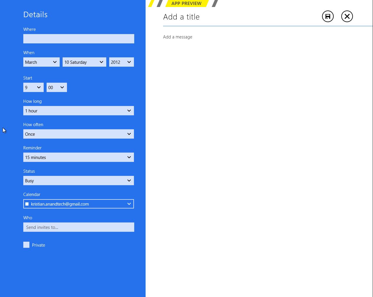
Adding an event has the common tools which are used by many other services. You can add a location, message, reminder and so on. There is an option to select the calendar where you want the event to be added, which is useful if you use different calendars/services for home and work purposes for example.
Service support is the same as Mail’s: Google, Microsoft (via Windows Live), and Exchange. I quickly tried Google and Microsoft and they synced fine. There is a slight delay in Metro’s Calendar so it takes a while before an event shows up. Different colors in the calendar stand for different services – in this case Google is in blue and Microsoft is in green.
Again, it feels odd to be constantly right-clicking in order to navigate in the user interface. There is definitely enough space for day/week/month buttons and personally I would prefer having them visible rather than right-click to access them. Moreover, the lack of list view can be a con if you’re used to using Apple’s calendar applications. Overall the calendar app is alright – there is no yippee effect but it’s mostly functional.
Messaging
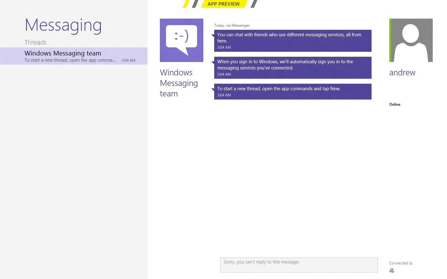
Like the other apps we've looked at, Messaging can only access a couple of services at present—Windows Messenger and Facebook, so again it's really best looked at as a demo or proof-of-concept than as a replacement for whatever your favorite IM program is. Messages between parties are laid out in a standard "speech bubble" format, with different colors and arrows to differentiate the parties who are sending messages.
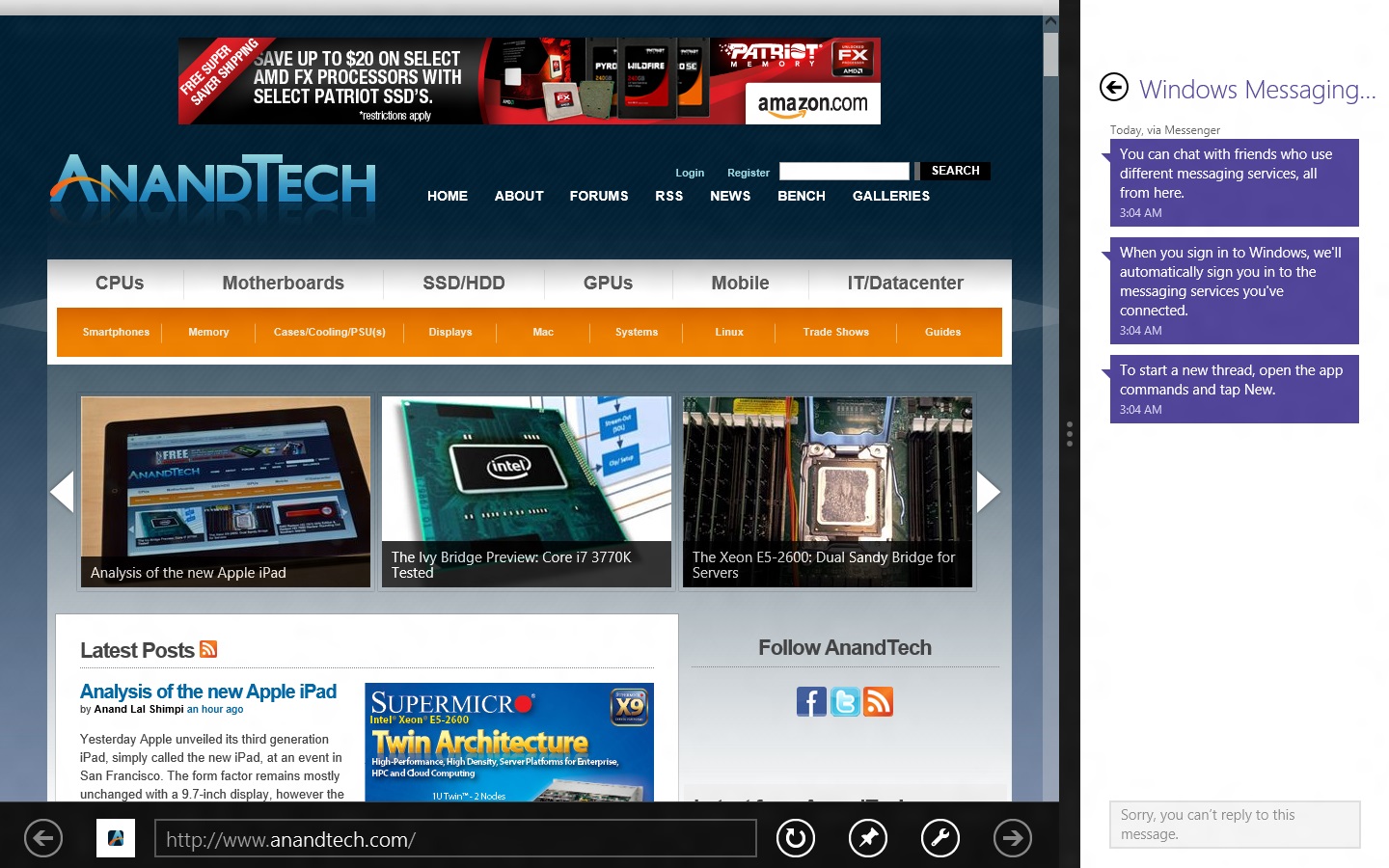
As a side note, Messaging is actually a really good example of the kind of app that works really well with Metro Snap—it takes up just the right amount of space on the side of your screen, and even on a 1366x768 display you still have enough room to use desktop apps comfortably. Someone make a Twitter client that works like this soon, OK?
People

The Metro People app serves more or less as an aggregator for all of your contacts from different services, including Facebook, Hotmail, Twitter, Google, Exchange, and others. You can tie People to these accounts directly from the app, and it will also pull data from accounts you've set up through other apps (like Messaging, Mail, and etc.). It can also aggregate status updates from various social networking services under its "What's new" heading.
Photos
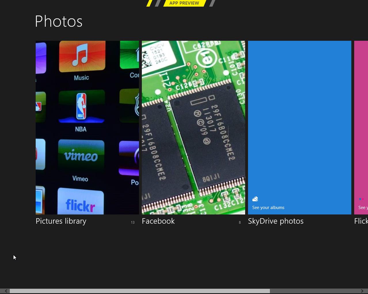
There is a very basic photo viewer included in Metro. Don’t expect anything fancy, all it does is view your photos. Supported services are the local pictures folder (obviously), Facebook, SkyDrive and Flickr. Once you enter your credentials, all of the photos show up in the now-familiar Metro-style grid of tiles [Editor's note: Kristian had problems getting SkyDrive and Flickr working, but this may be due to his geographical location—both services work fine for me here in the US].
The menu has four tiles, one for each service. Click a tile and the selected service opens. Right-clicking doesn’t bring any extra features here in the main menu.
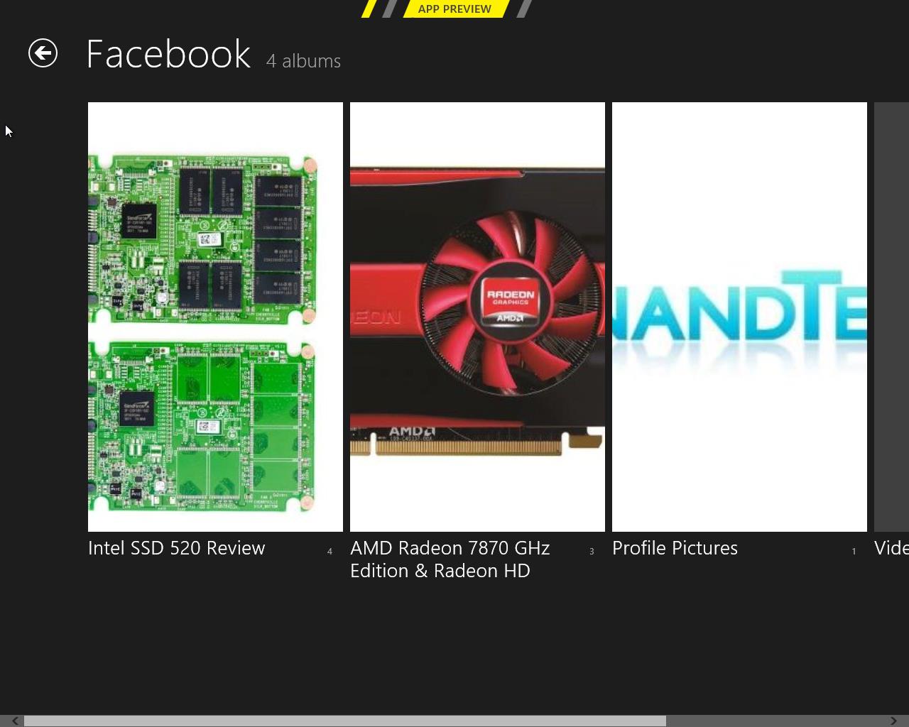
Once you open a service, it shows you the photos and possible folders. I created a test Facebook account and uploaded a few pics from our recent reviews, and they all show up fine. Unfortunately, Photos doesn’t show Facebook photos where you were tagged, so it’s limited to photos uploaded to your account.
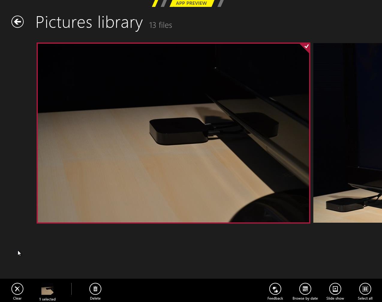
Inside an actual photo folder, you can play a regular slide show of the pictures or view them separately. Pictures library allows deletion and browsing by date as well, and Facebook has an option to view the photo in Facebook.
Metro’s Photos is very tablet-like and once again screams for touch input. It’s usable with a mouse but there are better photo viewing applications which are a lot more powerful as well in terms of features (editing, organizing, etc.). This time the service support is at least decent and Photos is indeed more than just a shortcut to your pictures folder.
Camera
Windows 8 includes a basic camera app that can be used to take pictures with your device's built-in camera—snapshots are saved in your Pictures library by default. The app has basic settings for setting camera resolution, controlling brightness, and other settings—it’s not going to turn a crappy webcam into an SLR, but it’s nice to see Windows finally get a functional native camera app.
Conclusions
The finished versions of these apps may be entirely different than the evaluation versions that Microsoft is showing off in the Consumer Preview, but even in their current form they give us an idea of how Windows 8 is going to approach the problem of vendor lock-in.
It seems like all of the major players in the tablet market—Google, Apple, and most recently Amazon—are using their hardware and software to lock the user into their respective ecosystems. Apple's iCloud offers easy setup and syncing for Apple mail, calendar, and other services; Google has built everything from an email service to a social network in an effort to get you to spend all of your time on its pages; and the Kindle Fire is purpose-built to purchase items from Amazon's stores. It can make interoperability difficult, and the longer you live in a given ecosystem, the more painful it can be to jump ship.
This is not to say that Microsoft doesn't offer you the option of lock-in: all settings are synced via your Windows Live ID, which is also needed to download apps, and it can also tie you to Hotmail, SkyDrive, Messenger, and any number of Microsoft-hosted services—they are trying to run a business here. The difference in Windows 8 is that you can also access data on the services that you're already using, and have data from those services treated the same way as data hosted by Microsoft. It's convenient and, most importantly, it presents a consistent user experience no matter where your stuff is coming from.


286 Comments
View All Comments
Sabresiberian - Sunday, March 11, 2012 - link
I downloaded and installed Win 8 CP last night (on a second partition, for dual boot). I must say, my fears about how hideous Win 8 would be are gone. There are no changes that are insurmountable, or even really difficult to understand, though it takes a bit of getting used to at first - as anything new does.As far as looks - I was surprised to find the big squares on a solid background weren't as hideous as I thought they would be, but it hardly matters because you can pretty much live in the desktop environment, in which you can install whatever background you like, just as has always been the case with Windows. There are things you will want to do that will bring Metro up, but it was no problem for me once I monkeyed around a bit and found out what to do.
There is a nice guide on MaximumPC for creating and installing Win 8 either dual boot or using Virtualization, if you are interested. Note: if you are installing on a RAID, you can't resize your partitions and create a new one from Vista (not sure about Win 7), you will need to use a third party app. I'll get back with the one I used, which worked nicely.
MaximumPC has several other excellent articles about Win 8, and I recommend reading them. One article had a method for starting Win 8 in the desktop mode, not Metro, so it has less impact on your sense of beauty. (I haven't tried it.)
Do yourself a huge favor and approach Win 8 with an open mind, and the knowledge that you WILL have to do some things differently - but it really will make sense in the end. Don't insist that things should work the old way, that just leads to frustration and deciding Win 8 is broken somehow; it is not.
There are a couple of things I don't like, such as not being able to make the rectangles smaller (2 sizes only). It's a minor quibble though since I will hardly ever have Metro up. There's no changing the Metro background beyond some solid color changes with different textural artwork, but the shades chosen by Microsoft for background colors actually displayed nicely on my screen. I wasn't fond of some of the tile colors and didn't see a way to change them in my poking around, yet anyway. (I actually like the tile that you click - or touch, if you have the hardware - to bring up the desktop, which looks like a miniature version of the desktop complete with whatever cool background you have installed.) As I said though, the desktop can be prettied up just as Win 7 could, and that's what I'll have up when I'm doing something that isn't fullscreen (such as posting in this thread).
Remember, too, that what we see in the Preview isn't set in stone and final; with enough constructive input, Microsoft could well change some things before release. I want to underline the "constructive" part of that, no one listens to flaming.
Give it a shot yourself! If you have any room on your hard drive, it's not hard at all to set up dual boot.
;)
jabber - Sunday, March 11, 2012 - link
Oh no doubt those of us that dont like will persevere because our jobs/careers depend on being able to support it going forward.However, I still feel that using Metro should be a choice.
All it needs is an option for those that want to use Metro or have a touch enabled desktop PC (yes thats you Jeff in Florida, nice to see you) to enable it and those of us that just dont have the time, inclination or need to do real work to earn a living to carry on as we were.
It's not like 8 is a total ground up clean sheet OS. Its just Windows 7 with this dog show assault course called Metro shoehorned into it.
If it was all new then I'd be more inclined to embrace it as it wasn't going to be able to change.
I'll change if I really have to due to real compelling reasons or benefits, that's life but not because some bum-fluffed faced developer at MS that's main daily IT work is typing tweets tells me to, simply on the justification that "it's cool"..
Sabresiberian - Sunday, March 11, 2012 - link
The program I used to resize the existing partition (because I have 2 hard drives set up in a RAID 0 configuration and Vista's "Shrink" will only work properly with a single disk. It appears to work at first, but does not.) and create one for Win 8 is called "Partition Wizard 7" Very nice, and the Home Edition is completely free. Nice little video tutorials on the site if you need help.I've never done dual boot before, so I thought I'd add a note for others new to the system. Once Win 8 was installed, my computer didn't give me an option to start on the different logical drives like I thought it would when I pressed "F8" (may be "F12" or something else on your hardware); it booted normally, I saw the Win 8 stylized fish, and then a screen popped up to allow me to select which OS I wanted to boot. Selecting "Vista" instead got me a restart into Vista.
Your computer might do something different, my mainboard is an Asus Rampage II Extreme, with Vista 64 Ultimate and now the Win 8 CP installed.
;)
klmccaughey - Sunday, March 11, 2012 - link
Well I have had it installed for a few days now, and as a power user, multimonitor, DESKTOP user, I find it is all but unusable.The reason for having multiple monitors and desktops is to make use of that space.... SPATIALLY and not have all this crap getting in the way. It takes ages to find things you need to use, it is ANTI-productivity and a total DISASTER for business and power users.
It's basically a very smooth running piece of shit (POS).
Surely they could create a business version where we can continue to have a desktop and easy ways to jump from one activity to another.
As it is you have a tablet interface that gets RIGHT IN THE WAY of trying to do what you want.
How much money were Anand given not to give it a bad review is what I am wondering. You cannot seriously tell me people in business, programmers etc are going to be able to use this POS?
B3an - Sunday, March 11, 2012 - link
Just STFU and go back to Windows 95 then.And oh no you have to learn new things with a new OS? Who would have thought!! Thats just shocking.
It takes about an hour at most to learn the new stuff, then maybe a week to get used to it. After that... you dont have to learn it again! And you'll find that most things are actually FASTER to do if you use the new OS the way it's intended.
jabber - Sunday, March 11, 2012 - link
Yeah you've never worked for a company with 10000+ staff have you? Ranging from Brandi in HR to Steve in Accounts etc.Corporations dont have that amount of time and productivity to lose to an OS designed to run fart apps and Angry Birds.
It's a grown up world out there. It's not just about catering to skinny jeaned hipsters who only use Twitter and Facebook while sitting in Starbucks.
Business as usual rules.
noname3 - Sunday, March 11, 2012 - link
Nobody has problems learning new things; the only person with learning difficulties seems to be you, based on your language.Learning new OSes is something some of us do for a living, but to do so we need to be rewarded with increased productivity. Metro UI kills productivity and it sucks, you want to learn something useful, go learn foresting or something.
klmccaughey - Sunday, March 11, 2012 - link
At a guess I would say I am able to learn substantially more than you would be able to. It is not a matter of learning something new, it is a matter of the interface, as is, getting in the way of productivity.I can see how it would be great on a tablet, but for me working it is a nightmare. Judging by the reaction worldwide it seems that other professionals are seeing the same iceberg.
I like the spanglies, and I am delighted for MS that they have caught up in this respect. But someone has dropped the design ball when it comes to productivity and any vision of workflow for the average person.
Hopefully there will be a bit of a rethink on the interface so that I can continue to program in Windows (tm) using "Windows", with easy access using mouse and screens. I want to upgrade, and I have spent hours enjoying Windows 8 on my tablet, but it isn't even close to usable for my day job. That is a real shame in my opinion.
Valahano - Friday, March 16, 2012 - link
Judging from your other posts on this article, I take it that you are some kind of a big Metro zealot. It's very hip, congratulations.However, this does not change the fact that this new interface is a major step back in usability on a desktop for anything beyond viewing lolcat pictures.
But don't worry, Win 8 is really great OS in at least one aspect - the Up button is back (Ctrl + Up still doesn't work though).
BehindEnemyLines - Sunday, March 11, 2012 - link
I think it's still the same Windows with all the desktop. In a multimonitor environment, you can have all your screens to be the desktop. The Start Screen is nothing more than a fullscreen start menu, and I actually find it more useful. The primary monitor will always be the screen with the Start Screen, so you can just click on the Desktop tile and use the desktop as it has always been. You can also access all of the power user resources by right-clicking on the bottom-left corner hot spot.And for a multimonitor setup, I suggest that you offset your left & right monitors slightly away from the bottom-left and top-right corners. That solved most of my problems.
I understand that businesses don't want to retrain employees, which is why all businesses should have an upgrade cycle and plan. Most businesses are NOT going to touch a new operating system at initial release. There's a ton of testing before deployment.
I had initially the same reaction with Windows 7 superbar. I thought MS was insane to remove the names from the taskbar and replace with just icons. And yet, I was amazed how much BETTER it's once I've learned it. I am just saying most things in life require some learning.