Microsoft BUILD: Windows 8, A Pre-Beta Preview
by Brian Klug & Ryan Smith on September 13, 2011 12:05 PM EST- Posted in
- BUILD
- Windows
- Microsoft
- Windows 8
- Trade Shows
The Metro UI
The best way to describe Windows 8 is a cross between the Metro UI from Window Phone 7 and the desktop architecture of Windows 7. In fact, virtually everything but the desktop gets a Metro treatment in Windows 8.

The Windows home screen starts initially hidden behind a lock screen virtually identical to WP7’s - slide up on a large edge-to-edge background to unlock. Inside is the Metro start screen, which is comprised of a grid of live application tiles that behave almost identically to those in Windows Phone 7. Two sizes of tiles serve as both application launch shortcuts and notification areas that can be populated with notifications, graphics, and other status indicators.
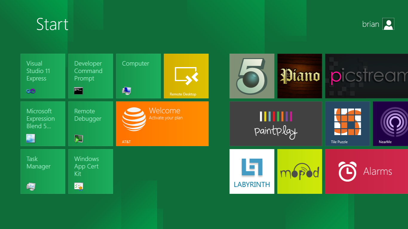
The tiles populate a horizontal strip that can be scrolled back and forth, and tiles can be rearranged accordingly. There are a few new gestures here over what we’ve seen before in WP7, including a swipe up to select a tile, and multitouch scrolling plus tile repositioning. Swipe up on tiles, and you can select them to convert size, uninstall, or unpin from the home screen.
The new start menu is more than a user experience oriented at tablets, it’s also the design language Microsoft has adopted for the entire new Windows 8 experience.
The thing to realize is that this modality isn’t so much a view as it is a combination of both new start menu, new interface for making Windows usable from a mobile perspective, and a completely new interaction paradigm. The interface is designed to perform and behave in the same way across multitouch, active digitizer, and keyboard+mouse combinations.
There’s another set of gestures and features as well which make use of the four edges of the display. The top and bottom are reserved for application-specific functions, the left and right are reserved for two Windows 8 specific tasks.
Sliding one’s finger from the left edge onto the display allows for both fast application changes, and the multiple-window snap functionality that’s been demoed already. The split is roughly 1:4 and divides horizontal real-estate between two applications views at once. The narrower of the two requires some additional development support, but the aim is to create a workable touch interface without sacrificing multitasking.
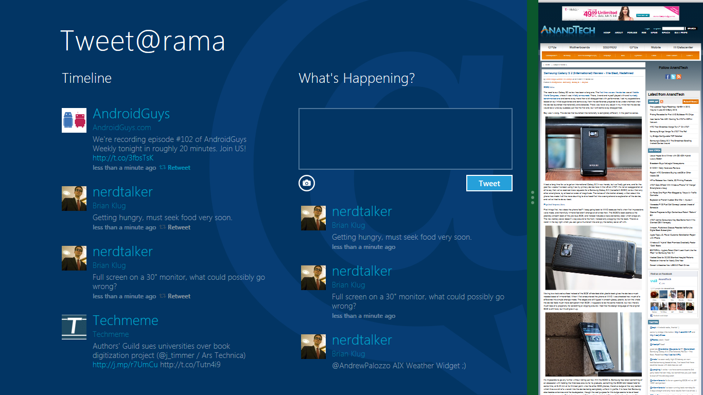
Swiping a finger from the right edge of the display towards the center brings up what Microsoft calls charms. This is a view that includes status indicators, and functionality like search, share, start, devices, and settings.

These respective shortcuts then bring up panes that occupy the same area on the right, and do what you’d expect. Settings for example is a place each application to build out a preferences area, so that each application has a common place users will go to control things.

Likewise, share acts like an intelligent copy paste, sharing working elements between applications. Finally search can either look through files and applications or dive into strings surfaced by other third-party applications.
These left and right based gestures exist across not just the Metro-infused start screen, but the entirety of Windows.
Moving around and getting back to the home screen is accomplished by pressing the Windows button, which on the tablet we were loaned is its own physical button analogous to iOS’ home button. Pressing the keyboard windows button performs the exact same action and summons the start menu.
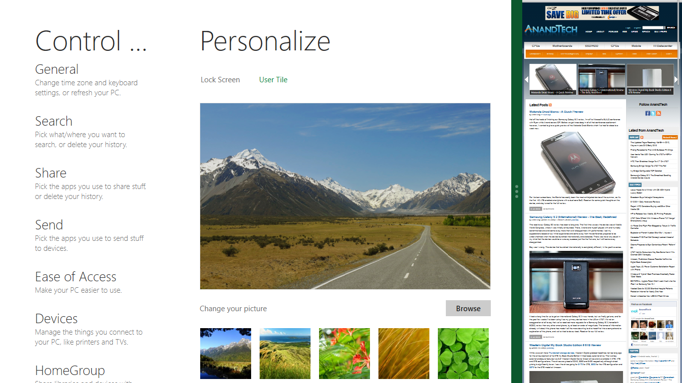
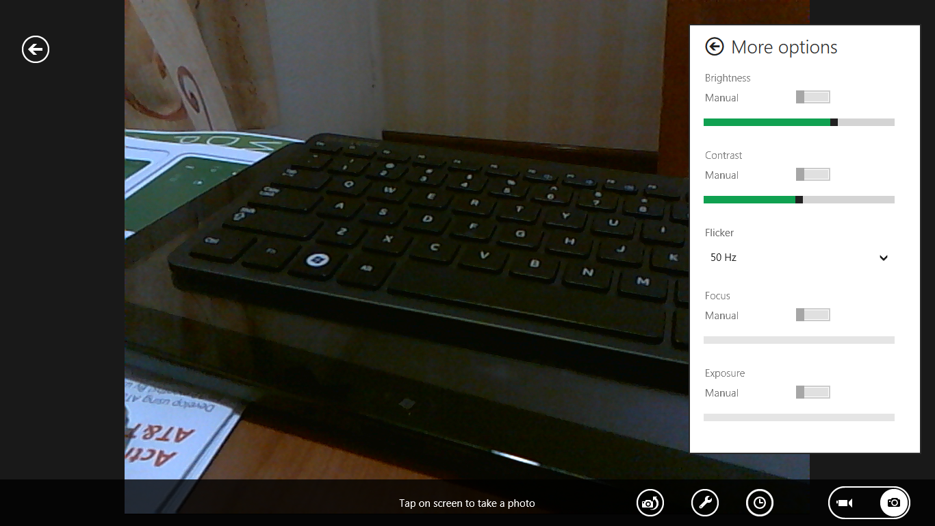
The current set of first-party applications is pretty spartan. There’s no maps, mail, or camera application, though Microsoft has already bundled a set of its own internally-created applications. These are entirely Metro themed as well. I mention camera because the sample hardware includes a front facing and rear facing camera, and at present the only way to access them is through the change user tile picture function, which can capture a photo from the front or back webcam.
Throughout the entire OS is a very WP7-like virtual keyboard, which supports a full size and thumb keyboard mode. There’s also a handwriting recognition mode which has two lines of handwriting input and is styled similarly to Windows 7’s tablet input keyboard.

The keyboard can be docked to the bottom of the display or detached and dragged around as well. I find that the split keyboard accommodates typing with thumbs and holding the device midair quite well.


235 Comments
View All Comments
Zan Lynx - Wednesday, September 14, 2011 - link
Interesting isn't it, that Microsoft has made versions of Server 2008 that don't have a desktop.I haven't run a server with a GUI in the last 12 years. Who would?
Text file based configuration that can be remotely managed, programmed and monitored entirely by script...
Using a GUI to point and click is horribly inefficient and doesn't scale to more than two servers.
Real sysadmins don't do pretty. They want it to work. Real sysadmins don't spend time clicking GUI buttons configuring new machines. They boot them and they auto-configure from the network. You never touch a GUI. Just the power button.
You might use a GUI to configure one user as a template in Active Directory. You'd never use the GUI to add 100 new employees to the system.
The real use for the GUI is to distract the management while you get real work done behind the scenes using a laptop and an SSH command line.
A GUI for tiling your command windows might be acceptable. Barely.
smithg5 - Wednesday, September 14, 2011 - link
My point wasn't that all sysadmins use GUIs now, but that the GUI hasn't gotten in the way of sysadmin work on a command-line, even though in most cases for Windows it starts up with the computer. This is a useful analogy for all these fears about Metro in a business environment.That said, most of the volume Microsoft sees for Windows server is that "two servers" size environment. Most businesses don't even have 100 employees. For the rest you'll still have your desktop, and that desktop will still have a command-line interface. And hey, they might even make desktop-less, Metro-less versions for the enterprise. If they don't, it won't somehow make your text-file configuration, CLI remote administration wizardry stop working. You'll just be a couple of clicks from that when you start up your server/laptop, and then you'll have something pretty to look at during your breaks. Those servers that you never see the desktop of will benefit from a smaller memory footprint. What's the problem?
piroroadkill - Thursday, September 15, 2011 - link
No, not really. For the vast majority, the gui represented a way to use a computer that made sense to more people.Metro is just a kind of gui, but heavily designed around touch and full screen tablet style use.
It's simply a bad fit for desktop users. I tried the dev preview, and I'm not impressed in the slightest.
This time, it isn't about resisting change for the sake of it. Really. The dev preview is seriously quite bad. Keyboard and mouse wise, it just sucks.
TEAMSWITCHER - Wednesday, September 14, 2011 - link
I've got the Developer Preview Up and running on a machine and I must say that I absolutely hate it! Whenever I click on the Windows Start Icon (lower left corner) you go to the Start Screen (METRO GUI), the Start Menu is gone! That's just not cool. Also the full screen metro apps are real easy to get lost in, it's begging for some kind of Mac OS X like Mission Control to see all running processes. There is no Back Button, I have to hit the Windows key to get back to the Start Screen. The Desktop (which has been standard on every Windows machine since the dawn of time) is now a strange bolt-on appendage to the METRO GUI experience. I don't know...this isn't beta yet and things may change....but so far consider me one totally pissed off Windows user...this shit isn't Windows. Feels more like Vista meets Bob. Oh, and calling icons "Charms" is gay.UMADBRO - Wednesday, September 14, 2011 - link
Well, at least you tried it. But try and remember, this is still a pre-beta, and isnt finished yet.Icehawk - Wednesday, September 14, 2011 - link
What are they trying to achieve? If it is one OS to rule them all I think they are making some serious mistakes as I do not believe traditional computing will be dominated by cellphones or tablets, they serve a much different function and will continue to do so indefinitely IMO. The apparent dumbing down of the OS to mimic a smartphone seems like a terrible idea to me.*Assuming* the desktop/Metro experience isn't radically altered the paradigm shift to right-hand panes (ie, the "charms" menu) makes no sense, for the last 10-15 years we've worked from the left. Works fine if I'm using a tablet but that is it - on a desktop nothing could be more jarring. Especially when it isn't uniform, for example the Start menu still pops up on the left. Ugg.
Also why does anyone think I want a touchscreen on my desktop? How am I supposed to reach it my arms are not 3' long! I guess we'll be forced at the least to use multi-touch pads? I hope it will work in tandem with a mouse since I'm not sure how the hell I'd game using a touchpad.
Shinya - Wednesday, September 14, 2011 - link
Microsoft,I really dont care for Ubuntu (lack of support and games) and OSX (lack of games, software, etc etc)
Please don't make me switch.
give us the ability to turn off Metro when it releases
ct82fl - Wednesday, September 14, 2011 - link
I think if Microsoft really wants to succeed in the tablet market with their OS, they really need to figure out a new innovative way to navigate. I saw very similar things to Apple's OS and iOS. In order to beat the competition they are going to need to figure this out and figure it quickly.cyberguyz - Wednesday, September 14, 2011 - link
Sorry but I am a power user of my computers. I don't want them looking or working like a tablet or my iPod.While I am usually on the bleeding edge with Windows, from beta onward with each release, this is one I am most definitely sitting out. It does not appeal to the way I want to use my computer at all. For a tablet that I am not expecting to use for heavy input or output, Win8 is just too cumbersome and tied to mouse or touch as primary inputs.
Rand - Wednesday, September 14, 2011 - link
A few suggestions, make CERTAIN your applications all have different names. If your applications have an uninstall.exe they will all be grouped together on the start screen with no way to differentiate them or tell which is for what program.Similarly, if your apps have a config.exe you won't be able to tell which is for which without opening them individually. Any executables must have clearly differentiated names that indicate precisely what they are.
Also, you absolutely must trim down your bookmarks to only a handful. If you're accustomed to having a 100-200 bookmarks in various folders in your browser, that isn't going to work well at all in Windows 8. You'll end up with screen after screen after screen of bookmarks.
I don't think it's remotely practical or usable any longer to have more then a dozen bookmarks at the most.