Microsoft BUILD: Windows 8, A Pre-Beta Preview
by Brian Klug & Ryan Smith on September 13, 2011 12:05 PM EST- Posted in
- BUILD
- Windows
- Microsoft
- Windows 8
- Trade Shows
The Metro UI
The best way to describe Windows 8 is a cross between the Metro UI from Window Phone 7 and the desktop architecture of Windows 7. In fact, virtually everything but the desktop gets a Metro treatment in Windows 8.

The Windows home screen starts initially hidden behind a lock screen virtually identical to WP7’s - slide up on a large edge-to-edge background to unlock. Inside is the Metro start screen, which is comprised of a grid of live application tiles that behave almost identically to those in Windows Phone 7. Two sizes of tiles serve as both application launch shortcuts and notification areas that can be populated with notifications, graphics, and other status indicators.
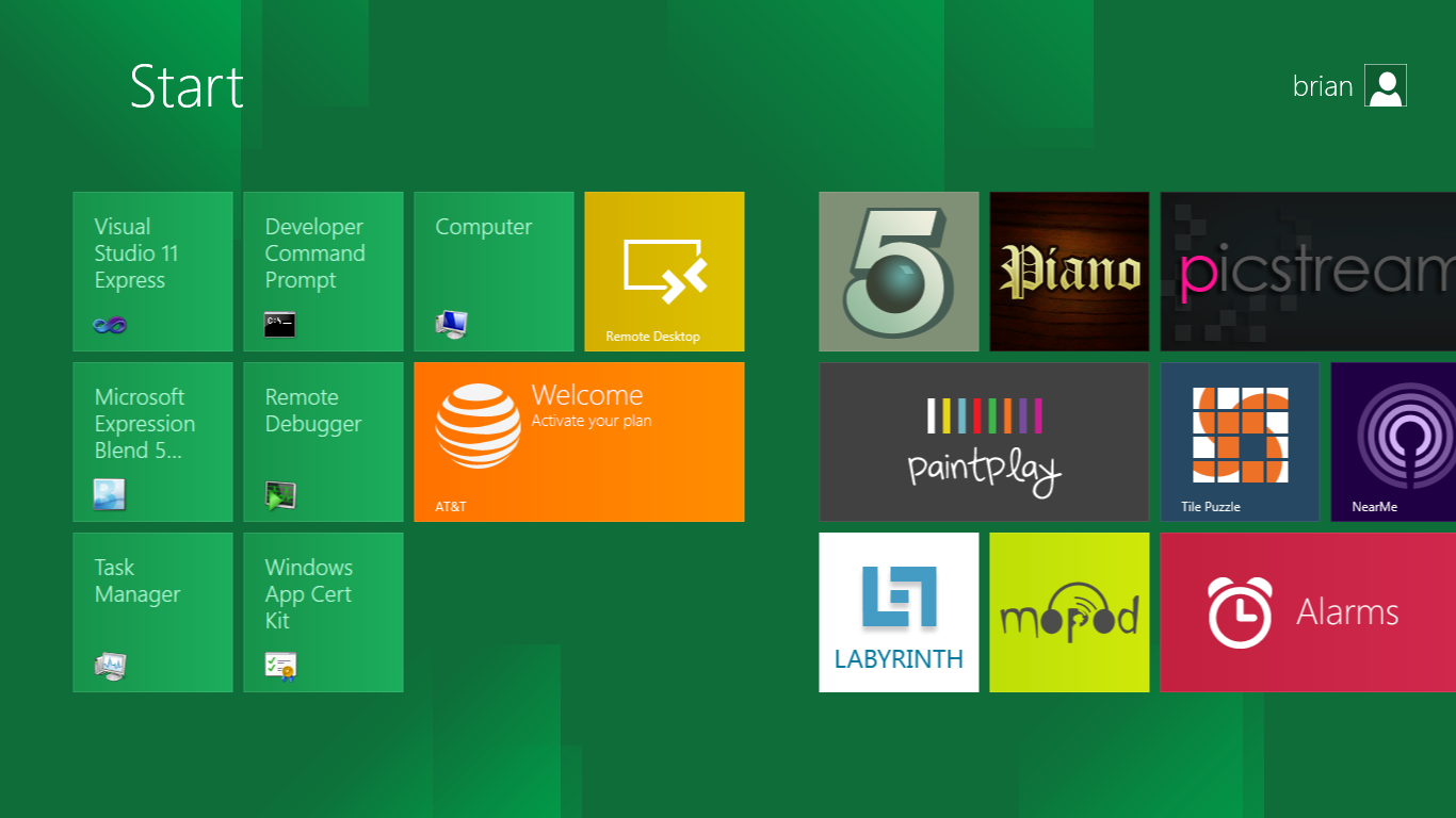
The tiles populate a horizontal strip that can be scrolled back and forth, and tiles can be rearranged accordingly. There are a few new gestures here over what we’ve seen before in WP7, including a swipe up to select a tile, and multitouch scrolling plus tile repositioning. Swipe up on tiles, and you can select them to convert size, uninstall, or unpin from the home screen.
The new start menu is more than a user experience oriented at tablets, it’s also the design language Microsoft has adopted for the entire new Windows 8 experience.
The thing to realize is that this modality isn’t so much a view as it is a combination of both new start menu, new interface for making Windows usable from a mobile perspective, and a completely new interaction paradigm. The interface is designed to perform and behave in the same way across multitouch, active digitizer, and keyboard+mouse combinations.
There’s another set of gestures and features as well which make use of the four edges of the display. The top and bottom are reserved for application-specific functions, the left and right are reserved for two Windows 8 specific tasks.
Sliding one’s finger from the left edge onto the display allows for both fast application changes, and the multiple-window snap functionality that’s been demoed already. The split is roughly 1:4 and divides horizontal real-estate between two applications views at once. The narrower of the two requires some additional development support, but the aim is to create a workable touch interface without sacrificing multitasking.
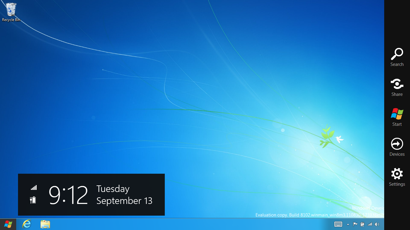
Swiping a finger from the right edge of the display towards the center brings up what Microsoft calls charms. This is a view that includes status indicators, and functionality like search, share, start, devices, and settings.

These respective shortcuts then bring up panes that occupy the same area on the right, and do what you’d expect. Settings for example is a place each application to build out a preferences area, so that each application has a common place users will go to control things.

Likewise, share acts like an intelligent copy paste, sharing working elements between applications. Finally search can either look through files and applications or dive into strings surfaced by other third-party applications.
These left and right based gestures exist across not just the Metro-infused start screen, but the entirety of Windows.
Moving around and getting back to the home screen is accomplished by pressing the Windows button, which on the tablet we were loaned is its own physical button analogous to iOS’ home button. Pressing the keyboard windows button performs the exact same action and summons the start menu.
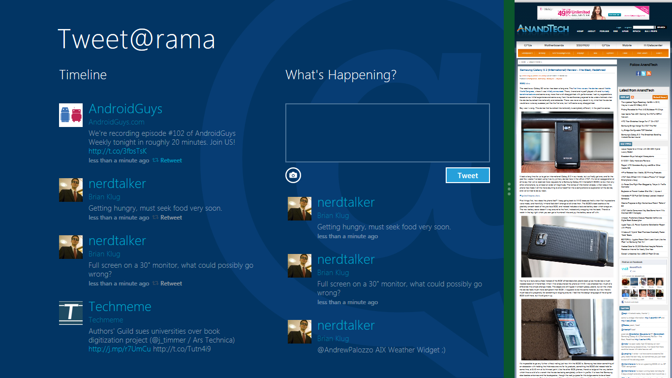
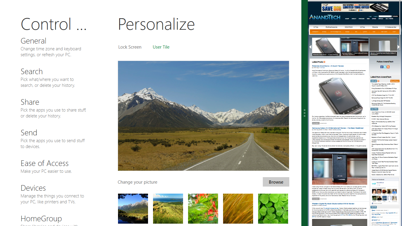
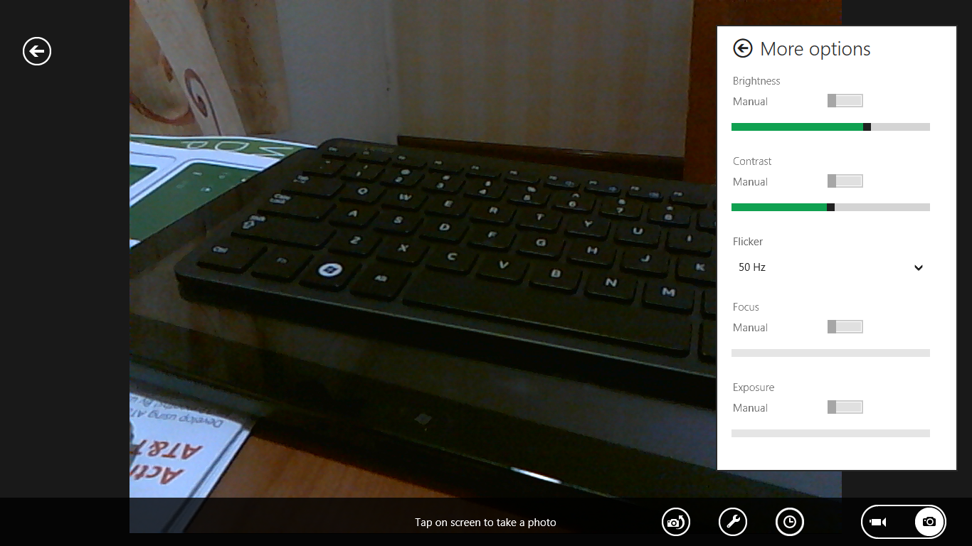
The current set of first-party applications is pretty spartan. There’s no maps, mail, or camera application, though Microsoft has already bundled a set of its own internally-created applications. These are entirely Metro themed as well. I mention camera because the sample hardware includes a front facing and rear facing camera, and at present the only way to access them is through the change user tile picture function, which can capture a photo from the front or back webcam.
Throughout the entire OS is a very WP7-like virtual keyboard, which supports a full size and thumb keyboard mode. There’s also a handwriting recognition mode which has two lines of handwriting input and is styled similarly to Windows 7’s tablet input keyboard.

The keyboard can be docked to the bottom of the display or detached and dragged around as well. I find that the split keyboard accommodates typing with thumbs and holding the device midair quite well.


235 Comments
View All Comments
Ryan Smith - Tuesday, September 13, 2011 - link
"How will this upset the AV vendors, and how does it affect corporate users who can currently only use MSE if they have up to 10 machines?"Realistically I have to think AV vendors will be upset. You can easily disable Defender and replace it with other AV software, but this will hurt consumer sales. For businesses it's murkier. I can't imagine MS will turn off Defender if you have too many employees, but products like Symmantec's Endpoint Protection do more than just AV scanning and will probably remain desirable.
"Also, wouldn't it be a simple fix to allow the mouse-wheel to scroll left and right in the tiles display? Down goes left and up goes right?"
The mouse wheel currently works that way. The problem is that it's on a per-app basis, it isn't implemented in a universal fashion. Also, it's very slow to scroll that way with the wheel.
Kakureru - Tuesday, September 13, 2011 - link
the beginning of the end for useable open platform computing..TPM sucked ass when it was thought up and sucks ass now as implemented.
Sure its greeeeat to prevent a few pieces of malware but corporate abuse is more
of a danger than the viruses its sought to prevent.
A5 - Tuesday, September 13, 2011 - link
If you'd like cite your claim of TPM being used for "corporate abuse", that'd be great.CSMR - Tuesday, September 13, 2011 - link
Could someone explain: why is the start menu so small in the desktop?The links there are: Start, Search, Share, Devices, Settings
No recently used programs, no pinned programs, no all programs? No libraries?
How is accessing programs going to work on Win8?
UMADBRO - Tuesday, September 13, 2011 - link
Why not try our the developer release and find out?bupkus - Tuesday, September 13, 2011 - link
I'm hopeful that it will run on my HP Touchpad.rasueno - Tuesday, September 13, 2011 - link
does it play crysis?Ryan Smith - Tuesday, September 13, 2011 - link
I'm wishing I brought a copy of Crysis with me. I would have installed it on the Samsung tablet given the opportunity.Exodite - Tuesday, September 13, 2011 - link
So in the end Windows 8 is Windows 7 with an UI I hate?No thanks, I'll pass.
Over the last weeks we've seen some minor utility functionality previewed and I've tried my very best to keep fingers crossed that the many technical problems related to the OS will be addressed as well.
Not so it seems.
Essentially, from '95 onward the only real difference between releases have been a constantly changing UI and tacked-on convenience functionality. And the changing UI isn't a good thing, that's one area where consistency is paramount.
Personally I find what I've seen of the new UI to be a complete clusterfuck and the fact that we seem to get further and further away from the simplicity, power and elegance - let alone the intuitive interface - of a 20 year old OS (namely AmigaOS 3.x) is deeply troubling.
I don't want to advocate thrashing the entire code base and rewriting everything from the ground up but it seems more and more likely that's what it's going to take.
Oh well, my '92 Amiga still works.
Belard - Tuesday, September 13, 2011 - link
Hey... I used to run AmigaOS 3.0 on my Amiga 1000. :PI'm still not a lover of MS... but MS I see what MS is doing... it does make sense and they want to cater to the typical computer user, which is still a moron -er I mean, novice. I see teenager kids nowadays who grew up with computers that don't actually know how to USE a computer. Other than games, opening a browser to use facebook, email and IM and look at porn, that's about it.
For those in the work place, its about running a few apps (Word, email, quickbooks). So for many people, the desktop is either a clean place they rarely see or mess with hundreds of icons all over the desktop.
With the launcher and controls off to the side - which is a good place for these stupid 16x9 screens, it may means faster access to our apps and data on the computer.
I have 9 Apps open right now (Photoshop, Word, excel, Opera, Notepad++ (awesome - a text editor with tabs that remembers everything), various explorer windows. I can't see the icons, widgets or folders on the desktop itself. If its not on the taskbar - I'm not seeing it. So maybe, Metro/Win8 will work in the end.
Windows 8 is obviously about keeping control of the computer market... as iPad and MacOS are selling like mad - even Walmart proudly sells iPad2s - the marketing is more so than anything I've seen at a Walmart, oh well.
The removal of the F8 DOS is a step in the right direction... remember AmigaOS 2.0 and above from 1990 is still more advance than Windows7 in some ways.
I own an Android phone, which its GUI works like iOS. I run a WindowsPhone7 Launcher to replace the Android one... why? Its easier to use, its faster, it tells me info... I spent almost a year trying to find an app, my alarm, camera etc with my Samsung phone... I know where they are, but I maybe on the wrong screen or an icon gets moves. Whatever. The WP7 launcher works great for mobile devices... and an ACTUAL WP7 works even better.
I generally don't NOT like or trust Microsoft. In the end - it was Commodore that screwed us and killed the Amiga, not apple, not MS. I still have my Amigas... along with my Win7PC, ThinkPads and iPad. Whatever works.
If MS wants to improve upon what they have... a major change is needed.
Dos > Win3.0 / 3.1 > Win95 / Win98 > WinXP / WinXP > Win7 (weakest jump).
Hmmmm.... I think Microsoft may actually OUT-Macintosh Apple... that would be fun.
Windows 7 is the best MS has down for their desktop OS, finally. Its still a challenge for most humans. Win8's Metro interface is a GOOD move towards more elegane and simplicity over the OLD desktop. But MS *MUST* do a good job in making Win8 run properly with a mouse and keyboard. I'm fine with fingerprints on my iPad... Pros are NOT going to be putting their hands on their 24~30" screens to use PHOTOSHOP!!
PS: notice there was still a DOS Prompt: Icon in the Win8 preview.