Microsoft BUILD: Windows 8, A Pre-Beta Preview
by Brian Klug & Ryan Smith on September 13, 2011 12:05 PM EST- Posted in
- BUILD
- Windows
- Microsoft
- Windows 8
- Trade Shows
The Metro UI
The best way to describe Windows 8 is a cross between the Metro UI from Window Phone 7 and the desktop architecture of Windows 7. In fact, virtually everything but the desktop gets a Metro treatment in Windows 8.

The Windows home screen starts initially hidden behind a lock screen virtually identical to WP7’s - slide up on a large edge-to-edge background to unlock. Inside is the Metro start screen, which is comprised of a grid of live application tiles that behave almost identically to those in Windows Phone 7. Two sizes of tiles serve as both application launch shortcuts and notification areas that can be populated with notifications, graphics, and other status indicators.
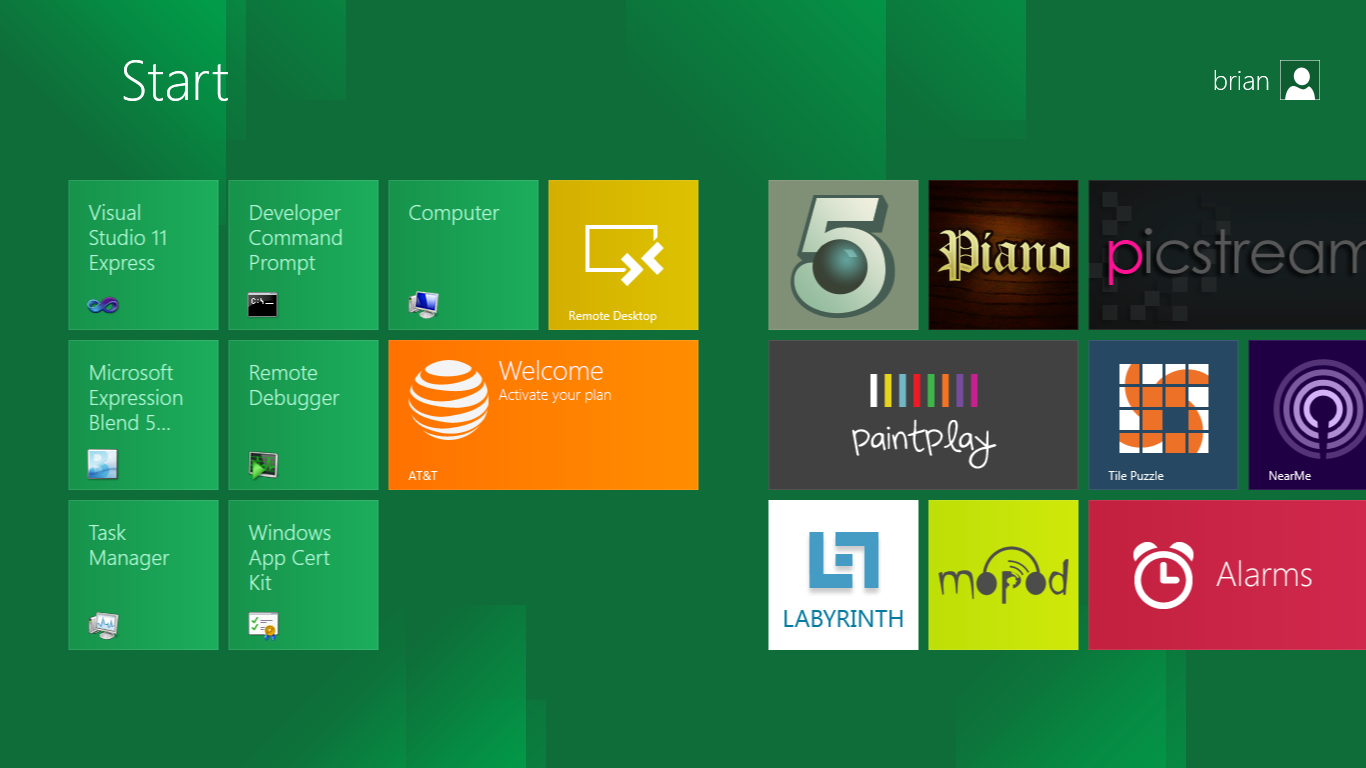
The tiles populate a horizontal strip that can be scrolled back and forth, and tiles can be rearranged accordingly. There are a few new gestures here over what we’ve seen before in WP7, including a swipe up to select a tile, and multitouch scrolling plus tile repositioning. Swipe up on tiles, and you can select them to convert size, uninstall, or unpin from the home screen.
The new start menu is more than a user experience oriented at tablets, it’s also the design language Microsoft has adopted for the entire new Windows 8 experience.
The thing to realize is that this modality isn’t so much a view as it is a combination of both new start menu, new interface for making Windows usable from a mobile perspective, and a completely new interaction paradigm. The interface is designed to perform and behave in the same way across multitouch, active digitizer, and keyboard+mouse combinations.
There’s another set of gestures and features as well which make use of the four edges of the display. The top and bottom are reserved for application-specific functions, the left and right are reserved for two Windows 8 specific tasks.
Sliding one’s finger from the left edge onto the display allows for both fast application changes, and the multiple-window snap functionality that’s been demoed already. The split is roughly 1:4 and divides horizontal real-estate between two applications views at once. The narrower of the two requires some additional development support, but the aim is to create a workable touch interface without sacrificing multitasking.
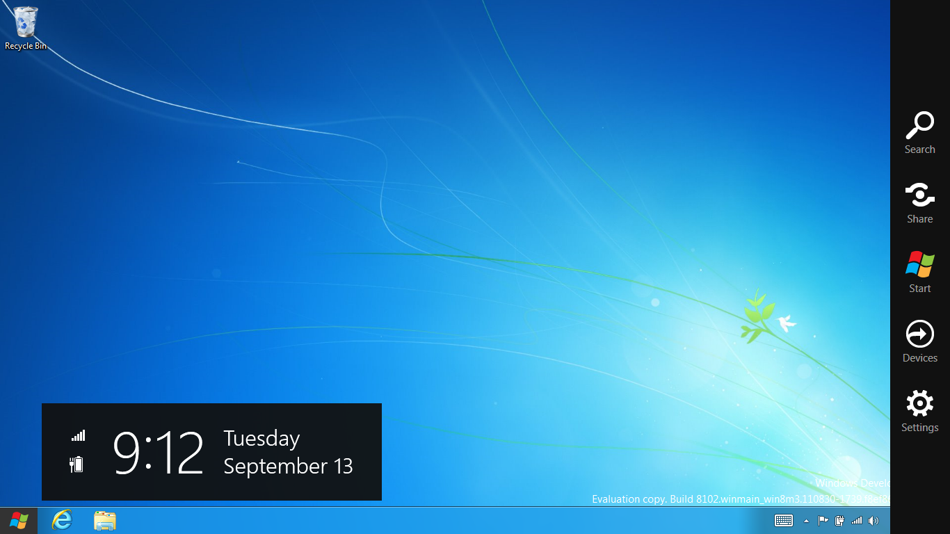
Swiping a finger from the right edge of the display towards the center brings up what Microsoft calls charms. This is a view that includes status indicators, and functionality like search, share, start, devices, and settings.

These respective shortcuts then bring up panes that occupy the same area on the right, and do what you’d expect. Settings for example is a place each application to build out a preferences area, so that each application has a common place users will go to control things.

Likewise, share acts like an intelligent copy paste, sharing working elements between applications. Finally search can either look through files and applications or dive into strings surfaced by other third-party applications.
These left and right based gestures exist across not just the Metro-infused start screen, but the entirety of Windows.
Moving around and getting back to the home screen is accomplished by pressing the Windows button, which on the tablet we were loaned is its own physical button analogous to iOS’ home button. Pressing the keyboard windows button performs the exact same action and summons the start menu.
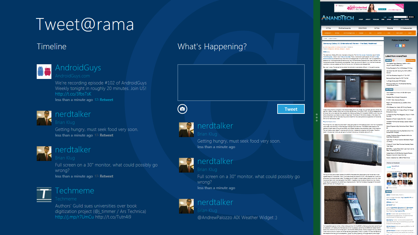
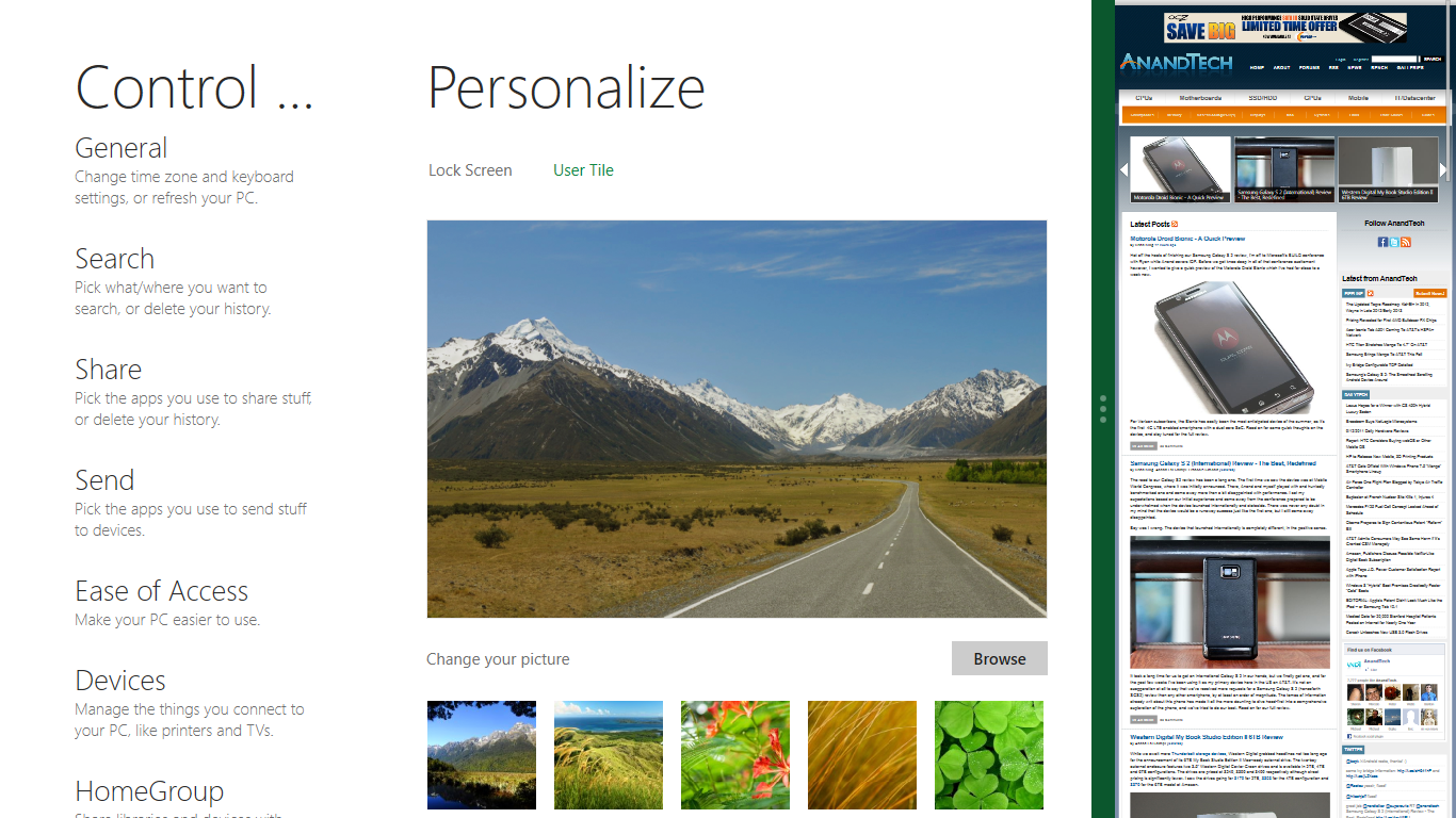
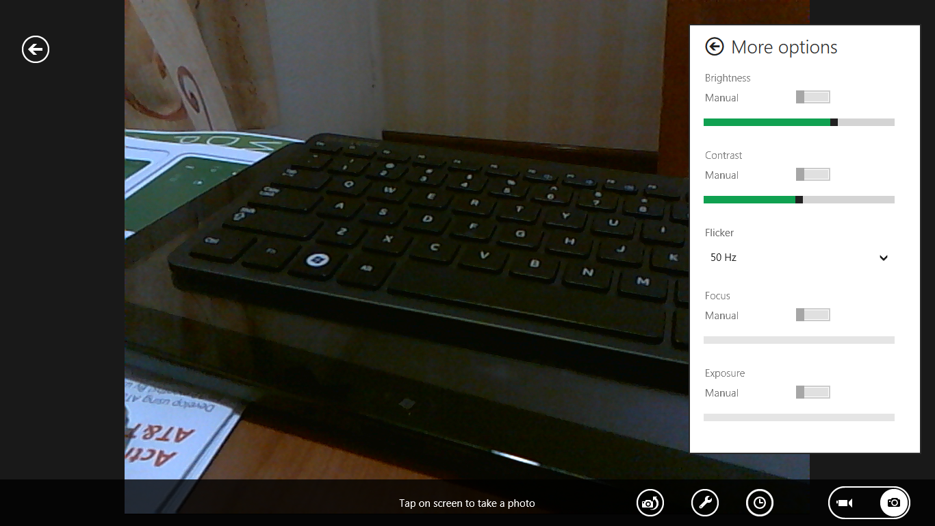
The current set of first-party applications is pretty spartan. There’s no maps, mail, or camera application, though Microsoft has already bundled a set of its own internally-created applications. These are entirely Metro themed as well. I mention camera because the sample hardware includes a front facing and rear facing camera, and at present the only way to access them is through the change user tile picture function, which can capture a photo from the front or back webcam.
Throughout the entire OS is a very WP7-like virtual keyboard, which supports a full size and thumb keyboard mode. There’s also a handwriting recognition mode which has two lines of handwriting input and is styled similarly to Windows 7’s tablet input keyboard.

The keyboard can be docked to the bottom of the display or detached and dragged around as well. I find that the split keyboard accommodates typing with thumbs and holding the device midair quite well.


235 Comments
View All Comments
cldudley - Thursday, September 15, 2011 - link
I see these arguments all the time about the application that use the ribbon-based UI, but I don't really see the problem... The most common features are located obviously and are easy to find, what are you using that is inconvenient? Mail-merge maybe, or something less obvious?I put together plenty of spreadsheets and documents using Excel/Word 2010, and I have used AutoCAD 2011 pretty extensively too, and I have no problem with the ribbon.
Maybe I am not doing the tasks you are doing, I write software for specialized controllers, produce drawings and layouts for industrial electrical control equipment, plus write documentation, memos, various tables and schedules, etc. At home I write letters, do the budget, different types of software development, game, etc, and I do not have any of these complaints.
I think the reality for 99.9999% of people is just the curmudgeon factor. "It's not what I am used to, so I don't like it."
gmknobl - Tuesday, September 13, 2011 - link
It appears MS is going for a real sea change here. What's hidden may not be either evolutionary or revolutionary but the GUI appears revolutionary, and that's not necessarily good.If they keep this to tablets only, they'll have to have a big hardware push at the same time and NO issues. In other words, a system that works as well or better than iOS from the start or they are in trouble in the tablet space. However, I think this is their best bet.
But as it stands now, if this isn't an easily disabled option for business and home non-tablet, non-phone computing it will fail in that area completely. One thing Apple got right with their OSes has been usability. (I think Amiga did too back in the day, and Android has now too.) MS has taken around three tries before it got a truly usable OS each time, including Win 7 which is essentially Vista SP2. They can't afford that this time. I cannot see this succeeding with desktops or laptops in the least. It's just too jarring, now matter how innovative it may be.
And I think the whole solid color flat 2d look is dead anyway but that's personal preference.
avddreamr - Tuesday, September 13, 2011 - link
While this format can and does work adequately in a mobile or rather hand held format the compromises that are made for this sort of functionality are simply unacceptable.I hope that this is obvious, because if that's the UI I have to deal with day to day... I will either not upgrade, switch to penguineware, or go fruity.
I would hope that with the vast collection of talent that works for microsoft have to know that the ui should be tailored for its specific use. Give me a 3d-taskbar, with scalable icons, and I'll be happy with the progress in my desktop.
I tell myself that they can't honestly be this stupid... but then I remember windows millennium.
CrapONez - Tuesday, September 13, 2011 - link
I'm at a loss to see how/why Microsoft would abandon a legion of business customers and introduce a new interface requiring retraining, from a mobile device paradigm that it owns a scant few percentage points of. As Kelly Bundy would say: "It wobbles the mind!"alent1234 - Tuesday, September 13, 2011 - link
do companies really spend a lot of money on OS training?damianrobertjones - Tuesday, September 13, 2011 - link
No they don't.Here is the training for Metro
"Do you see the massive Window for Icon there in purple... click it"
Opens Excel in the standard fashion.
"Do you see the saved excel spreadsheet there, right click and attach to the desktop/ui"
User scrolls tyo his/her Excel files.
User... "Ohh that's shiny"
cldudley - Thursday, September 15, 2011 - link
This. I have never had any computer "training" other than sitting down in front of the machine and using it.I may consult the online help quite a lot at first, but after I get used to how things work it all kind of comes together on it's own.
Certainly no employer has ever given me a training class for applications, in 2011 it is just assumed you know how to operate a Windows-based computer and basic Office applications. I don't think there is anything wrong with this assumption.
jecs - Tuesday, September 13, 2011 - link
Ok, tablets, I can see and understand.But do I have to pay full price for a tablet shell on a desktop or a workstation? And if W8 is mostly an interface would MS consider W8 a service pack for desktop use?
I want to skip W8 shell on my desktop, but I may like or need W8 other upgrades at a "fair" reduced price.
If MS does not understand this I wont pay for W8. Lets hope the best for W9.
damianrobertjones - Tuesday, September 13, 2011 - link
They offered Windows 7 at a reduced pricedgingeri - Tuesday, September 13, 2011 - link
It looks a lot like the old Star Trek LCARS system. Sure, LCARS was imaginary for the most part, but the guys who came up with it back when Star Trek: The Next Generation was in pre-production had the same basic ideas behind their design. I'm thinking Paramount might have an nice IP case against Microsoft for this one.