Understanding Camera Optics & Smartphone Camera Trends, A Presentation by Brian Klug
by Brian Klug on February 22, 2013 5:04 PM EST- Posted in
- Smartphones
- camera
- Android
- Mobile
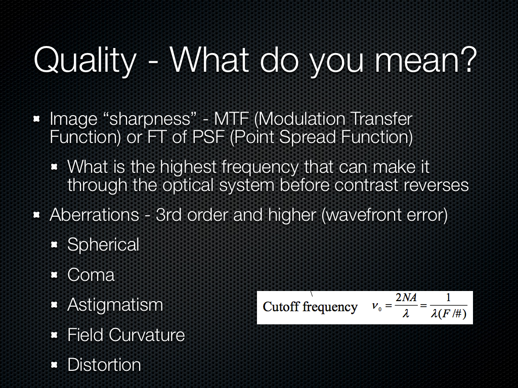
Evaluating Image Quality
How do we evaluate quality from an image? Tomes have been written about this, and really there are many things to look for in a good image. Chief among those is really sharpness, or MTF, the modulation transfer function. That’s a discussion in and of itself, but basically MTF plots show us how much contrast we will see in a square wave at a particular spatial frequency. MTF also tells us about what the highest frequency (spatial resolution) will make it through a system, this is the cutoff frequency. There are other things to look for too, like third order aberrations.
No camera system is perfect, and good design balances one aberration against the other. If we look at field dependency the most difficult part of an image for a designer is the edges, where aberrations increase quickly.

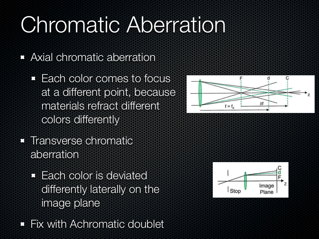
These previous aberrations have been monochromatic, there are also aberrations which exist as a function of wavelength or color. Axial chromatic we can fix with a doublet to some extent or try to minimize. Transverse is what we sometimes see with color fringing, although in most commercial systems purple fringing is often an artifact of ISP.
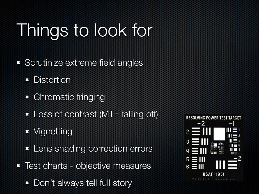
So what can we look for? Again, distortion is visible quickly since these systems in a smartphone are so wide angle. Chromatic fringing since this is annoying and something easy to notice on silhouetted subjects. Obviously sharpness is a big deal, does the image look blurry. Finally the presence of any residual vignetting and lens color shading, despite lots of gnashing of teeth from the optical designers and lots of ISP tweaking — which if you’re like my ex girlfriend you’re going to add back in with Instagram or Twitter filters to look “vintage,” you hipster. Test charts will tell us a lot, and there are many good choices, but good test scenes sometimes tell a lot more.
I hate pictures of keyboards in reviews since they’re the laziest subject of all to photograph when doing a review of a smartphone, but here’s one I couldn’t resist. The image is so noisy I can’t read the keys, and the totally homogenous desk looks awash with luminance noise. There isn’t much chroma (color) noise.

Here’s one I complain about a lot, huge halos around contrasty regions thanks to the sharpening kernel or unsharp mask applied to the image. This is an attempt by the OEM to add back in spatial resolution or contrast after killing it all with noise reduction, and after you see halos you won’t un-see them. We can also see some serious moire in the bottom left, partly why I love that scene.

This is a photo from a recently released device which clearly has some strong field curvature. Again the center of the image is easy to get nice and sharp, but if you look at the edges, it gets dramatically blurry. The center is easy, the edge of the field is hard.

There was a very popular phone which was criticized for having some purple color stray light visible in the image when a light source was just out of the field of view. It turns out stray light is a big issue for everyone, since obviously nobody wants a huge lens hood sticking out of their phone, or at least industrial designers don’t. Well, again, this isn’t an isolated problem for just one vendor, it’s something everyone has. I believe the purple color gets picked up from a magnesium fluoride antireflection coating or some other AR coating.

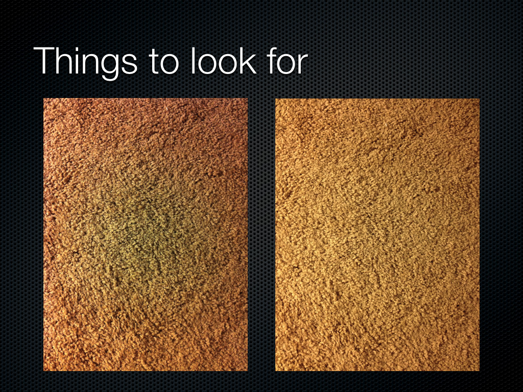
The image on the left is from a very popular device, and the image on the right is of the next generation of this popular device. The left image has a very pronounced green spot in the center, and then a definite red ring around the outside. After you see this pattern, it’s unlikely you’ll be able to un-see it. I used to play a game on Reddit looking for the green circle in people’s images, then going and checking EXIF, and about 90 percent of the time I could nail what smartphone this was coming from, just from the green spot. This is classic failure to correct for lens color shading, either their ISP couldn’t do it or they didn’t characterize it well enough, but it was fixed in the next generation. These lens shading errors are incredibly annoying when taking a photo of a subject with a flat monochromatic field, like a book, whiteboard, or so forth.
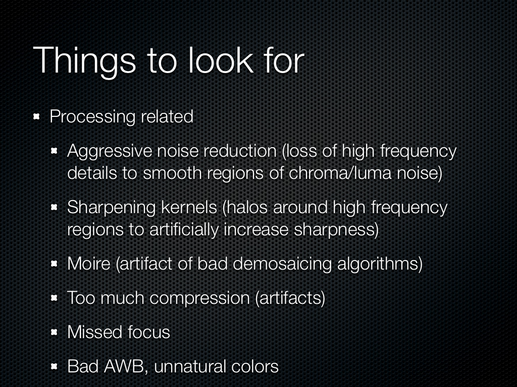
There are other things that I look for as well, aggressive noise reduction, again moire, bad auto white balance are pretty easy to spot. Another annoyance are cameras which completely miss focus, even on very contrasty scenes which should be easy to focus on with contrast based auto focus.


60 Comments
View All Comments
Sea Shadow - Friday, February 22, 2013 - link
I am still trying to digest all of the information in this article, and I love it!It is because of articles like this that I check Anandtech multiple times per day. Thank you for continuing to provide such insightful and detailed articles. In a day and age where other "tech" sites are regurgitating the same press releases, it is nice to see anandtech continues to post detailed and informative pieces.
Thank you!
arsena1 - Friday, February 22, 2013 - link
Yep, exactly this.Thanks Brian, AT rocks.
ratte - Friday, February 22, 2013 - link
Yeah, got to echo the posts above, great article.vol7ron - Wednesday, February 27, 2013 - link
Optics are certainly an area the average consumer knows little about, myself included.For some reason it seems like consumers look at a camera's MP like how they used to view a processor's Hz; as if the higher number equates to a better quality, or more efficient device - that's why we can appreciate articles like these, which clarify and inform.
The more the average consumer understands, the more they can demand better products from manufacturers and make better educated decisions. In addition to being an interesting read!
tvdang7 - Friday, February 22, 2013 - link
Same here they have THE BEST detail in every article.Wolfpup - Wednesday, March 6, 2013 - link
Yeah, I just love in depth stuff like this! May end up beyond my capabilities but none the less I love it, and love that Brian is so passionate about it. It's so great to hear on the podcast when he's ranting about terrible cameras! And I mean that, I'm not making fun, I think it's awesome.Guspaz - Friday, February 22, 2013 - link
Is there any feasibility (anything on the horizon) to directly measure the wavelength of light hitting a sensor element, rather than relying on filters? Or perhaps to use a layer on top of the sensor to split the light rather than filter the light? You would think that would give a substantial boost in light sensitivity, since a colour filter based system by necessity blocks most of the light that enters your optical system, much in the way that 3LCD projector produces a substantially brighter image than a single-chip DLP projector given the same lightbulb, because one splits the white light and the other filters the white light.HibyPrime1 - Friday, February 22, 2013 - link
I'm not an expert on the subject so take what I'm saying here with a grain of salt.As I understand it you would have to make sure that no more than one photon is hitting the pixel at any given time, and then you can measure the energy (basically energy = wavelength) of that photon. I would imagine if multiple photons are hitting the sensor at the same time, you wouldn't be able to distinguish how much energy came from each photon.
Since we're dealing with single photons, weird quantum stuff might come into play. Even if you could manage to get a single photon to hit each pixel, there may be an effect where the photons will hit multiple pixels at the same time, so measuring the energy at one pixel will give you a number that includes the energy from some of the other photons. (I'm inferring this idea from the double-slit experiment.)
I think the only way this would be possible is if only one photon hits the entire sensor at any given time, then you would be able to work out it's colour. Of course, that wouldn't be very useful as a camera.
DominicG - Saturday, February 23, 2013 - link
Hi Hlbyphotodetection does not quite work like that. A photon hitting a photodiode junction either has enough energy to excite an electron across the junction or it does not. So one way you could make a multi-colour pixel would be to have several photodiode junctions one on top of the other, each with a different "energy gap", so that each one responds to a different wavelength. This idea is now being used in the highest efficiency solar cells to allow all the different wavelengths in sunlight to be absorbed efficiently. However for a colour-sensitive photodiode, there are some big complexities to be overcome - I have no idea if anyone has succeeded or even tried.
HibyPrime1 - Saturday, February 23, 2013 - link
Interesting. I've read about band-gaps/energy gaps before, but never understood what they mean in any real-world sense. Thanks for that :)