The Motorola Moto G4 and G4 Plus Review
by Brandon Chester on August 15, 2016 8:00 AM EST- Posted in
- Smartphones
- Lenovo
- Motorola
- Moto G
- Moto G4

At this point in time, I don't think the Moto G line needs any introduction. With the original Moto G in 2013 Motorola really went beyond what was thought to be possible in a mid-range smartphone. At that point in time, buying a $200 smartphone usually meant buying some Samsung or LG phone with a name nobody had ever heard of, and specs that left much to be desired. The Moto G showed that you could create an Android phone with an HD display, good performance, a good build, and good battery life at a price under $200.
Motorola has iterated on the Moto G in the years since the original model. The second generation saw an increase in the display size, but in all other respects it was the same phone as the original. The third generation Moto G was where Motorola provided a significant increase in performance, while also bumping up battery life and adding unique features like water resistance. At the time of its release, I recommended the 2015 Moto G to anyone looking for a well- rounded Android smartphone at a price around $200.
As another year comes and goes, we get another version of the Moto G. As the mid-range smartphone market gets increasing competitive, there's more pressure to improve on a phone each year rather than shipping a basic update like the second generation Moto G was. This year Motorola, now owned by Lenovo, has gone for a strategy of segmentation. I am personally not a huge fan, as to me the Motorola phone line was characterized by its simplicity, with there just being the Moto E, Moto G, and Moto X. However, having sub-models within the Moto G line allows certain higher priced models to add additional features on top of the standard extras like more storage and RAM.
For this review I'll be looking at the Moto G4, as well as the Moto G4 Plus. Motorola also sells the Moto G4 Play which isn't part of this review, and it represents a less expensive option with reduced specifications that are similar to those of the 2015 Moto G. Below you can view the specs of both the Moto G4 and G4 Plus, with last year's Moto G thrown in for comparison.
| Moto G (2015) | Moto G4 | Moto G4 Plus | |
| SoC | Snapdragon 410 4 x 1.4GHz Cortex A53 Adreno 306 |
Snapdragon 617 4 x 1.5GHz Cortex A53 4 x 1.2GHz Cortex A53 Adreno 405 |
|
| RAM | 1GB/2GB LPDDR3 | 2GB LPDDR3 | 4GB LPDDR3 |
| NAND | 8/16GB eMMC + MicroSD | 16/32GB eMMC + MicroSD | 16/64GB eMMC + MicroSD |
| Display | 5-inch 1280x720 IPS | 5.5-inch 1920x1080 IPS | |
| Network | 2G / 3G / 4G LTE Cat4 | ||
| Dimensions | 142.1 x 72.4 x 11.6mm, 155g | 153 x 76.6 x 9.8mm, 155g | |
| Camera | 13MP Rear Facing, f/2.0, 1.12µm, 1/3.06" (Sony IMX214) |
16MP Rear Facing, f/2.0, 1/2.4", PDAF + Laser AF (OmniVision OV16860) |
|
| 5MP Front Facing, 1.12µm (Samsung S5K5E2) |
5MP Front Facing, 1.4µm (OmniVision OV5693) |
||
| Battery | 2470 mAh (9.39 Wh) | 3000 mAh (11.4 Wh) | |
| Launch OS | Android 5.1 | Android 6.0 | |
| Connectivity | 2.4GHz 802.11a/b/g/n, BT 4.0, GPS/GNSS, USB2.0 | 2.4/5GHz 802.11a/b/g/n, BT 4.2, GPS/GNSS, USB2.0 | |
| Fingerprint Sensor | No | No | Yes |
| SIM | MicroSIM | MicroSIM + Included NanoSIM Adapter | |
| Price | $179 (1GB/8GB) $219 (2GB/16GB) |
$199 (16GB) $229 (32GB) |
$249 (2GB/16GB) $299 (4GB/64GB) |
On paper, the Moto G4 and G4 Plus look like a good improvement over the 2015 model. The SoC has moved from Qualcomm's Snapdragon 410 to Snapdragon 617, which bumps the max CPU frequency to 1.5GHz and uses the much faster Adreno 405 GPU. RAM has also moved to 2GB standard, which is good to see as the 1GB Moto G was crippled compared to the 2GB model due to aggressive application eviction. In the case of the Moto G4 Plus, you have two different SKUs. The first commands a $50 premium over the equivalent Moto G4, which gets you an improved camera with PDAF and Laser AF, as well as a fingerprint scanner. An additional $50 brings the total to $299, but doubles the amount of RAM to 4GB and quadruples the storage to 64GB.
Both the Moto G4 and G4 Plus increase the display size to 5.5 inches, while also increasing resolution from 1280x720 to 1920x1080. With the increased size comes a larger but thinner chassis, and the mass is actually kept the same. Battery capacity has increased accordingly, moving from 9.39Wh to 11.4Wh. As for the cameras, the Moto G4 uses the same 13MP IMX214 rear-facing sensor from Sony, while the Moto G4 Plus adopts a much larger 16MP sensor from OmniVision. Both phones use a larger 5MP OmniVision sensor than the 2015 model's Samsung sensor.
Connectivity is mostly the same, with cellular support staying at Category 4 LTE. 5GHz WiFi has been added which is great to see, but it's still 802.11n only. NFC is still nowhere to be found, which isn't a serious issue now, but may cause some disappointment as Android Pay expands to other countries. Curiously, Motorola continues to use a MicroSIM slot despite most phones having moved to NanoSIM. They do provide a NanoSIM to MicroSIM adapter pre-installed, which saves you from having to buy an adapter.
Design
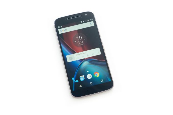
The Moto G4 still retains Motorola's design attributes, but it departs from the design of the 2015 Moto G and other previous Motorola devices in several ways. When you hold it, the most obvious change is the fact that the back cover levels off and is mostly flat, which contrasts with all the other Motorola devices I have where the back has a continuous curve going from the left to the right side edges of the chassis. The reasoning behind this is fairly clear, as a curved back would make the phone thicker and more difficult to hold, and that wouldn't pair well with the jump from a 5-inch display to a 5.5-inch one. This does mean that the Moto G4 is not as comfortable to hold in the hand as its predecessor, but that's also just what happens when you keep increasing the screen size until a device is no longer usable in a single hand.
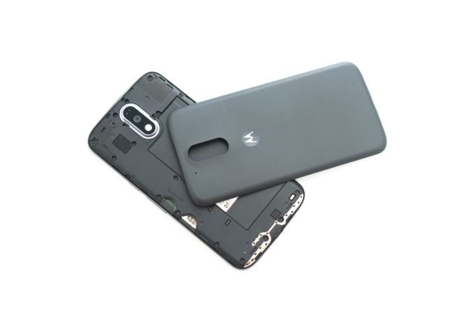
The back cover is still removable, and the material it's made of is distinctly different from the 2015 Moto G. It has a very fine texture, and it almost feels rubbery in a way. In contrast, the 2015 Moto G's back cover was made of a fairly hard plastic with diagonal lines running across it to create texture. I personally prefer the feel of the Moto G4's back cover, and I think it lends itself well to the new flatter design. I still don't understand why the back cover is removable when it only serves to access the SIM tray and MicroSD slot. This kind of chassis works well with removable trays, and it would eliminate the seam between the back cover and the edges of the phone.
One thing you lose with the Moto G4 is the waterproofing of the previous model. In general I don't think this is a deal-breaker, although I do have to say that I'm a bit disappointed as the 2015 Moto G has always been my go-to device for taking photos when kayaking due to its waterproofing.
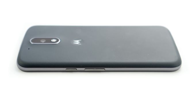
Like the previous Moto G, the Moto G4 and G4 Plus have both the sleep/wake button and the volume rocker on the right side of the phone. With the previous models this wasn't necessary from a usability standpoint, but with the move to a 5.5" display it's definitely a good call. The sleep/wake button maintains its textured feeling so you can distinguish it from the volume rocker, which has always been a nice touch. Unfortunately, I don't have any other good things to say about these buttons. I've never used buttons with such a poor click to them before, not just on a smartphone but on any mechanical device I can recall using that has some sort of button. With the sleep/wake button this isn't a huge issue as you don't use it often, but with the volume rocker it becomes a legitimate usability problem.
Motorola's previous phones actually had pretty nice buttons given their prices, with the Moto E surprising me by having decent buttons despite the fact that the upper part of the mechanism was part of the removable band around the phone. The Moto G4's buttons have almost no clickiness to them at all, and in the case of the volume rocker the mushy feeling ends up compromising their usability because if you try to repeatedly press them they seem to stay in the depressed position and won't click at all until you let it reset. I had hoped that this was just some sort of flaw with one of the units, but both have the same issue. Every other Motorola device that I've reviewed has had a similar feeling to the buttons, and I don't understand why the Moto G4 has downgraded their quality this significantly.
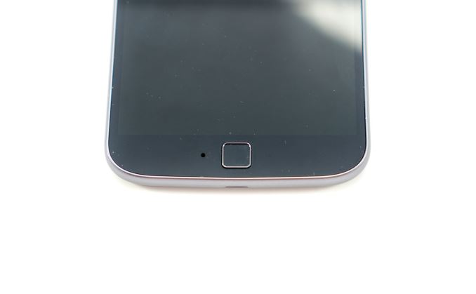
Moving on to the front of the phone, you'll see one of the other visual differences that help to distinguish the Moto G4 Plus from the normal Moto G4. Both phones are the same in size so they have the same front plate design, but the Moto G4 Plus has placed a fingerprint scanner on the bottom bezel. Unfortunately, this is really another poor design decision on Motorola's part. The Moto G4 and G4 Plus both use on-screen buttons, and so the fingerprint scanner doesn't act as a home button with capacitive buttons for back and recent apps on the left and right. While the fingerprint sensor does its job fine apart from some scanning issues due to its small size, I find the fact that it can't act as a home button to be quite an annoyance. It's positioned exactly where you'd expect a home button to be, and I've lost track of how many times I would instinctively tap it instead of tapping the on screen home button. The entire implementation just feels very thoughtless, and the decision to put the sensor in that spot while still using on screen buttons is one of the pitfalls of segmenting products in this manner while trying to maintain a common design between them.
Owners of the 2015 Moto G may miss having two speakers on the front of their phone, but with the Moto G4 Plus putting a fingerprint scanner in that spot the feature had to go on both versions of the phone. Motorola has also made an interesting choice by putting the microphone on the bottom bezel rather than on the bottom or side of the phone. On the Moto G4 Plus this does concern me as far as durability is concerned, because you now have breaks in the glass for the microphone and the fingerprint scanner side by side, potentially creating an area that can easily crack.
In the end I'm torn on how to feel about the Moto G4's design. I really don't like that Motorola has moved to such a large display, as I have always advocated them to users looking for a smartphone that can be reasonably used in one hand. I think the design of the phone has matured from the previous Moto G, and the materials certainly feel nicer. On the other hand, the buttons don't feel good at all, and it presents a legitimate usability problem in the case of the volume rocker. The fact that the fingerprint scanner isn't a home button is also really strange given its placement, and it can take a while to train yourself to not attempt to use it as one. For me personally, I'd honestly have to describe the new design as a downgrade due to the large size, sub-optimal fingerprint scanner UX, lack of waterproofing, and poor buttons. The change in size is the biggest issue for me here, but even if you find it manageable I don't think you can really describe the Moto G4's design and build quality as a definite upgrade from its predecessor.


94 Comments
View All Comments
kspirit - Monday, August 15, 2016 - link
The fingerprint scanner on the front ruins the look with the bottom bezel... They should have placed it on the back. Otherwise seem like pretty good phones for the price. Hopefully Moto keeps them updated instead of what they've been doing with their last few devices.nevertell - Monday, August 15, 2016 - link
Do you enjoy not being able to unlock a phone whilst it's laying on a table, screen facing upwards ?I certainly don't.
smartthanyou - Monday, August 15, 2016 - link
Seems a pretty simple thing to just pick it up and unlock. If it is a place you frequent such as work or home, you can set it up to automatically unlock.mrochester - Monday, August 15, 2016 - link
How do you get it to only unlock when it's you who is using the phone?snowmyr - Wednesday, August 17, 2016 - link
Try the fingerprint sensor.markiz - Monday, August 15, 2016 - link
This is something that is painfully obvious to me, so my I am really, really confused when people insist that fps on the back is better.johnsonx - Monday, August 15, 2016 - link
I have the ZTE ZMax Pro, which is a very similar phone to the G4 Plus, but the fingerprint sensor is on the back. I almost always pick up the phone to do anything with it, and having the fingerprint sensor on the back is natural. However it does also have numerous secondary unlock methods, several of which work without picking up the phone. Presumably the G4 Plus has similar features.Cod3rror - Monday, August 15, 2016 - link
Agreed. The back where the dimple is seemed like the obvious choice where the FP sensor would go.markiz - Monday, August 15, 2016 - link
Again, you have no problem with having to pick up the phone ALL the time?Cod3rror - Monday, August 15, 2016 - link
How often you use your phone when it's on its back compared to holding it in your hand? Most people pick up their phones purely as a habit now.