Analyzing Intel Core M Performance: How 5Y10 can beat 5Y71 & the OEMs' Dilemma
by Brett Howse & Ian Cutress on April 8, 2015 8:00 AM ESTTouchXPRT 2014 Results
TouchXPRT performs several tasks, and the workloads very much fall into the race to sleep category. There are several workloads, from adding filters to photos, to creating podcasts. The benchmark takes about ten minutes to complete, but each workload is slightly different.
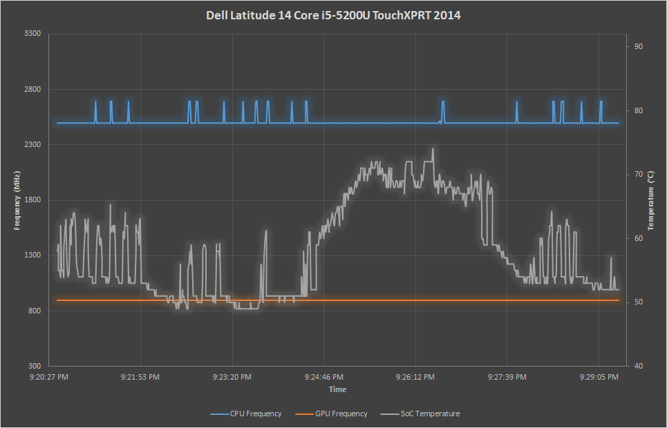
Looking at the Core i5 graph makes it very obvious where the heaviest lifting is in this benchmark, but even that one is full of bursts of work. The Dell Venue tablet is able to hit a very high frequency for many of these tasks, since it has adequate time to cool off in between. The ASUS is as consistent as always, and the Yoga 3 Pro can really stretch its legs on this benchmark.
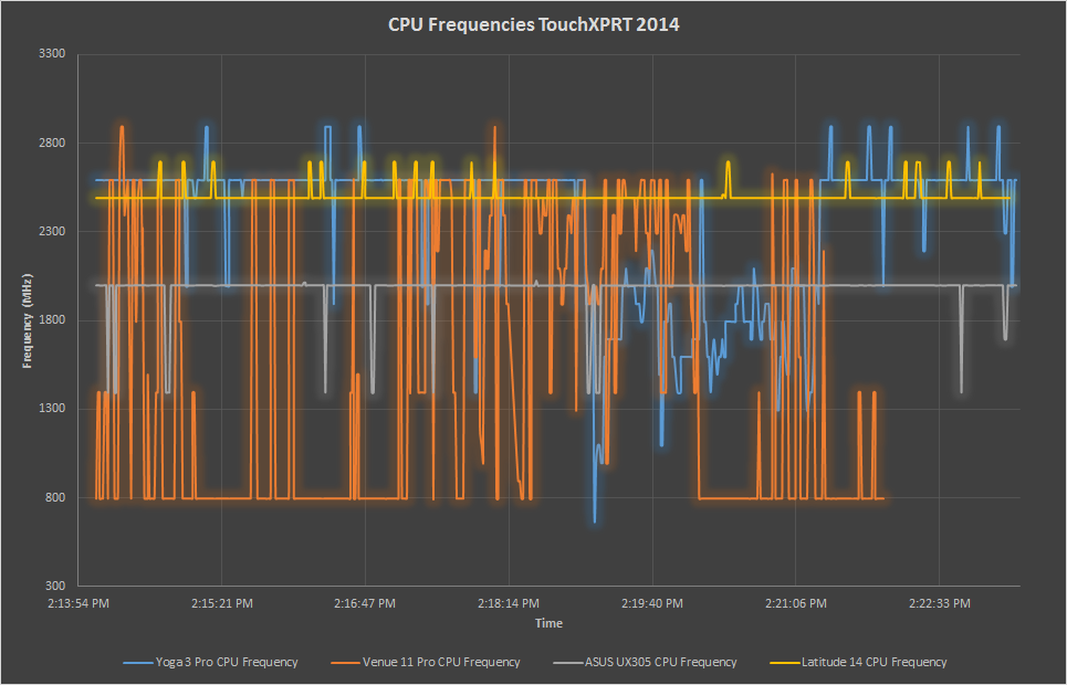
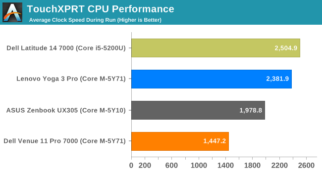
Looking at the average CPU frequency, the Yoga 3 Pro beats out the other Core M devices by a lot, and even turbo higher than the Core i5 on many occasions. If the work is short, the higher burst frequency of the 5Y71 can make a big difference. This would be very similar to web browsing, where short bursts of work get the job done. The Dell has the lowest average CPU frequency again, but as we have seen in previous results the fact that it can hit a much higher frequency than the ASUS can help it regain ground, especially on a short workload such as this one.
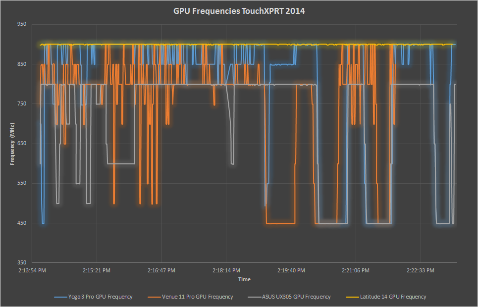
The GPU average frequencies show the disadvantage of the 5Y10. It is quite a bit under the 800 MHz turbo frequency of the chip, and it cannot turbo to the 900 MHz of the other two chips when it does have thermal headroom to make up the difference. The other two devices can be seen to jump all the way up to the 900 MHz maximum many times.
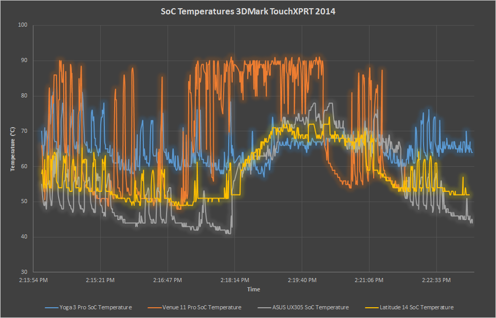
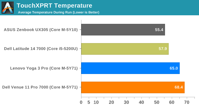
Temperatures are low, and the ASUS is the lowest again. The Yoga 3 Pro is sitting right at the 65°C target temperature, which means it was not always able to keep within that target during these quick bursts of energy needed.
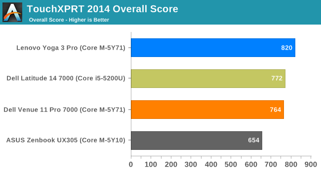
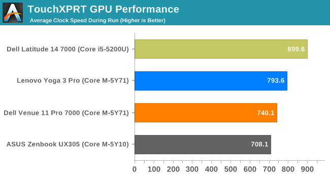
TouchXPRT is almost a perfect workload for 5Y71, and the Yoga 3 Pro outperforms even the Core i5-5200U in this test. The Venue 11 Pro also comes in right at the score of the Core i5. The ASUS UX305 is certainly hampered by its lack of turbo compared to the other devices in this test. It had the lowest average temperature, and it could not do anything with it.


110 Comments
View All Comments
zodiacfml - Wednesday, April 8, 2015 - link
A long for this look at the performance Core M. Thanks. Like all nice, popular movies the end is pretty expected after a review from the Asus UX305. It's also good that the Dell is there to provide the scores for no limitation on cooling for long continuous loads.After all this, I don't see any problem. The performance of the Asus is pretty expected as well having a tradional notebook design which is fairly overkill for the SDP/TDP.
I was a PC overclocker many years ago and then realized that underclocking and overclocking at the same time would be ideal. I believe the race to wider CPU dynamic range has become mainstream.
dragonsqrrl - Wednesday, April 8, 2015 - link
"Each model comes with 4MB of L2 cache" On the first page.Shouldn't that be L3 cache?
dananski - Wednesday, April 8, 2015 - link
I love how the Asus tries to draw a piano keyboard in the PCMark 8 Creative graph. Very creative of it.DryAir - Wednesday, April 8, 2015 - link
The temperature x time graphs are all messed up. The lines goes "back" on many ocasions, indicating 2 different temperatures on a same time stamp. You should check the settings on whatever program you are using to generate these graphics.be_prime - Wednesday, April 8, 2015 - link
I just signed up to comment on the same thing -- the graphs are so clearly distorted by some (no doubt well-intentioned) spline/smoothing that much (even most?) of the data we see here may be the product of a spline or interpolation process, and not represent a data measurement. Where the line goes "back", as DryAir pointed out, it implies time travel.That's a very big miss for a site that I've considered to be thoughtful and authoritative. The approach you took here presents false and interpolated data and obscures the quality of your research. Don't let the goal of an attractive graph ruin the whole point of the graph: showing the data.
These graphs are obviously impossible due to the spline/interpolation used, and should be replaced by a scatter plot or normal line graph.
Brett Howse - Wednesday, April 8, 2015 - link
As I mentioned on the Devices and Test page, sometimes the devices were very heavily loaded and they were not able to log consistently. Sometimes they would log twice in the same second, but with slightly different values. One log would be time 0:00:01:05, and another would log 0:00:01:95 (for instance), but both would be truncated to the same second. Unfortunately that's just the limit of the software, since it only logs time to the nearest second. A second can be a lot of time for a CPU.be_prime - Thursday, April 9, 2015 - link
That's fine because those data points represent measurements.The problem here is you've used interpolated splines/curves which, in this case, actually show impossible or false information: the curve leaning "left" implies that the x-axis (time) is decreasing: that's time travel, and it'd be a bigger story than the Core M for sure, right?
Also recognize that if you're gathering data points, but drawing a line, you're always implicitly creating an interpolation between those points (at least in viewers minds). Usually, it doesn't matter so much. Here, the resulting lines are false, and I think Anandtech is a better publication than that.
As it stands, the interpolation/smoothing on your graphs implies time travel. Respectfully: please correct this (or, patent the relevant technology and profit!). If you're going to make your graphs look "pretty" and don't care if they're correct, I can't trust your results.
DryAir - Friday, April 10, 2015 - link
Sarcastic time travel jokes aside, I agree that you should change it somehow. Perhaps just change the data points to be connected to a straith line, instead of a smoothed one. Right now its looking very amateuristic, not matching an otherwise great and highly technical review.Brett Howse - Friday, April 10, 2015 - link
Ice Storm was the worst offender so I've re-generated the graphs with straight lines. There just was not enough data points on that one because it was so short.gw74 - Wednesday, April 8, 2015 - link
I am furious that OEMs are using Core M in ultrabooks. It is the solution to a problem which does not exist. The Samsung Series 9 / ATIV 9 Plus use full fat i5 and i7 ULVs and the 2 tiny fans hardly ever come on. when they do, they sound like mice whispering. and huge battery life.Core M is not progress when used in the ultrabook factor. it is a step backwards and a ripoff.