The Android 5.0 Lollipop Review
by Brandon Chester on December 1, 2014 10:00 AM EST- Posted in
- Smartphones
- Android
- Tablets
- Android 5.0
Google Fit
Google Fit was launched at Google IO, as an answer to other health systems put forth by Apple, Samsung, and other companies. Much like Healthkit and the Health app on iOS, Google Fit is a set of APIs and services which is accompanied by the Fit application on your Android device. With Lollipop on the Nexus 6, Google has included Fit by default as an application that cannot be uninstalled, which may be to the annoyance of users who don't really care for fitness applications.
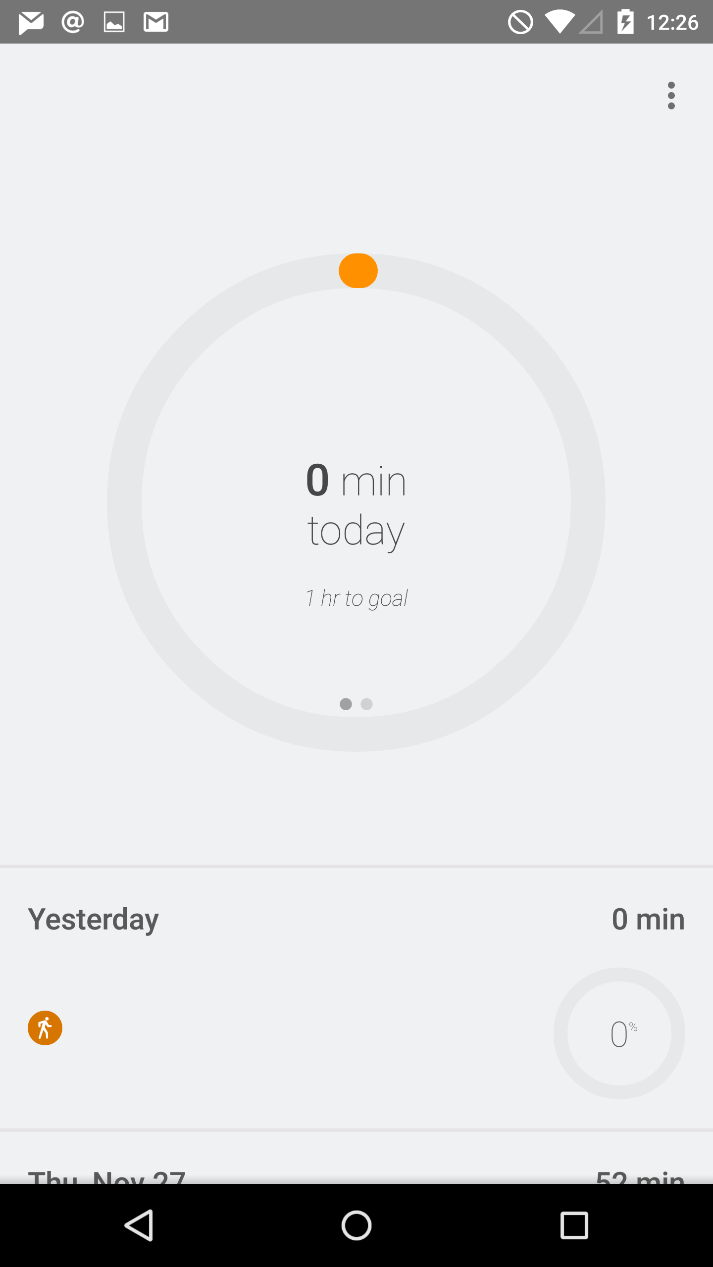
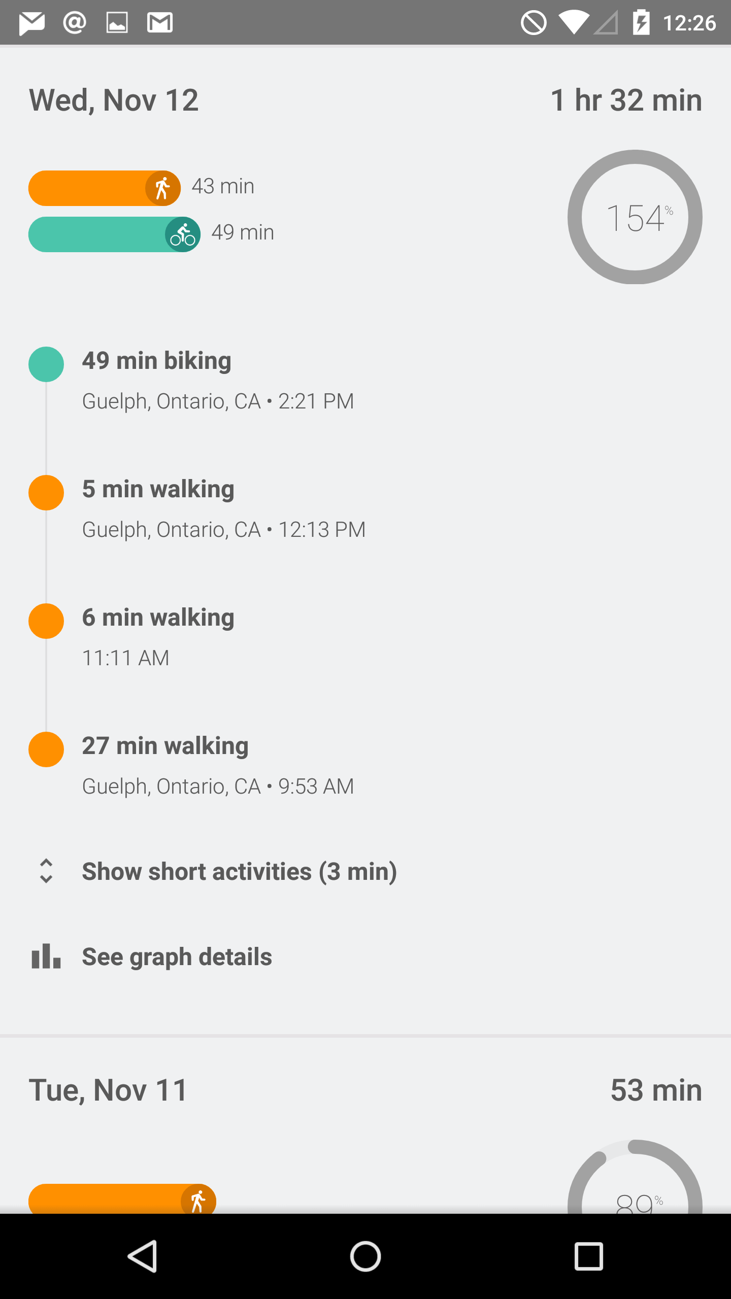
That being said, there are obviously quite a number of users who do use fitness applications, as the list of fitness applications and initiatives from both first and third party developers is growing rapidly. The distinction between health and fitness applications should probably be made here, as while Apple's Health app can track and store things like medical information, applications like Fit are limited to tracking exercise. As you can see above, the application is organized as a list of dates, with information about your fitness activity on each day. You can specify a goal for the amount of time you want to spend exercising, and the application will send you a notification when you reach it. The tracking is done by monitoring the various sensors in your device, and you can also input information manually if you prefer to exercise without your phone. I'm not really big on exercise, but during my time using the app it seemed to work reasonably well. I did notice it can sometimes categorize time spent in a vehicle moving slowly as time biking, but that's really just a limitation of how the information is being tracked.
Updated Applications
Contacts
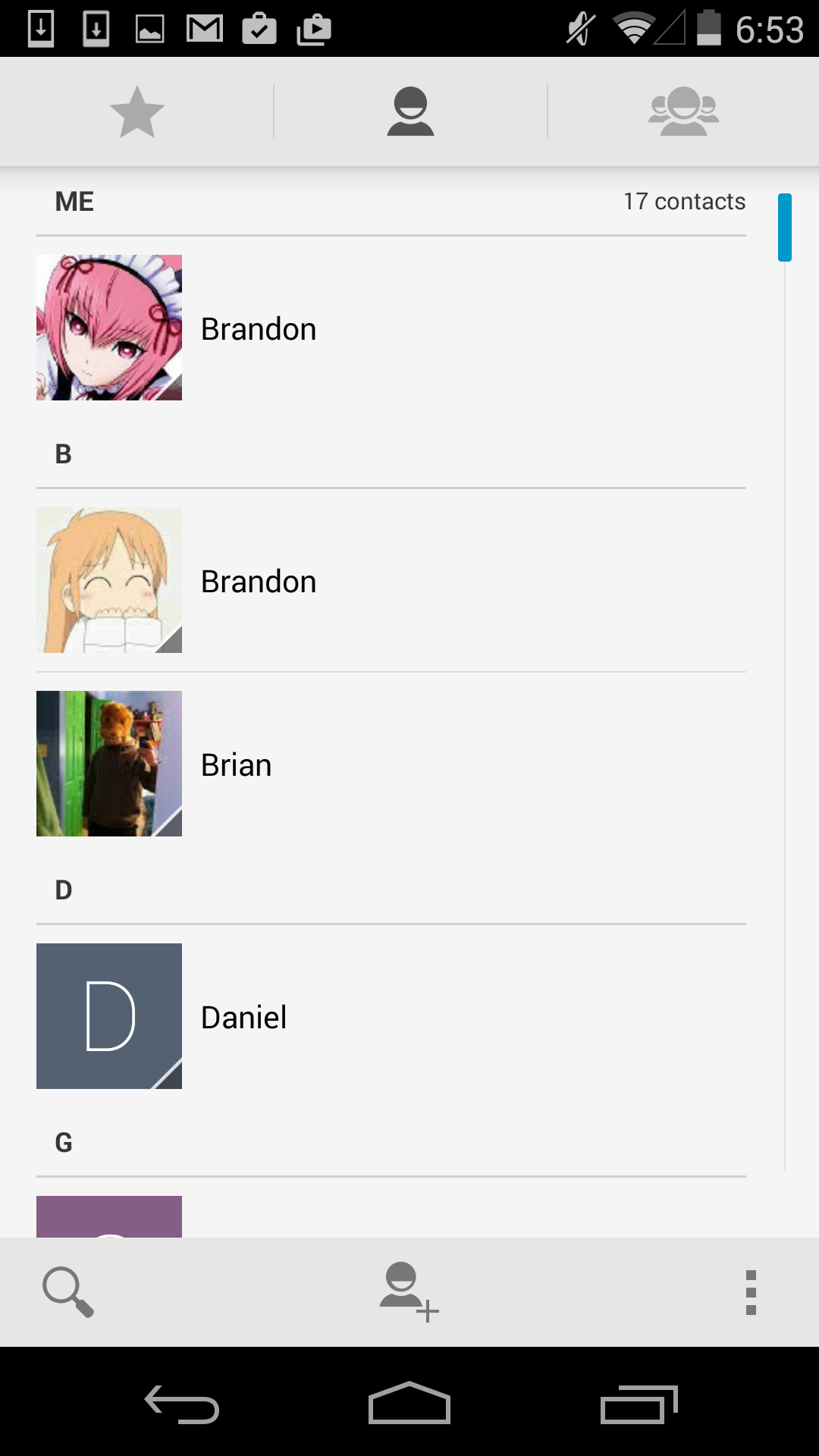
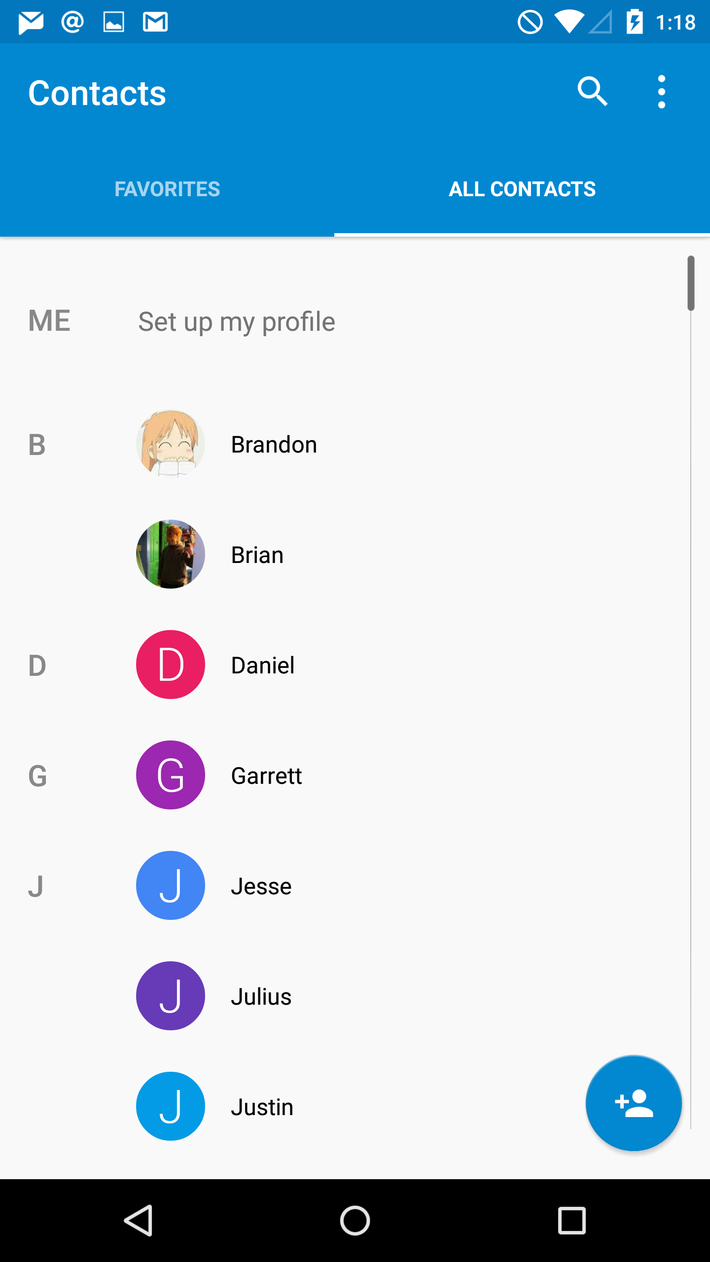
The People application has become Contacts in Android Lollipop, and the design is greatly improved from what was quite frankly an awfully designed interface. As you can see above, Google has given the interface a blue accent color and adopted the circular contact photo style that we've seen on other platforms. They've also cleaned up the interface significantly by consolidating the controls into the top part of the application, and by removing unnecessary parts of the interface like the lines that separated the contacts into sections based on their initials. These changes also improve usability significantly because the simplified interface is now made up of only two sections which are clearly labelled by their name, rather than by 3 icons that do not make it obvious what each section contains.
Calculator
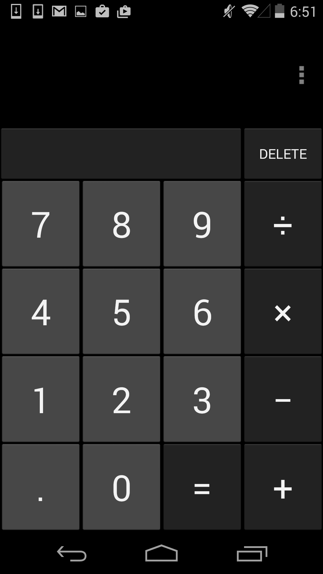
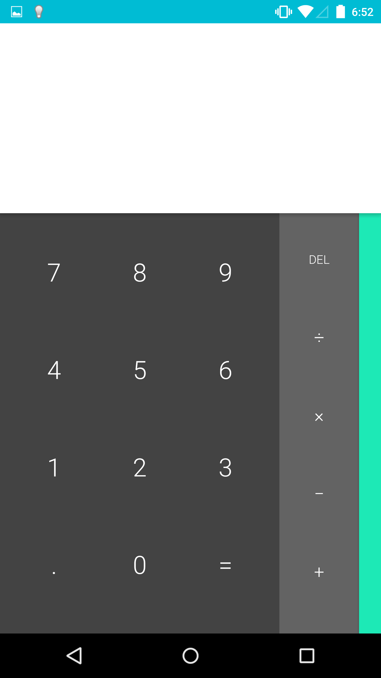
The calculator application also receives a complete visual overhaul in Lollipop. Much like the keyboard, Google has done away with the separate visual keys for each button in the calculator, allowing them to simply float atop a solid colored background. This also allows them to not be constrained by the rules of a virtual grid, which has made it possible to move the delete key downward in the row with the basic math operators. This change means that there's no longer an empty rectangle above the keypad in portrait mode, and more space to enter numbers and operators in landscape. You can also see above how the edge of the overlay with trigonometric, exponential. and logarithmic operators is visible on the right side of the main part of the application, which lets the user know that there is something to the right that they can pull on.
Google has also greatly improved the landscape view. In the previous version, switching to landscape simply put two buttons for parentheses alongside the numerical keys, with the more advanced operators still in a section that you would have to swipe to. This layout didn't do a very good job of taking advantage of all the horizontal space available in landscape mode. With the calculator in Lollipop, the landscape view shows every button in the calculator on a single screen, separated into three separate colored sections. This is a good improvement, although I think it would be helpful if Google implemented some more features, like dedicated keys for the cubic and cube root functions.
Messenger
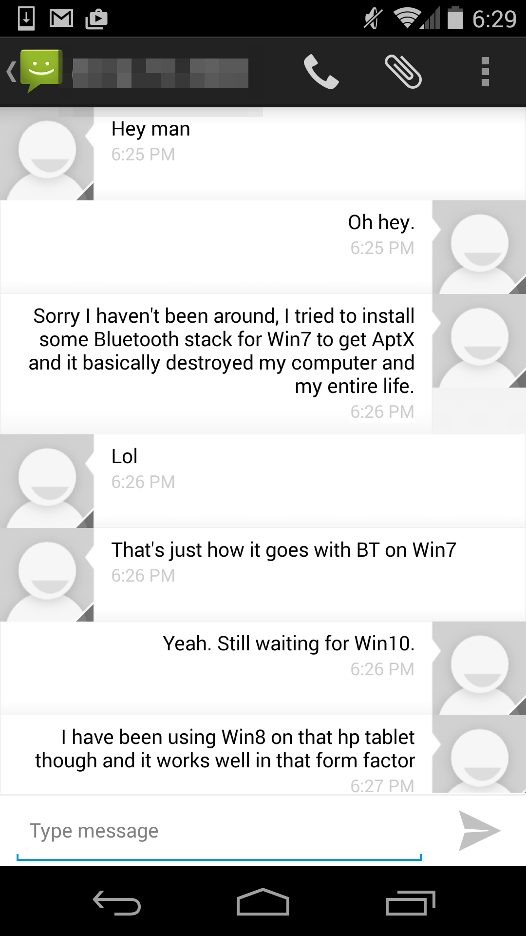
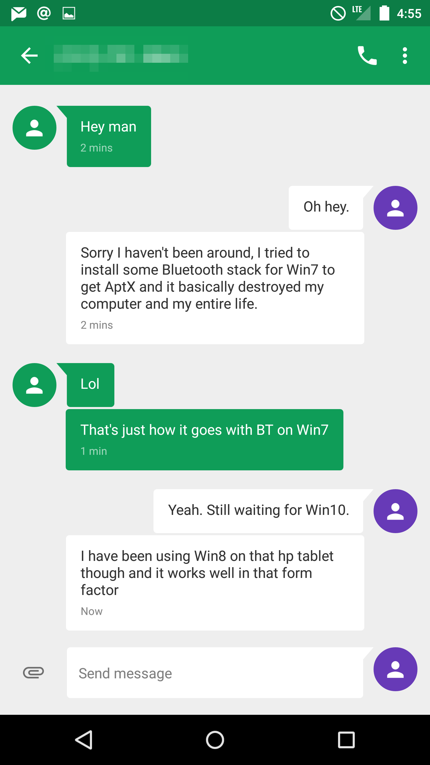
For a long time, I thought Google had just forgotten about the Android Messaging application. It seemed like users were being pushed toward using Hangouts as their SMS application. Lollipop brings an unexpected new application called Messenger, which is like a better version of the AOSP Messaging app. This is a good example of how what people think of as stock Android on a Nexus device is not really stock Android in the sense of using everything from AOSP. It should be noted that the Nexus 5, which never had the AOSP Messaging app, does not get the Messenger app when upgrading to Lollipop.
Messenger is also an interesting example of an application actually using more grey in Lollipop than in KitKat. The application uses a grey background, with white speech bubbles for messages you send, and colored ones for messages you receive. The color of the receiving ones can depend on if you have a contact photo assigned for the person you're texting or not. If you don't, it sets a random color for the speech bubbles. This makes for an interesting dynamic interface, but it can sometimes result in bright pink conversations that may be unwanted.
Google has also made some interesting changes to adding attachments for MMS messages. The paper clip icon has been moved beside the field for entering your message, and tapping it brings up an in-app camera interface that allows you to quickly take a photo of something and send it. Swiping upward expands the camera preview to the entire size of the display, and tapping the check mark takes a photo of whatever is in view. Google also also added an interface for the Photos app which behaves in the same manner beneath the text input field, and there's now a microphone button for recording and sending audio messages.
There are many more updated applications in addition to the ones I've discussed here, some of which appear in other parts of the review. Some applications which have been redesigned are very similar to their KitKat counterparts, but with new color schemes and small changes to header bars and buttons to fit in with the new Material Design style. Overall, I'm very happy with the updated applications in Android Lollipop. Truly redesigning an operating system requires a lot of work, and a lot of planning. For the most part, Google has avoided creating any inconsistencies by leaving in parts of the interface from older versions of Android, and it results in a new design that feels very thoughtfully created and implemented.


126 Comments
View All Comments
OreoCookie - Monday, December 1, 2014 - link
But that's as misguided a statement as »Microsoft didn't invent squares« or »Apple didn't invent rounded rectangles«: Microsoft deserves kudos for being the first to pick up on this trend on a large scale. And if you claim »but they didn't invent it« what you really want to say is that you don't want to give them credit for it.HisDivineOrder - Tuesday, December 2, 2014 - link
I find that most people care less for who does something first and more for who does something best.tralalalalalala40 - Monday, December 1, 2014 - link
Design is never new. People copy each other in this area all the time. Look to the world of fashion how crazy fast people copy.HackerForHire - Monday, December 1, 2014 - link
Maybe because you're incorrect and couldn't be more wrong? To associate a connection between material design and that hideous metro interface is just ludicrous. I've used both interfaces and thankfully I've abandoned that ugly metro interface with its superfluous animations that did nothing but hide the performance problems of the OS. Additionally, it seems the only people complaining about the similarities are butt hurt windows phone fanboys that are upset their OS of choice in tanking so hard.theduckofdeath - Monday, December 1, 2014 - link
Microsoft throwing toys out of the pram because they messed up on mobile (again)...Windows Phone will keep failing as long as Microsoft keeps trying to sell us another closed and locked down ecosystem.
haukionkannel - Tuesday, December 2, 2014 - link
Well... Apple is selling closed and locked ecosystem and is doing better than Android...The WP is just fine mobile os! It is something between iOs and android when compared how locked down it is. It has been very snappy and light (a good thing !) it has been new (bad thing ?)
I have used all those three and all of them have their advantages and disadvantages. It is really good that we have three ecosystem. It keeps competition high enough!
kyuu - Thursday, December 4, 2014 - link
Right. Closed and locked down are the ultimate sins for a mobile operating system and doom it to failure. Just ask Apple.Hyper72 - Monday, December 1, 2014 - link
I'm guessing most people are not in denial, they just don't care whether ideas have been copied, independently developed or somewhere in-between or perhaps trends followed as another commented. Taking inspiration is how the industry have moved for decades and generally it benefits the user.Narg - Tuesday, December 2, 2014 - link
Obviously they don't care. Don't you see how quiet and peaceful they are about the changes.... Oh, wait.tuxRoller - Tuesday, December 2, 2014 - link
Material isn't flat. It uses shading to indicate a z dimension (or layers).