The iOS 8 Review
by Brandon Chester on September 17, 2014 1:00 PM ESTSettings
In terms of its appearance, the Settings application is relatively unchanged from its iOS 7 counterpart. There are some changes to icon colors to better group menus that all relate to a certain type of setting such as cellular settings. The big changes are the new sections that have been added along with many of the new features in iOS 8.
We have already shown some of these in other sections of the review, such as the new settings for self-deleting audio and video messages, or the settings for iCloud. The rest of the changes covered here are those that didn't quite fit into the other parts of the review, as well as changes that pertain to the functions of the Settings app itself.

Those looking closely for changes from iOS 7's Settings app will notice that the Personal Hotspot settings have been promoted from the Cellular section and given their own area on the main settings page. The color of the phone icon for the Carrier section has also been changed from blue to green, better reflecting the Phone app icon it is based on and creating better unity with the other two green icons that are also for settings relating to cellular connectivity. The section for General settings now houses a new menu for settings relating to Handoff, as well as the new battery usage section.
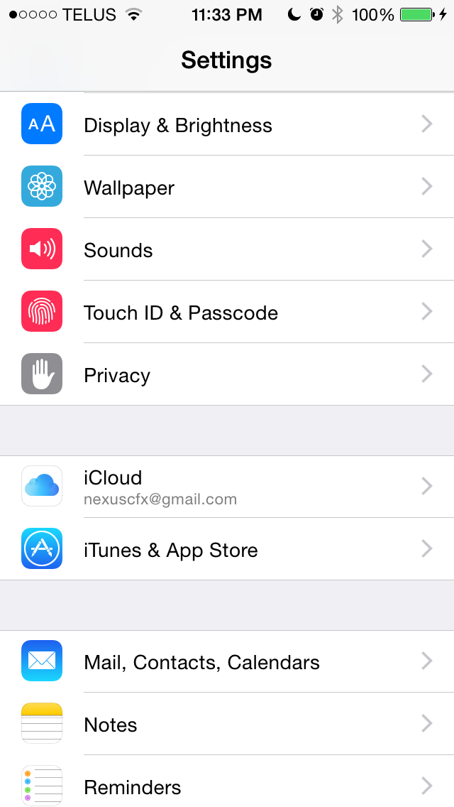
Moving down we can see that the wallpaper and brightness section in iOS 7 has been split into a Wallpaper section and a Display & Brightness section. The new Display & Brightness section also inherits items previously classified as General settings for text size in applications that support Apple's Dynamic Type feature, and the bold text option. The next block of settings contains the sections for iCloud and iTunes & App Store settings that were previously attached to other sections of the Settings app.
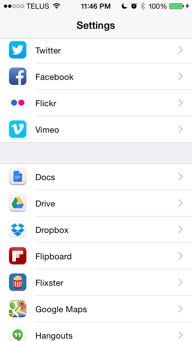
Near the bottom there's a new Twitter icon that reflects the design of the actual app icon, and a section that previously contained a small handful of App Store applications but now seems to include the majority of applications installed on the device. The reason the Settings app is now home to new settings menus for these applications is because on iOS 8 any application that requests access to cellular data will show up in the Settings app with a menu containing an option to block cellular data access if the user desires. However, I don't think that goes far enough; I would like to see Apple put developer guidelines in place to include all individual app settings into the Settings app so they can be modified from a single location rather than having to go into each app separately.
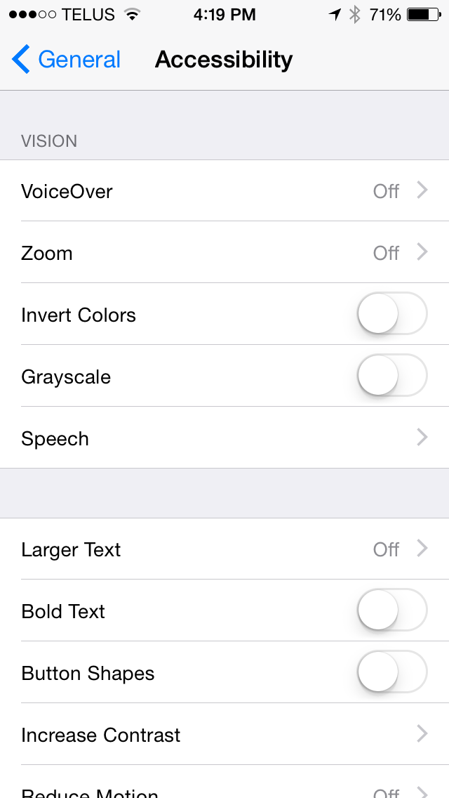
Some of the sub-menus in the General section of the Settings application receive some additional changes in iOS 8. The Accessibility section now has a greyscale feature for those with visual impairments, and for users with hearing impairments there is a setting that blinks the camera flash whenever a notification arrives.
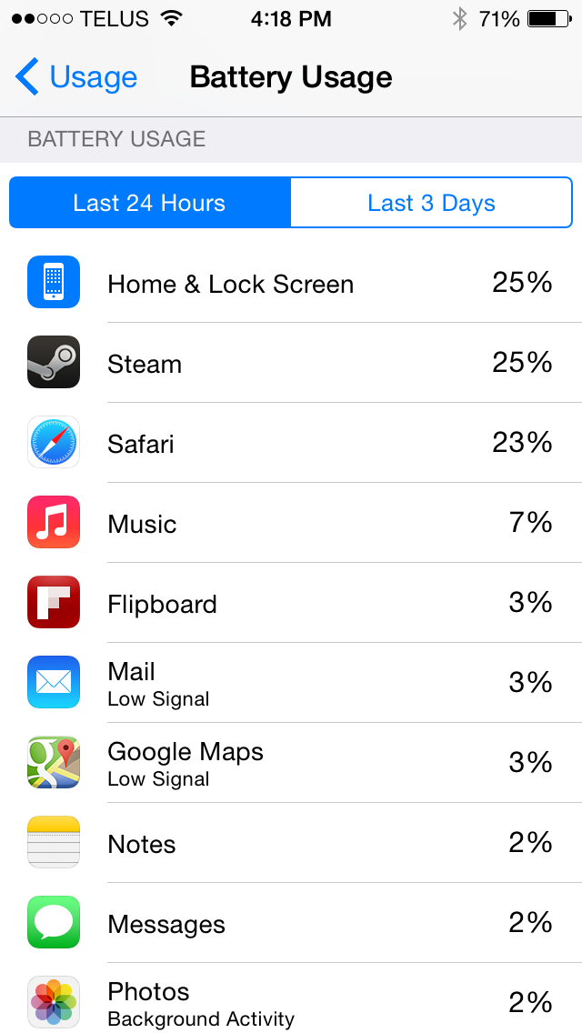
The Usage section has a new Battery Usage feature that displays how much each application on the device contributed to battery usage within either a 24 hour or three day period. Applications that were used when reception was poor are labeled as such to help the user differentiate between misbehaving applications and ones that were simply using more battery because the phone's radio had to be active for longer to complete a task. The Battery Usage section will also give tips for improving battery life such as enabling auto-lock or auto-brightness.
Safari


Safari received one of the larger overhauls of the stock iOS applications when iOS 7 released last year. The new unified search bar, vertical scrolling cards for tabs, and overall iOS 7 style design were big changes from the Safari in iOS 6 and earlier. Safari's appearance is relatively unchanged in iOS 8, but there are a couple new design elements and new features. For example, if you look closely at the above photos you'll see that Apple has changed the bookmarks icon on the navigation bar.
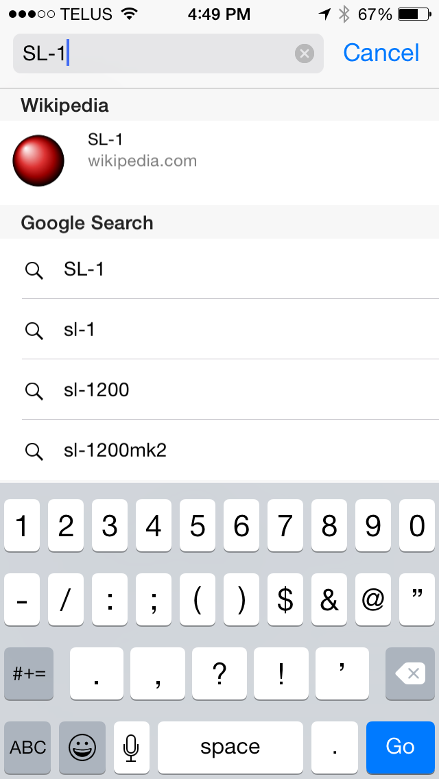
Safari also inherits all the additions to Spotlight Search. Search engine results are now accompanied by App Store suggestions, direct links to Wikipedia, Apple Maps results, and more. The Wikipedia results are proving to be a favorite feature of mine, as cutting out the time to navigate to and from a search engine to access a Wikipedia article makes finding information significantly quicker.
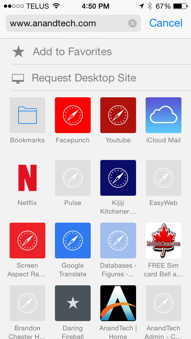
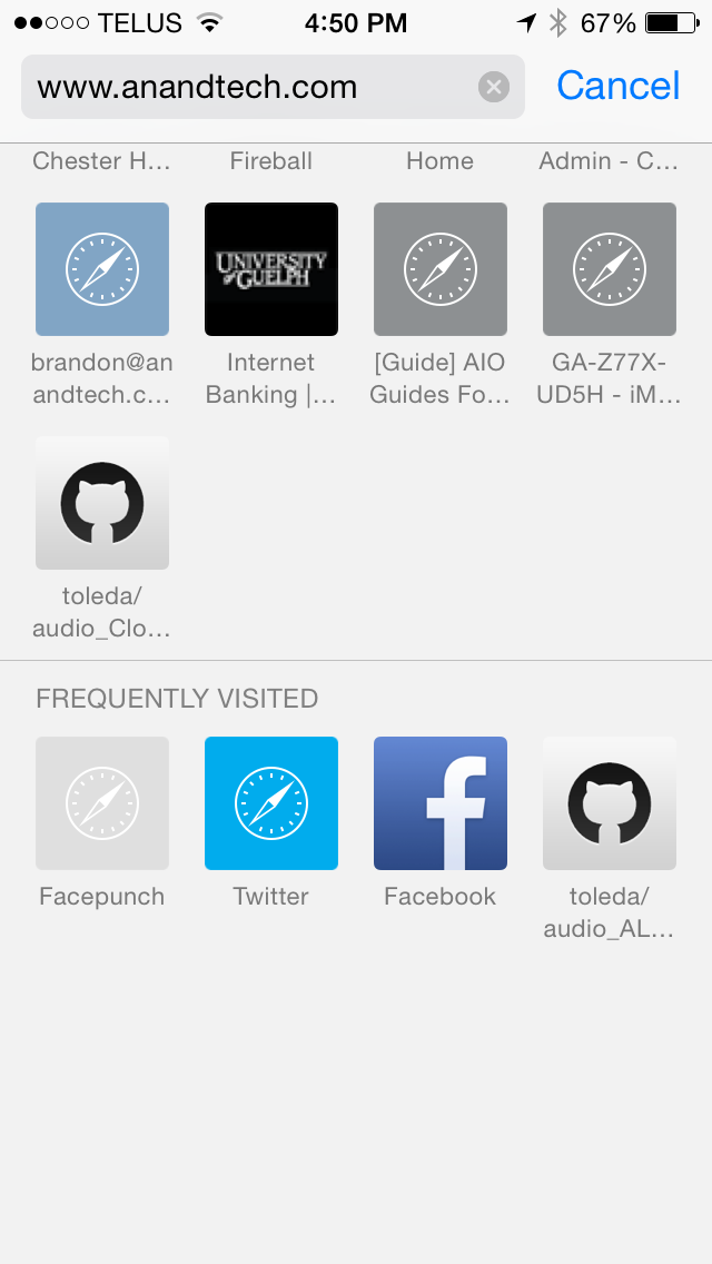
The Bookmarks page now contains buttons to add a website directly to favorites, as well as to request the desktop version of sites that default to a mobile layout. Users may have trouble finding these buttons unless they discover them by accident though, as they are hidden behind the search bar by default and require you to swipe down on the favorites page from what was previously the highest scroll position on iOS 7. At the bottom of the Favorites page there is also a new section for frequently visited websites.
Safari for iPad is an entirely different situation. The interface has undergone quite a number of changes, and it includes all the new features of the iPhone version along with a few of its own including a new tab view.
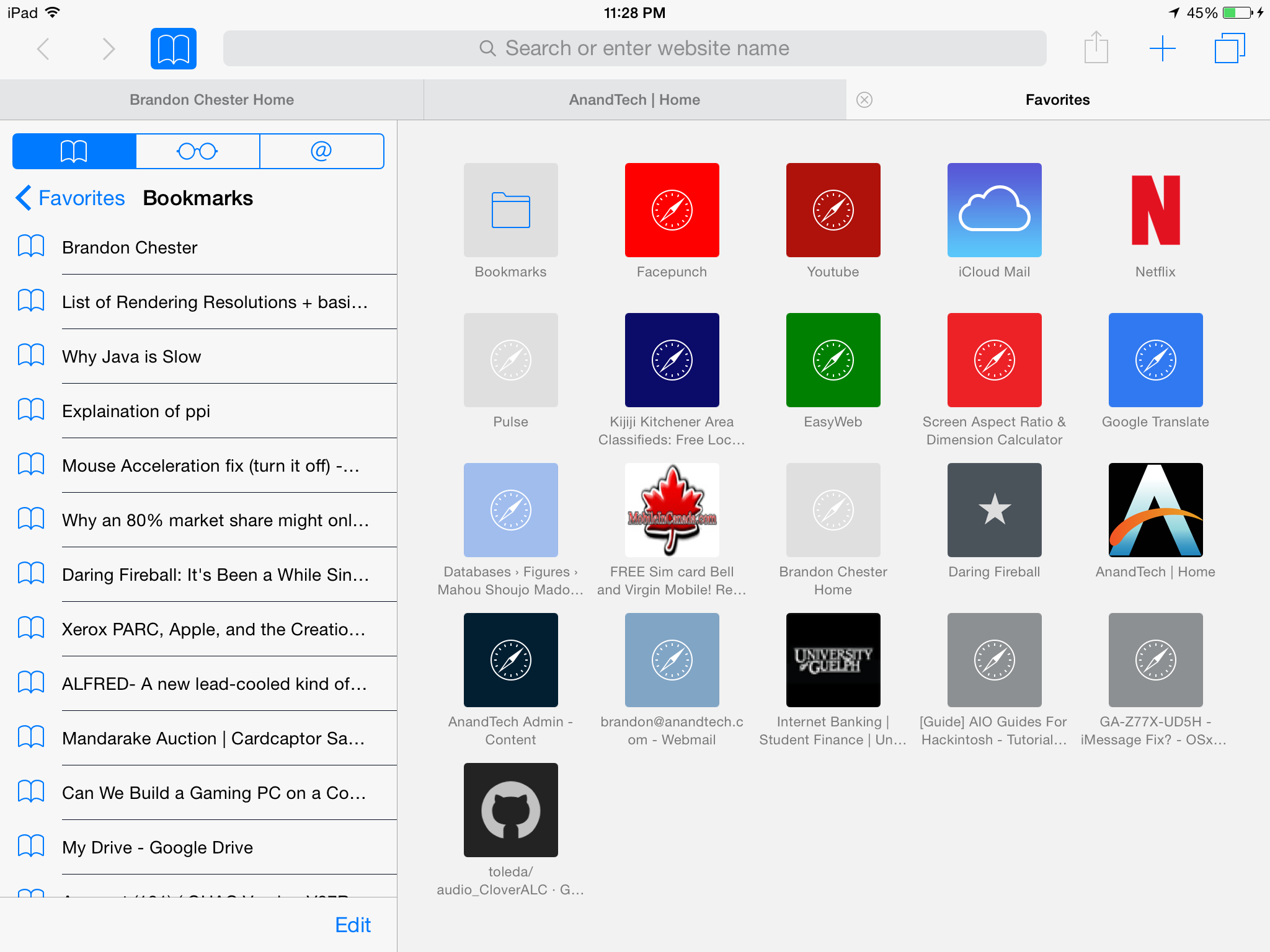
Above you can see that the Bookmarks menu has been implemented as a pane that slides in from the side rather than a menu that appears above other UI elements. The navigation bar at the top also receives some changes, including the tab view button that iPhone users will be familiar with.
Tab view on iPad is implemented slightly differently than on iPhone due to its larger screen area. Rather than stacking all tabs together, each website is given its own stack. These stacks are displayed in rows across the screen and all tabs from the same website will be added to its own stack. In addition to being accessible from the navigation bar, the tab view can also be accessed by pinching inward to zoom out on any page that is already being rendered at 100% scale, including the favorites page. Despite the addition of tab view, Safari for iPad still retains the tab bar beneath the navigation bar, although it only appears when more than one tab is open and can be disabled if the user desires. The navigation bar also shrinks to only display the website URL when scrolling down, much like the iPhone version of Safari.
What I found most interesting about the new Safari for iPad is how similar it looks to the new version of Safari for OS X Yosemite. The tab view, sliding bookmark menu, and bookmark links in the search bar suggestions are all features that Apple is also including in the next version of Safari on OS X. Even the gesture to access tab view by pinching the touchscreen exists on the OS X version by performing the same gesture using a Macbook's trackpad or Apple's Magic Trackpad. Once upon a time the iPad's web browsing experience was impeded by the limitations of mobile Safari, a cut down interface, and a web filled with Adobe Flash content. Now the browsing experience on the iPad and on a Mac are much the same. Times certainly have changed.
Performance
As usual, Apple has made improvements to their Nitro JavaScript engine in iOS 8. What's also exciting is that with Apple's XPC API for inter-app communication now on iOS, third party apps are now able to take advantage of Nitro rather than being limited to a slower JavaScript engine. This means that third party web browsers and applications such as Facebook and Twitter that use the iOS UIWebView class to display web pages will no longer have a performance penalty compared to Safari and Apple's other stock applications if they are updated to use the new WKWebView class. In addition, WebKit has been updated from 537.51.2 to 600.1.4.
Below are several benchmarks comparing the JavaScript performance on iOS between iOS 7.1.2 and the iOS 8 GM release. These tests were performed on an iPhone 5s, and they were also run on an iPad 3 to see the degree that performance has improved (or regressed) on an older device.
| iPhone 5s | iOS 7.1.2 | iOS 8 GM |
| Sunspider 1.0.2 (ms) | 405.8ms | 393.6 |
| Kraken 1.1 (ms) | 5948.7ms | 5301.6 |
| Google Octane (score) | 5700 | 5880 |
| HTML5test.com (score) | 410 | 440 |
| iPad 3 (Early 2012) | iOS 7.1.2 | iOS 8 GM |
| Sunspider 1.0.2 (ms) | 1303.8 | 1525.2 |
| Kraken 1.1 (ms) | 30790 | 29145.8 |
| Google Octane (score) | 1450 | 1590 |
| HTML5test.com (score) | 410 | 440 |
Something that took away from how fast iOS devices felt when iOS 7 launched was the speed at which animations played. Seeing the homescreen turn into a card and zoom out to reveal a list of apps was a neat effect the first few times, but after a while sitting through the lengthy animation made devices feel slow. With iOS 7.1 Apple increased the speed of animations like the multitasking drawer and the icons flying in when unlocking the device. The same has been done with iOS 8, and as a result the iPhone 5s I was testing felt faster than ever.
In terms of UI smoothness, the experience on the iPhone 5s is as fluid as it always has been. With the improvements to areas like Spotlight Search it may be that iOS 8 is actually smoother overall on the 5s than iOS 7.1 was. Unfortunately the same can't be said for the experience on iPad. As an early iPad Mini with Retina Display adopter, I was never really satisfied with the UI performance under iOS 7, especially given how much I paid for the tablet. It was certainly not up to par with my 5s. Though much of that has to do with the significantly higher resolution display, I still didn't feel it was as smooth at it should have been given the performance of Apple's A7 SoC. iOS 7.1 remedied this in many ways, but some areas such as the multitasking drawer and notification center would still drop below 60fps at times.
As for the third generation iPad from early 2012, there are definitely regressions in UI fluidity. I upgraded from the iPad 2 to the iPad 3 shortly after its release and even in the days of iOS 5 there were areas where performance was worse than its predecessor due to the memory and GPU requirements of driving such a high resolution display. In our iOS 7 review we remarked that it was surprising how early after its release the iPad 3 got to the point of feeling very slow to use.
It's unfortunate to say this, but that trend hasn't stopped with iOS 8. There are also issues like homescreen icons not rendering when using the four finger app close and swiping to another app page. I don't know if this occurs on the newer iPads but on the iPad 3 the software feels like it's not even finished. Taking all that into account, with the current performance under iOS 7.1 and fact that the iPad 3 is still excluded from features like Handoff and Airdrop, I can't say I recommend that iPad 3 users upgrade to iOS 8 unless they're fully aware of the possible bugs and reduction in smoothness from doing so.


164 Comments
View All Comments
robinthakur - Friday, September 19, 2014 - link
Er, no that's nonsense. If I start typing a message to somebody in my address book on an iOS device, it turns blue if they have iMessage but to Android users it's green which means it is an SMS and it reaches them perfectly fine. Honestly, if it worked the way you say it did, it would be totally pointless. iMessage syncs with all Apple kit so this benefits people who use iPads and Macs, which is fine because it makes life easier. If I send a Hangout on my HTC One M8 to somebody with a Google account but who doesn't have Hangouts enabled, it goes through fine, but they never reply. Which is the more useless? I wanted to like Hangouts, but the hideous green interface or the fact that hardly anybody I know user Android makes it suboptimal and tend to just leave it in the SMS setting which is a far worse solution than on my old iPhone with iMessage because I could send without cellular signal and send pictures,voice etc. for free over wifi. Seriously, of the two implementations, I definitely prefer (and miss) iMessage.Impulses - Wednesday, September 17, 2014 - link
Well, for one thing, people that initiate a group chat on iMessage just end up annoying those of us who have to interact with it thru SMS and can't seamlessly reply to the whole group etc ... So that's one reason not to use it.Photos sent over iMessage also end up overcompressed when sent to an MMS recipient, and trying to explain to someone why you would prefer they email it or Dropbox it is like pulling teeth.
Granted, you could rightly state most of those issues stem from user ignorance, but I'm the end it's really Apple's attempt at transparently blending a universal system with a proprietary one that's causing the confusion.
WinterCharm - Wednesday, September 17, 2014 - link
False. That's completely wrong. If the messages app detects that not everyone in the group you are messaging has iMessage, it simply forces the entire group to use SMS, so it's seamless for everyone.grayson_carr - Wednesday, September 17, 2014 - link
No, you are wrong. It forces the entire group to use MMS, not SMS. There is a difference. In many countries, SMS is free, but MMS (used for group texts, pictures, etc.) is not.Impulses - Thursday, September 18, 2014 - link
False. That's completely wrong. I've been in plenty of conversations with iPhone users (most of my friends) where one of them suddenly goes "why isn't Frank responding, is he not coming?" because they don't realize I'm not on iMessage and my replies ate only going to the originator of group chat.Thanks for playing but try again. I could get around that by initiating a group SMS for everyone in the chat (once I figure who THAT is after a few replies), but it's a big hassle since each individual reply from each person will come in under the thread for that particular person.
Usually the chat originator just ends up repeating what I've said, it's a pain, and iMessage can eat me.
sherifone - Thursday, September 18, 2014 - link
Thats because on Android group MMS is a crap show. Apple supports the standard correctly and on Android it is handled on an app by app basis, sometimes very poorly. It is your phone/app's fault you didn't get the message.iOS detects that there is a non iMessage user in the conversation and it turns into a group MMS. There is no such thing as a group SMS, just FYI.
This works flawlessly among my android and iOS friends. Mostly because my Android friends are educated in the way MMS/Group messaging works and took the time to find a functional app and/or phone.
Impulses - Thursday, September 18, 2014 - link
I didn't fail to receive any messages, read my comment. Point is turning it into a hybrid group MMS/instant message convo is not very helpful to others and turns into a mess, because I can't easily reply to the group and I'm basically forced into the conversation as well... With no option to back out of it or ALL subsequent replies. It's not just non-iPhone users that are affected either.It might seem all transparent and easy to use for them, except when it ceases to be. I've lost track of the number of times an iMessage user has sent a group message asking something (like everyone's address for wedding invitations, etc) and the rest of the iMessage users blindly reply. Other iMessage users don't (and shouldn't) see those replies, only the originator, but I end up seeing all of them...
Any time you send a group MMS to someone on iMessage every other user you sent it to is invariably gonna see that iMessage user's reply, which doesn't follow standard SMS/MMS logic.
robinthakur - Friday, September 19, 2014 - link
Yep, definitely agree since I mopved from iPhone to Android, I was shocked at how backwards messaging still is on the platform, most still use SMS and Hangouts has hardly any traction. All my friends who are iPhone users regularly bitch and moan that they have no idea if i've read something, and that they receive multiple identical texts from Hangouts and I would say they now message me less because it is just hassle for them. Hopefully my iPhone 6 plus arrives soon.retrospooty - Wednesday, September 17, 2014 - link
clearly you havent used Hangouts. It's fully integrated with text messaging. It just worksrobinthakur - Friday, September 19, 2014 - link
Is that why both my HTC One M8 and my brother's Motorola G send the same message multiple times to recipients which drives them crazy? As the sender, I have no idea this is happening until I start getting complaints that i've just sent the same text 5 times. It seems such a simple app, the fact that it doesn't actually work must be pretty embarrassing for Google. In all my years of using iMessage, it never screwed up that badly and generally worked pretty slickly across all my devices with a decent carrier. Google would help themselves if they got rid of having Messages AND Hangouts in the AOSP. Most users have no idea which one to use and opt for Messages and then think that Android is incredibly backward as a result.