The iOS 8 Review
by Brandon Chester on September 17, 2014 1:00 PM ESTControl Center
Control Center came into being with the release of iOS 7, and it's hard to imagine that before iOS 7 the only sort of toggles and controls that were accessible anywhere were the music controls and the rotation lock in the multitasking tray. Control Center was certainly a long time coming, but it's now a vital element to iOS. In iOS 8 Control Center is much of the same in terms of its functionality, with the same five fixed toggles for settings and four feature shortcuts. However, like many other parts of the operating system, Apple has refined the appearance by stripping out unnecessary design features and making the selection state of toggles much more apparent.
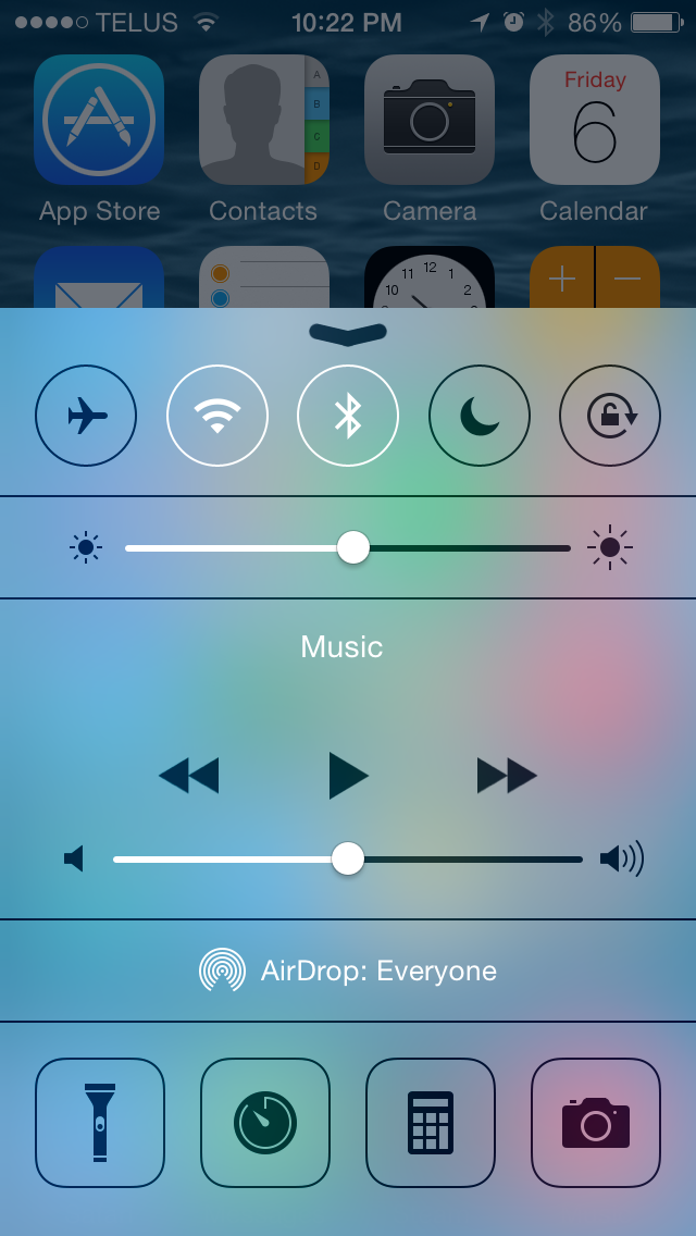
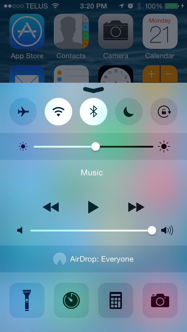
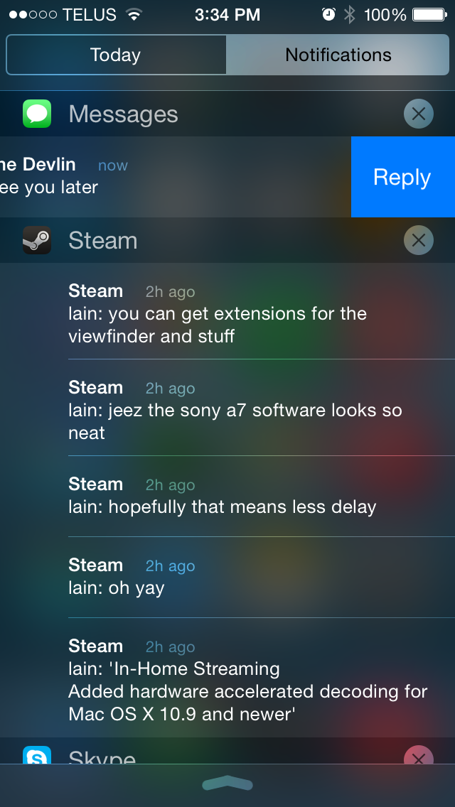
Control Center. iOS 7.1 on the left, iOS 8 on the right.
Immediately noticeable is the removal of the lines that defined the borders of buttons and separated the different sections of the application. The buttons and the brightness slider are now defined using a section with different opacity than the Control Center shade itself, with no black border lines to speak of. While design is certainly a matter of taste, the new design definitely fits in better with the overall appearance of Control Center and iOS in general by using different levels of opacity to indicate buttons and to separate information. Notification Center has used this type of design since the launch of iOS 7 so these changes also work toward making the design principles of iOS more consistent and unified.
The state of the five selection toggles is also improved due to the removal of the black borders. In iOS 7 the outline of the button and the icon in the middle would change from black to white to indicate that it was selected. Unfortunately this method had some issues with communicating which settings were on and which were off. If four toggles were enabled it may not have been immediately apparent if four were on and one was off, or vice versa; you almost had to look at the icons at the bottom for confirmation that the black border indicated an inactive icon. With the removal of the icon borders the state of the toggles is now communicated by changing the circle behind the icon to white. This white highlight contrasts heavily with all the other sections in Control Center and it's now readily apparent which toggles are enabled and which are not.
The brightness and volume sliders also receive a couple of minor changes. The previously opaque white section of the slider bar has been made slightly transparent and so it reacts to the icons and background beneath. In the screenshots above you can see that the blue and green from the icons and background shows on the slider. Setting brightness from Control Center has also been improved. Bringing up Control Center dims the brightness of the app beneath it. On iOS 7 this meant that it was difficult to gauge how bright your display would actually be during use was when changing brightness from Control Center as the application below was darker than it normally would be. On iOS 8 the dimming effect is removed when changing brightness using the slider in Control Center, eliminating this issue.
In the future, one thing I'd really like to see Apple add is the ability to modify the toggles and shortcuts in Control Center. I personally would much rather have a settings shortcut instead of the timer shortcut, and I would replace the airplane mode toggle with a toggle for personal hotspot if I could. Others might be happy with the default set of toggles, but there are definitely items that I use far more often than the current set.
Notification Center
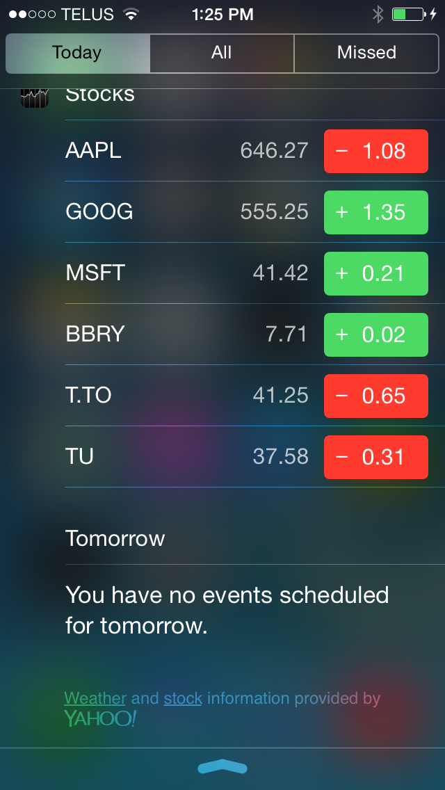
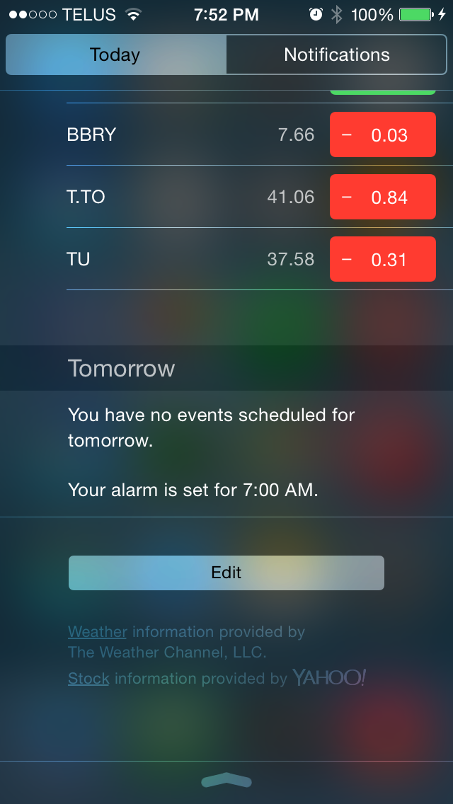
In terms of initial appearance, Notification Center in iOS 8 is very much the same as in iOS 7, but there are a couple of changes. The Today view tab has two major changes, both at the bottom. The first is that text for the source of weather and stock information now reflects Apple's move to getting weather forecasts from The Weather Channel rather than Yahoo. The second is the addition of an edit button that allows the user to manage widgets, which will be explained shortly.
Moving beyond the Today view you'll notice the removal of the Missed notifications section. It's likely that many users didn't utilize this tab often as if a user responds to a notification when using their device it shouldn't appear in Notification Center at all, which means that the normal Notifications tab fulfills the function of the Missed tab for the most part and made it redundant. Having the third tab also conflicts with Apple's new gesture to address individual notifications by swiping to the left to reply, flag, remove, etc.
Notification Center. iOS 7.1 on the left, iOS 8 on the right.
One doesn't normally associate the iOS Notification Center with widgets; however, since its introduction in iOS 5 it has included a widget of sorts for the Weather application as well as the Stocks application. In iOS 7 Apple expanded this to the Calendar and Reminders apps as part of the newly created Today view. With iOS 8 Apple is going even farther and allowing developers to create widgets for their applications that can appear in Notification Center. Widgets can be interacted with to perform actions or show relevant information, such as an Ebay widget that displays a list of items that a user has bid on and provides a button to increase the bid if another user has outbid them. Functionally they are very similar to widgets on Android; however, in terms of their implementation and place in the UI it is a very different approach and there are some pros and cons to both strategies.
With Android's widgets that appear on the homescreen they are immediately visible upon turning on your device. They can also be resized and arranged in different ways. However, this means that widgets will come in many shapes and sizes and adopt various visual styles. Android's widgets also require leaving an application and returning to the homescreen to view them. Widgets on iOS are always a defined width and must conform to the style of Notification Center. They can also be accessed in any app by simply pulling down the Notification Center shade from the top. However, they are not immediately visible after getting past the lock screen, and there's little room for customization aside from the vertical order they are displayed in.
For me personally, Apple's widget implementation wins because of the ability to pull down Notification Center in any app. Having to leave the app I'm working in on Android to see the weather widget on my homescreen introduces a bump in my workflow that is bothersome enough to make me to avoid using widgets on Android in general. That being said, having no ability to alter how much a widget displays means that some of them end up having considerable length, which forces you to scroll down to see widgets that you may have been able to fit onscreen had you been able to customize the widget sizes.
Actionable Notifications
The state of notifications on iOS wasn't always as good as it is today. At one time notifications were given by big alerts that popped up in the middle of the screen and blocked everything you were doing. My entry into the iOS world was an iPad 2 that ran iOS 4.3 for a short time. At the time, my phone was the original Samsung Galaxy S, and I could not understand why on iOS a notification needed to completely take over my screen until I dismissed it. On Android the notification simply displayed in the status bar.
I knew many users who jailbroke their devices to get different notifications styles that didn't block the screen and allowed for replying right from the notification itself. Thankfully, Apple took inspiration from Google's implementation and introduced banner notifications and Notification Center in iOS 5. This addressed the interface issue but it didn't address the desire for the ability to respond to a notification without having to go into the app it was sent from. It's been a long time, but Apple has finally implemented Actionable Notifications in iOS 8.
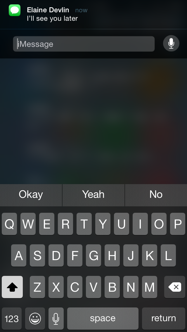
With the above example from the Messages app you can see the new gesture for replying to messages directly from Notification Center by swiping left. When a banner notification is received at the top of the screen it can be pulled down to bring up the keyboard and open the interface for responding without leaving the current application. Both these gestures also work for notifications and banners received on the lock screen.
Developers can also specify custom actions. For example, pulling down on a banner notification from Facebook notifying you about a post you have been tagged in may display options to like or comment on that post. An application like Ebay could send notifications when you have been outbid, and pulling down on the notification could reveal a button to increase your bid on that item.
This is definitely one of my favorite additions in iOS 8. With the iPhone being far too small to do any sort of on-screen multitasking, any addition that Apple can make to enable performing actions in apps other than the one currently open are greatly welcomed.
Spotlight Search
Apple brought Spotlight from OS X to iOS long ago with the release of iOS 3.0, but it has never really been one of my heavily used features. While I'll occasionally use it to find a text message sent long ago or to quickly find an important email, I never felt it offered much as a comprehensive search tool. The buttons to search the web or Wikipedia never felt convenient because navigating to them took longer than just opening Safari and doing a search.
The other issue was the ever-present stutter when bringing up the Spotlight Search screen. It seemed like no matter how powerful the hardware in the iPhone and iPad got, Spotlight would always drop a few frames when bringing up the keyboard while the homescreen icons are still moving. In iOS 8 Apple has greatly improved the capabilities of Spotlight and eliminated the performance issues through a couple of design alterations.
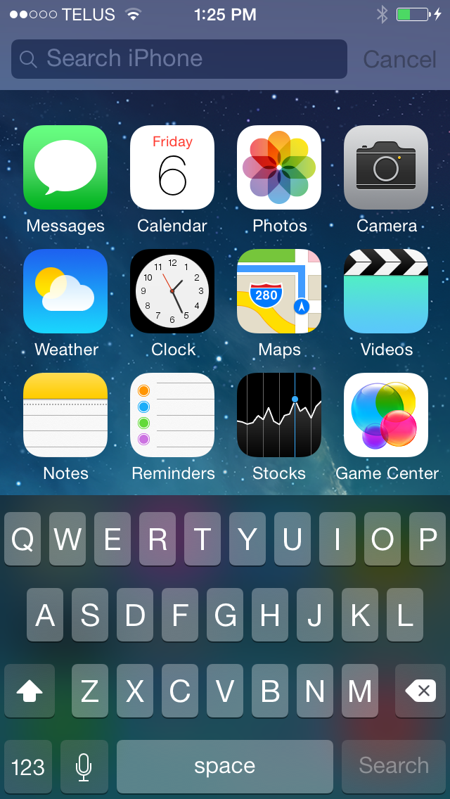
Spotlight Search. iOS 7.1 on the left, iOS 8 on the right.
As you can see above, in iOS 8 the blurred overlay now appears before anything is typed into the search bar, which works to mask any possible stutter by blurring the icons while they are still moving. The other change is that the icons now only go down a certain amount before they stop and the keyboard comes up. The stutter with Spotlight Search would typically occur due the the keyboard coming up while the icons were still in motion and bouncing back to their original position. Because of this design change, Spotlight now feels much smoother and more in line with how the rest of the operating system performs. One other design change is that text in the search bar has also been altered to say "Spotlight Search" on all devices rather than just the word Search followed by the name of the device being used.
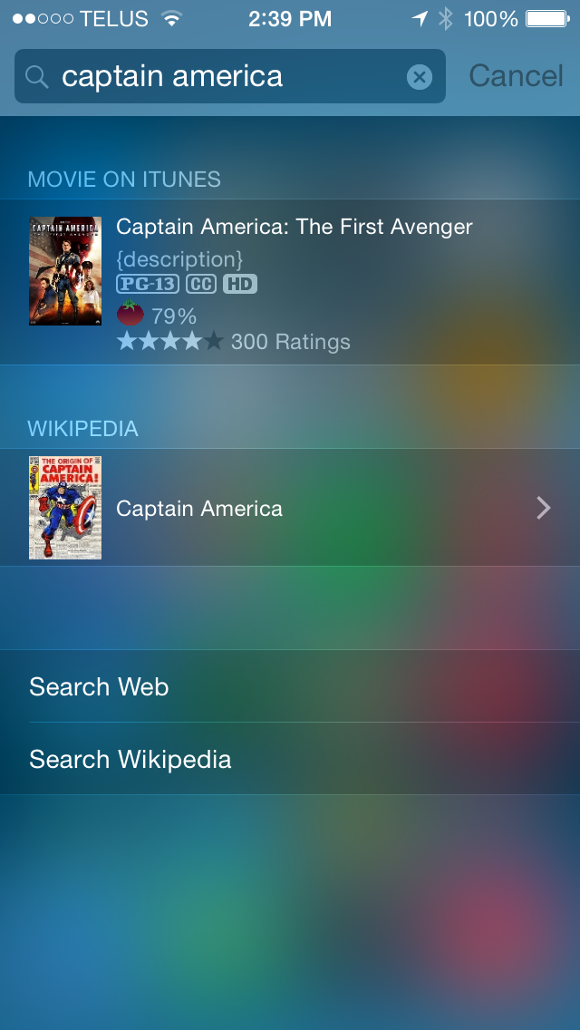
In terms of functionality, Spotlight is now very useful as a tool for searching more than just the content stored on a device. It now grabs information from various sources on the web and gives suggestions for what you may be searching for. Searching for apps and media can bring up links to Wikipedia pages and content available for purchase on the iTunes Store. If a movie is playing in nearby theaters, Spotlight will display showtimes right in the search result. Doing a search for a location or a business brings up results like Apple Maps information, Wikipedia entries, and official web pages in the case of businesses. These Spotlight suggestions have also been integrated into the search bar in Safari, which I've found to be really helpful when all I want is to get to a Wikipedia page without having to deal with search engine results.


164 Comments
View All Comments
Brandon Chester - Saturday, September 20, 2014 - link
No I'm not. None of the A5 devices maintain 60fps everywhere on iOS 7.1.2 (I own an iPad 3 and a relative owns a 4s). Scrolling lists like the settings app are one of the best examples.mjh483 - Saturday, September 20, 2014 - link
"From the perspective of a user there's no real wow factor with iOS 8 right now".I get what you are saying, but I don't get why you say it. This just tells me that you are EXPECTING to be amazed by just downloading one software update and not using anything other than the stock apps. The general expectation for Apple products is just purely wrong. I am not saying it's perfect, but criticising the lack of a wow factor doesn't SEEM AT ALL like a way to judge a new mobile operating system. If you only use Whatsapp, Facebook and play a few casual games, there's only so much any software update can improve your experience.
houkoholic - Friday, September 26, 2014 - link
> but criticising the lack of a wow factor doesn't SEEM AT ALL like a way to judge a new mobile operating systemYet that is always done with other OS like Windows Phone.... "oo but it lacks this WOW feature the other OS has".
WakarusaJack - Saturday, September 20, 2014 - link
Updated my iPad to iOS 8 and now I leave it on the table, virtually unusable. Slow. Locks up. So sorry I upgraded!!!!raj5151 - Saturday, September 20, 2014 - link
Wow, really useful information post. Thanks for sharinghttp://techhowdy.com/blackmart-alpha-black-market-...
dopehat - Sunday, September 21, 2014 - link
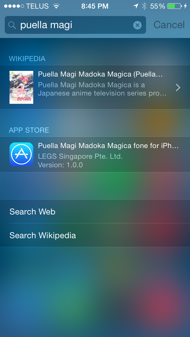
Okay... I understand your love for Madoka Magica... lolAppleCrappleHater2 - Sunday, September 21, 2014 - link
Worship the holy apple.The apple way, selling over expensive crap to stupid consumers that like to
get robbed.
This has been a disastrous launch in every respect. The iwatch is such an
ugly piece of crap, it is truly unbelievable how a company, formerly known for
its remarkable design, dares to put out such a crap ton of shit. Some
characteristics are glaringly obvious and inherent to it: over expensive,
hardly innovative, limited functionality and usability (need of an iPhone to
make it work), looks exactly like a toy watch and so on.
There are of course way better smart watches out there, especially form the
likes of Samsung, Sony, Motorola, Asus, LG, simply put, there is no need for
another piece of over expensive junk.
The iPhone 6 is technologically stuck in pre-2011 times, a base model with
a capacity of 16GB without the possibility to use SD cards isn't even funny
anymore. The screen resolution is horrendous, it isn't water proof, shock and
dust resistant, it offers nothing innovative, just some incremental
updates over its predecessor, both lacking severely behind their competitors at
their respective launch dates.
Now the Iphone 6 Plus offers a „Retina HD“ screen, full 1920x1080p, oh wow,
where have you been for the past 4 years apple, talk about trailing behind.
That’s pathetic. The interesting thing about that is the fact that apple
always manages to sell backwards oriented, outdated crap to its user base, all
while pretending to be an innovative technology leader. The similarities
regarding any form of sectarian cult are striking.
You gotta love how Apple always comes up with new marketing bullshit terms,
aka "Retina HD", with the intention to manipulate its users while preventing easy
comparisons with its competitors by withholding the actual specs. Apparently it’s
not enough to have a 1080p screen, you have to call it "Retina HD" to make those
suckers buy it, otherwise someone could look at the 4K Amoled and Oled screens
form LG and Samsung devices and get outright disappointed. Same goes for
everything else. Every outdated „feature“ needs to get its own marketing label
to persuade buyers with crappy „experience“ and „usability“ ads, while covering
the truth with marketing gibberish, knowing full well that only a fraction of
aforementioned buyers cares to look at the facts and dares to compare them.
Car engines come to mind. For comparisons shake let’s look at a 1.0 liter, turbo
charged petrol engine and a V8 compressor. What’s better should be obvious, but
by calling the former an „ecobooster“, thus giving it a special marketing label,
this joke becomes a „feature“, something positive that can be added tot the list
of features of a car.
By doing so a negative aspect is transformed into a positive one, the
reality is distorted, non tech savvy buyers are manipulated and comparisons are
made more difficult (another layer of marketing bullshit to overcome), well done
marketing department. You see , if something is seriously lacking (of course for
profit, what else), don’t bother explaining, just give it a nice marketing term, distort
reality, make it a feature and call it a day. Fuck that!!
The Apple Iphone 1 and Ipad 1 might have been innovative at their time,
but since then, the bitten apple has been continuously rotting from the inside
outwards, always swarmed by millions of Iworms which regale themselves with its
rotten flesh, not forgetting all other Americans who support apple by means of
their tax dollars to finance its bought US Treasury/Government bond interest rates.
Last but not least, every Apple product includes a direct hotlink to the nsa,
free of charge, something that might make it a good value, after all.
Ceterum censeo Applem esse delendam.
Breach1337 - Sunday, September 21, 2014 - link
Rendered my wife's iPhone 4S completely unusable. It's not just lag and worse performance compared to 7.x - the whole thing just stops responding, touchscreen, couldn't even reboot it. So much for it simply works for me.xenol - Sunday, September 21, 2014 - link
I lost it at the Madoka Magica Nendroid figures.phoenixash87 - Monday, September 22, 2014 - link
Not sure if this was already posted, but to undo an unintentional delete, one can simply shake the iPhone which is the standard gesture for undo-ing any action.