Samsung Galaxy Note 2 Review (T-Mobile) - The Phablet Returns
by Brian Klug on October 24, 2012 9:00 AM ESTSo up until now I’ve felt like the Galaxy Note 2 is really just a larger Galaxy S 3 with an active digitizer. But the 1280x720 HD SAMOLED display at 5.5 inches diagonal is where the Note 2 begins to strongly diverge from that trend. First off, it’s bigger than the Note’s HD SAMOLED which was 5.3" and 1280x800.

Galaxy Note 2 (left), Galaxy Note (right)
When I heard that Samsung was going to be doing a Note 2, I originally suspected that they would use the original Note’s display in conjunction with the hardware platform I outlined earlier. Instead, Samsung has gone with an entirely new revision of HD SAMOLED yet again for the Note 2, one that represents an interesting middle ground between a traditional RGB stripe like you’d see on an LCD and the RG BG Nouvoyance PenTile tech that we’ve seen countless times and iterated through a few different geometries to date.
With Galaxy Note 2, Samsung has gone with an entirely new subpixel rendering matrix, which I’ve heard was going to be called S Stripe. Instead of the previous PenTile tech which used two subpixels per logical pixel (either RG or BG), this new subpixel geometry uses 3 subpixels per pixel (RGB) but with a green subpixel above the red subpixel and a long vertical blue subpixel.
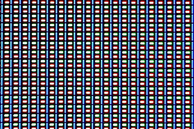
The reason for this change in geometry has always been an interesting one. The blue material has a lower luminous efficiency than the other colors, and thus requires either a larger area or higher drive power to match the equivalent green and red luminance. This is why you hear people saying the blue subpixel ages faster — sure, at the same size it ends up burning out faster due to this lower efficacy.
The mitigation is thus to craft a matrix that allows for a nonuniform geometry, and this one brilliantly does it without the tradeoff in longevity or loss of spatial resolution from going to two subpixels per pixel. The tradeoff that does get made is that subpixel smoothing only really gets two pixels to turn off - the blue, or the red and green unit. In the past the display driver could handle the RGBG unit cell and do font smoothing, from what I’ve seen the above is how the new one works as well.
I’m not complaining, this is a great tradeoff and makes sense for the resolution and size that Samsung has selected for the Note 2. Going with a PenTile RGBG layout at this size would not be desirable, instead the “S Stripe” layout runs with subpixels small enough that I can’t see them. It’s tempting to look at the 1280x800 of the Note and the 1280x720 of the Note 2 and assume it’s lower resolution, when in fact the Note 2 has more subpixels (2.05 MP vs 2.76 MP) and in spite of the size increase stays around the magical 1 arcminute subtense (1.073 arcminutes on Note 2).
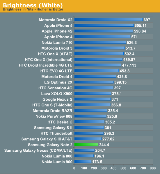
The Note 2’s brightness unfortunately isn’t that high, but like always Samsung makes up for it with huge contrast from the black subpixels being almost entirely dark. I have a feeling this is still being very conservative for the panel for battery life concerns and to minimize both aging effects and burn-in.
Next up is color accuracy and calibration, where Samsung AMOLED has traditionally been very oversaturated — which looks vibrant and draws customers in at stores — but results in inaccurate rendering. We’re using Chris’ new suite here which is in CalMAN 5, I touched on the details in the iPhone 5 review.
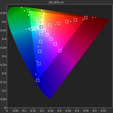
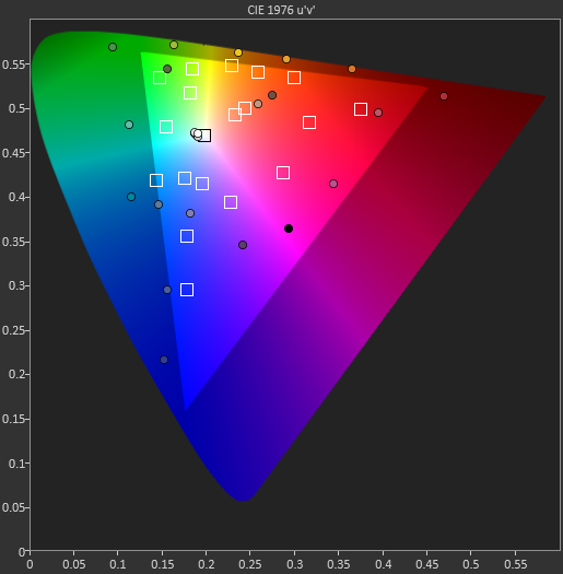
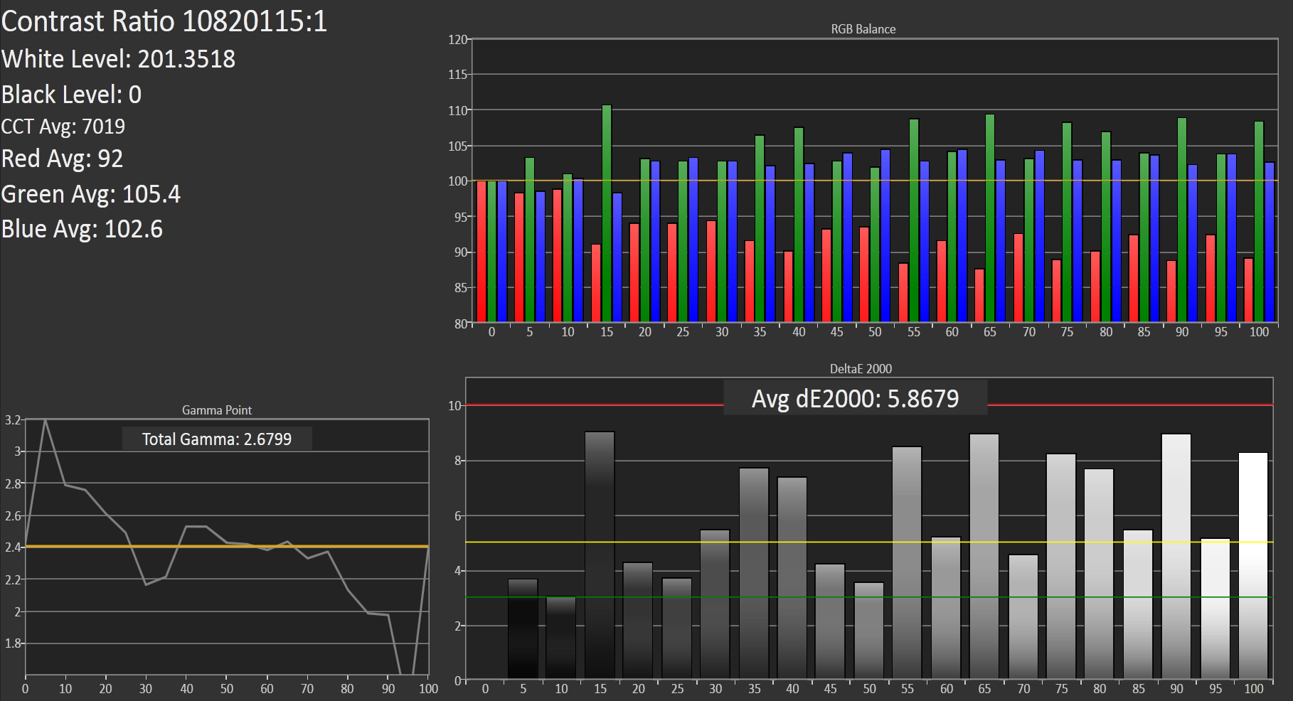
Our target is sRGB, as Android doesn’t have a CMS, and the Galaxy Note 2 doesn’t stop the trend of SAMOLED having a gamut much larger than sRGB. At the same time however things could be much worse. I also measured the Galaxy Note 2 display at maximum brightness with Francois who said much the same thing - it isn’t alltogether bad among SAMOLED displays.
Color temperature at 200 nits is around 7000K but as the blue subpixel wears it will warm up and get closer and closer to 6500K. Overall the Galaxy Note 2 display makes some tradeoffs but ends up being quite appealing. There’s still something to be said for how contrasty AMOLED is even if it still is oversaturated compared to sRGB.
| CalMAN Display Comparison | ||||||||
| Metric | iPhone 5 | iPhone 4S | HTC One X | Samsung Galaxy S 3 | Samsung Galaxy Note 2 | |||
| Grayscale 200nits Avg dE2000 | 3.564 | 6.162 | 6.609 | 4.578 | 5.867 | |||
| CCT Avg (K) | 6925 | 7171 | 5944 | 6809 | 7109 | |||
| Saturation Sweep Avg dE2000 | 3.591 | 8.787 | 5.066 | 5.460 | 7.986 | |||
| GMB ColorChecker Avg dE2000 | 4.747 | 6.328 | 6.963 | 7.322 | 8.185 | |||


131 Comments
View All Comments
tommo123 - Thursday, October 25, 2012 - link
i'm in liverpool and we're getting it amongst the 1st.1 - the prices are stupid.
2 - afaik the radio uses more power
3 - youtube - only buffering probs i have are on their end
4 - streaming in general - 3G i get is more than sufficient
tommo123 - Thursday, October 25, 2012 - link
put a LTE note 2 next to a 3G note 2 and watch youtube/stream netflix and odds are there won't be a difference in anything other than downloading. And that is not going to happen due to EEs anaemic allowanceagent2099 - Wednesday, October 24, 2012 - link
That is a steep price at 299 Subsidized. Any idea what the unsubsidized price will be?warisz00r - Wednesday, October 24, 2012 - link
Where I live, the at-launch price is the same as the OG Note.phemark - Wednesday, October 24, 2012 - link
Good review, waiting for Padfone 2 review now:)antef - Wednesday, October 24, 2012 - link
IMO the menu-home-back button layout is a dealbreaker (as opposed to back-home-recent apps on Nexus/HTC/Motorola devices). It means you have to long-press to access recent apps and you have to remember to look down there to press the menu key even though every other action is on the action bar up top, totally disjointed. Not to mention the menu key is always present and lit up even in apps where it doesn't do anything, like the camera app and Google Reader. Try explaining that to a new user, no wonder so many people choose iPhone, it makes Android seem more confusing than it has to. This combined with the awful look and bloated, overlapping feature set of TouchWiz makes it apparent Samsung has zero handle on UI design or usability. I will gladly buy a Nexus device that they manufacture, but not any of their branded devices.schmitty338 - Wednesday, October 24, 2012 - link
iOS can be even more convoluted. Case in point, my mom, whom has an old HTC android phone that she uses just fine) called me the other day asking how to do basic things on her new iPad.Neither is perfect and both have their pros and cons.
Also, have you use the new Note 2? EVery single video/written review I have seen praises the software. Yes, some features are probably never going to be used, but that doesn't harm the experience which, everybody agrees, is for the most part, outstanding.
Bubbacub - Wednesday, October 24, 2012 - link
padfone 2 review would be great.i dont know about others - but i spend a lot of time copying data (HD films) from my laptop to my phone and my tablet. would be nice to get rid of that extra step (which is huge for me because i use linux which has utterly retarded MTP support)
Jumpman23 - Wednesday, October 24, 2012 - link
In a lot of android phones whenever I try to use a stylus and draw a diagonal line in some drawing app, the diagonal line would never be perfectly straight as I'd like. It is always wavy. Try drawing a slow diagonal line in any drawing app and you'd know what I mean. So I wonder if the Note 2 has improved upon this.schmitty338 - Wednesday, October 24, 2012 - link
That is because they use inaccurate capacitive touch for drawing. This is an active stylus built on Wacom tech, just like full-sized windows tablet PCs and drawing tablets...it won't have that issue.