Samsung Galaxy Note 2 Review (T-Mobile) - The Phablet Returns
by Brian Klug on October 24, 2012 9:00 AM ESTSo up until now I’ve felt like the Galaxy Note 2 is really just a larger Galaxy S 3 with an active digitizer. But the 1280x720 HD SAMOLED display at 5.5 inches diagonal is where the Note 2 begins to strongly diverge from that trend. First off, it’s bigger than the Note’s HD SAMOLED which was 5.3" and 1280x800.

Galaxy Note 2 (left), Galaxy Note (right)
When I heard that Samsung was going to be doing a Note 2, I originally suspected that they would use the original Note’s display in conjunction with the hardware platform I outlined earlier. Instead, Samsung has gone with an entirely new revision of HD SAMOLED yet again for the Note 2, one that represents an interesting middle ground between a traditional RGB stripe like you’d see on an LCD and the RG BG Nouvoyance PenTile tech that we’ve seen countless times and iterated through a few different geometries to date.
With Galaxy Note 2, Samsung has gone with an entirely new subpixel rendering matrix, which I’ve heard was going to be called S Stripe. Instead of the previous PenTile tech which used two subpixels per logical pixel (either RG or BG), this new subpixel geometry uses 3 subpixels per pixel (RGB) but with a green subpixel above the red subpixel and a long vertical blue subpixel.
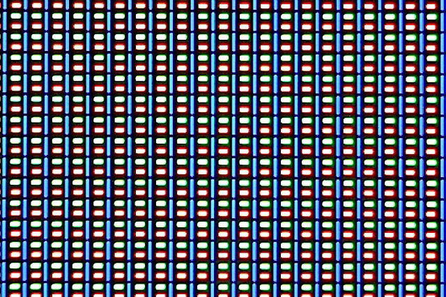
The reason for this change in geometry has always been an interesting one. The blue material has a lower luminous efficiency than the other colors, and thus requires either a larger area or higher drive power to match the equivalent green and red luminance. This is why you hear people saying the blue subpixel ages faster — sure, at the same size it ends up burning out faster due to this lower efficacy.
The mitigation is thus to craft a matrix that allows for a nonuniform geometry, and this one brilliantly does it without the tradeoff in longevity or loss of spatial resolution from going to two subpixels per pixel. The tradeoff that does get made is that subpixel smoothing only really gets two pixels to turn off - the blue, or the red and green unit. In the past the display driver could handle the RGBG unit cell and do font smoothing, from what I’ve seen the above is how the new one works as well.
I’m not complaining, this is a great tradeoff and makes sense for the resolution and size that Samsung has selected for the Note 2. Going with a PenTile RGBG layout at this size would not be desirable, instead the “S Stripe” layout runs with subpixels small enough that I can’t see them. It’s tempting to look at the 1280x800 of the Note and the 1280x720 of the Note 2 and assume it’s lower resolution, when in fact the Note 2 has more subpixels (2.05 MP vs 2.76 MP) and in spite of the size increase stays around the magical 1 arcminute subtense (1.073 arcminutes on Note 2).
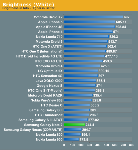
The Note 2’s brightness unfortunately isn’t that high, but like always Samsung makes up for it with huge contrast from the black subpixels being almost entirely dark. I have a feeling this is still being very conservative for the panel for battery life concerns and to minimize both aging effects and burn-in.
Next up is color accuracy and calibration, where Samsung AMOLED has traditionally been very oversaturated — which looks vibrant and draws customers in at stores — but results in inaccurate rendering. We’re using Chris’ new suite here which is in CalMAN 5, I touched on the details in the iPhone 5 review.
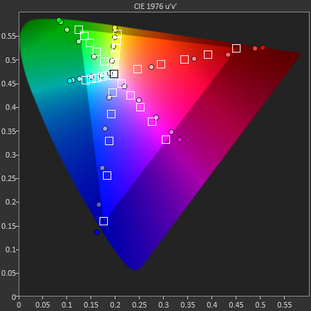
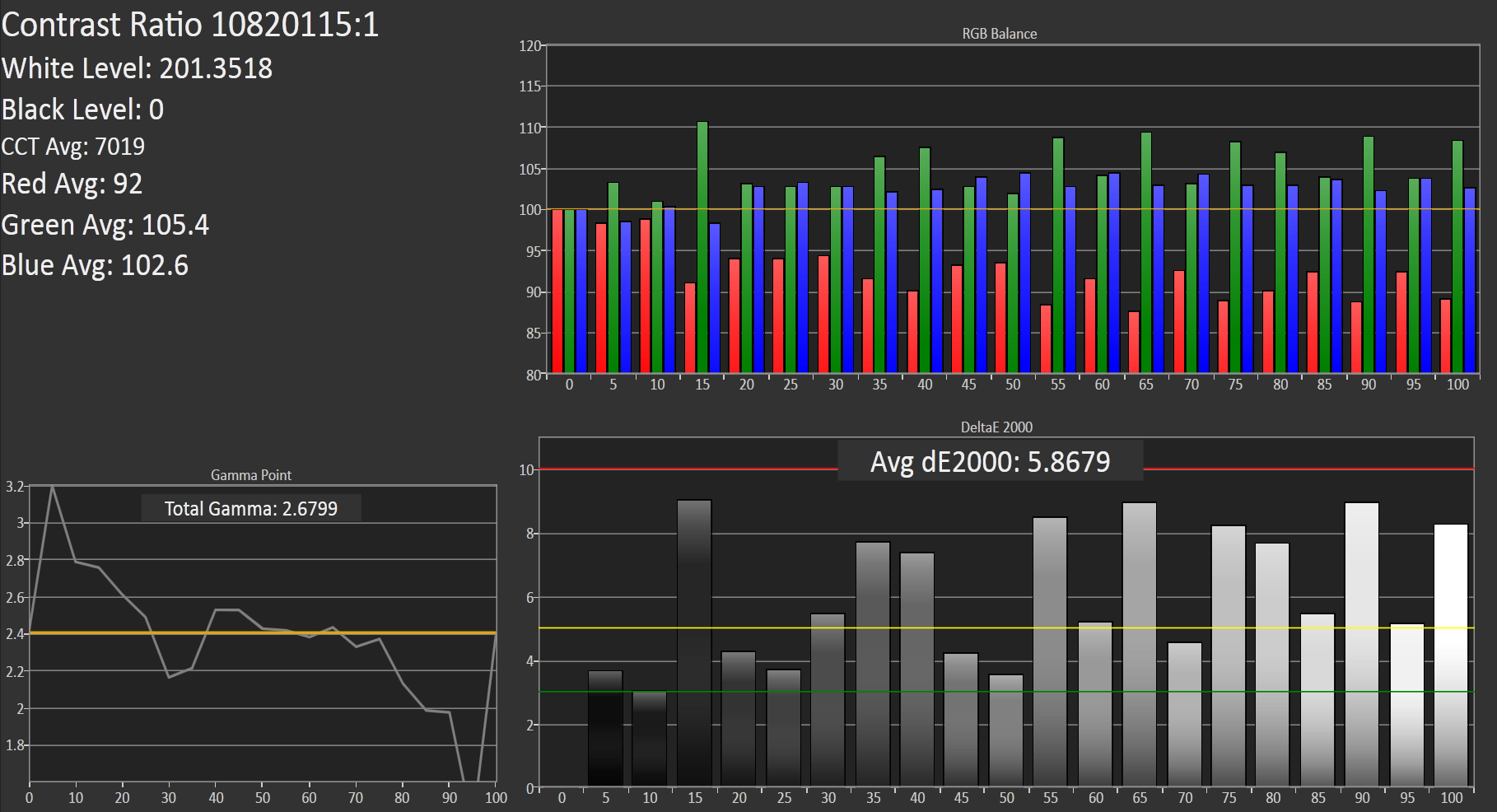
Our target is sRGB, as Android doesn’t have a CMS, and the Galaxy Note 2 doesn’t stop the trend of SAMOLED having a gamut much larger than sRGB. At the same time however things could be much worse. I also measured the Galaxy Note 2 display at maximum brightness with Francois who said much the same thing - it isn’t alltogether bad among SAMOLED displays.
Color temperature at 200 nits is around 7000K but as the blue subpixel wears it will warm up and get closer and closer to 6500K. Overall the Galaxy Note 2 display makes some tradeoffs but ends up being quite appealing. There’s still something to be said for how contrasty AMOLED is even if it still is oversaturated compared to sRGB.
| CalMAN Display Comparison | ||||||||
| Metric | iPhone 5 | iPhone 4S | HTC One X | Samsung Galaxy S 3 | Samsung Galaxy Note 2 | |||
| Grayscale 200nits Avg dE2000 | 3.564 | 6.162 | 6.609 | 4.578 | 5.867 | |||
| CCT Avg (K) | 6925 | 7171 | 5944 | 6809 | 7109 | |||
| Saturation Sweep Avg dE2000 | 3.591 | 8.787 | 5.066 | 5.460 | 7.986 | |||
| GMB ColorChecker Avg dE2000 | 4.747 | 6.328 | 6.963 | 7.322 | 8.185 | |||


131 Comments
View All Comments
The0ne - Wednesday, October 24, 2012 - link
Don't worry, I'm 40 years old myself and screen specs are very important for me due to my aging eyes. I've since replaced all my LCDs with 30" IPS ones, e-readers and tablets have at least x800 and now this phone if I decide to buy one (if pricing is right).I was glad to read that statement in the review as well. It definitely put a smile onto my face to actually read it and have someone share the perspective. Mind you my eyes aren't too bad being .75 off but it does make a huge difference having a good screen to look at.
jjj - Wednesday, October 24, 2012 - link
Not a fan of the S3 but for some reason i kinda like this one.The weight seems rather high,after all most of the time the phone sits in a pocket,hope they get rid of some layers of glass in future models.Maybe by then we also see Corning's Willow Glass and the flexible Atmel touch sensor (not controller) for a thinner bezel.
It does feel a bit outdated already with quad Krait devices announced and dual core A15 arriving soon hopefully (Gigaom had some numbers for the A15 based Chromebook and they look impressive)
enezneb - Wednesday, October 24, 2012 - link
That 11 million contrast ratio is just amazing; a true testament to the potential of AMOLED.I could forsee Samsung improving their color calibration standards for the next generation of flagships seeing how they're under considerable pressure from the likes of SLCD2 and Apple's retina display. Paired with this new pentile matrix ultra-high ppi displays in the range of 400 may be possible as well (a la SLCD3)
Looks like next year will be another exciting year for mobile display technology once again.
schmitty338 - Wednesday, October 24, 2012 - link
You can change the colour calibration to be more 'natural' in the TouchWiz software ont eh Note II.Also, personally I don't see the need for 'more accurate' colours on a phone. Maybe if you are a pro photog who reviews pics on their phone, but otherwise, I love the colourful pop of AMOLED displays. Even the low res pentile AMOLED of my old galaxy S (original...getting the Note 2 soon) looks great for media. Text, not so much, due to the low res and pentile.
slysly - Wednesday, October 24, 2012 - link
Why would colour accuracy ever not be important? I thought the point of a big phone is to make it easier to consume all sorts of media, from websites to photos to movies. Wouldn't more accurate colours be better for all of these activities? To me, it's a bit like saying, I don't see the need to eat delicious food during lunch, or I don't need to be with a beautiful woman on the weekdays. Why settle for something markedly inferior?Calista - Thursday, October 25, 2012 - link
Is your screen properly colour calibrated? Are your walls painted in a neutral colour to avoid a colour cast? Are your lamps casting a specified type of light and shielded to avoid glare? Do you use high-quality blinds to prevent sunlight?This is only a few of the things to consider when dealing with calibration. And a cellphone is unable to deal with any of them unless it stays in the lab.
So for a cellphone the criteria is:
Is it bright enough?
Does it look pleasing to the eye, overly saturated or not?
PeteH - Thursday, October 25, 2012 - link
Eh, depends what you do with it. I can understand wanting an accurate representation of a photo you're taking.And given the option between an accurate display and a less accurate display (all other things being equal) I think most people would opt for the more accurate option. Note that I'm not saying they would choose it as better visually (people seem to be suckers for over saturated displays).
Zink - Wednesday, October 24, 2012 - link
Great review. Just the right amount of detail and I really like your perspective on day to day use.Mbonus - Wednesday, October 24, 2012 - link
Battery Life Question: I have noticed that since I have started using audio streaming apps my battery has taken quite a hit. I wonder if that could be added to your battery life benchmarks?It might not matter for devices like this where you have a large storage upgrade ability, but some other devices are forcing us to the cloud where streaming matters.
Great and thorough review as always!
Brian Klug - Wednesday, October 24, 2012 - link
So with streaming apps and such, even though the bitrate is low, if they're not very bursty (eg download and fill a big buffer, then wait 30 seconds or minutes, then repeat) they can hold the phone in CELL_DCH on UMTS or the appropriate equivalent on other air interface types, and that's what really burns power. It's time spent in that connected state that really destroys things.This is actually why I do the tethering test as well (which has a streaming audio component), but I'm beholden to whether or not the review unit that I'm sampled is provisioned for tethering or not, which is the real problem.
-Brian