In-Depth with the Windows 8 Consumer Preview
by Andrew Cunningham, Ryan Smith, Kristian Vättö & Jarred Walton on March 9, 2012 10:30 AM EST- Posted in
- Microsoft
- Operating Systems
- Windows
- Windows 8
As soon as the setup process is finished, you’re presented with your first look at Windows 8’s primary innovation: Metro. This new UI, which originated in Windows Phone 7 and has since been extended to the Xbox 360, is the Wave of the Future at Microsoft, and it’s part and parcel of Windows 8. There is no classic Start menu to fall back on. There’s nothing built-in to the OS that allows you to disable it or boot to the desktop by default (though surely various hacks will enable this if they haven’t already). Metro is here, and if you use Windows 8 you’ll have to come to terms with it.
That’s because Microsoft is going a step further than Apple with regards to its operating systems: while Apple is busy porting iOS features and characteristics to a desktop operating system that is still recognizably OS X, Microsoft insists that the tablet is just another kind of PC, and to that end is building a unified OS for both tablets and traditional PCs. Microsoft tablets (whether running Windows 8 or Windows on ARM) will run the same core software as PCs, will be able to run many of the same apps as PCs, and (most importantly for Microsoft’s ecosystem of enterprise users) can be managed using the same tools as PCs. We’ve known for years that the traditional Windows desktop doesn’t work well on tablets, but does an interface designed for touch also work with a mouse and keyboard?
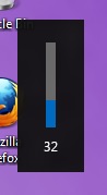 Metro, with its large fonts, bold colors, and large buttons was designed to be touched, and I think once we get some tablets designed for Windows 8 people are going to warm up to it. It’s well thought-out and with a little polishing will stand up well to iOS and Android in terms of features, and in terms of aesthetics it's already there—animations are fluid and attractive, and nice touches like a volume overlay (see right—finally!) bring an extra level of modern polish to Windows.
Brian Klug and Ryan Smith talked a bit about using Metro on a tablet in their piece on September’s Windows 8 Developer Preview, a process which is more or less the same in the Consumer Preview, so what I’ll be focusing on here is the general layout and function of Metro in the Consumer Preview, and my experience using it with a keyboard and mouse.
Introducing Metro
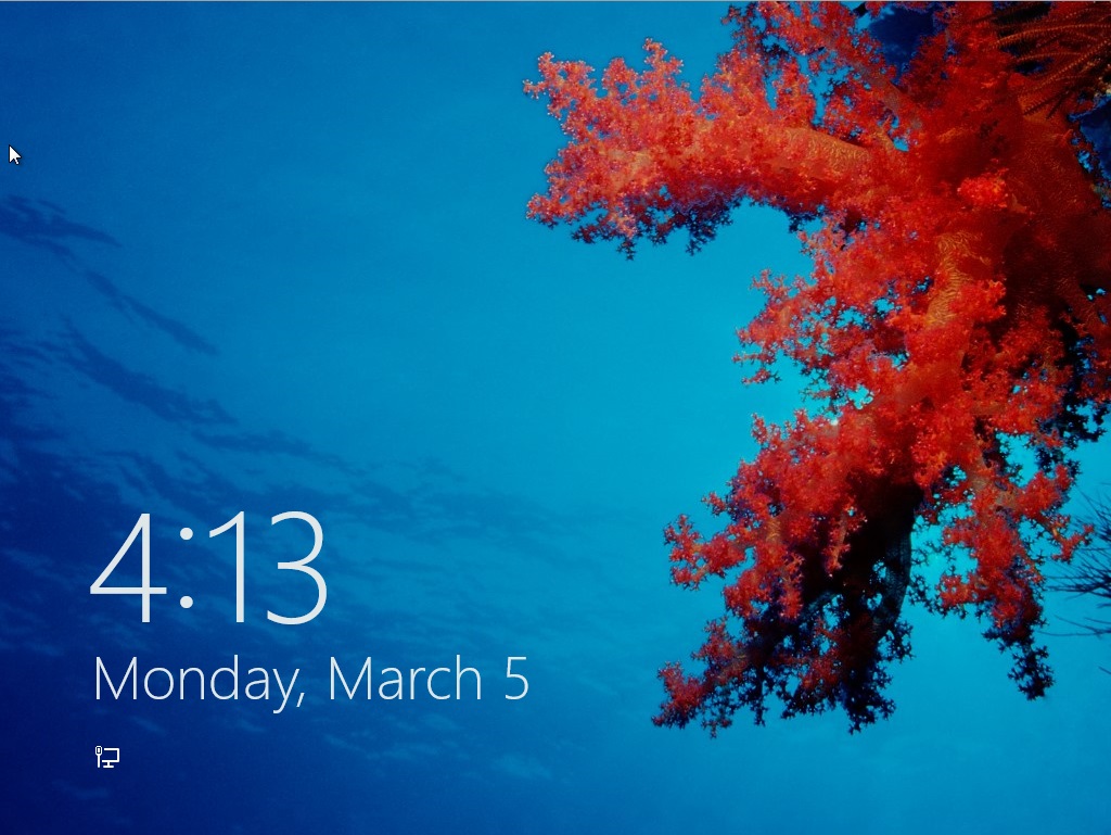
We’ll start with the entry point: the new login/lock screen. In previous Windows versions, this screen told you nothing about the computer—it was simply a gateway, and as such it either showed you a list of user accounts on the computer or displayed a CTRL + ALT + DELETE prompt with username and password fields. In Windows 8, the lock screen shows you the date and time and your current battery life and network connectivity status, set against a user-configurable background. Other Metro apps, like Mail and Messages, can also be configured to display status and notification messages on the lock screen. The look is reminiscent of most tablets and smartphones, but its big, high-resolution, striking images reminded me more of the Kindle Fire than anything. It’s a nice effect.
Press any key on your keyboard and the login image will slide upward, revealing the traditional Windows name and password fields. Authenticate, and you’ll be looking at the Metro-style Start screen.
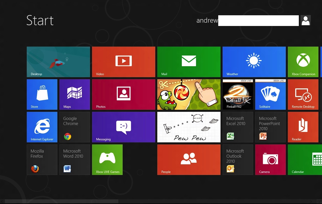
Tiles for Metro-style apps are big and colorful, and can usually be set to two sizes, a smaller square that allows for two tiles to sit side by side in a column, and a longer rectangle that spans the entire column. Metro columns on the Start screen will expand or contract to fill all of the screen resolution available to them, as evidenced in the screenshots above and below, and your mouse or trackpad’s vertical scrolling function will let you move left and right (horizontally, I know) through all of your apps. You can also scroll by grabbing the scrollbar at the bottom of the screen, or by moving your mouse pointer all the way to the left or the right of the screen.
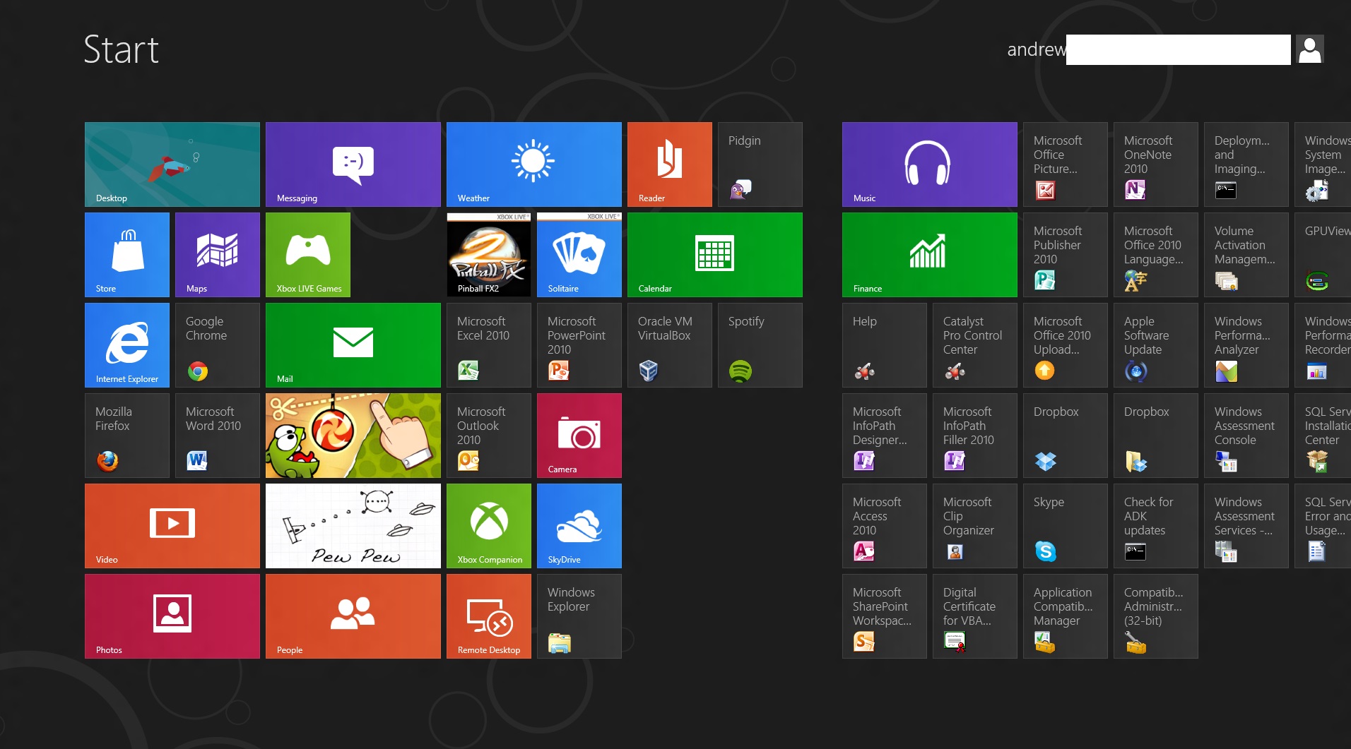
Displays with more pixels can display more items
Above, you can see most of what constitutes a Metro page: tiles of apps lined up into neat columns. Tiles can be moved around at will, and will try their best to rearrange themselves dynamically. The wider gap between two of the columns is a divider between “pages” of apps. There is no limit to the horizontal size of pages, and you can freely drag tiles to either side of these wider divides.
Right-clicking a Metro app will bring up a list of actions at the bottom of the screen—most Metro tiles will let you shorten or lengthen them, remove them from the Start screen, or uninstall them.
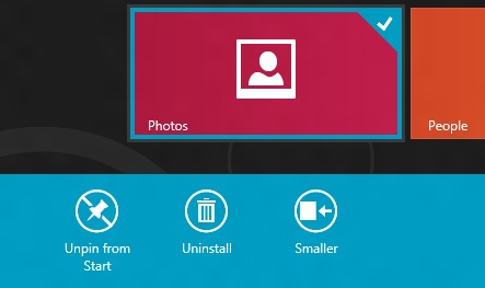
Standard desktop programs also show up on the Start screen as rather unglamorous-looking gray tiles that show the name of the program and its icon. Left clicking on it will dump you to the desktop and open the app as it would open in older versions of Windows, and right-clicking will bring up that app’s standard right-click menu in the Metro style across the bottom of the screen, with the added option to uninstall the program without going into the Programs and Features control panel.
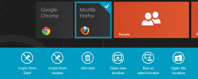
To add and remove desktop app icons from the Start screen, right-click them and then click “pin to Start.” Desktop apps can be pinned to and unpinned from the desktop taskbar and the Start screen from the desktop or from Metro, the first of many ways in which the two interfaces are integrated.
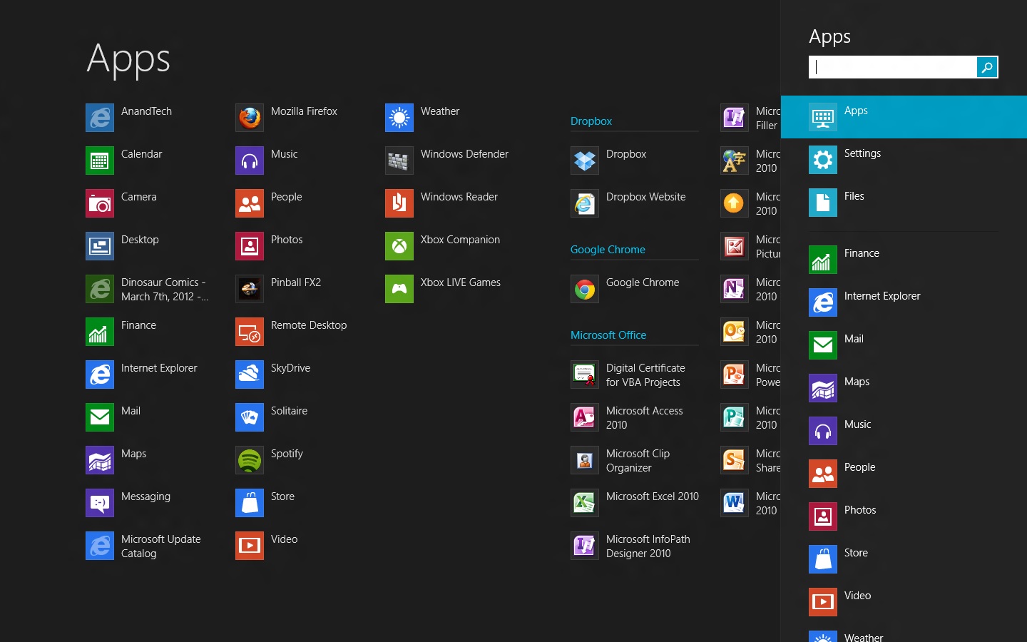
Windows Search can be invoked automatically from the Start screen if you begin typing. In Windows 8, there are three distinct search categories: Apps, which will display most Metro and desktop programs; Settings, which will search through the Metro and desktop control panels; and Files, which is self-explanatory. You can also search through any Windows Search-enabled Metro app, which you can see listed below the three main headings. I’d love to see a unified search group like we had in the Windows 7 Start menu, especially given the sometimes-blurry line between what appears in Settings and what appears in Apps, but search in Windows 8 is powerful and it’s fast, even using slower processors and mechanical HDDs.
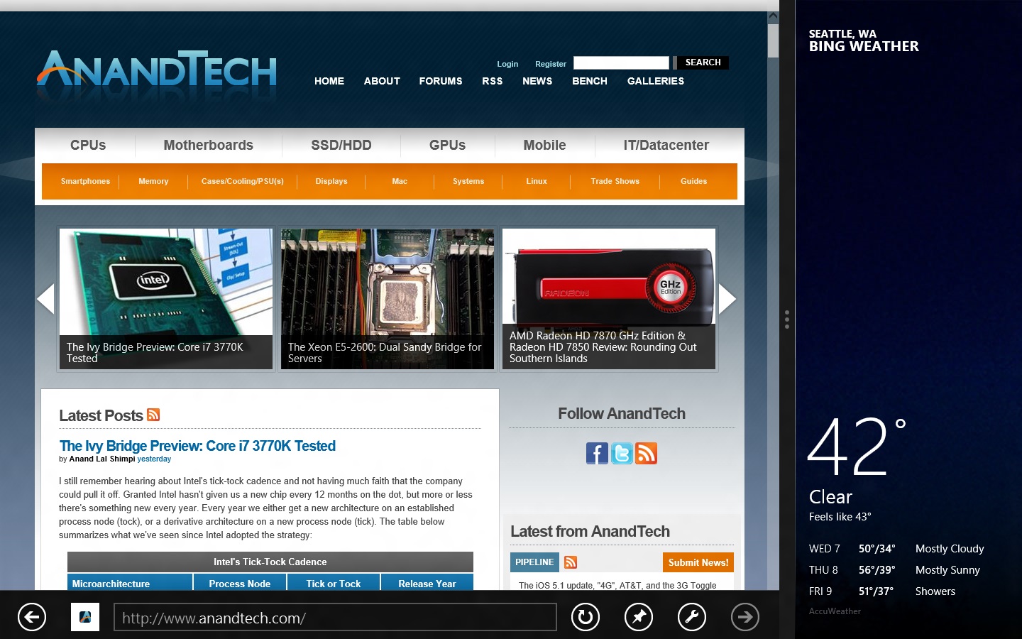
All Metro apps, including the desktop, can be “snapped” to the left or right edge of the screen, which lets one app use up about a fifth of the screen while another app uses the remaining space—I’ve seen this called “Metro Snap” and that’s how I’ll refer to it for the rest of the article. This is especially useful for things like Twitter or messaging clients that work well with a single vertical strip of screen space. Metro Snap will only work on panels that are 1366x768 or higher—anything smaller has too few horizontal pixels to make effective use of the feature—but the Windows desktop’s Aero Snap features will continue to work as they did in Windows 7.
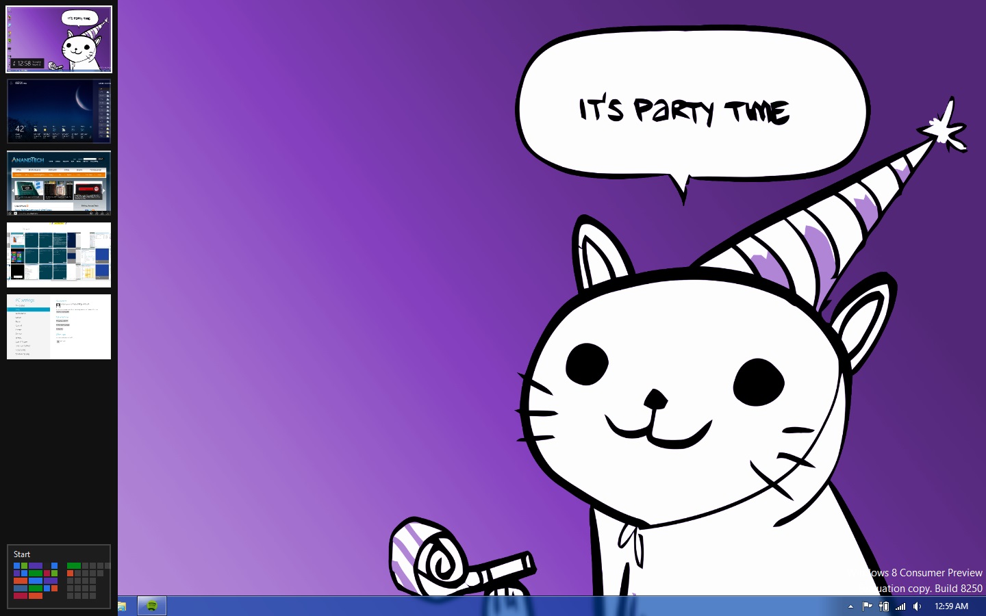
Party Cat knows when it is time to party. Also, the app drawer is on the left.
Metro has a few menus that can always be brought up no matter what app you’re using: the left edge of the screen is for an application drawer (above), which serves a function similar to the application switchers in iOS and Android. It shows all of your currently running apps and allows you to either switch to them from the currently running app or close them. The desktop will show up in the application drawer as a single item regardless of how many programs you have running on it, and while you can “close” it, this only makes the tile vanish from the drawer, and won’t close any of the programs running on the desktop.
Update: Several readers have pointed out that right-clicking in the lower left corner of the screen brings up a mini-Start menu of sorts, where the Explorer, Search, the Run dialog box and several control panels can be accessed more easily. Thanks to all who sent this in!
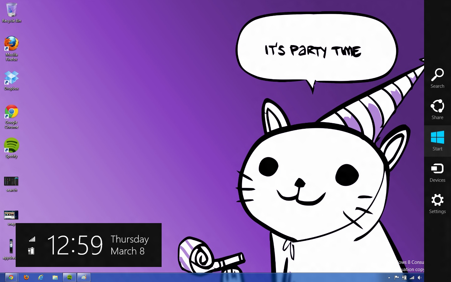
The right edge of the screen is for Charms (above), Microsoft’s name for the buttons that let you access several high-level settings and features. The Charms are, from top to bottom:
- Search, which brings up the Search menu (which, remember, can also be invoked by typing from the Start screen). The default search view is Apps.
- Share. While in a Metro app like Photos, you could use this charm to send a picture to someone using another Metro app like Mail.
- Start, which brings up the Start screen.
- Devices, which brings up attached devices like printers and extra monitors and gives you some configuration options for them—for instance, it will allow you to change your display settings if you’ve got a second monitor or projector attached, and it will bring up a Print menu if you click an attached printer. This charm is context-sensitive—if there’s nothing in your app to print (or if the app doesn’t support it), for example, any printers attached to your computer won’t show up in the menu as a selectable option.
- Settings. This brings up both general settings and options for the currently-running application as well as some system-wide settings like brightness, volume, notifications, language, network connectivity, and shutdown options. The “More PC Settings” link brings up the system-wide Metro control panel, where one can control things like the lock screen and Metro backgrounds, your PC’s refresh and reset functionality, and a few other settings.
Screen resolution requirements
As we’ve discussed, using Metro Snap requires a screen resolution of at least 1366x768, but there’s one more very important resolution requirement in Windows 8.
While working on my netbook, I quickly found that almost all Metro apps included in the Consumer Preview wouldn’t run on its 1024x600 display. After some research I found that, yes, Metro apps are only going to run on screens that are 1024x768 or higher. It’s important to give developers a minimum screen resolution to shoot for (and we may even see some tablets that use 1024x768 panels, given the precedent set by the iPad, the HP TouchPad, and others), but it means that users of PCs with smaller screens aren’t going to be able to use Windows 8’s defining feature (though the Start screen and system menus will still work just fine). This is too bad, since the limited amount of screen space on a netbook is a decent fit for Metro's simplified interface and full-screen apps.
Now that you know the basic features and layout of Metro, it’s time to teach you how to use it with a mouse and keyboard.


286 Comments
View All Comments
Andrew.a.cunningham - Friday, March 9, 2012 - link
1) We'll probably do an analysis of that with an RTM version of the OS. I wouldn't expect it to change too drastically from a patched copy of Windows 7.2) Not guaranteed, but probably. When 7 was released, Vista got a Platform Update that added support for DX11, some WDDM 1.1 features, and a few other things: http://support.microsoft.com/kb/971644
Windows 7 is still in its mainstream support phase, so I'd expect those updates to be available after Windows 8 RTM.
R3MF - Friday, March 9, 2012 - link
many thanks Andrew.Andrew.a.cunningham - Friday, March 9, 2012 - link
Welcome! :-)valnar - Friday, March 9, 2012 - link
Isn't the fact that new Windows phone BOMBED in the marketplace enough reason not glorify this crappy GUI? The public has already spoken.And....what makes a good tablet or phone OS (touch screen) does not necessarily make a good desktop OS.
silverblue - Saturday, March 10, 2012 - link
True, however everybody has differing tastes. I don't mind it, personally, and it's not as if the Windows 7 desktop has gone forever.As for Mango, it's not on many devices and hasn't been out long. I also firmly believe that it's the first flavour (sorry) of Windows Phone that Microsoft has truly taken seriously. Give it time. Had dozens of devices been launched with Mango yet sales been poor, I'd have been more inclined to agree with you.
Touch screen technology has been around a while and it's about time that a mainstream OS had extensive functionality in this area.
Subzero0000 - Sunday, March 11, 2012 - link
>Isn't the fact that new Windows phone BOMBED in the marketplace enough reason not glorify this crappy GUI? The public has already spoken.Well, that's exactly why they have to FORCE metro to their biggest userbase (Desktop PC). They want people to get used to metro, then hopefully people get attached to it and choose to buy tablet/phone with metro.
PopinFRESH007 - Sunday, April 15, 2012 - link
+1This is where I think Apple's methodical, very deliberate, well thought out approach is going to win over a lot of people after Windows 8 launches. Microsoft already tried this in reverse order and it was awful until they instantly became irrelevant when the original iPhone launched. They crammed a mouse and keyboard OS into a crappy touchscreen phone and called it a day. Here they are cramming a touchscreen phone/tablet OS pasted on top of a desktop OS and figured out the least amount of work to make it possible to maneuver between the (what feels like) two OS's. When the review consistently has "There are actually two versions of..." you know you have done something wrong as an OS engineer.
I've given Win8 a fair shake, I've really tried to give it an honest everyday usage to give it a fair comparison. I have a Lumia 900 and have been running the consumer preview since it came out. I'm really going the extra mile to give the Metro UI a shot, but it just doesn't scale to a desktop (In the way windows 8 implements it) very well at all. I've used Win8 on a very nice prerelease tablet and it works wonderfully. Microsoft should really take a step back and survey the industry and learn from what has been successful and what has had problems. The iPad is crushing the tablet market because it benefits (like many Apple products) from a halo of the iPhone, iTunes, and iCloud. Google has realized their misstep in segmenting the phone & tablet OS's and I think Microsoft will come to realize that a touchscreen tablet has more in common with a touchscreen smartphone than it does with a keyboard and mouse desktop PC.
The thing about Metro is that it is very simplistic and *could* scale easily. Look at a Windows Phone 7 next to a Windows 8 Tablet and it's ability to scale is obvious. I think the real problem here is Microsoft is taking a Bold, half hearted, All-in, keep some chips in reserve, Go for the gusto, partially move to Metro. They cram it down your throat but don't believe in it enough to completely re-think the OS an move to it. I would like Windows 8 a whole lot more if it was a unified experience with Metro at it's center. The half ***ed cramming of two OS's with different UI's into one cup of tea is what really pushes me away from Windows 8. If they left the core of windows 7 under the hood so any windows 7 app's would run, and provide a simple framework for developers to create "live tile" shortcuts that plugin to the new services that Windows 8 will bring this would be a much better OS. If this is the future, GO FOR IT!! There should not be a control panel for "desktop" and a settings for Metro. There should not be Metro IE 10 and IE 10 for Desktop. If they built API's and service frameworks for developers to bridge Metro UI to C++ code and let developers design their software the best way that suits their needs there would be far better support. The Metro UI as a launcher for native C++ app's and HTML5 Metro apps would be great. This would be especially true if developers could push notifications and information to the live tiles for their app's. Imagine a multiplayer game like Battlefield 3 on Windows 8. On the Metro UI "Start" screen the Live Tile for BF3 would be alive with info from battlelog. So you could easily see if some friends are playing the game, or if there is new content/updates, etc... It would be like having the community features of Steam, without ever having to "Launch" anything. A quick glance at your games area of your Live Tiles and you could see who is online playing what games and quickly join in. The same thing would be true for a more professional app like Photoshop. Imaging if Adobe, using these types of API's could build in collaboration features tied into the Live Tiles & using SkyDrive. You could save an image in your skydive and share it to your fellow team members, then if there are changes and edits all of those peoples Live Tiles for Photoshop would reflect that new information. They have so much potential and are at a solid time to make the leap, the real leap to Metro with less risk. They have a solid "traditional" OS in Windows 7 that they could continue to sell. They also have the ability to really bring a new level of integration that has been absent from Microsoft products. Tie in Xbox Live like they did on Windows Phone 7, and integrate voice chat, the friend list, messaging, etc as system wide services. The list goes on and on with the amount of potential they have to make a seamless experience across all of their platforms from phone, to xbox to tablet to PC. It's sad to see this is the best they can do.
As mentioned above, I think Apples approach of using services like iCloud to bridge your data from a mobile platform to a desktop platform is a better strategy. Really looking at each element of a mobile OS and thinking how that will work on a desktop with a mouse and keyboard; working to merge what makes sense and leaving out what doesn't. I think Apple is also failing at this to some extent as well. They should be working on unifying their "Store's" so I could make an app that when loaded on an iPhone would have the iPhone UI, when loaded on the iPad would have the iPad UI and when loaded on a Mac would have a windowed UI, and the store would serve up the correct parts of the binary depending on if it's on a mobile device like iPhone/iPad or Mac.
/END RANT.
jabber - Friday, March 9, 2012 - link
The feedback has been 100% negative. Really really bad. No question I haven't seen a normal PC user yet that likes it or wants to use it.The feedback for Windows 7 was 90% positive.
Not looking good MS.
futurepastnow - Friday, March 9, 2012 - link
The feedback from the two "normal" non-technical computer users I showed it to was very negative. I let them play with it with no instructions or advice, and they couldn't do anything. It's the least intuitive interface ever.Oddly (or not oddly), the most computer-literate person I showed it to figured he could get used to it, since he uses keyboard commands for everything and they still work. He thinks Microsoft are out of their minds, though.
Perhaps that is Microsoft's problem, I wonder? All of their engineers, testers and QA people know all of the keyboard commands, which puts them in the 1% of computer users. Perhaps if they created a special version of Win8 for interface testing, which *required* mouse input for all actions, they'd seriously reconsider Metro.
Exodite - Saturday, March 10, 2012 - link
I don't know, I'm a software engineer myself and I wouldn't touch W8 with a 10ft pole.I like the minor underlying enhancements to things like the Task Manager and File Transfer dialog, though nothing of that can even begin to make up for the UI clusterfuck.
I run a multiple-display desktop system.
I _like_ nestled folder structures and rely on it to organize.
I prefer minimal clutter on the desktop, to the point the only application icons there are Chrome and MPC-HC, and half a dozen project folders. I also use minimal size icons.
Huge icons in listings, and the enormous amount of whitespace they add, is wasteful and inefficient.
I can't stand that good and intuitive UI elements like radiobuttons and checkboxes are giving way to touch-oriented dragbars, it just underlines wha ta gigantic step backwards the entire Metro experience represents.
Perhaps you're right about technical and professional users being less impacted by the horrors of W8 due to being more comfortable with keyboard shortcuts than users in general, my personal experience isn't enough to say one way or another.
On the other hand I'd argue that that particular group of people are least inclined to accept the changes because they very rarely have to. I don't have to use Windows as a development platform, I could quite trivially move to any *NIX platform of choice.
And if Microsoft doesn't see the light before Windows 7 hits EOL I might as well migrate platform, at least I can set up the UI as I prefer that way.