ASUS Eee Pad Transformer Prime & NVIDIA Tegra 3 Review
by Anand Lal Shimpi on December 1, 2011 1:00 AM ESTTegra 3 GPU: Making Honeycomb Buttery Smooth
The bigger impact on the overall experience is the Tegra 3's GPU. If you remember back to our initial analysis of Tegra 3 you'll know that the GPU is not only clocked higher but it also has more execution resources at its disposal. To further improve performance, per "core" efficiency is up thanks to some larger internal data structures and tweaks. The end result is much better gaming performance as well as a much smoother UI.
Tasks like bringing up the apps launcher or even swiping between home screens are finally far above 30 fps. While Tegra 2 didn't have the fill rate to deal with some of the more complex overlays in Honeycomb, Tegra 3 does. The move to Tegra 3 makes the Honeycomb experience so much better. This is what it should've been like from the start.
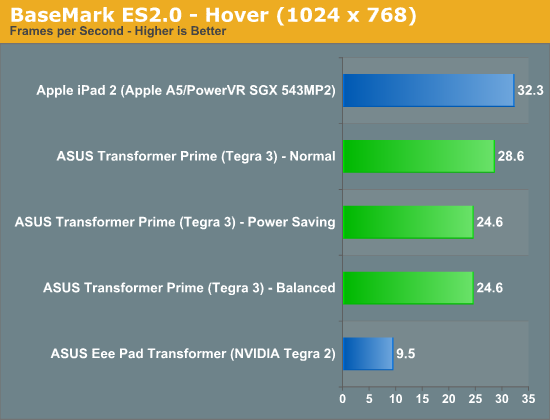
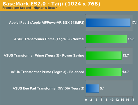
Gaming performance is also significantly better as you can see from our standard collection of Android GPU benchmarks:
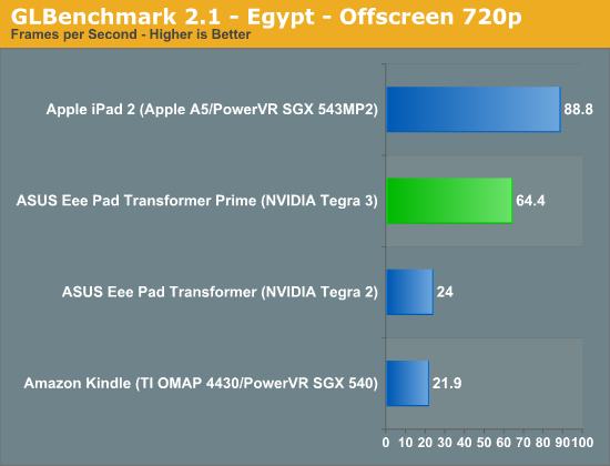
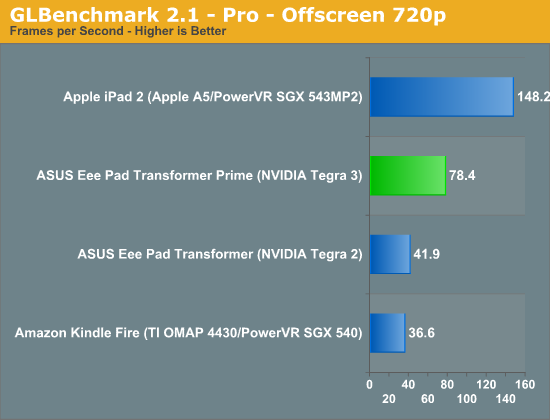
Performance is still not quite up to par with the iPad 2, but if we look at GLBenchmark's Egypt test Tegra 3 doesn't do too bad. The gap grows in more texture bound tests but in a heavier shader environment Tegra 3 isn't too shabby. While it's clear that Tegra 2 wasn't enough to deal with the 1280 x 752 resolution of Honeycomb tablets, Tegra 3 seems well matched.
Note that the BaseMark ES2.0 tests run at FP16 on Tegra 2 and 3 vs. FP24 on the PowerVR SGX 543MP2.


204 Comments
View All Comments
Penti - Thursday, December 1, 2011 - link
It looks like they have finally a pretty good product and software, they should dump the Eee pad and the redundant awkward name now and it would be even better :)Would love to see better optimized software, but this is what you could have expected plus with a great screen and I wonder how well it would work as a thin-client with Citrix? Keyboard and touchpad should make it a pretty good experience, does it? Chromebooks can just forget it any way :) Here we have form factor, local software, multimedia (Chromebooks are not even having accelerated H.264 as standard) and so on. With keyboard docked and standard, and not just a browser that was obvious would be replaced by a Android distribution of some kind any way. Maybe that time is now. Even though I wouldn't except Asus to complete that process. Fun to see them kinda getting there act together though.
Malih - Thursday, December 1, 2011 - link
I agree that Eee is an awful name, especially for a flagship/cutting-edge product.Eee is associated with low-end Atom netbooks, since that's the first device that uses the name. And I always hate that Samsung name their mobile devices Galaxy.
IMHO, the name Zenbook sounds good, maybe they should invent something consistent with that for their top-line tablet, Zenpad?
Penti - Friday, December 2, 2011 - link
Zenbook is still kinda awkward but it's better, ZenPad doesn't do anything for me and sounds silly. Transformer Prime is a pretty good name. Transformer might cause some confusion though, if they decide to release one without any keyboard attachment. Their Windows tablet PCs (slates as of now) might as well get some updated finish and release as a Zenbook slate though.MamiyaOtaru - Thursday, December 1, 2011 - link
"The 16:9 panel measures 10.1-inches diagonally, giving it a larger surface area than the iPad 2's 9.7-inch 4:3 display. "If you do your math, this isn't actually true. A 10.1" 16:9 display has a surface area of 43.58", while a 9.7" 4:3 display has a surface area of 45.17". This is one of the main reasons behind widescreen, they get to trumpet a larger diagonal measurement while actually saving costs on smaller total area. I am a little disappointed you fell for it.
MamiyaOtaru - Thursday, December 1, 2011 - link
some numbers you can plug in for verification (rounding all around!):16:9 10.0" display has sides of 8.8 and 4.951. 8.8/4.95 ~= 16/9 (correct ratios). 8.8² + 4.95² ~= 10.1² (correct dimensions for given diagonal, shown via pythagorean theorem).
area then: 8.8*4.95 = 43.96.
4:3 9.7" display has sides of 7.76 and 5.82. 7.76/5.82 ~= 4/3 (correct ratios). 7.76²+5.81² ~= 9.7² (correct dimensions for given diagonal, shown via pythagorean theorem).
area: 7.76*5.81=45.09.
45.09 is larger than 43.96. Ipad2 has a screen with a larger surface area. Run the numbers. Do it without dropping as many places as I did in this post, result will be the same. Again, disappointing
(I don't have a horse in this race, I own no Apple products. I do hate widescreen monitors though)
MamiyaOtaru - Thursday, December 1, 2011 - link
interestingly, the gap was closed somewhat when I dropped more places in typing up the second post. The first is more accurate, and the gap is bigger. But they both show the ipad as having more surface area, and that will hold true with pretty much whatever level of exactitude one wishes to calculate itAnand Lal Shimpi - Thursday, December 1, 2011 - link
It's actually a 16:10 panel, my statement was incorrect. But the Prime's display measures roughly 8.5" x 5.25". The iPad 2 by comparison measures approximately 7.75" x 5.75". 44.625 in^2 vs. 44.5625 in^2, giving the Prime a slightly larger display (albeit negligible).Solandri - Thursday, December 1, 2011 - link
At 9.7" diagonal and 4:3 aspect ratio, the iPad 2's screen is 7.76" x 5.82".At a 10.1" diagonal and 16:10 aspect ratio, the Prime's display is 8.56" x 5.35".
Solandri - Thursday, December 1, 2011 - link
Anand's math is right. His aspect ratio is wrong. The Transformer Prime has a 1280x800 screen, which is 16:10, not 16:9. At a 16:10 aspect ratio, you end up with 45.85 square inches of surface area.Personally I think 16:10 is the "right" aspect ratio for a multifunction device. You waste10% of the screen when displaying a 16:9 video. A 4:3 device wastes 25% of the screen. The extra width is nicer for web browsing too.
Where the 4:3 screen does better is displaying pages scanned from paper or magazines. Subtracting a 1-inch margin along all four sides, a 4:3 screen wastes 4% of its screen displaying a Letter-sized sheet of paper, while a 16:10 wastes 13%. (With A4 paper and 2-cm margins, it's reversed. The 4:3 wastes 12%, the 16:10 screen wastes 6%.)
But that's counter to the whole point of tablets - to free us from the shackles of a paper-bound world. As a media consumption device, I think 16:10 is the better aspect ratio. It's almost exactly the golden ratio too (1.62), so most art which is produced will fit in it better.
GnillGnoll - Friday, December 2, 2011 - link
For browsing the web and reading, portrait orientation is often a better fit. Though it requires a certain minimum width and resolution to work really well.