ASUS Eee Pad Transformer Prime & NVIDIA Tegra 3 Review
by Anand Lal Shimpi on December 1, 2011 1:00 AM ESTThe Dock & Keyboard
Despite what ASUS originally told us when it launched the first Transformer, the Prime does not work with the old dock. Admittedly you wouldn't want to use the sleek new tablet with the clunky old dock, but I'm just not a fan of being used to convey incorrect information.
The new dock matches the Transformer Prime perfectly. The docked Prime isn't as elegant as the Zenbook and I'd argue that the dock does take away from the tablet's beauty, but if you need to hammer out long emails or a big document the dock is a great solution.

The dock's beauty isn't just that it's convenient (it behaves just like a notebook once mated to the tablet) but that it acts as a second battery for the Eee Pad. ASUS has also done the necessary customizations to Honeycomb to appropriately track battery levels in the dock and the tablet. There's also a little animation indicating that the dock is charging the tablet. To the best of my knowledge, the tablet will never be used to charge the dock.
Scrolling is rarely as smooth as I'd like it to be via the dock's trackpad. Many times the gesture just won't register on the trackpad or the trackpad will detect my two fingers but it won't scroll. With the screen inches away I found myself preferring to use the touchscreen for scrolling and stuck to using the dock for typing. You can control pointer speed and cursor style in the OS now, which is a nice addition.
The typing experience itself is great on the dock. The keys are big enough (around 15mm x 14mm) to type quickly on and feedback is good. The keys were a bit taller on the old dock, but as the new model is thinner the keys went on a similar slimming process.
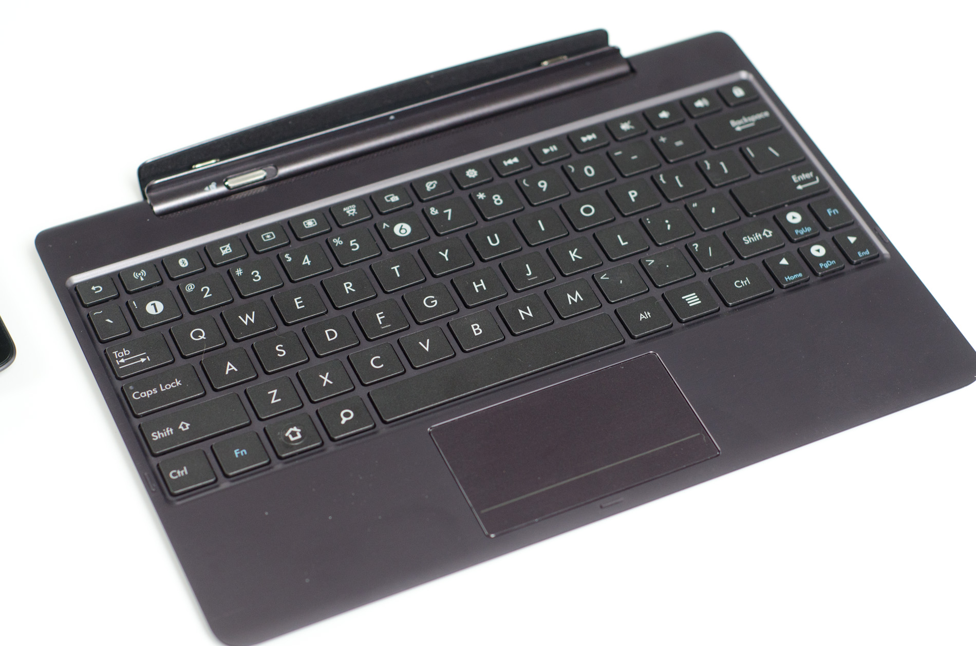
Using the dock on a desk is fine, but use the dock on your lap and you'll have to keep applying a little bit of downward force with your wrists to keep the system from leaning backward. The dock is angled forward so if you're not typing on a flat surface the system might pivot backwards. The correction is simple, you just need to push down with your wrists/palms a bit while you type. I even have to do that a bit on my 11-inch MacBook Air. The difference is the MBA has enough surface area for me to comfortably rest my wrists, the Transformer Prime's dock does not. While I don't notice much fatigue while typing on my MBA, my wrists do feel it when I use the Prime + dock on a couch.
My dock had a connection issue between the Prime and the dock itself, which ASUS insists shouldn't be happening. Tilt the Prime towards you when in the dock and the screen would occasionally go white. It feels like a manufacturing issue, although I'm apparently the only one who has reported it.
Android is still not beefy enough to be a full blown laptop replacement, but the Prime does come with enough apps to at least let you do some basic word processing and spreadsheet work. If you're going to do a lot of typing on your tablet I'd easily recommend the dock, it's the best way to get your thoughts into words on the Prime. Otherwise, the $150 adder just adds bulk and cost to the platform. The Prime is really great to use on its own. If you want an alternative to the dock, ASUS will have its own clone of Apple's iPad smart covers at some point in the coming weeks.
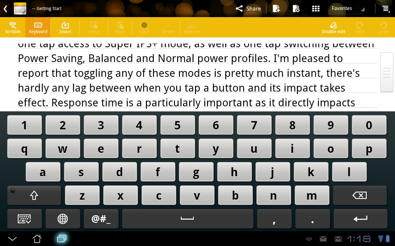
ASUS' five row virtual keyboard is back on the Prime. While it doesn't look as good as the standard Honeycomb keyboard, I do like having the numeric row visible above the rows of letters. Nuance's T9 Trace is still supported by the keyboard (Swype-like continuous text input) although I'm not personally a fan. You can disable Trace as well as revert to the stock Honeycomb keyboard if you'd like.


204 Comments
View All Comments
Penti - Thursday, December 1, 2011 - link
It looks like they have finally a pretty good product and software, they should dump the Eee pad and the redundant awkward name now and it would be even better :)Would love to see better optimized software, but this is what you could have expected plus with a great screen and I wonder how well it would work as a thin-client with Citrix? Keyboard and touchpad should make it a pretty good experience, does it? Chromebooks can just forget it any way :) Here we have form factor, local software, multimedia (Chromebooks are not even having accelerated H.264 as standard) and so on. With keyboard docked and standard, and not just a browser that was obvious would be replaced by a Android distribution of some kind any way. Maybe that time is now. Even though I wouldn't except Asus to complete that process. Fun to see them kinda getting there act together though.
Malih - Thursday, December 1, 2011 - link
I agree that Eee is an awful name, especially for a flagship/cutting-edge product.Eee is associated with low-end Atom netbooks, since that's the first device that uses the name. And I always hate that Samsung name their mobile devices Galaxy.
IMHO, the name Zenbook sounds good, maybe they should invent something consistent with that for their top-line tablet, Zenpad?
Penti - Friday, December 2, 2011 - link
Zenbook is still kinda awkward but it's better, ZenPad doesn't do anything for me and sounds silly. Transformer Prime is a pretty good name. Transformer might cause some confusion though, if they decide to release one without any keyboard attachment. Their Windows tablet PCs (slates as of now) might as well get some updated finish and release as a Zenbook slate though.MamiyaOtaru - Thursday, December 1, 2011 - link
"The 16:9 panel measures 10.1-inches diagonally, giving it a larger surface area than the iPad 2's 9.7-inch 4:3 display. "If you do your math, this isn't actually true. A 10.1" 16:9 display has a surface area of 43.58", while a 9.7" 4:3 display has a surface area of 45.17". This is one of the main reasons behind widescreen, they get to trumpet a larger diagonal measurement while actually saving costs on smaller total area. I am a little disappointed you fell for it.
MamiyaOtaru - Thursday, December 1, 2011 - link
some numbers you can plug in for verification (rounding all around!):16:9 10.0" display has sides of 8.8 and 4.951. 8.8/4.95 ~= 16/9 (correct ratios). 8.8² + 4.95² ~= 10.1² (correct dimensions for given diagonal, shown via pythagorean theorem).
area then: 8.8*4.95 = 43.96.
4:3 9.7" display has sides of 7.76 and 5.82. 7.76/5.82 ~= 4/3 (correct ratios). 7.76²+5.81² ~= 9.7² (correct dimensions for given diagonal, shown via pythagorean theorem).
area: 7.76*5.81=45.09.
45.09 is larger than 43.96. Ipad2 has a screen with a larger surface area. Run the numbers. Do it without dropping as many places as I did in this post, result will be the same. Again, disappointing
(I don't have a horse in this race, I own no Apple products. I do hate widescreen monitors though)
MamiyaOtaru - Thursday, December 1, 2011 - link
interestingly, the gap was closed somewhat when I dropped more places in typing up the second post. The first is more accurate, and the gap is bigger. But they both show the ipad as having more surface area, and that will hold true with pretty much whatever level of exactitude one wishes to calculate itAnand Lal Shimpi - Thursday, December 1, 2011 - link
It's actually a 16:10 panel, my statement was incorrect. But the Prime's display measures roughly 8.5" x 5.25". The iPad 2 by comparison measures approximately 7.75" x 5.75". 44.625 in^2 vs. 44.5625 in^2, giving the Prime a slightly larger display (albeit negligible).Solandri - Thursday, December 1, 2011 - link
At 9.7" diagonal and 4:3 aspect ratio, the iPad 2's screen is 7.76" x 5.82".At a 10.1" diagonal and 16:10 aspect ratio, the Prime's display is 8.56" x 5.35".
Solandri - Thursday, December 1, 2011 - link
Anand's math is right. His aspect ratio is wrong. The Transformer Prime has a 1280x800 screen, which is 16:10, not 16:9. At a 16:10 aspect ratio, you end up with 45.85 square inches of surface area.Personally I think 16:10 is the "right" aspect ratio for a multifunction device. You waste10% of the screen when displaying a 16:9 video. A 4:3 device wastes 25% of the screen. The extra width is nicer for web browsing too.
Where the 4:3 screen does better is displaying pages scanned from paper or magazines. Subtracting a 1-inch margin along all four sides, a 4:3 screen wastes 4% of its screen displaying a Letter-sized sheet of paper, while a 16:10 wastes 13%. (With A4 paper and 2-cm margins, it's reversed. The 4:3 wastes 12%, the 16:10 screen wastes 6%.)
But that's counter to the whole point of tablets - to free us from the shackles of a paper-bound world. As a media consumption device, I think 16:10 is the better aspect ratio. It's almost exactly the golden ratio too (1.62), so most art which is produced will fit in it better.
GnillGnoll - Friday, December 2, 2011 - link
For browsing the web and reading, portrait orientation is often a better fit. Though it requires a certain minimum width and resolution to work really well.