Back to the Mac: OS X 10.7 Lion Review
by Andrew Cunningham, Kristian Vättö & Anand Lal Shimpi on July 20, 2011 8:30 AM ESTLike iCal and Mail, Address Book also gains a new, iPad-like look. Like on the iPad, you have a window that looks like a real personal organizer.
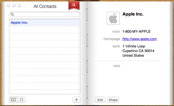
Standard Organizer layout
On the left-hand-side, you have a list of alphabetically sorted contacts. On the right-hand-side, you have the information for the contact you have selected. In the bottom right, there are two buttons: Edit and Share. Edit is fairly obvious and it simply lets you edit the information of the selected contact. Share button prompts you with a new email window with the contact’s .vcf file attached to it, so you can easily share contacts. There is also a plus button on the bottom which generates a new contact.

Simplified layout
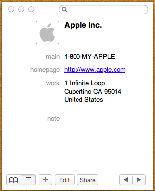
In the left bottom corner, there is a button to change the layout. There are two options: The first one is the List & Card (organizer) view from iPad but second display mode provides a much more simplified view. You don’t have a list of contacts anymore, only the search bar, contact’s information and left and right arrow buttons. If you already know who you are looking for, this view is enough, you don’t need the list of contacts hogging your precious screen estate, you can just use the search.
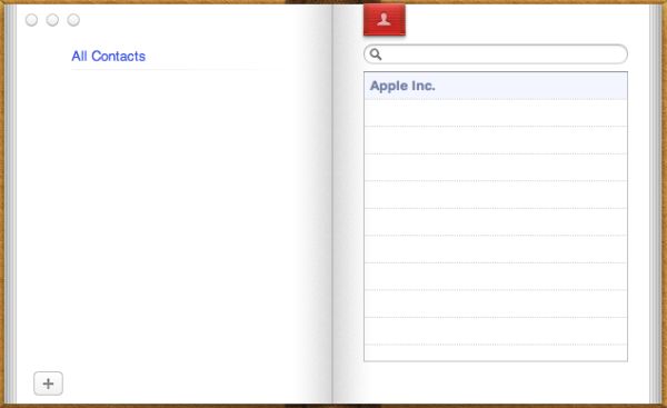
Groups view
In the organizer view, there is a red bookmark and like in iPad’s Address Book, it takes you “one page backwards” to your list of groups. Many of us have different groups for relatives, co-workers and friends, so this can be useful. Groups were present in the old Address Book as well, so this isn’t a new feature, the user interface is just slightly different.
Apart from UI changes, there are a few new features too, which are mainly concentrated on improved social networking and instant messaging support. You should now see instant messaging availability in Address Book. If the contact is available, then there is a green ball next to the picture in Address Book. Red means the contact is away, just like in iChat. Unfortunately the support seems to be limited to iChat as we weren’t able to get any indication of user’s availability with MSN for example when using Adium. In addition to instant messaging support, you can now add social network profiles like Facebook to a contact's information. At least in our tests, adding a Facebook profile didn’t make any difference and you weren’t even able to access the profile though Address Book. FaceTime calls from Address Book are supported as well and can be started by just clicking an email address and choosing FaceTime.
All in all, the new Address Book isn’t that special. The biggest change is the UI and like all UI changes, it will divide people into two groups: Some people like it, others don’t. In my opinion, the new looks of iCal and Address Book don’t really suit with the overall look of OS X. All other windows have grey toolbars and overall designs but the brownish look of iCal and Address book stick out quite a lot. It works in iPad where all apps are full screen but when all of your other windows are greyish, iCal and Address Book windows look like they got lost from the iPad.


106 Comments
View All Comments
rs2 - Wednesday, July 20, 2011 - link
Okay, it makes sense on a touch device where your finger is actually making contact with the thing you are scrolling. But a mouse cursor is *not* a finger. It is not an analog for a finger. It is a different input paradigm entirely, and trying to make it behave as if the mouse cursor is your finger by making scrolling go backwards is stupid.It's good that they put in an option to disable the nonsense that is "natural" scrolling.
name99 - Thursday, July 21, 2011 - link
Not at all. The issue is simple : what is the metaphor?When I move my finger, am I moving
- the window container? OR
- the content?
Claiming that one is more "natural" than the other is as stupid as claiming that English is more natural than Chinese. It's simply that you are used to one and, like a good American, you simply cannot imagine that the world could possibly be different --- after all, Jesus spoke English.
rs2 - Thursday, July 21, 2011 - link
Not at all. There is no "finger" when using a mouse. Touch and mouse-driven are distinct input paradigms. If a touch-based interface ever scrolled content in the opposite direction that the user moved their finger, then people would say that it was broken. And rightly so. Moving content in the same direction as the touch is the intuitive operating mode of a touch interface.And similarly, moving content in the opposite direction of the scroll (or more accurately, moving the scrollbar in the same direction of the scroll) is the intuitive operating mode for a mouse-driven interface. By your logic scrollbars themselves should also be inverted.
As a side-note, a direct analog to touch style scrolling does exist in the mouse-driven paradigm, it is the drag operation. It is available in some things like Adobe PDF documents, and also work on any scrollbar. In this operation you choose an anchor-point, and then that anchor point moves in the same direction that you move, and it all makes sense. The problem with scrolling is that it has no anchor point, it is a distinct operation from a drag operation, and by conflating the two Apple has broken their interface. At least until they start incorporating touch into every computer they sell.
Mouse-driven and touch interfaces are not the same thing, and just because a metaphor makes sense in one does not mean that it also makes sense in the other.
Uritziel - Friday, July 22, 2011 - link
Agreed.CharonPDX - Wednesday, July 20, 2011 - link
On page 23 "Performance: Similar to Snow Leopard", you have a couple bar graphs comparing Snow Leopard to Lion performance. Unfortunately, you use a generic "compared to before as 1.0" metric, with no indication on a per-test basis whether higher or lower is better. In the Core 2 Duo graph, you talk about boot time skyrocketing, and the boot time graph for Lion shows Lion as "about 1.4" of Snow Leopard, yet you also talk about iPhoto having a "greater than 10% increase in performance", where the graph shows "about 1.1" of Snow Leopard. So in one line in the graph, higher is worse, in the other line, higher is better.You either need a per-test identifier (Higher is better / Lower is better) or you need to to standardize them all (so 'benchmark' ones would stand as-is, while 'timing' ones would use the inverse, so that both would be 'higher is better', or example.)
Deaffy - Thursday, July 21, 2011 - link
Did anyone check to see whether Apple has included a UI element to enable IPv6 privacy extensions for statelest address autoconfiguration?And did DHCPv6 to get IPv6 addresses from your ISP's cable via IPv6 finally make it's entry?
Deaffy - Thursday, July 21, 2011 - link
Oh yeah, and maybe the ability to query a name server via IPv6?kevith - Thursday, July 21, 2011 - link
they are more and more returning to the Linux it came from. Who knows, they might even go bact to open source:-)Omid.M - Thursday, July 21, 2011 - link
Anand/Andrew/Christian,If you right click on a YouTube video, does it say the rendering AND decoding is "accelerated" ? I thought Lion was supposed to bring that.
If this is now the case, it'd be enough reason for me to buy Lion and a new MBP 15". I can't stand the fans on my 2008 MBP 15 going nuts every time I watch a 30 second YouTube clip. The laptop gets unreasonably hot right now.
@moids
P.S. I'm not a fan of the way buttons appear on the upper borders of windows. There's no typical button "design" to signify that the text is clickable, at least not from the screen shots I saw in the article.
Omid.M - Thursday, July 21, 2011 - link
I guess it's disabled:http://www.macrumors.com/2011/07/21/adobe-suggests...