Back to the Mac: OS X 10.7 Lion Review
by Andrew Cunningham, Kristian Vättö & Anand Lal Shimpi on July 20, 2011 8:30 AM ESTMail, now at version 5.0, has gone through some pretty major overhauls in Lion. It is yet another feature that has clearly been inspired by iOS. The most obvious connection between iOS’s and Lion’s Mail is that received emails are grouped as conversations, which is supposed to make it easy to quickly review the email history on that topic. For users who hate iPad’s Mail, don’t worry, there is an option to use the classic layout in the preferences.
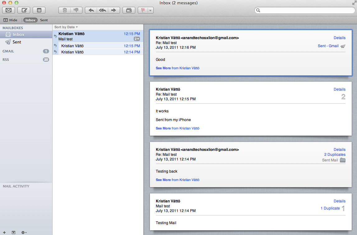
Lion's new Mail layout
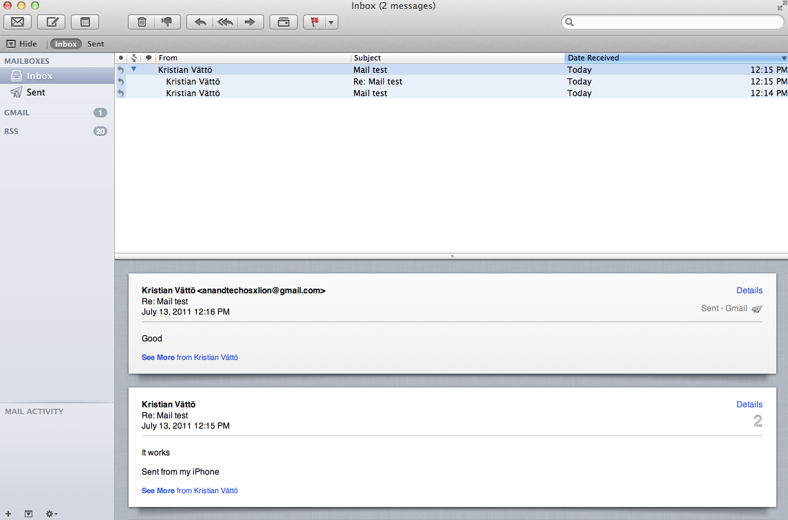
Classic layout
On the top, you have ten buttons by default: get new emails, trash or junk the email, reply, reply to all or forward the email, send new email, compose a new note, show relevant emails and the flagging button. Most of these buttons are straight from Snow Leopard and are the backbone of any email application, but there is at least one totally new button which shows the relevant emails or hides them. This is actually part of the new conversation layout, since showing relevant emails means that it will also show the emails that you have sent so it looks like a conversation. Disabling relevant emails simply hides your sent emails and shows only the emails you have received. The preferences have an option to automatically show the related emails as well so you don’t have to click the button every time you want to see the emails as a conversation. Users can customize the Mail toolbar by right-clicking it and selecting “Customize Toolbar…” which will reveal lots of different buttons, such as printing. Obviously, some of these buttons are only enabled when you have selected an actual email/conversations, and are greyed out if you have just selected a mailbox.
Below the toolbar, you have a small toolbar-like stripe that Apple calls the Favorites bar. It allows easy and fast navigation between mailboxes and is the most useful if you have hidden your mailboxes. You simply have shortcuts for inbox, sent items, notes and drafts mailboxes.
The email window is divided into three different sections. On the left-hand-side you have your mailboxes, which includes inbox, drafts, sent items, trash and so on. Next from the left you have the emails for the selected mailbox, which can be sorted by date, attachments, flags, sender, size, subject, receiver or based on whether they have been read or not. Finally, you have the actual email or email conversation on the right-hand-side that occupies roughly half of the window. Actually, if you hide the mailboxes, you can drag the center section to full size, meaning that you will only see the headers of the emails and you can then double-click the header to open it.
The similarities with iOS’s Mail don’t end here. There is now an option to list a preview of the email under the header, just like in iOS. The preview can be anywhere from one line to five lines depending on what you prefer, but it can also be totally disabled.
On the technical side, Lion’s Mail adds support for Microsoft Exchange 2010, which should be excellent news for users of Exchange. iCal and Address Book will also support Exchange 2010 so you should be able to take full advantage of OS X’s built-in apps, even as an Exchange user. Another good piece of news for Exchange users is the support for a vacation responder.
All in all, the new Mail offers a new convenient layout, and anyone who has used the iPad’s Mail should be familiar with it. I find it to be better than the old one, especially when in full screen mode. The conversations make it very simple to read earlier emails in a nice format (no quotes, or etc.) and the layout is logical and very easy to use. While iOS-ification in general may sound scary, it will bring us some great updates as well. The new Mail is one of them.


106 Comments
View All Comments
rs2 - Wednesday, July 20, 2011 - link
Okay, it makes sense on a touch device where your finger is actually making contact with the thing you are scrolling. But a mouse cursor is *not* a finger. It is not an analog for a finger. It is a different input paradigm entirely, and trying to make it behave as if the mouse cursor is your finger by making scrolling go backwards is stupid.It's good that they put in an option to disable the nonsense that is "natural" scrolling.
name99 - Thursday, July 21, 2011 - link
Not at all. The issue is simple : what is the metaphor?When I move my finger, am I moving
- the window container? OR
- the content?
Claiming that one is more "natural" than the other is as stupid as claiming that English is more natural than Chinese. It's simply that you are used to one and, like a good American, you simply cannot imagine that the world could possibly be different --- after all, Jesus spoke English.
rs2 - Thursday, July 21, 2011 - link
Not at all. There is no "finger" when using a mouse. Touch and mouse-driven are distinct input paradigms. If a touch-based interface ever scrolled content in the opposite direction that the user moved their finger, then people would say that it was broken. And rightly so. Moving content in the same direction as the touch is the intuitive operating mode of a touch interface.And similarly, moving content in the opposite direction of the scroll (or more accurately, moving the scrollbar in the same direction of the scroll) is the intuitive operating mode for a mouse-driven interface. By your logic scrollbars themselves should also be inverted.
As a side-note, a direct analog to touch style scrolling does exist in the mouse-driven paradigm, it is the drag operation. It is available in some things like Adobe PDF documents, and also work on any scrollbar. In this operation you choose an anchor-point, and then that anchor point moves in the same direction that you move, and it all makes sense. The problem with scrolling is that it has no anchor point, it is a distinct operation from a drag operation, and by conflating the two Apple has broken their interface. At least until they start incorporating touch into every computer they sell.
Mouse-driven and touch interfaces are not the same thing, and just because a metaphor makes sense in one does not mean that it also makes sense in the other.
Uritziel - Friday, July 22, 2011 - link
Agreed.CharonPDX - Wednesday, July 20, 2011 - link
On page 23 "Performance: Similar to Snow Leopard", you have a couple bar graphs comparing Snow Leopard to Lion performance. Unfortunately, you use a generic "compared to before as 1.0" metric, with no indication on a per-test basis whether higher or lower is better. In the Core 2 Duo graph, you talk about boot time skyrocketing, and the boot time graph for Lion shows Lion as "about 1.4" of Snow Leopard, yet you also talk about iPhoto having a "greater than 10% increase in performance", where the graph shows "about 1.1" of Snow Leopard. So in one line in the graph, higher is worse, in the other line, higher is better.You either need a per-test identifier (Higher is better / Lower is better) or you need to to standardize them all (so 'benchmark' ones would stand as-is, while 'timing' ones would use the inverse, so that both would be 'higher is better', or example.)
Deaffy - Thursday, July 21, 2011 - link
Did anyone check to see whether Apple has included a UI element to enable IPv6 privacy extensions for statelest address autoconfiguration?And did DHCPv6 to get IPv6 addresses from your ISP's cable via IPv6 finally make it's entry?
Deaffy - Thursday, July 21, 2011 - link
Oh yeah, and maybe the ability to query a name server via IPv6?kevith - Thursday, July 21, 2011 - link
they are more and more returning to the Linux it came from. Who knows, they might even go bact to open source:-)Omid.M - Thursday, July 21, 2011 - link
Anand/Andrew/Christian,If you right click on a YouTube video, does it say the rendering AND decoding is "accelerated" ? I thought Lion was supposed to bring that.
If this is now the case, it'd be enough reason for me to buy Lion and a new MBP 15". I can't stand the fans on my 2008 MBP 15 going nuts every time I watch a 30 second YouTube clip. The laptop gets unreasonably hot right now.
@moids
P.S. I'm not a fan of the way buttons appear on the upper borders of windows. There's no typical button "design" to signify that the text is clickable, at least not from the screen shots I saw in the article.
Omid.M - Thursday, July 21, 2011 - link
I guess it's disabled:http://www.macrumors.com/2011/07/21/adobe-suggests...