ASUS VG236H 23-inch 3D Display Review: 120Hz is the Future
by Brian Klug on August 7, 2010 2:48 AM ESTColor Quality
Now let’s get to the meat of the display characteristics. As usual, we report two main quality metrics: color accuracy (Delta-E) and color gamut. Color gamut refers to the range of colors the display is able to represent with respect to some color space. In this case, our reference is the AdobeRGB 1998 color space, which is larger than the sRGB color space. So our percentages are reported with respect to this number, and larger is generally better.
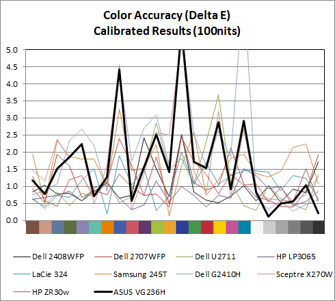
Color accuracy (Delta E) refers to the display’s ability to display the correct color requested by the GPU and OS. The difference between the color represented by the display, and the color requested by the GPU is our Delta-E, and lower is better here. In practice, a Delta E under 1.0 is perfect - the chromatic sensitivity of the human eye is not great enough to distinguish a difference. Moving up, a Delta E of 2.0 or less is generally considered fit for use in a professional imaging environment - it isn’t perfect, but it’s hard to gauge the difference. Finally, Delta E of 4.0 and above is considered visible with the human eye. Of course, the big consideration here is frame of reference; unless you have another monitor or some print samples (color checker card) to compare your display with, you probably won’t notice. That is, until you print or view media on another monitor. Then the difference will no doubt be apparent.
As I mentioned in our earlier reviews, we’ve updated our display test bench. We’ve deprecated the Monaco Optix XR Pro colorimeter in favor of an Xrite i1D2 since there are no longer up-to-date drivers for modern platforms.
For these tests, we calibrate the display and try to obtain the best Delta-E we can get at both 200 nits of brightness for normal use, and 100 nits for print brightness. We target 6500K and a gamma of 2.2, but sometimes the best performance lies at native temperature and another gamma, so we try to find what the absolute best performance could be. We also take an uncalibrated measurement to show performance out of the box using either the manufacturer supplied color profile, or a generic one with no LUT data. For all of these, dynamic contrast is disabled.
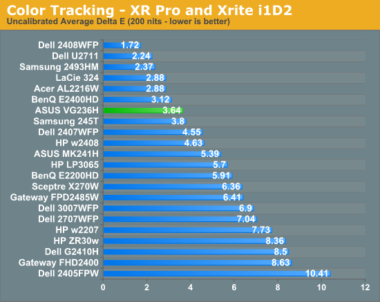
Performance uncalibrated, entirely out of the box is actually very good, at a respectable 3.64. When I first started working on the VG236H I didn’t notice any color tints or weird hues, and upon measuring the display, found the white temperature to be almost exactly 6600K, very close to our 6500K target for calibration. This is nice to see out of the box. For gamers interested in ballpark color reproduction but not professonal level absolute colormetric reproduction, this is adequate.
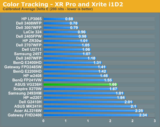
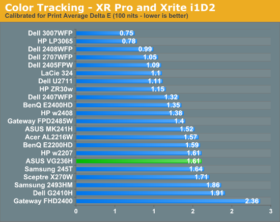
Moving on, at 200 nits the VG236H gets a bit more accurate, down to 1.66, but still isn’t quite as good as an IPS panel. Still, not bad for a TN. Going down to 100 nits, we get a bit better, moving down to 1.61, but still not that elusive sub 1.0 the highest quality displays can deliver. What about gamut?
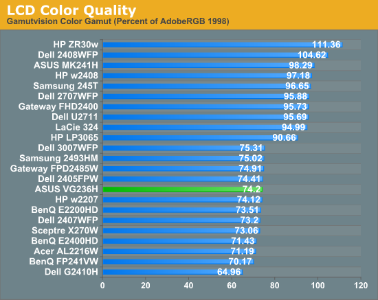
As expected, gamut is right around where we’d expect it to be for the TN, sRGB display. Interestingly enough, the OSD controls do have an sRGB mode, though I don’t think it’s as necessary as it would be on say a wide gamut display. But it’s there for certain.


121 Comments
View All Comments
B3an - Sunday, August 8, 2010 - link
It's the less pixels and the simple fact that it's not good for a monitor. If you watch movies all day then its great. But for pretty much ANYTHING else it's inferior, even for something like reading this review as you have less vertical space and have to scroll more.I also don't like paying the same as a 16:10 monitor for less pixels.
It's getting harder to buy a quality LCD these days, you have shitty glossy screens, more and more ridiculously poor image quality TN panels, and now a inferior aspect ratio to top it off. Technology is meant to improve over time not go backwards.
Mr Perfect - Sunday, August 8, 2010 - link
Yes, the cut down pixels are a large part of my complaint. 16:9 is great for TVs since it fits the format of the content, but why deliberately cut down the vertical viewing space for a PC monitor? What could we possible gain from knocking it from 1920x1200 down to 1920x1080? It seems that the mainstream monitors are using 16:9 in the 24" space, while the higher quality models still offer 16:10. All 30" screens seem to be 16:10 yet, but who's got that kind of money?BTW, B3an, there are some newer 16:10 IPS screens kicking around. None of them are 120Hz though. :( TFTCentral has recently reviewed the HP ZR24W, NEC PA241W, Dell U2410, NEC LCD2490WUXi, NEC 24WMGX3 and HP LP2475W. They report that Hazro will soon be launching an updated line of 24" IPS screens as well, the HZ24W models a, b, and c.
seapeople - Sunday, August 8, 2010 - link
I disagree, I think 16:9 is a good aspect ratio. Yes, you have to scroll a bit more vertically, but you always have to scroll vertically anyway so why does it matter that much? On the other hand, the wider aspect ratio makes it easier to look at content side by side and/or prevent horizontal scrolling on wide content which is a pain.With that said, obviously 1900x1200 is better than 1900x1080 because it contains more pixels. However, I've found 1920x1080 monitors to be generally cheaper than the 1920x1200 equivalent. My 1920x1080 23" Dell monitor that I bought on sale for $160 18 months ago is an example.
DarkUltra - Sunday, August 8, 2010 - link
It really is a lot of display real estate you lose. It's not just a slim border at top and bottom. You can actually fit two Ribbon menus in the 120 vertical pixels, or two Windows 7 double-sized task bars. It's not about less width; there are bigger monitors. It's about having 3,7 cm extra height "for free" at same desk space.Old games like the 1600x1200 resolution better, and RTS games like Starcraft with a hud at the bottom is much better with 1920x1200.
AnnonymousCoward - Monday, August 9, 2010 - link
16:10 gives 23% more area with 4:3 pillarboxed content. That's huge.medi01 - Monday, August 9, 2010 - link
To create 4:3 X inches monitor, you need 12% more stuff. Is it clear?Stokestack - Sunday, August 8, 2010 - link
Glossy doesn't look better ANYWHERE. Even in a pitch-black closet, the image from the glossy screen still illuminates YOU, creating your reflection in the monitor. Therefore, those "deep blacks" and "rich colors" are neither; they're covered by a sheen of reflection in essentially all cases.It's a fraud that preys on consumer ignorance.
synaesthetic - Monday, August 9, 2010 - link
I miss my old 17" samsung LCD monitor. :(yeah, it was only 1280x1024 but... 5:4, not glossy and it... was pretty.
Stargrazer - Saturday, August 7, 2010 - link
"Further, instead of getting tearing above 60 FPS like you would with vsync off on a traditional 60Hz LCD, you get smoother gameplay that just looks more fluid. I definitely can tell the difference, and now I don’t want to go back."How much of a difference do you notice when vsync is *on*?
DarkUltra - Sunday, August 8, 2010 - link
Twice as much I would say. IF the objects move across the speed at 120 pixels per second, or you got a big jittery object that darts all around the screen. To make an impression the object needs enough "samples" across the temporal dimension to let the eye follow it.In other words, if you look around slowly in an FPS game, even 10FPS could be enough. If you flick your wrist fast, or enemies move fast, you can track them at up to 60 movements per second in 120fps/hz.