Apple's iPad - The AnandTech Review
by Anand Lal Shimpi, Brian Klug & Vivek Gowri on April 7, 2010 9:39 PM EST- Posted in
- Smartphones
- Mac
- Apple
- iPad
- Mobile
Apple gives you most of the essentials with the iPad. You get Safari, which we just finished talking about and an iPad version of the Mail app.
This is another one of those situations where it’s just a pleasure to read email on the iPad. I actually found myself unlocking my iPad just to read email on it while I was sitting in front of my desktop.
I hate to sound like a broken record but the combination of the touchscreen and the awesome display really help make the Mail app great. Switching between accounts still requires far too many taps, and there’s no easy way to select and mark a bunch of messages as read.
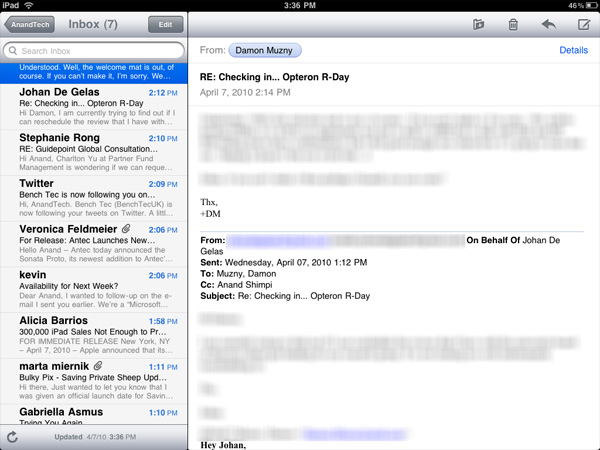
Mail, like many apps, is a bit more useful in landscape mode (you can view your inbox and selected message at the same time).
Being based on the same iPhone OS as the iPhone means that the iPad suffers from the same glitches. Sometimes when I get a new email it will appear then disappear. I have to wait for the app to check my email again or manually force it to see that message.
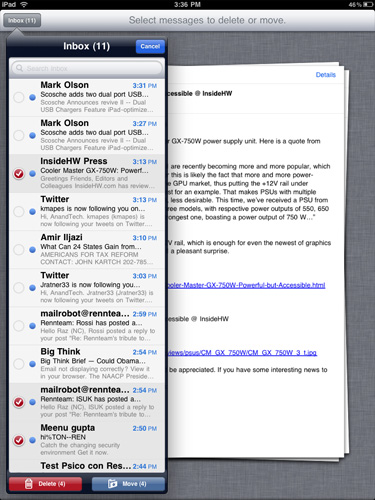
Another annoyance is the total lack of scroll bars on the iPad. While scrolling via touch works well in most cases, once you start displaying a lot of information (e.g. my entire inbox) you have to do a lot of touching to scroll from top to bottom. A simple grab and hold scroll widget would help a lot. It’s odd to me that there isn’t a single app that ships with the iPad that has this.
But if you’re away from your desk, the iPad can serve as an excellent stand in email client.
The Calendar and Contacts Apps
I've rarely used Digital planners, they never really felt right to me. The exceptions were my time with the Palm V, some years with Blackberries and more recently the iPhone. Something about the way their calendaring apps worked just seemed to fit well with my mental routine. Even then I didn't use them as much as I actually needed to, only critical events and reminders got entered in.
The iPad calendar is the closest thing I've seen to a daily planner in digital form. Apple just got the feel right with this one. Date selection is fast as is event input. I find that the UI of a good calendar app determines my likelihood of using it, and Apple got it right with the iPad. Ultimately it's just a scaled up version of the iphone app (like most apple iPad apps) but the visual flair it got in the transition from small to big is awesome.
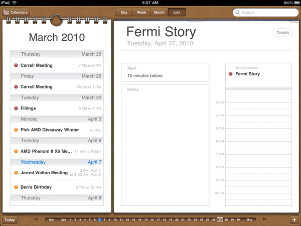
The calendar uses the scrubber UI element, but instead of flipping through photos you're scanning through dates. Flipping through pages also uses the popular page turning animation.
I'm sure heavy calendar users can easily find limitations with the app. But for regular users, it's very impressive.
The contacts app is straight forward port from the iPhone. It works and is one of the only apps to use the equivalent of a vertical scroll bar. Just run your finger over the alphabet on the left side and you can scroll through your virtual rolodex.
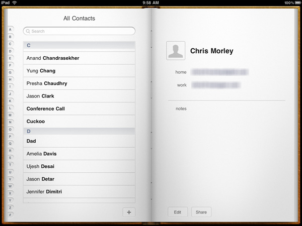
Apps like contacts are simply easier to use just because of the increase in screen size and resolution compared to the iPhone. Apple did an amazing job making the iphone UI very efficient and with some minor tweaks it scales very well to a nearly 10" screen.


108 Comments
View All Comments
zodiacfml - Thursday, April 8, 2010 - link
Another quality review, useful as trying the device myself.I'm not buying Apple products but you touched on features that it should have.
One is the ability to stand on its own to function as a picture frame, movie screen, and reader while someone is eating or something else.
Support for mouse device and keyboard when it can already stand on its own.
Support for uploading media such as video and photos from either flash cards or directly from cameras. it is such a good device to use with cameras.
one more thing, they could get the intel atom cpu once it gets to a smaller process to improve size and energy efficiency.
Spivonious - Thursday, April 8, 2010 - link
Anand, I love your writing and have read the site since the GeoCities days, but please learn the difference between "lay" and "lie".crimson117 - Thursday, April 8, 2010 - link
My biggest pet peeve with the iPhone UI is the lack of an indicator for when an app is visible but busy processing something and not currently accessible.The default Notepad app on the iPhone 3G is a great example - as soon as you tap the icon, the yellow Notepad interface pops right up. However, it actually takes several seconds to finish loading until you can tap to edit a note or tap the (+) sign to start a new note. There's no indicator at all of when the loading is complete - you have to keep tapping periodically until it finally works.
The same is true for resizing a web page using multitouch - there's no indicator that your input has been received but it's going to take a few moments to make it happen.
In Windows 7 when an app is "thinking" and thus you can't interact with it, your mouse pointer becomes a a little circle (aka an hourglass). If an app is ever extremely busy thinking, the app may even gray out to indicate that even Windows can't get it to respond at that time.
The iPhone's lack of this feature just smells of Apple trying to make the device appear on the surface to be more responsive than it really is. Perhaps you'll question whether you tapped correctly, and won't realize that the device is just slower than you expect it to be.
archcommus - Thursday, April 8, 2010 - link
This article, like your others, despite being 22 (!) pages long, is a quick, refreshing read. It feels more like you're talking about your experiences and less like you're writing an article as a journalist (which can make some other long reviews a little boring). Also seemed pretty unbiased and highlighted the good and bad. Another solid article, thanks.Mumrik - Thursday, April 8, 2010 - link
Hehe, this isn't a big deal - it's just amusing:"Although there's no mute button, holding the volume down rocker for 2 seconds mutes the device instantly."
Nope. Sounds to me like it takes about two seconds to mute the device :)
AstroGuardian - Thursday, April 8, 2010 - link
Good one. My thought exactly...leospagnol - Thursday, April 8, 2010 - link
I'm planning to buy one of them when I travel to US next month. THe Eee 1001P is $ 280.00, and the iPad $499.00 at least. I usually read more than I write during classes and I have wifi available during class. I'll probably buy the Eee, but wich do you think suits this task best?Mumrik - Thursday, April 8, 2010 - link
Imagine the iPad lying flat on your desk and then imagine the position you would have to sit in all lecture long if you wanted to be able to write.Then imagine how much of the time you'd have to look down at what you were writing because you didn't have the physical response of a keyboard to make touch typing easy.
Now imagine not being able to multitask.
It would not be a difficult choice for me - Anand said it himself - the iPad is generally not a laptop substitute.
videogames101 - Thursday, April 8, 2010 - link
I love the M3, great episode there.Good to know I can watch it on the iPad, lol.
AstroGuardian - Thursday, April 8, 2010 - link
As far as i remember, this was not mentioned in the review (the overheating problem):http://www.dailytech.com/article.aspx?newsid=18075
Personally i don't think it's worth commenting. It's not just the iPad but all other electronic devices will overheat when put out on the sun. And i wouldn't call it overheating but more like misuse.