The Corsair Gaming K70 RGB RAPIDFIRE Mechanical Keyboard Review
by E. Fylladitakis on July 1, 2016 8:00 AM EST- Posted in
- Peripherals
- Corsair
- Keyboard
- Cherry MX
- Mechanical Keyboards
- RGB
Conclusion
I always try to use every keyboard that we review as my personal keyboard for at least a week. My typical weekly usage includes a lot of typing (about 100-150 pages), a few hours of gaming and some casual usage, such as internet browsing and messaging. As I am used to switches with a 4 mm key travel, I was worried that the shortened key travel of the RAPIDFIRE would have the keys frequently bottoming down while I was typing. This however was never an issue, as the higher force of the spring below the actuation point compensated for my muscle memory and my typing experience was mostly unaffected in comparison to a keyboard using MX Brown, MX Red or other similar switches. There was only one difference and that was higher fatigue after long typing sessions, an expected side effect of having the travel distance shortened and countering a muscle movement with higher force.
As for gaming, the K70 RGB RAPIDFIRE is both practical and comfortable for long gaming sessions. It is however difficult to say that it is significantly better than a model with Cherry MX Red or similar switches. The shorter actuation distance does technically reduce the time required for actuation, but the difference is just a few milliseconds at best. There is only one scenario I can think of in which the RAPIDFIRE would actually be faster than a standard Cherry MX Red switch (and is very likely that the designer baptized the new switches with that scenario in mind): rapid continuous keystrokes. The shorter actuation distance and travel of the RAPIDFIRE switch also has it using a strong spring that exerts significantly higher force after the actuation point, allowing it to reset faster and making it ideal for rapid keystrokes. From a purely practical point of view, this is the only pragmatic difference that the new RAPIDFIRE switch offers over a typical Cherry MX Red switch.
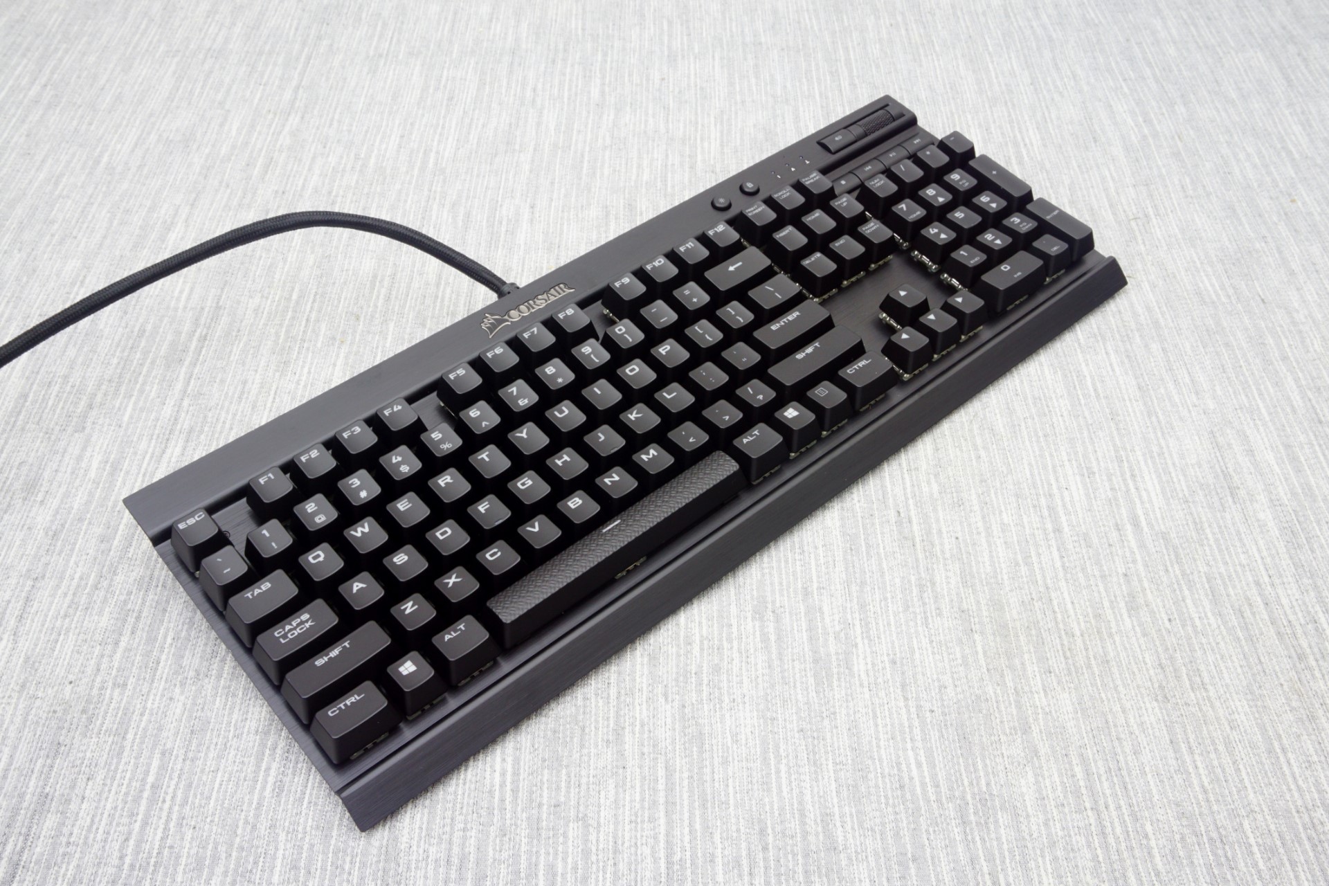
Aesthetically, the aluminum cover of the K70 RGB RAPIDFIRE creates a feeling of classiness without being extravagant, making it well suited to modern advanced and gaming systems. The metal body makes the keyboard itself very robust, increasing its overall quality. Inside the keyboard, the assembly job is excellent and Cherry’s switches are some of the best available globally, therefore we do not have any complaints there. Our only concern lies with the ABS keycaps, as they tend to deteriorate quickly. Very few manufacturers use other types of keycaps due to their significant cost, but we would have liked to see better keycaps on a keyboard with such a price tag, and especially on a model that has an atypical bottom row of keys, as replacements will be hard to come by.
Corsair also seems quite proud of their new Corsair Utility Engine software and they have every reason to be. It is a very advanced keyboard tuning software, one of the best that we have seen to this date. The programming options and capabilities are enormous and Corsair is continuously evolving it, albeit there is still room for popular options such as the recording of absolute mouse coordinates (they can be inserted in a macro but only manually).
Although the RAPIDFIRE variations of the K70 and K70 RGB are supposed to be a little more expensive than the models using “classic” Cherry MX switches, the retail prices of the K70 RAPIDFIRE and K70 RGB RAPIDFIRE currently are equal to those of the older models ($125 and $170 respectively). Even if there was a small difference of $10-20, considering the already high price of every similar keyboard, it is unlikely that it would be enough to influence a buyer’s decision.
In practice, the most important question when evaluating the K70 RAPIDFIRE is whether the new RAPIDFIRE switches are better than Cherry MX Red switches or not. In our opinion, they are marginally better for gaming, but marginally worse for typing and professional usage by an equal amount. To that end, we would recommend them to gamers looking for a pure gaming keyboard, but we would still suggest Cherry MX Brown switches to professionals or for mixed usage. We also would not recommend upgrading from a Cherry MX Red switch to a RAPIDFIRE switch, as while there is a difference between the MX Red and RAPIDFIRE, the difference is very small. Overall then, the K70 RGB RAPIDFIRE is an excellent product for those seeking to buy a new top tier gaming keyboard, yet not so much better or different than the previous model so as to justify an upgrade.


36 Comments
View All Comments
Omega215D - Friday, July 1, 2016 - link
This is why I felt the Romer G and SteelSeries low profile mechanical switches are quite good for quicker actuation and, for the Romer G, tactile feedback for typing purposes. The only thing that annoys me with Logitech's Romer G keyboards are the lack of on-board memory so that I can store settings without having to fire up LGS. The SteelSeries Apex m500 is just priced way out there to justify a purchase but it felt good to type on.JoeyJoJo123 - Friday, July 1, 2016 - link
Then use O-rings to prevent bottoming out your standard profile keys?wsjudd - Friday, July 1, 2016 - link
I agree, o-rings are a much cheaper solution than buying a new keyboard with new switches, and they work on every keyboard :)ddriver - Friday, July 1, 2016 - link
I guess they put a blind man in charge of selecting the font on this oneMargalus - Friday, July 1, 2016 - link
I wish more companies would use blind people then. That the best font I've seen on a keyboard in years.ddriver - Friday, July 1, 2016 - link
15 years of graphics and print experience say the font is mighty fugly and disproportionately stretched. You either haven't seen all that much keyboards or you have no notion of aesthetics.ddriver - Friday, July 1, 2016 - link
Font spacing on keys that have more than one character is very bad too.Margalus - Friday, July 1, 2016 - link
I've probably seen a lot more keyboards than you have, and I do have a notion of aesthetics. Just because my opinion is different than yours does not make it any less valid. The font is smooth, large, and easy on the eyes.inighthawki - Friday, July 1, 2016 - link
I'd have to side with ddriver on this one. The font looks pretty ugly to me -- The letters are way too wide and bold, and have a pretty nonstandard (almost "gamer") design to them. And while I personally don't mind it, ALL CAPS HAS BEEN KNOWN TO BE A FAIRLY BAD IDEA for labelling things.ddriver - Saturday, July 2, 2016 - link
It is not just "gamer" it is "shitty 80's game" written all over. The font is obviously stretched far beyond the intent of the designer. Spacing is too small. Zero design skill, I'd fire that guy... out of a cannon.