The Corsair Gaming K70 RGB RAPIDFIRE Mechanical Keyboard Review
by E. Fylladitakis on July 1, 2016 8:00 AM EST- Posted in
- Peripherals
- Corsair
- Keyboard
- Cherry MX
- Mechanical Keyboards
- RGB
Per-Key Quality Testing
In order to test the quality and consistency of a keyboard, we are using a texture analyser that is programmed to measure and display the actuation force of the standard keyboard keys. By measuring the actuation force of every key, the quality and consistency of the keyboard can be quantified. It can also reveal design issues, such as the larger keys being far softer to press than the main keys of the keyboard. The actuation force is measured in Centinewton (cN). Some companies use another figure, gram-force (gf). The conversion formula is 1 cN = 1.02 gf (i.e. they are about the same). A high quality keyboard should be as consistent as possible, with an average actuation force as near to the manufacturer's specs as possible and a disparity of less than ±10%. Greater differences are likely to be perceptible by users. It is worth noting that there is typically variance among keyboards, although most keyboard companies will try and maintain consistency - as with other reviews, we're testing our sample only.
The machine we use for our testing is accurate enough to provide readings with a resolution of 0.1 cN. For wider keys (e.g. Enter, Space Bar, etc.), the measurement is taking place at the center of the key, right above the switch. Note that large keys generally have a lower actuation force even if the actuation point is at the dead center of the key. This is natural, as the size and weight of the keycap reduces the required actuation force. For this reason, we do display the force required to actuate every key but we only use the results of the typical sized keys for our consistency calculations. Still, very low figures on medium sized keys, such as the Shift and Enter keys reveal design issues and can easily be perceptible by the user.
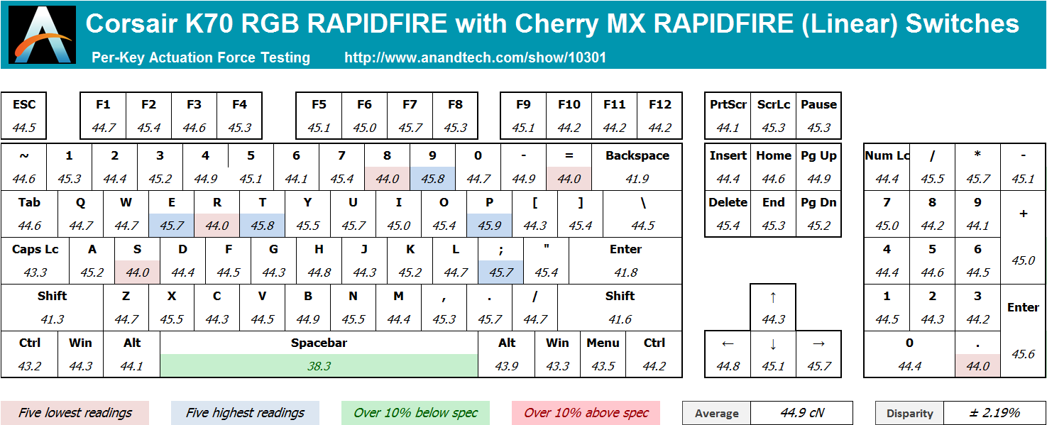
Cherry’s MX switches are of excellent quality and they always give us excellent consistency readings. We were glad to see that the new shortened “RAPIDFIRE” switch was no exception. We measured an average actuation force of 44.9 cN, just a little higher than the 45 gram-force (44.13 cN) that the switch is rated at. The disparity is very small, at just ±2.19% across the main keys, a difference that no user will be able to discern by touch.


36 Comments
View All Comments
Omega215D - Friday, July 1, 2016 - link
This is why I felt the Romer G and SteelSeries low profile mechanical switches are quite good for quicker actuation and, for the Romer G, tactile feedback for typing purposes. The only thing that annoys me with Logitech's Romer G keyboards are the lack of on-board memory so that I can store settings without having to fire up LGS. The SteelSeries Apex m500 is just priced way out there to justify a purchase but it felt good to type on.JoeyJoJo123 - Friday, July 1, 2016 - link
Then use O-rings to prevent bottoming out your standard profile keys?wsjudd - Friday, July 1, 2016 - link
I agree, o-rings are a much cheaper solution than buying a new keyboard with new switches, and they work on every keyboard :)ddriver - Friday, July 1, 2016 - link
I guess they put a blind man in charge of selecting the font on this oneMargalus - Friday, July 1, 2016 - link
I wish more companies would use blind people then. That the best font I've seen on a keyboard in years.ddriver - Friday, July 1, 2016 - link
15 years of graphics and print experience say the font is mighty fugly and disproportionately stretched. You either haven't seen all that much keyboards or you have no notion of aesthetics.ddriver - Friday, July 1, 2016 - link
Font spacing on keys that have more than one character is very bad too.Margalus - Friday, July 1, 2016 - link
I've probably seen a lot more keyboards than you have, and I do have a notion of aesthetics. Just because my opinion is different than yours does not make it any less valid. The font is smooth, large, and easy on the eyes.inighthawki - Friday, July 1, 2016 - link
I'd have to side with ddriver on this one. The font looks pretty ugly to me -- The letters are way too wide and bold, and have a pretty nonstandard (almost "gamer") design to them. And while I personally don't mind it, ALL CAPS HAS BEEN KNOWN TO BE A FAIRLY BAD IDEA for labelling things.ddriver - Saturday, July 2, 2016 - link
It is not just "gamer" it is "shitty 80's game" written all over. The font is obviously stretched far beyond the intent of the designer. Spacing is too small. Zero design skill, I'd fire that guy... out of a cannon.