The Samsung Galaxy Tab S2 Review
by Brandon Chester on October 15, 2015 8:00 AM ESTTouchWiz on Tablets
Much to the dismay of many Android enthusiasts, almost every Android device sold by an OEM will have that company's own skin running on top of Android, and their own custom applications as well. However, the skins running on top of Android often bring legitimate improvements to some of the problems in Android, and in fact many of the great features that exist in Android today were implemented in some form by an Android device OEM before it was officially added to the operating system.
Samsung's skin on Android is called TouchWiz. TouchWiz itself is a fairly known quantity by this point as it ships on all of Samsung's devices, and at a high level the UI and aesthetics of the UI on the Tab S2 are the same as the Galaxy S6 and Galaxy Note 5. However, Samsung has made changes to their included applications in order to improve their usability on a large display, which makes them one of the only first or third party developers to ever do that for Android apps, Google included.
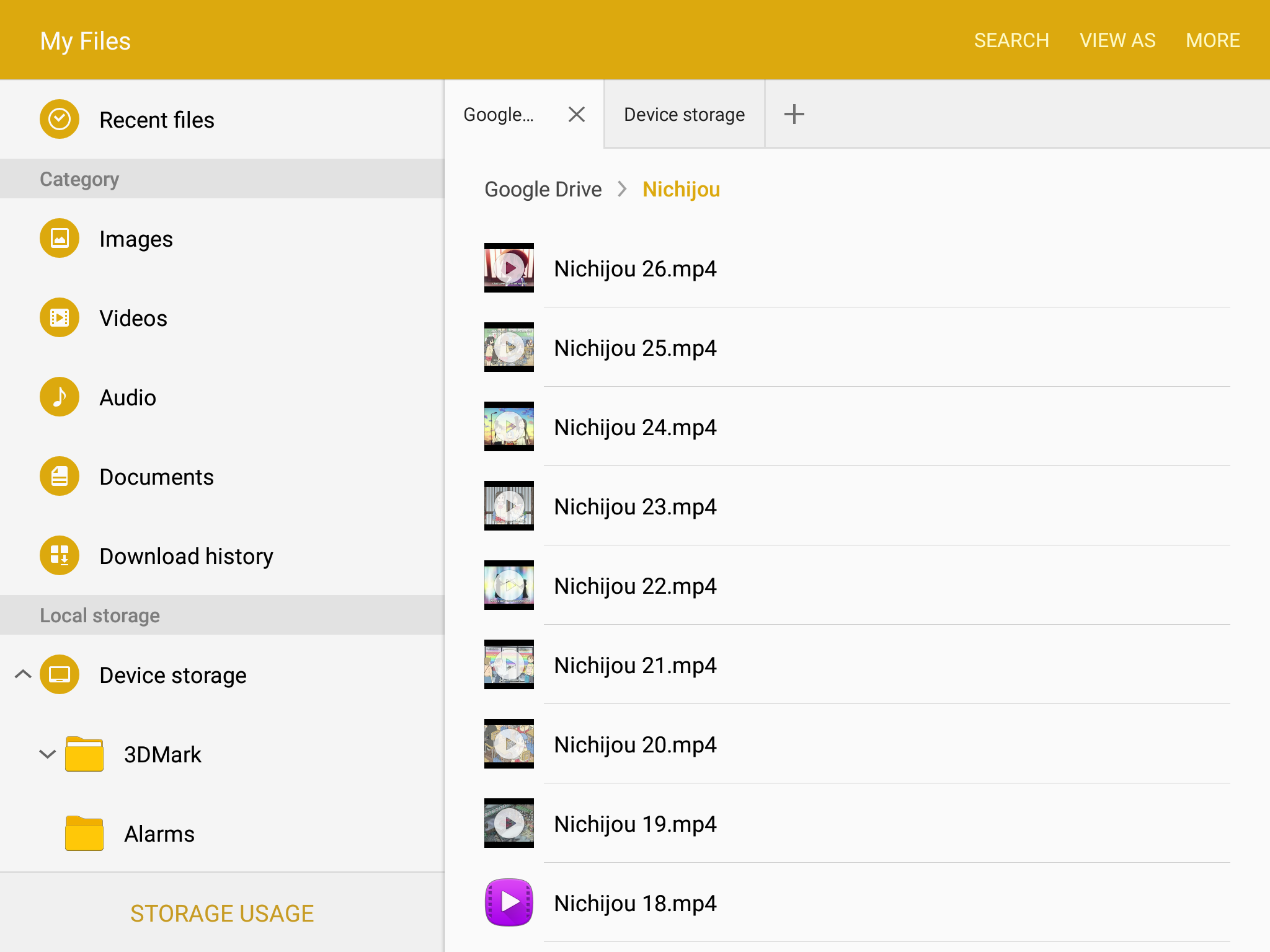
Above is Samsung's file browser application, and I think it's a great example of a tablet application. Samsung uses a segmented layout, with a list of folders on the left and the files within a selected folder on the right. On top of that, the right side can have multiple tabs to allow the viewing and navigation of multiple folders that may be located at completely different parts of the file system. While I don't typically use file browsers on mobile devices, this is exactly how you make a file browser to take advantage of all the screen space available on a tablet.
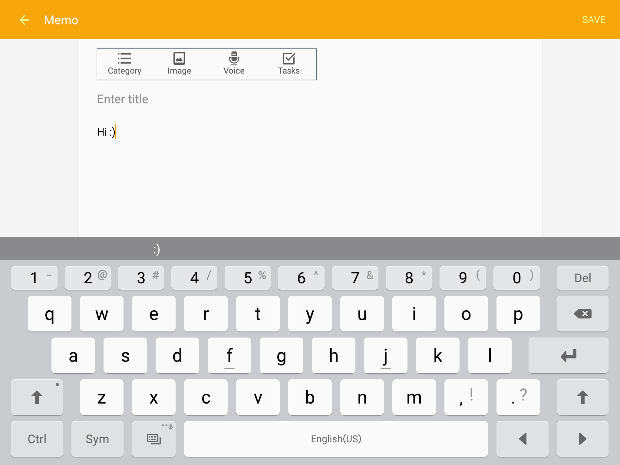
While the Tab S2 comes with some pretty great tablet apps, there are some that don't do as good of a job using the screen's real estate. An example is Samsung's Memo app, which has some obvious space on the left and right sides which could be used to display a list of all of a user's notes like Apple's notes application on the iPad. You can also see the Samsung keyboard in the screenshot above. I think the size of the keys and the overall size of the keyboard is very good, although the autocorrect tends to give absolutely terrible suggestions. I do like the fact that Samsung has put a row of short number keys on the top which can greatly speed up typing when you need to insert numbers frequently.
While I don't want to dive into detail about each of the good and bad tablet apps on the Tab S2, I've put a few screenshots of the apps that I think are really good in the gallery below. I have to give Samsung credit for putting in the effort to actually design many of their apps to properly utilize their display. It's something even Google isn't doing, and that's something Samsung deserves kudos for.


Multitasking
The biggest feature that TouchWiz brings to Android tablets is support for multitasking. Samsung definitely deserves a lot of credit for implementing these features that don't exist within Android itself. I remarked in my iOS 9 review that it's honestly quite sad that Google allowed Apple to beat them to split screen multitasking on tablets when iOS apps have traditionally been designed for specific resolutions while Android applications have been scalable from day one. Of course, Samsung is working within limitations on what they can alter, and this imposes limitations on the functionality and quality of their multitasking implementation. Unfortunately, the vast majority of my experiences with multitasking on the Tab S2 have been far from positive.
Above is how the Gmail app and the Play Store app behave when put into split view multitasking. I really need to note that the claim that this works for all apps is not true at all; I have several apps that do not support it including Flipboard which is a massively popular news app. As you can see, neither application is scaling properly at all. It seems that Samsung isn't able to force the interface DPI such that they can have one side switching to the type of UI they would display on a smartphone. As a result, both sides are squashed with clipped text and other issues, and neither is usable at all.

The experience still has numerous issues even with Samsung's own apps. You can see above that the browser address bar gets completely squashed. Not only that, but the reader view touch target is still there and it makes it nearly impossible to actually hit the address bar to change it. If you adjust the split any further to increase the size of the OneNote window the header buttons in the browser start getting clipped. The fact of the matter is that no applications actually scale properly with this implementation at all, because proper scaling would entail switching to layouts similar to those used on smartphones which would work perfectly fine in these window sizes.
On top of the issues with the scaling of apps, using the multitasking features is also just downright confusing. Entering multitasking isn't too hard, as apps that work with it have buttons on the app cards in the multitasking drawer which brings it into split view and asks you to select another app for the other side of the display. Beyond that point things really break down. In the middle of the split you have a circle that you can drag to change the ratio. There's no animation for the dragging, presumably because there's no way to dynamically scale the interfaces and show it in an animated matter. iOS also doesn't scale the applications like that, but Apple still had an animation to give you some reasonable feedback to go along with the action you're performing.
Tapping the circle between the two apps brings up the menu with five icons that you see above. It's worth noting that there's no affordance to tell you that the circle can be tapped, and you'll almost certainly just discover it by accident. Once you do open the menu you're tasked with deciphering what the icons actually do. I was able to infer that the curved double arrows meant switching the apps between the sides of the screen, but I had no idea what any of the other icons did.
My initial guess for the x was that it closed the menu, but it actually closes whichever application you currently have selected. The other three icons from top to bottom are for dragging and dropping content between sides, moving the selected side into a floating window, and expanding the current window to fill the screen. Expanding the current window also happens to be the exact same action that the x performs, although the x button actually closes the application instead of just putting it into the background. The end user really shouldn't have to make such distinctions, and to most users it's completely redundant to have the two separate options.
Due to the limitations of how Samsung can modify window management, there's no way for them to bring up a full size keyboard like iOS's multitasking does. Instead, they put the keyboard into a floating window. I really can't fault them for this because it's the only thing they could of done, but the UX really is terrible. It's impossible to type with, and the keyboard stays in the window even after you've stopped using split screen mode. I actually couldn't figure out how to close it, and ended up having to Google the issue to figure out the solution. It turns out that the gear icon next to the symbol button which just kept bringing me to the keyboard settings can be long pressed to bring up a menu which alters the behavior of the button. I don't think I need to elaborate on all the obvious issues there are with that design, but suffice to say I don't think split screen mode works well for any applications that involve having to type things.
I don't feel good criticising Samsung's multitasking implementation, because the fact that they attempted to implement these features shows a great deal more effort than any other manufacturer or even Google. They obviously care about trying to provide a good tablet experience, because if they didn't they wouldn't have bothered to make tablet app UIs or implement any sort of multitasking. There are limitations on what they can do, and as a result the UX ends up being pretty poor. I have to give them credit for trying, but the experience is not even close to what you get on an iPad or on a Windows tablet where the apps work properly and the features are implemented at the OS level. Samsung's multitasking implementation is likely the best they could have possibly done given their constraints, but the end product just isn't very good, and I would never use it.


162 Comments
View All Comments
theduckofdeath - Sunday, October 18, 2015 - link
Because tablets really, really benefit from every mm or gram lost. It's not rocket science.nathanddrews - Thursday, October 15, 2015 - link
For $500, I'd rather just get a Surface 3...lilmoe - Thursday, October 15, 2015 - link
+1That would be my only choice for that price range. But the Surface Pro 3 is on sale for ~$630, so I'd go for that.
lilmoe - Thursday, October 15, 2015 - link
Also, for the extra ~$100 in cost (plus ~100 for the type cover), you're getting a device that will easily outperform any ARM tablet in performance, and outlast them in OS/software support. You won't have to worry about planned obsolescence in performance and support either.If Microsoft releases a 10" Surface 4 (non-pro) with a Core M3/M5, it would be the perfect tablet in its class, even if it still had the same resolution (1920x1280).
Alexey291 - Thursday, October 15, 2015 - link
Instead you have to worry about using Windows. I'm sorry but the last thing I want in my dedicated browsing device / content consumption device is having bsods (yup they still happen) or viruses/trojans.Let alone the rest of Windows bullshit which is the prime reason why so many people got arm tablets in the first place. To get away from Windows.
steven75 - Thursday, October 15, 2015 - link
Yep, the problem with the Surface is Windows. The hardware is mostly fine.wavetrex - Thursday, October 15, 2015 - link
Can you install Linux on Surface ? :)That would be fun... MICROSOFT Surface, Powered by LINUX :)
thedons1983 - Saturday, October 17, 2015 - link
Linux is shit! Anyone that uses it, has a penchant for pain and suffering...thedons1983 - Saturday, October 17, 2015 - link
And what OS what you replace it with exactly? iOS is shit, as is OS X. Linux is crap, Android isn't a fully fledged OS... So what are you using, that's so great??lilmoe - Thursday, October 15, 2015 - link
Windows is a plus. Windows was never a downside except for those "YES", "OK", "Go Ahead and Install" (because you won the lottery) go happy pop-up clickers.Let's be honest here, those who use ARM tablets for anything other than browsing and watching youtube are a very small minority.