The Apple Watch Review
by Joshua Ho & Brandon Chester on July 20, 2015 8:00 AM EST- Posted in
- Wearables
- Apple
- Mobile
- Apple Watch
WatchOS: Time and Notifications
Ultimately, Apple Watch is a first generation product. As a result, details like the CPU, GPU, and RAM configurations are of secondary importance to software. Choices made early in the growth of a platform can have far-reaching consequences that will remain many years after the original hardware has long been obsolete. Android still uses the sdcard convention for user storage, even though many modern Android smartphones place the sdcard partition on internal storage as early Android smartphones strongly relied on microSD cards for user storage. iOS generally sees more issues with aspect ratio and density transitions than Android due to choices in UI rendering architecture, which were determined with the original iPhone. As a result, Watch OS 1 has to be a solid base for future growth, even if future iterations of Watch OS end up nothing like the original Watch OS.
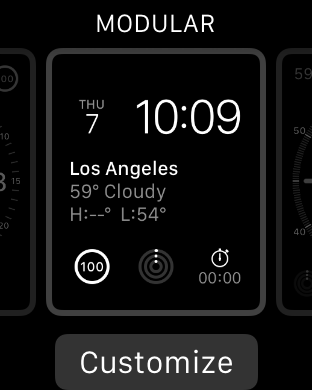
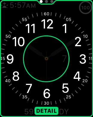
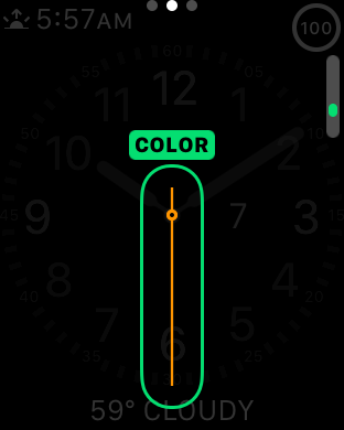
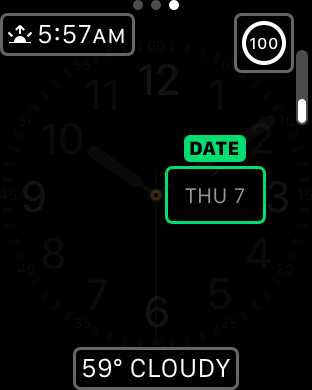
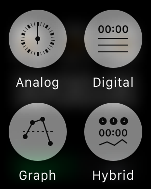
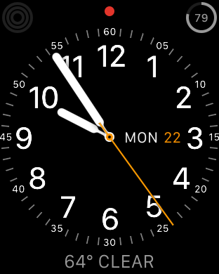
Probably the first area worth discussing are watchfaces. One of the first things that became apparent to me in my experiences with Watch OS was that watchfaces have a great amount of depth when it comes to interactivity and customization. On other wearable platforms there are definitely applications that allow a pretty decent level of watchface customization in terms of appearance, but the equivalent of complications in Watch OS is usually missing to some extent. You might be able to see the weather, but you usually can’t display something else like battery percentage, sunset, calendar events, moon phases, activity progress, stocks, or any other information that you might be interested in seeing at a glance. It’s also possible to change the amount of detail you get when displaying the watch and use the digital crown to adjust the detail present analog faces. For example, the chronograph watchface allows you set 60, 30, 6, and 3 seconds for the timer. Other analog faces make it possible to set hours, minutes, and seconds of precision on the display. This might be a bit boring, but the included watchfaces show a solid framework for future growth.
It is a bit disappointing to see that there isn’t support for third party watchfaces out of the gate, but I suspect this is more due to a need to work out exactly what is needed for the API and the need to commit to long term support for any public-facing API. By comparison, it goes without saying that whatever private APIs Apple is using to enable the first-party watchfaces are subject to change at any time, which allows for significant latitude in how watchfaces are implemented.
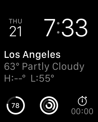
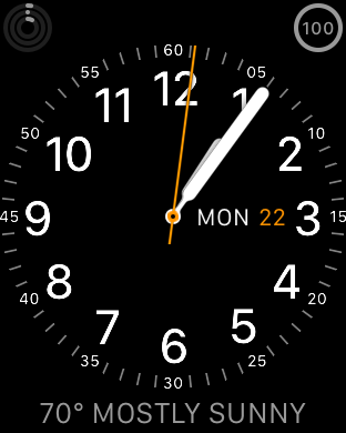
Overall, the included watchfaces are also well-designed. It isn’t really possible to show with video, but the animations that are included are impressively executed. On analog watchfaces, the second hand moves smoothly with no apparent stutter, which is a nice touch even if this isn’t all that difficult for a general purpose computer with a display that can refresh at incredibly high rates as I’ve seen more than one smartwatch that will only update the second hand every second rather than in a seemingly continuous manner. I personally ended up using the modular watchface most of the time, which doesn’t have any analog motion, but something as simple as the breathing second indicator is subtle and well-executed.
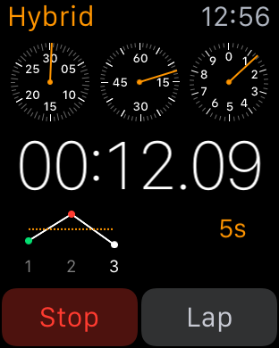
Given that Apple Watch is supposed to be a timepiece first, there are other aspects of the watch worth discussing like the timer, alarm, and stopwatch UIs. Although this is seemingly small stuff, it’s really worth calling out the timer and alarm UIs as the best example of how the combined touch and digital crown navigation works in practice. There are large touch targets to select hours and minutes, and the digital crown allows for fast and precise selection within hours or minutes. The stopwatch UI is a great demo of Force Touch in action, as it’s possible to go from a simple analog or digital interface to a hybrid one, with a live graph of relative lap times instead of just a list of previous laptimes.
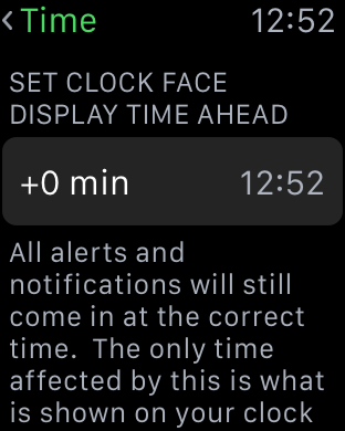
This is all really rather boring when you take a step back and realize that I’ve been talking about three of the most boring and bog-standard applications on any smartphone today, but when it comes to a first generation smartwatch it’s critical to get these applications done right. Of course, it goes without saying that alarms and timers work incredibly well on the Apple Watch due to the haptic feedback that is occurring on my wrist. Overall, on these simple aspects it's already pretty clear that Apple has put a pretty significant amount of thought into WatchOS. Probably the most obvious example of this is the ability to set the clock to be a set number minutes ahead, which is something that really shows attention to detail on Apple's part.

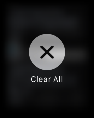
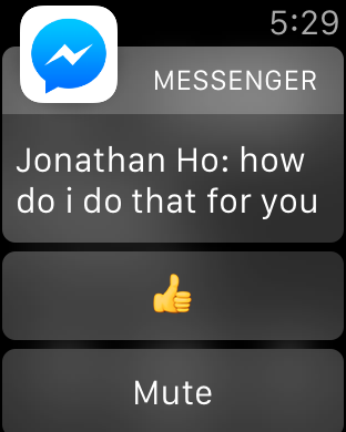
Outside of watchfaces, the next most important aspect of the Apple Watch is probably the notification system. When purely focused on the actual notification shade, the design doesn’t have any obvious flaws. If there are notifications in the drawer, a red dot appears on centered on the top of the display. Swiping down from the watchface opens up the notification drawer, with the ability to scroll through notifications with the digital crown and dismiss all notifications by using Force Touch providing a smooth and quick experience, although if you’re like me you might not realize that you can use Force Touch to dismiss all notifications for some time. However, in my experience with Watch OS 1 the experience is pretty bimodal when it comes to how useful these notifications are. The first case usually involves the ideal experience, which is an actionable notification that I can respond to on my wrist and dismiss after responding to it without ever taking out the phone to respond to the notification. Multiple simultaneous notifications are handled smoothly and logically. This is usually what happens with simple text messages/iMessage and other first-party applications.


The second case is usually what happens with third party applications, which tends to be a combination of poor handling of multiple notifications and no real actions that can be taken. Pretty much any third party IM client suffers from these issues right now, and probably the biggest source of notifications on my phone comes from third party IM clients. As a result, it’s really quite irritating to raise my wrist and see nothing but the application icon and a message saying that I have two notifications. In order to appropriately respond to this, the only solution at this time is for me to take out my phone, unlock it, and then read and type out my response on the phone. Alternatively, I have to dismiss the notification, then go back to the notification drawer and go through each notification separately.

To me, this represents a pretty significant issue that pretty much every wearable platform has right now, which is that there are often corner cases where wearables end up using more time than just using a smartphone alone. In the near term, I suspect the quickest solution to this issue is turning multiple notifications arriving simultaneously into a scrollable list instead of simply notifying that there are multiple notifications. It would also be helpful to be able to respond to notifications using dictation on the watch to draft a response, but I suspect that this requires additional work on the part of the developer to enable such things.


270 Comments
View All Comments
everythingis1 - Tuesday, July 21, 2015 - link
Is anyone going to talk about that fact that these devices need 2 hands to operate. Doesn't that make the entire platform functionally irrelevant as anything other than a simple sensor? Am I completely crazy or is any smartphone, that can be operated with one hand for basic functionality, superior in every single way?deasys - Tuesday, July 21, 2015 - link
Actually, the Apple Watch can be operated 'no hands.' That's what Siri is all about.everythingis1 - Friday, July 24, 2015 - link
How do you activate Siri?Barilla - Tuesday, July 21, 2015 - link
Too bad one of the biggest features separating it from other smartwatches - the digital crown - becomes literally unusable if you decide to wear it on right hand. Yeah, some people do that...name99 - Tuesday, July 21, 2015 - link
LITERALLY unusable?http://www.imore.com/how-set-apple-watch-left-hand...
You mean the scheme Apple devised for this purpose doesn't work? Forgive me if I trust the opinions of various reviewers who have actually tried it over the opinion of someone who's never even touched an Apple watch...
nja4 - Tuesday, July 21, 2015 - link
I'm sort of on the anti-Apple hype train too, where reviewers are seem really expected to give Apple products overly positive reviews. However, I don't expect most people to share my opinions. The polish and appeal is so intense that I would bet most people would prefer their products over others. This review, as Ryan said, is going to be read by more than the core community, and I'm SO happy that Ryan responded in such a positive and discussion-oriented way. You're a great part of this community even when people are jerks about this sort of "obvious Apple bias."uhuznaa - Tuesday, July 21, 2015 - link
Nothing that draws 200 comments on Anandtech can be really pointless... As soon as reviews of Apple products will fizzle out here with five comments or so Apple will have lost it. But not sooner.Really, all you guys seem to be really obsessed with Apple. Even if you hate it, but you do care very much. Most reviews of smart watches draw much fewer comments...
Junereth - Tuesday, July 21, 2015 - link
this site really needs to make comments collapsible. it's incredible hard to navigate in here.SBD.3 - Tuesday, July 21, 2015 - link
I'd love to see the iWatch interface optimized on an iPhone. But as far as wearing a watch again, that ship has sailed.Tams80 - Tuesday, July 21, 2015 - link
A day for a smartwatch is just about bearable, just as it is a smartphone. More battery runtime is always better, but two to three days at moderate usage is the point at which I would be happy (basically, the ability to last a weekend away, where power is not easy to come by). One thing to take into account though, is that the smartphone takes priority. If there is only one charging point, the smartwatch gets left out, and therefore becomes useless.As for the review, I have some issues:
You haven't tried many watches, and by the sounds of it, none to the same extent as the Apple Watch. If that is the case, then I don't think you are qualified to make a comparison to them, as a professional reviewer. Further, you didn't even mention the Alcatel OneTouch Watch; the most apt comparison, as it also works with iPhones. As you clearly spent so much time of this review, you could have at least picked one up. They are cheap, but you also work for the well respected technology site; they might have even sent you one for free!
"The Apple Watch on the other hand doesn’t suffer from discomfort issues at all, and in this regard, Apple has arguably pushed the industry forward."
You do know that there are smartwatches out there that take standard watch straps? You do know that there are countless different designs of standard watch straps?
Finally, two specific points that really grated my gears (especially coming from someone who I expect to technologically knowledgeable):
"The ergonomic annoyances involved with wearing a wristwatch strongly outweighed whatever functionality it provided."
What ergonomic annoyances? The watch goes on your wrist, and in many cases never needs to come off. In return watches tell the time, often the date and day, and sometimes more. How is glancing at a watch less ergonomic than getting your phone out of wherever it is and checking it?
"wireless charging behaves differently from wired charging" - Total fluff, and no shit Sherlock.
So, to summarise. I think that while this was a good technical review of the Apple Watch, as a product review in general, it was very poor. The author let their personal view cloud his judgement too much, and comparisons were, well basically non-existent. If you didn't intend it to be a product review, then remove the product review sections. I expect much better from AnandTech.