The iOS 7 Review
by Brian Klug & Saumitra Bhagwat on September 19, 2013 1:25 AM ESTControl Center
One of the big new features in iOS 7 is the addition of a quick settings menu called control center. Where notification center comes down from the top like a shade, control center comes up from the bottom and has quick access to settings toggles and shortcuts. This takes the place of the quick settings which used to exist to the left of the multitasking interface that had playback controls, rotation lock, and volume access. This also gets a transparent effect that superimposes the control center UI over whatever other view you have open.
The new control center is probably one of the most functional new additions to iOS 7. iOS has slowly filled in all the major gaps in functionality, and a quick settings toggle has been one of them for a while now. I remember running SBSettings a long time ago from Cydia and wondering why something like this wasn’t a part of iOS, control center finally fills that niche.
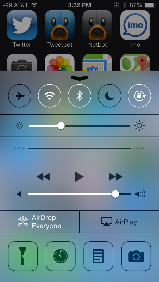
There’s a top bar with toggles for airplane mode, WiFi, bluetooth, do not disturb, and rotation lock. Below that is a brightness slider (although there’s not auto brightness toggle), and then playback controls. Below that is AirDrop and AirPlay, and finally underneath that are four shortcuts for flashlight, clock.app, calculator.app, and camera.app.
It’s great to have settings toggles, but unfortunately the toggles don’t double as settings shortcuts. For example you can enable or disable WiFi, but if you want to attach to a wireless network, you still have to launch settings.app and then get to it that way, instead of long pressing on the toggle in control center. The same applies for bluetooth or do not disturb, which should be toggles but also offer shortcut functionality into the appropriate page in settings.app. I’d also love it if there was a settings.app shortcut inside control center as well, or the ability to customize the four shortcuts at the bottom. It’s also a bit weird to always have the playback controls visible even when there isn’t music playing, since they take up a considerable amount of vertical space in the shade.
Notification Center
Just like control center, notifications center gets changes with new organization and visual styling. Previously notification center was just a long vertical structure – new things just piled in and stacked on top of each other. The new iOS 7 version includes three tabs with different organization - Today, All, and Missed. This entire view also has the transparency effect that makes it look like the shade is on top of whatever view you dragged it down from. What's still missing however is a 'clear all' button for notifications.
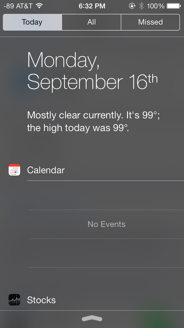
Today is designed to be an at a glance information screen that takes the place of the always-visible information from the previous version. Weather, date, calendar, and stocks are here now with completely different appearance. The topmost view includes the date and current weather, much like what you’d get if you asked Siri for the current weather. Below that is calendar with upcoming appointments, which curiously always occupies the same amount of vertical space regardless of whether you actually have any upcoming appointments.
What’s gone are the Twitter and Facebook status updates, which I never admittedly used that much from iOS 6. I guess there’s not really a good place for them under this new organization anyways.
Notifications sit under All and Missed, which self explanatory. All includes every notification that’s come in, including those while the device was in standby. Missed explicitly includes those that were never delivered atop the UI with the screen on.

Notifications in general in iOS 7 are improved, and can now be more easily dismissed by dragging the shade up. Previously you’d have to sit through the notification animation and wait for it to dismiss itself or tap on it to act on it, you just lost the screen real estate at the top until either finished. Correction: You could flick banner notifications away previously, it's just a lot easier now. Now if you’re inside an app that uses that topmost portion of the display and don’t want to act on one, you can just drag up. Likewise if you want to act on it, dragging down works like you’re pulling on the notification shade itself.
I like those two changes quite a lot. Losing the top part of the view in an app when a notification gets delivered and then waiting for it to dismiss used to be very frustrating in iOS 6, I find being able to toss them away very handy.
Status Bar
The status bar in iOS 6 changed from being this unmutable solid color object at the top of almost every view to something that applications could finally manipulate the color of and occasionally deliver status messages with. In iOS 7 the status bar changes once again, this time it’s narrower and includes the Helvetica Neue light weight font for the time and indicators. There are actually two different font weights in the status bar, one for the time, the other for battery percentage and the operator string.

All the iconography changes here, but not dramatically, thankfully the battery indicator still tracks on a per pixel basis with battery state of charge, and the rest of the status indicators (WiFi, Bluetooth, rotation lock, location services) seem to be styled differently but aren’t dramatically different from their predecessors.
The most dramatic change however is to the signal bars, or should I say signal dots. We have a pretty interesting history going back to the signal bars in iOS with the iPhone 4 antenna situation and changes to both the visualization and bars to dBm mapping, so for me following the progression of this visualization is a big deal.
The earliest iPhone prototypes famously included dots that look identical to what we get now in iOS 7, clearly Apple’s SVP designer feels strongly about the use of circles to convey signal strength. In fact the use of circles appears a lot throughout iOS 7 – from the dialer, to the passcode entry screen, to the new design grid guidelines inside the application icon.
There are still five of them, and fundamentally as far as I can tell the mappings between dBm and dots is unchanged, so really it’s a purely aesthetic change rather than functional one. While it matches the theme of a complete redesign and the other circular design elements, the lack of any real functional change confuses me.
I guess I’m disappointed that Apple didn’t take the opportunity to do something else with the visualization entirely. I was hoping they would create either some different means of conveying cellular signal strength than just changing the tired old bars metaphor to circles which also no longer even convey magnitude. The bars at least previously each had different amplitudes, is 4 dots 4 times as good as 1 dot? Is each dot the same amount of relative change? I just find the entire metaphor tiring across the entire industry and was hoping Apple would do something other than change the bars to dots and take up more horizontal space in the the already crowded status bar.

At one point, I was hoping that the design direction for the dots would mirror the battery status indicators on a MacBook and breathe in and out to show amplitude between the cutoff points rather than this boolean on/off indicator. It just seems hilarious to me all of this traces its roots to a segmented monochrome display and has yet to be re-imagined for a modern display. Whatever the case, I continue to just switch to numerics in iOS 7 by force quitting field test (which thankfully still remains in iOS 7) since the bar cutoffs are still arbitrary and still don’t tell me what I want to know.
Home Screen
I have always maintained that iOS has evolved in a very logical and cohesive fashion over the years. Existing apps and features have built meaningfully on their predecessors in an intuitive way. The home screen however has been largely unchanged over the years, barring minimal changes to the status bar, icons and docks. The biggest change was the support for background wallpapers in iOS 4 and the Notification Center in iOS 5.
In iOS 7, the home screen has received a major facelift. The home screen now also supports a parallax effect, as icons appear to float over the wallpapers and react in relation to physical device movements. The status bar has been updated with a new battery indicator and a subtle new charging animation.
The new dock has a frosted transparent look, and adapts to the current wallpaper, much like other parts of the OS such as the Notification Center and Control Center. Folders have also been completely revamped, but look rather bland and uninviting. Again, the folders adapt to the current wallpaper, which should keep things fresh in the long-run from a UI standpoint. Once accessed, a folder fills up the entire screen and now supports multiple pages of apps. The home screen adds support for dynamic wallpapers, a few of which come bundled with the OS itself, but there’s no word yet on support for custom dynamic wallpapers. Swiping down from the top edge of the screen provides access to the revamped Notification Center, whereas swiping up from the bottom edge provides access to the Control Center. Spotlight can now be accessed by swiping down anywhere (anywhere but the top edge, or the dock icons) on the home screen. The Spotlight UI is a light gray, frosted, transparent overlay on the home screen. Results are categorized by apps, and display additional information such as an icon for unread email or a line which says “completed” under reminders.
iOS 7 features a completely revamped multitasking interface which is similar to the one adopted by webOS back in the day. Double pressing the home button zooms out of the home screen to display a full screen preview of all running apps with the app icon below the preview. From here you can switch between apps by tapping on their window preview or the app icon below it. You can manually quit apps by swiping their preview windows up, you can even swipe multiple windows off at the same time. You can’t however switch to or quit an app by tapping on any of the windows while the multitasking view is in motion; you have to wait for all windows to come to a halt before you’re allowed to interact with any of them. The app icons themselves are fair game, but otherwise this is a waste of an otherwise very quick animation.
There are some orientation quirks that need to be worked out, for instance, if an app is currently in landscape mode, the multitasking interface orients itself correctly in the landscape mode, but the previews for other running apps running in portrait mode appear rotated 90 degrees, making things slightly disconcerting on the eyes. Another thing I noticed (because the sleep/wake button on my iPhone 5 is defunct), is that Assistive Touch is not available in the new multitasking interface.
The design and color scheme of the new icons have been a subject of much debate with opinions spanning the entire possible gamut. The new icons are a stark departure from the glossy, texture-ridden icons used so far. Personally, I found the new icons to be excessively simple, and the color scheme to be a tad bit garish for my liking. While I’m quite comfortable with the big rounded edges and the flat appearance, I feel some of the icons don’t quite convey the purpose of the apps. Icons for the Photos and Game Center apps are prime examples, because if it weren’t for the text underneath, it would be impossible to figure out what the app is supposed to do. Icons for the Stocks and Voice Memos app are also overly simplistic and don’t convey much about the app’s purpose. Icons for the Calendar and Music apps are quite well designed in my opinion, but it all boils down to personal preferences. That being said, I strongly feel the new icons and color scheme will garner an extremely polarizing response from the general public, much like the one from the beta testing community.
Multitasking API Changes
Although iOS added multitasking support a long time ago, there still are a few pain points in the multitasking workflow that get smoothed over in iOS 7. In iOS 6, applications could request a certain amount of time to complete a task or run in the background state, after which point the background task ends and the iPhone goes to sleep. Push notifications and other things can give the impression that the application is still awake, but that background process really is finished.
In iOS 7 there are two new multitasking modes. The first addresses a pain point that I’m sure many other iOS users have encountered with third party messaging applications that deliver messages as push notifications and also in an app. This new mode allows applications to fetch new content in the background when a push notification comes in, rather than doing it when the user launches the app in response to the notification arriving. I run into this all the time with my IM client of choice, for example – push notifications will come in with the messages, but the app is unaware until it actually gets launched, after which it pulls down what’s new.
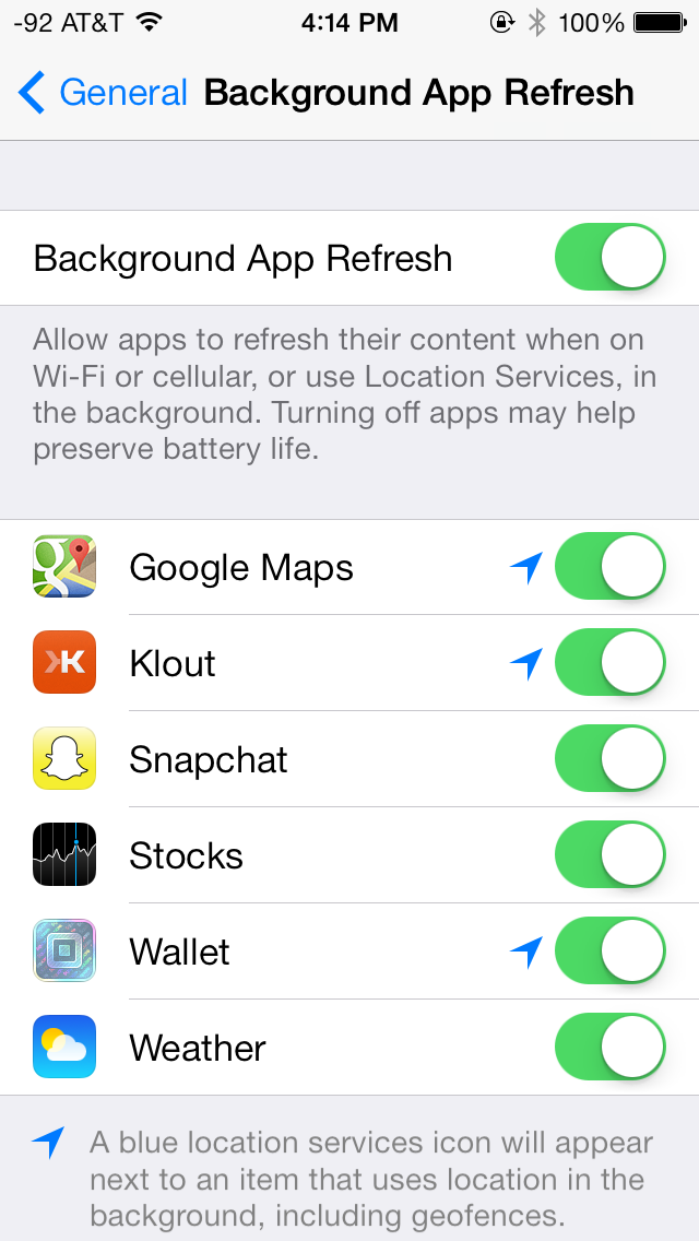
The second mode adds supports for periodic background content fetching for apps that update their content on a schedule. This allows apps that request content periodically to get background execution time so that information is already fresh and pulled down when the user launches it.
iOS 7 also now changes up the background task scheduling system so that applications that do run in the background opportunistically do so during other periods when the phone is awake and screen-off. The reality is that the iPhone (and really all other smartphones) are waking up all the time while they’re suspended and either fetching content or doing some processing, using this time to complete some other task is what’s new in iOS 7 as well.
App developers can opt for these new background states, but they aren’t necessarily used. Based on launch pattern (frequency and time of day) for applications, over time iOS 7 learns what apps a user is using and when, and schedules those background events accordingly. Users can of course just disable the functionality entirely under the background app refresh menu in settings.
Keyboard Design
The default keyboard has also been revamped with the new typography and a white or dark gray color scheme, depending on the app. The keyboard also takes advantage of translucencies, much like other UI elements such as the status bar and the action bars in apps, inducing a sense of depth and functional layers in apps. Apps that support the new keyboard must be updated to draw their view behind the keyboard now, enabling a pretty cool visual effect. The new keyboard looks great and compliments the rest of the OS beautifully. Third party apps that haven’t been updated currently don’t use the new keyboard design.
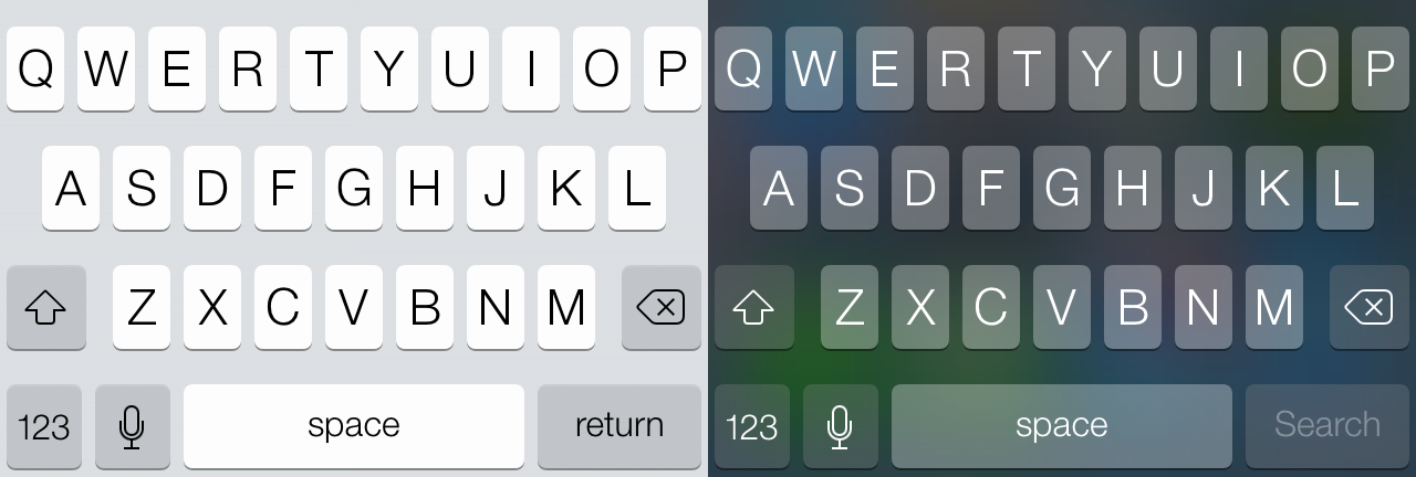
Functionally the new keyboard works a lot like the old one, although there are some weird changes that detract from the overall experience. For starters, all keys are still labeled with capitalized letters regardless of whether or not you’ve toggled the shift key. Pressing shift just toggles an indicator on the virtual shift key, the letters themselves don’t change their appearance on the keyboard. I don’t need to explain how this may be a stylistic improvement but is definitely a functional difference between iOS and Android. Although Apple seems fundamentally opposed, it'd still be great to someday get the ability to use third party keyboards and enable swype-like typing.
Autocorrect is seemingly unchanged, although I do find myself making more mistakes on the new keyboard compared to the previous version. There’s visually less spacing between the keys, which seems to have an impact on my typing accuracy. Whenever I switch to a third party app without the updated keyboard view I typically find my accuracy goes up. I’m sure it’s something I can get used to, but definitely a change and not necessarily one for the better (at least, again, from a functional standpoint).


144 Comments
View All Comments
prophet001 - Friday, September 20, 2013 - link
I got that part. What I was referring to was how he mentioned that there had previously been a lack of change between OS versions. With iOS 7 though, Brian asserts, there are radical changes. Immediately following his claim is a picture of two identical screens. One screen iOS 7 and one screen iOS 6. This undermines his claim that "almost every part of the OS gets some kind of change."solipsism - Thursday, September 19, 2013 - link
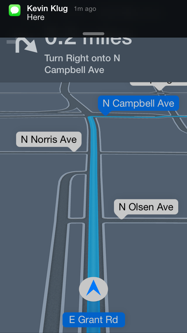
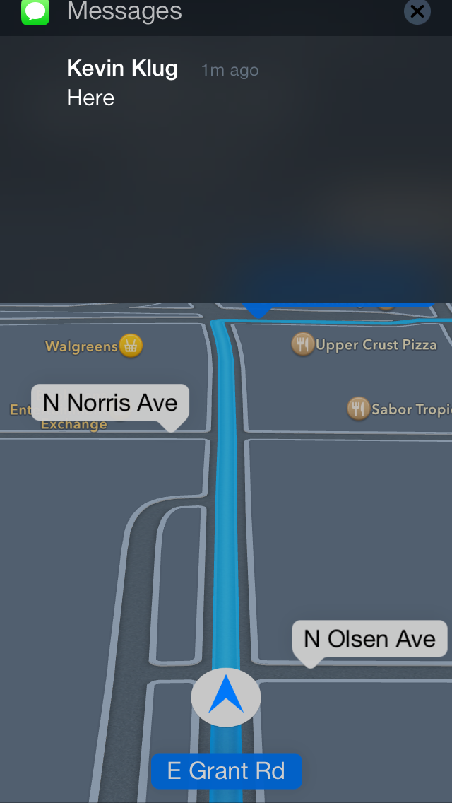
My biggest complain with the new UI is that with Maps giving you directions the "slide to unlock" button is so faint that I too often can't figure out why the Maps app isn't responding as I think it should. (See last image on first page of review)solipsism - Thursday, September 19, 2013 - link
Additionally…2) I might be in the minority here but I'm not a fan of the way Safari shows multiple pages. it's *neat* looking but like Windows Vista's Aero Flip 3D effect it's not very useful if you need to quickly distinguish between multiple similar pages at once. I'd much rather it be like the new Fast App Switcher in iOS 7.
3) It's great that iOS finally has a Control Center and it's great that it's accessible from the Lock Screen, but it should not allow one to enable Airplane Mode (or disable any wireless communication) without having to use a PIN/Touch ID for verification. Sure, you can turn off Control Center from being accessible from the Lock Screen but that's all or nothing.
4) Very, very minor but I am not a fan of most of the new icons. That said, I ultimately don't care about how a fraking icon looks so all things considered the pros far outweigh the cons.
Impulses - Thursday, September 19, 2013 - link
Wait what? You can pick up a locked iPhone and switch it into airplane mode without ever needing the PIN? How would they miss that?? Seems like such an obvioususability/security flaw... Wouldn't that make it ridiculously easy to steal phones and not worry about tracking/find phone features?Guspaz - Thursday, September 19, 2013 - link
It's not really a problem, because the device is still locked. Find My Phone wouldn't work either on a phone if the thief simply turned off the device or (in the case of some Android phones) pulled out the battery; airplane mode on the lock screen has a similar effect. The device is still locked, and even if they manage to wipe the thing it'll still need the PIN to unlock on setup the next go around.I mean, yes, it hurts security, but no more than turning off the phone, which you can't really prevent anyhow.
solipsism - Thursday, September 19, 2013 - link
Now it's just easier for thieves. Before they could turn it off — which I think really should require security to do otherwise it should just reboot — but now they can disable all wireless connections whilst still being able to keep it on and find a way to break in without using a Faraday cage to prevent it from giving the owner a chance to locate it.Impulses - Thursday, September 19, 2013 - link
Been a while since I picked up my iPod touch, you can turn off an iOS device from a locked status by holding power without unlocking? Can't seem to on my Android, where the notification shade also doesn't slide down if it's locked (that's what the lock grace period is for after all, seems like a better comprise).I mean, at the end of the day you're right, it's not the end of the world... Even if you can't easily turn off a locked device you can still just yank the SIM out... Tho that would take a thief a little more time than tapping airplane mode (specially if you're paranoid and just glue the SIM lid).
Arbee - Thursday, September 19, 2013 - link
You can disable Control Center from appearing on the lock screen. Which isn't as handy as having it there, but it's certainly more secure.uhuznaa - Thursday, September 19, 2013 - link
Makes not difference as long as you can shut the thing down by just long-pressing the power button. I think iOS should require the PIN for that, this would make just shutting it down by a thief much harder.Txmtx - Saturday, September 21, 2013 - link
there is, in fact, a Cydia tweak that accomplishes just that. A couple of them. One that reboots instead of powering off, and one that fakes powering off animations but stays on underneath, without the proper user actions.Decent added security from more normal thieves. Experienced iOSers would know a properly-timed holding of the home and power buttons results in the phone staying off. That's a hard wired function.
But yeah, a bit insecure, defaulting to such an obvious flawed idea. Jobs indeed would be pissed, at that, the animations for animation's sake (vice hiding loading times), and the killing of the skeumorphism. The latter I'm good with, though I'll be waiting for a JB to polish up a few areas and retain the functionality I'm used to. BTW, I prefer the look of the non-blurred transparency (ala the ipad3 and 4S method). Too much color on the full thing... And way too saturated. Looks like spilt watercolors.